Время на прочтение
11 мин
Количество просмотров 452K
Полное руководство по CSS flexbox. Это полное руководство объясняет все о flexbox, сосредотачиваясь на всех возможных свойствах для родительского элемента (контейнер flex) и дочерних элементов (элементы flex). Оно также включает в себя историю, демонстрации, шаблоны и таблицу поддержки браузеров.
Background
Модуль Flexbox Layout (Flexible Box) (W3C Candidate Recommendation от октября 2017 г.) направлен на обеспечение более эффективного способа размещения, выравнивания и распределения пространства между элементами в контейнере, даже если их размер неизвестен и / или динамичен (Flex значит «гибкий»).
Основная идея flex layout состоит в том, чтобы дать контейнеру возможность изменять ширину / высоту его элементов (и порядок), чтобы наилучшим образом заполнить доступное пространство (главным образом, для отображения на всех типах устройств с любым размером экрана). Flex контейнер расширяет элементы, чтобы заполнить доступное свободное пространство, или сжимает их, чтобы предотвратить переполнение.
Наиболее важно то, что макет flexbox не зависит от направления, в отличие от обычных макетов (block на вертикальной основе и inline на горизонтальной основе). Хотя они хорошо работают для страниц, им не хватает гибкости (без каламбура :-)) для поддержки больших или сложных приложений (особенно когда речь идет об изменении ориентации, изменении размера, растяжении, сжатии и т.д.).
Примечание: Flexbox layout наиболее подходит для компонентов приложения и мелкомасштабных макетов, а Grid layout предназначен для макетов большего масштаба.
Основы и терминология
Поскольку flexbox — это целый модуль, а не одно свойство, он включает в себя множество элементов с набором свойств. Некоторые из них предназначены для установки в контейнере (родительский элемент принято называть «flex контейнер»), в то время как другие предназначены для установки в дочерних элементах (так называемые «flex элементы»).
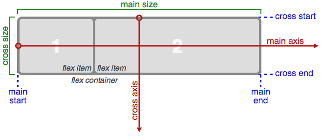
Если «обычная» компоновка основана как на блочном, так и на inline направлениях, flex layout основана на «направлениях flex-flow». Пожалуйста, посмотрите на этот рисунок из спецификации, объясняющий основную идею гибкого макета.

Элементы будут расположены либо в направлении главной оси (main axis от main-start до main-end) или в направлении поперечной оси (cross axis от cross-start до cross-end).
- main axis — главная ось flex контейнера — это основная ось, вдоль которой располагаются flex элементы. Будьте внимательны, эта ось не обязательно горизонтальная; это зависит от flex-direction свойства (см. ниже).
- main-start | main-end — flex элементы помещаются в контейнер, начиная с main-start и заканчивая main-end.
- main size — ширина или высота flex элемента, в зависимости от того, что находится в основном измерении. Определяется основным размером flex элементов т.е. свойством ‘width’ или ‘height’, в зависимости от того, что находится в основном измерении.
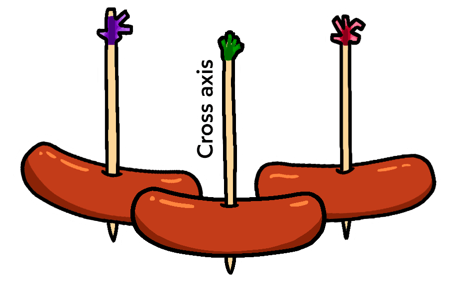
- cross axis — ось перпендикулярная главной оси, называется поперечной осью. Её направление зависит от направления главной оси.
- cross-start | cross-end — flex строки заполняются элементами и помещаются в контейнер, начиная от cross-start flex контейнера по направлению к cross-end.
- cross size — ширина или высота flex элемента. В зависимости от css свойства flex-direction, это ширина или высота элемента. Это всегда поперечный размер flex элементов.
Свойства для Родителя (flex контейнер)

display
Определяет flex контейнер; inline или block в зависимости от заданного значения. Включает flex контекст для всех потомков первого уровня.
.container {
  display: flex; /* or inline-flex */
}
Имейте в виду:
Обратите внимание, что CSS-столбцы columns не влияют на flex контейнер.
flex-direction

Устанавливает основную ось, таким образом определяя направление flex элементов, помещаемых в flex контейнер. Flexbox — это (помимо дополнительной упаковки) концепция однонаправленного макета. Думайте о flex элементах, как о первичных раскладках в горизонтальных рядах или вертикальных столбцах.
.container {
  flex-direction: row | row-reverse | column | column-reverse;
}- row (по умолчанию): слева направо в ltr; справа налево в rtl
- row-reverse справа налево ltr; слева направо в rtl
- column: так же, как и row но сверху вниз
- column-reverse: то же самое, row-reverse но снизу вверх
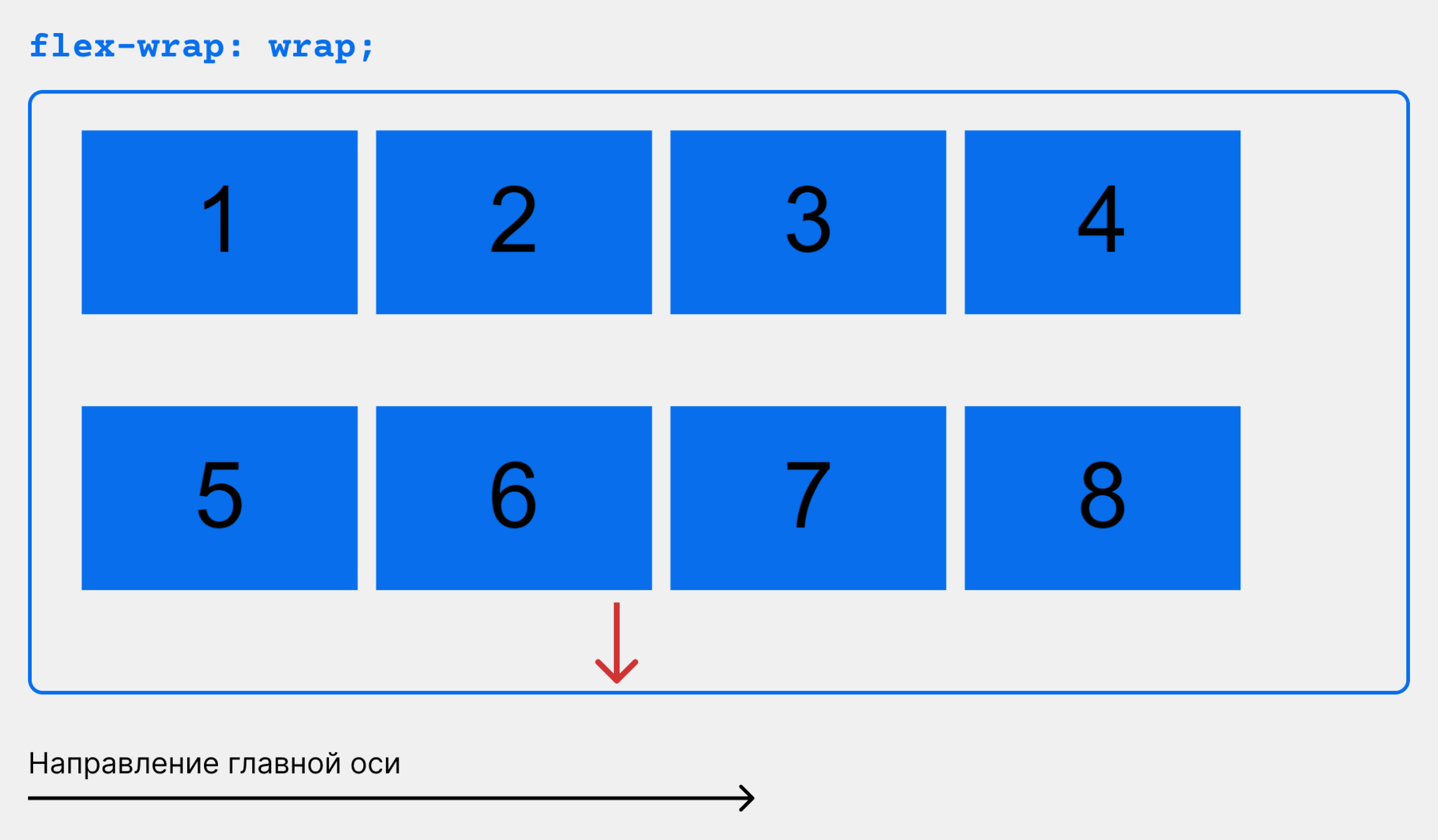
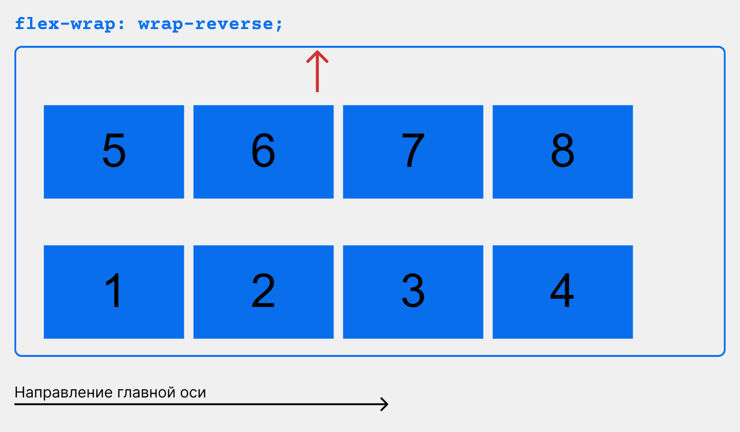
flex-wrap
По умолчанию гибкие элементы будут пытаться уместиться на одной строке. Вы можете изменить это и позволить элементам переходить на новую строку по мере необходимости с помощью этого свойства.
.container{
  flex-wrap: nowrap | wrap | wrap-reverse;
}- nowrap (по умолчанию): все flex элементы будут в одной строке
- wrap: flex-элементы будут перенесены на несколько строк сверху вниз.
- wrap-reverse: flex-элементы будут перенесены на несколько строк снизу вверх.
Посмотреть визуальные демоверсии поведения flex-wrap можно здесь.
flex-flow (Применяется к: родительскому элементу flex-контейнера)
Это сокращение для flex-direction и flex-wrap свойств, которые вместе определяют основные и поперечные оси flex контейнера. Значением по умолчанию является row nowrap.
flex-flow: <‘flex-direction’> || <‘flex-wrap’>justify-content
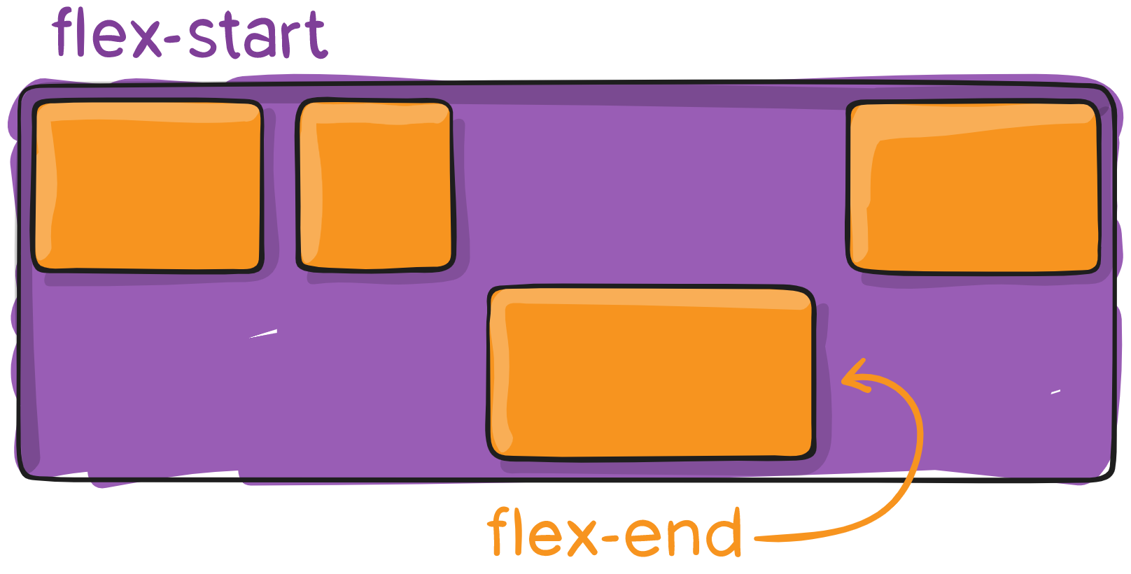
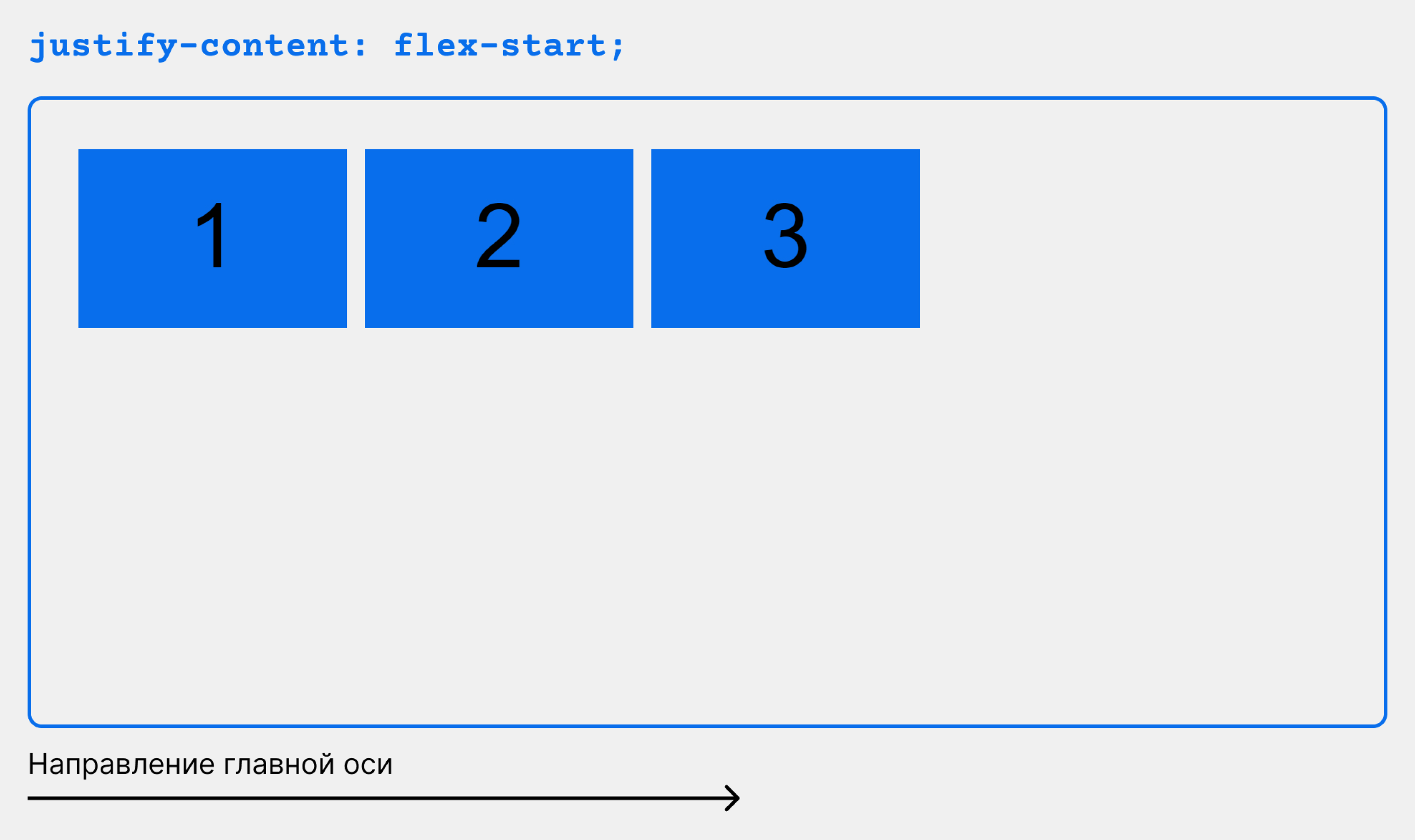
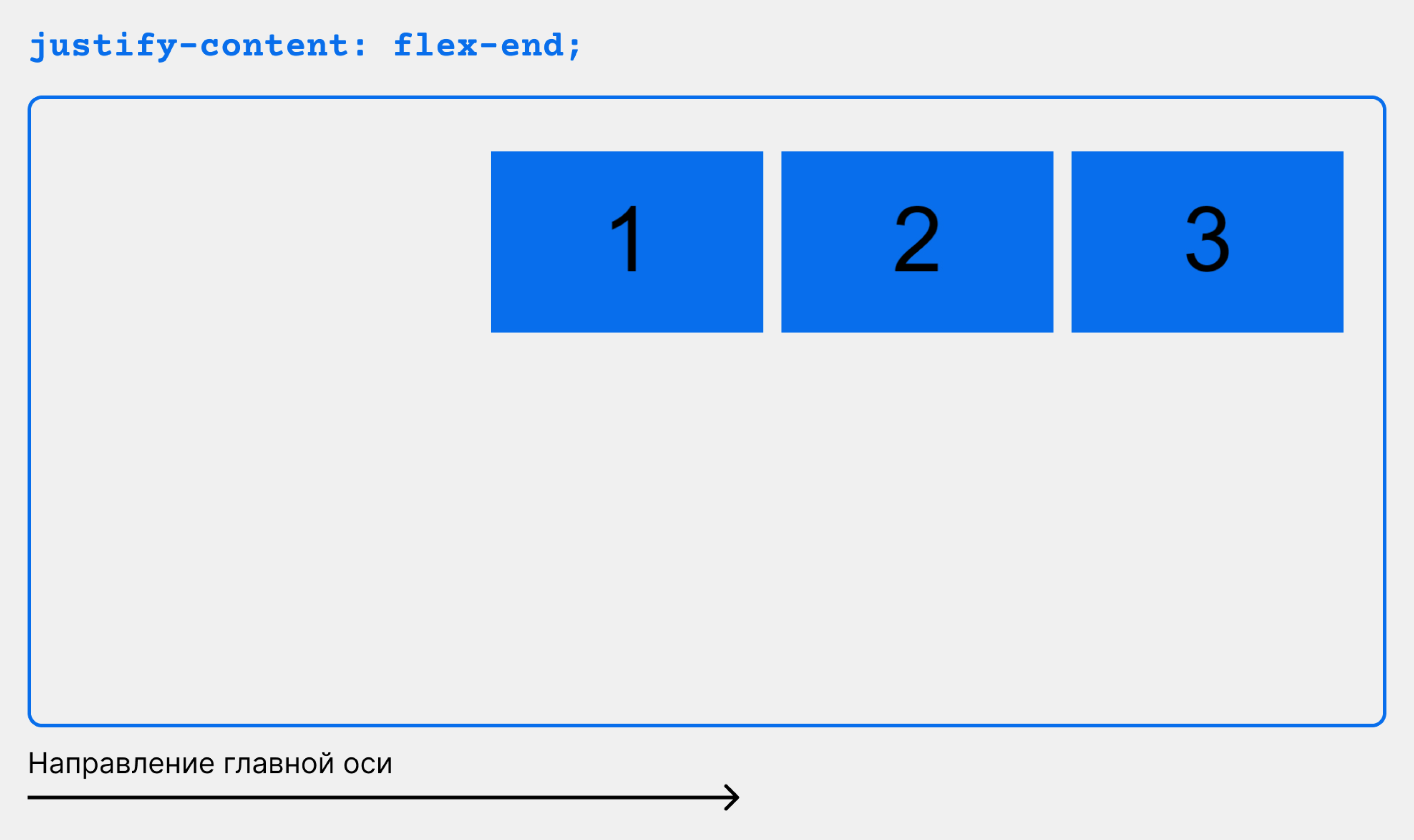
Это свойство определяет выравнивание вдоль главной оси. Оно помогает распределить дополнительный остаток свободного пространства, когда-либо все flex элементы в строке негибкие, либо гибкие, но достигли своего максимального размера. Это также обеспечивает некоторый контроль над выравниванием элементов, когда они переполняют линию.
.container {
  justify-content: flex-start | flex-end | center | space-between | space-around | space-evenly | start | end | left | right ... + safe | unsafe;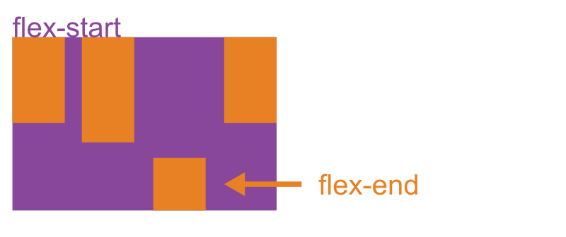
}- flex-start (по умолчанию): элементы сдвинуты в начало flex-direction направления.
- flex-end: элементы сдвинуты ближе к концу flex направления.
- start: элементы сдвинуты к началу writing-mode направления.
- end: элементы сдвинуты в конце writing-mode направления.
- left: элементы сдвинуты по направлению к левому краю контейнера, если это не имеет смысла flex-direction, тогда он ведет себя как start.
- right: элементы сдвинуты по направлению к правому краю контейнера, если это не имеет смысла flex-direction, тогда он ведет себя как start.
- center: элементы центрированы вдоль линии
- space-between: элементы равномерно распределены по линии; первый элемент находится в начале строки, последний элемент в конце строки
- space-around: элементы равномерно распределены по линии с одинаковым пространством вокруг них. Обратите внимание, что визуально пространства не равны, так как все элементы имеют одинаковое пространство с обеих сторон. Первый элемент будет иметь одну единицу пространства напротив края контейнера, но две единицы пространства между следующим элементом, потому что у следующего элемента есть свой собственный интервал, который применяется.
- space-evenly: элементы распределяются таким образом, чтобы расстояние между любыми двумя элементами (и расстояние до краев) было одинаковым.
Обратите внимание, что поддержка браузером этих значений имеет свои нюансы. Например, space-between никогда не получал поддержку Edge, а start / end / left / right еще нет в Chrome. В MDN есть подробные графики. Самые безопасные значения это flex-start, flex-end и center.
Есть также два дополнительных ключевых слова, которые вы можете связать с этими значениями: safe и unsafe. Использование safe гарантирует, что как бы вы ни занимались этим типом позиционирования, вы не сможете расположить элемент таким образом, чтобы он отображался за пределами экрана (например, сверху) так, чтобы содержимое тоже не могло быть прокручено (это называется «потеря данных»).
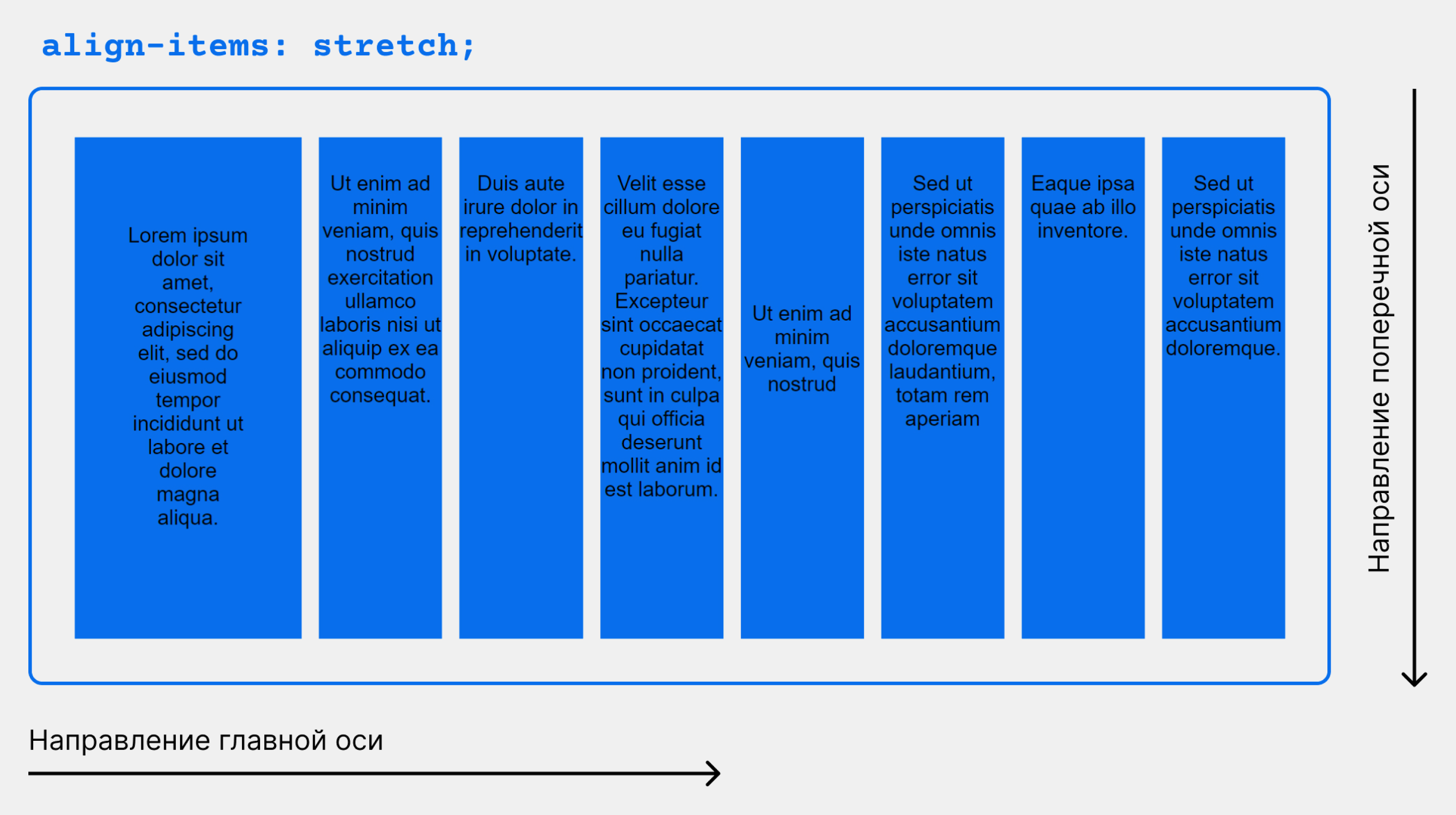
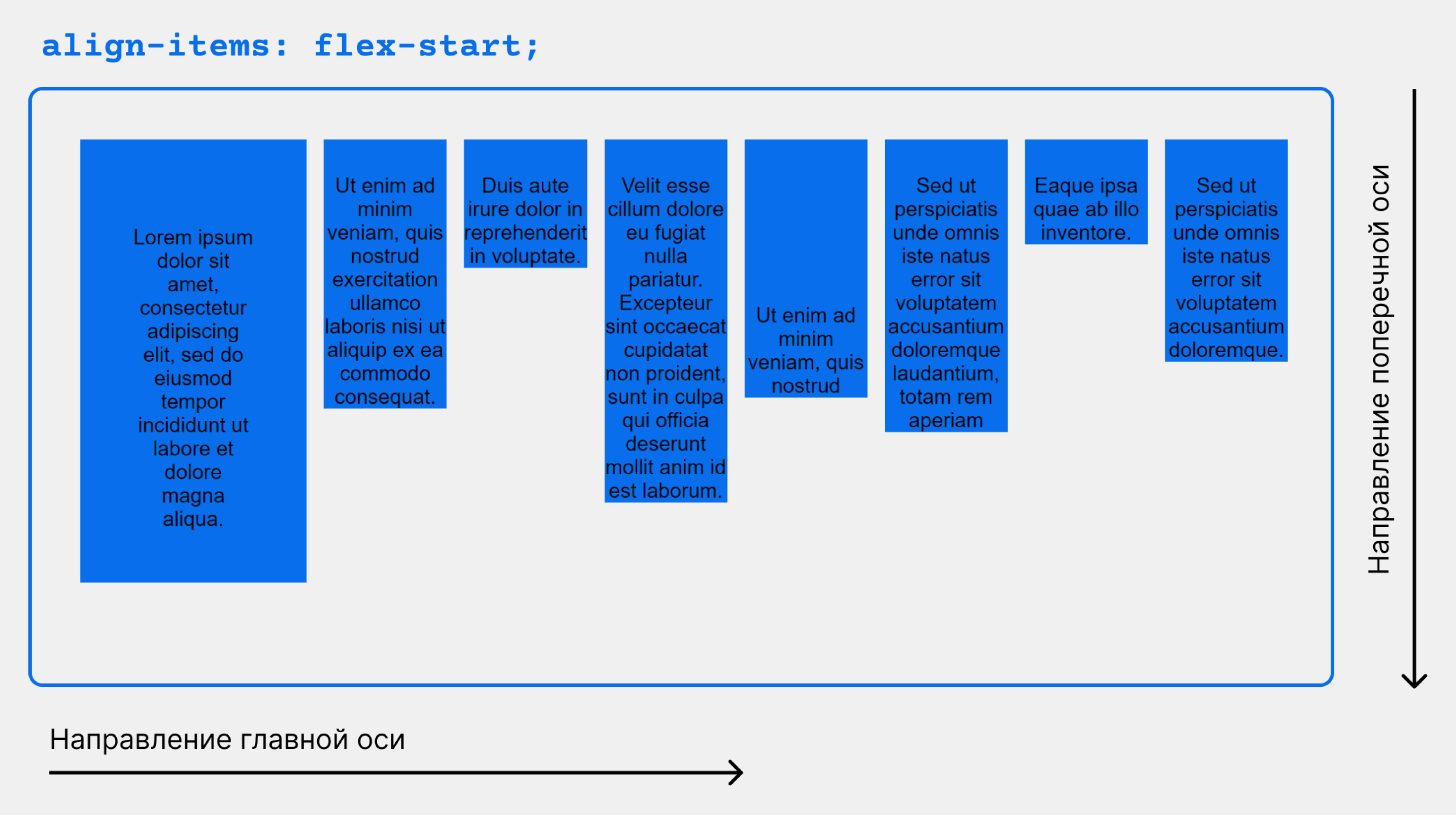
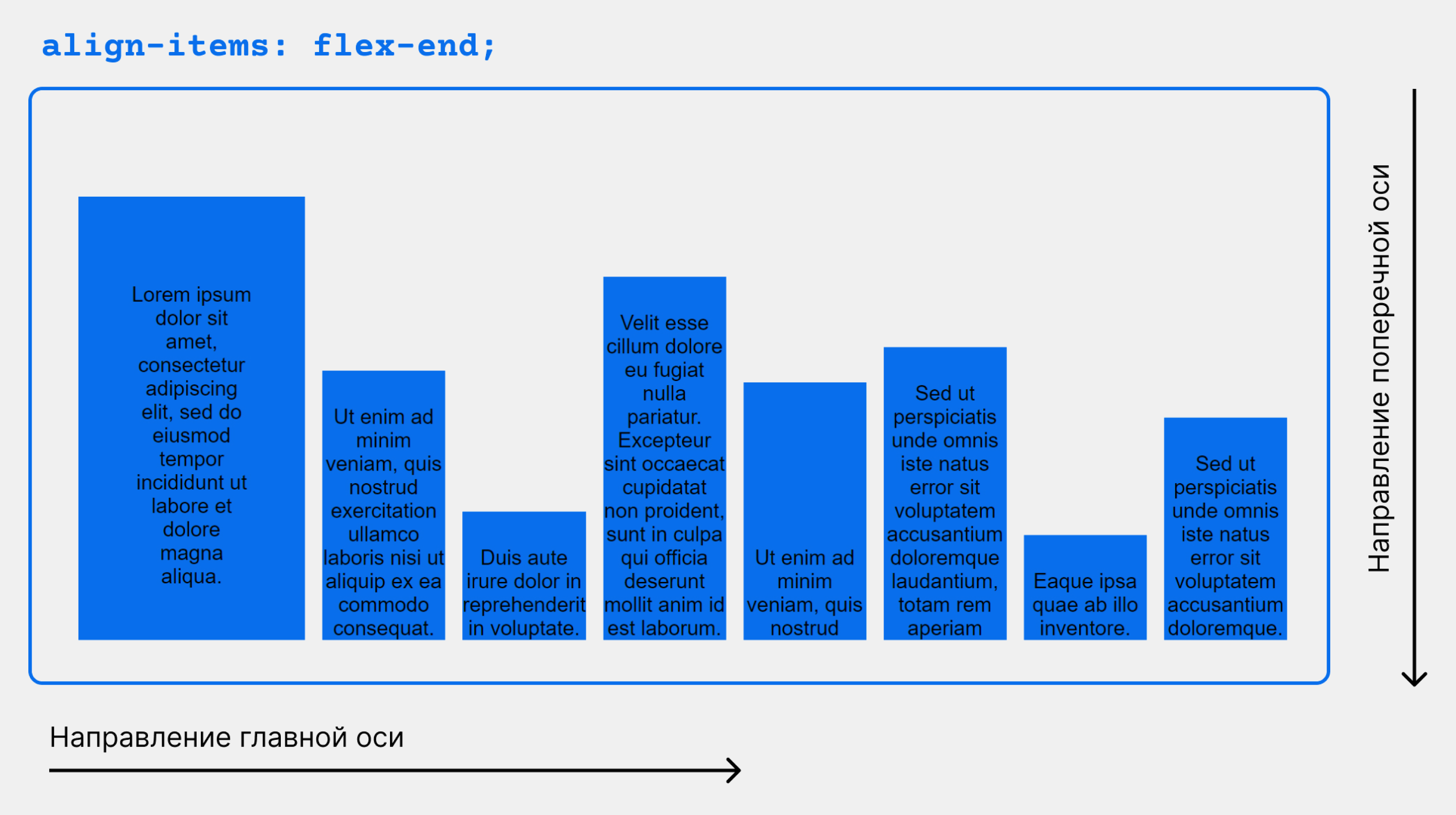
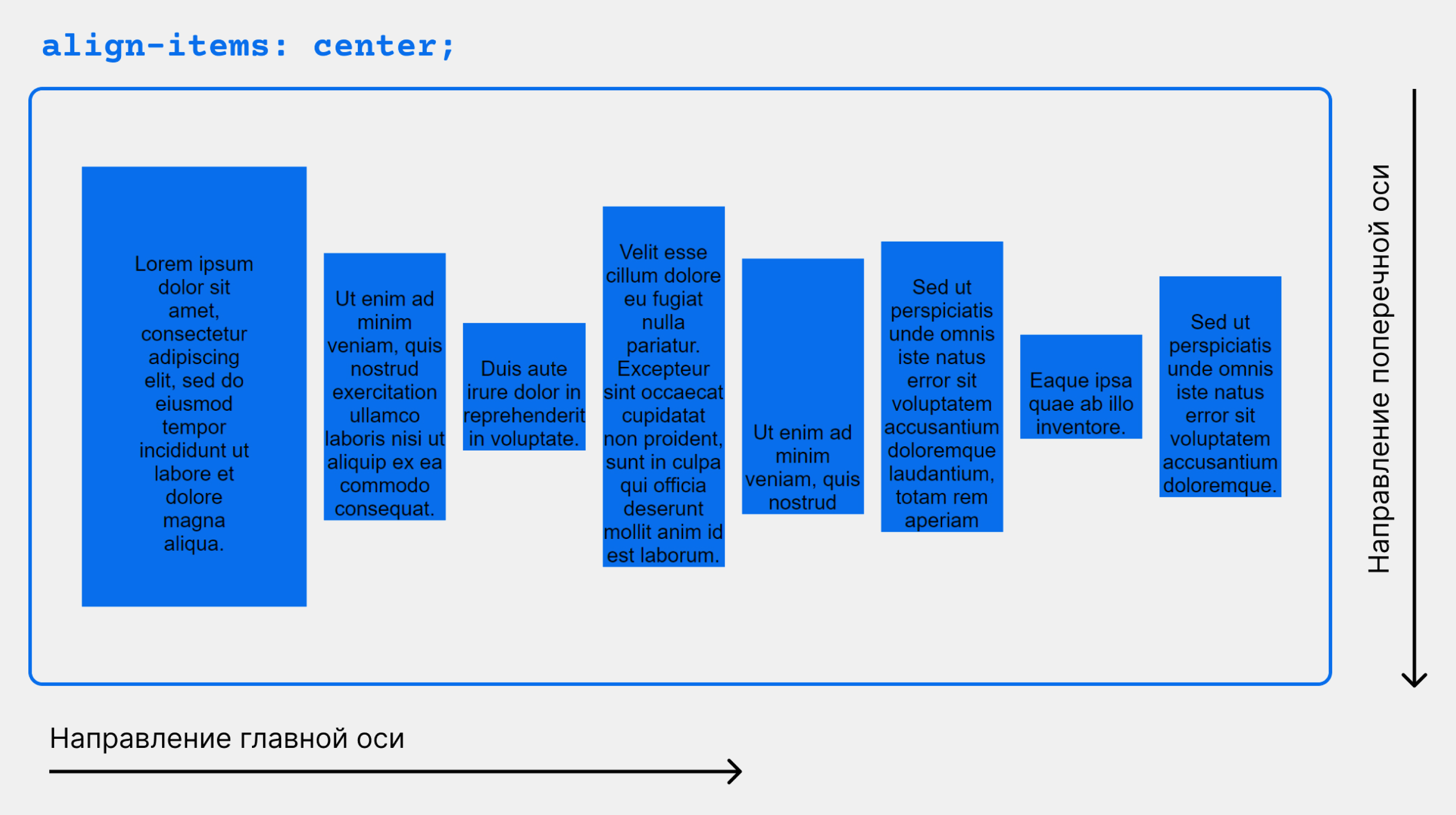
align-items
Это свойство определяет поведение по умолчанию того, как flex элементы располагаются вдоль поперечной оси на текущей линии. Думайте об этом как о justify-content версии для поперечной оси (перпендикулярной главной оси).
.container {
  align-items: stretch | flex-start | flex-end | center | baseline | first baseline | last baseline | start | end | self-start | self-end + ... safe | unsafe;
}- stretch (по умолчанию): растягивать, чтобы заполнить контейнер (все еще соблюдаются min-width / max-width)
- flex-start / start / self-start: элементы размещаются в начале поперечной оси. Разница между ними невелика и заключается в соблюдении flex-direction правил или writing-mode правил.
- flex-end / end / self-end: элементы располагаются в конце поперечной оси. Разница опять-таки тонкая и заключается в соблюдении flex-direction или writing-mode правил.
- center: элементы центрированы по поперечной оси
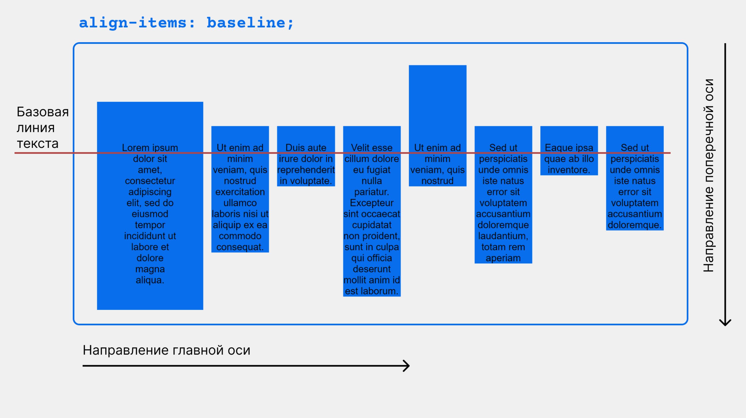
- baseline: элементы выровнены, по их базовой линии
safe и unsafe ключевые слова модификаторов могут быть использованы в сочетании со всеми из этих ключевых слов (хотя это поддерживается не всеми браузерами), это помогает предотвратить выравнивание элементов таким образом, что содержание становится недоступным.
align-content

Это свойство выравнивает линии в пределах flex контейнера, когда есть дополнительное пространство на поперечной оси, подобно тому, как justify-content выравнивает отдельные элементы в пределах главной оси.
Примечание: это свойство не действует, когда есть только одна строка flex элементов.
.container {
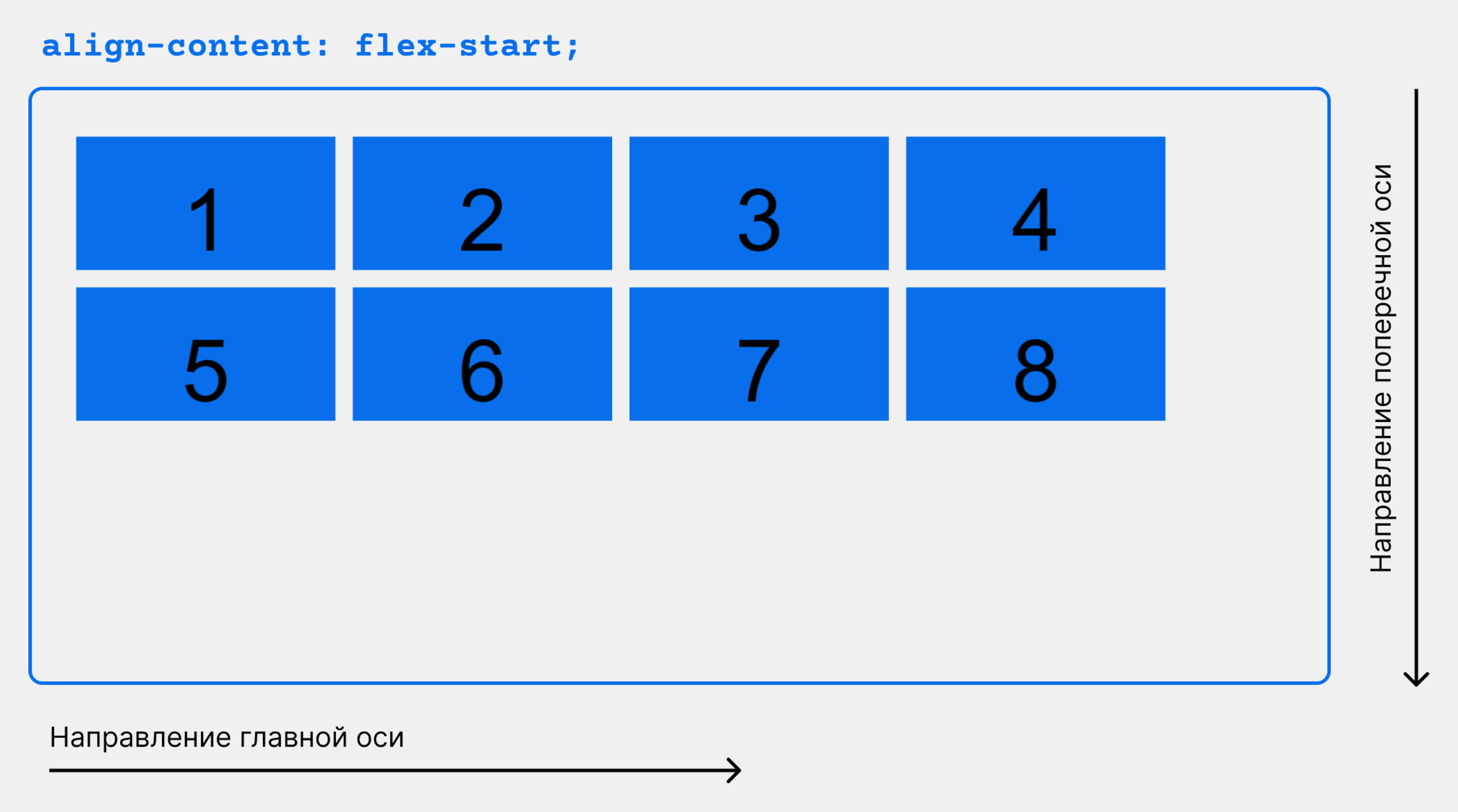
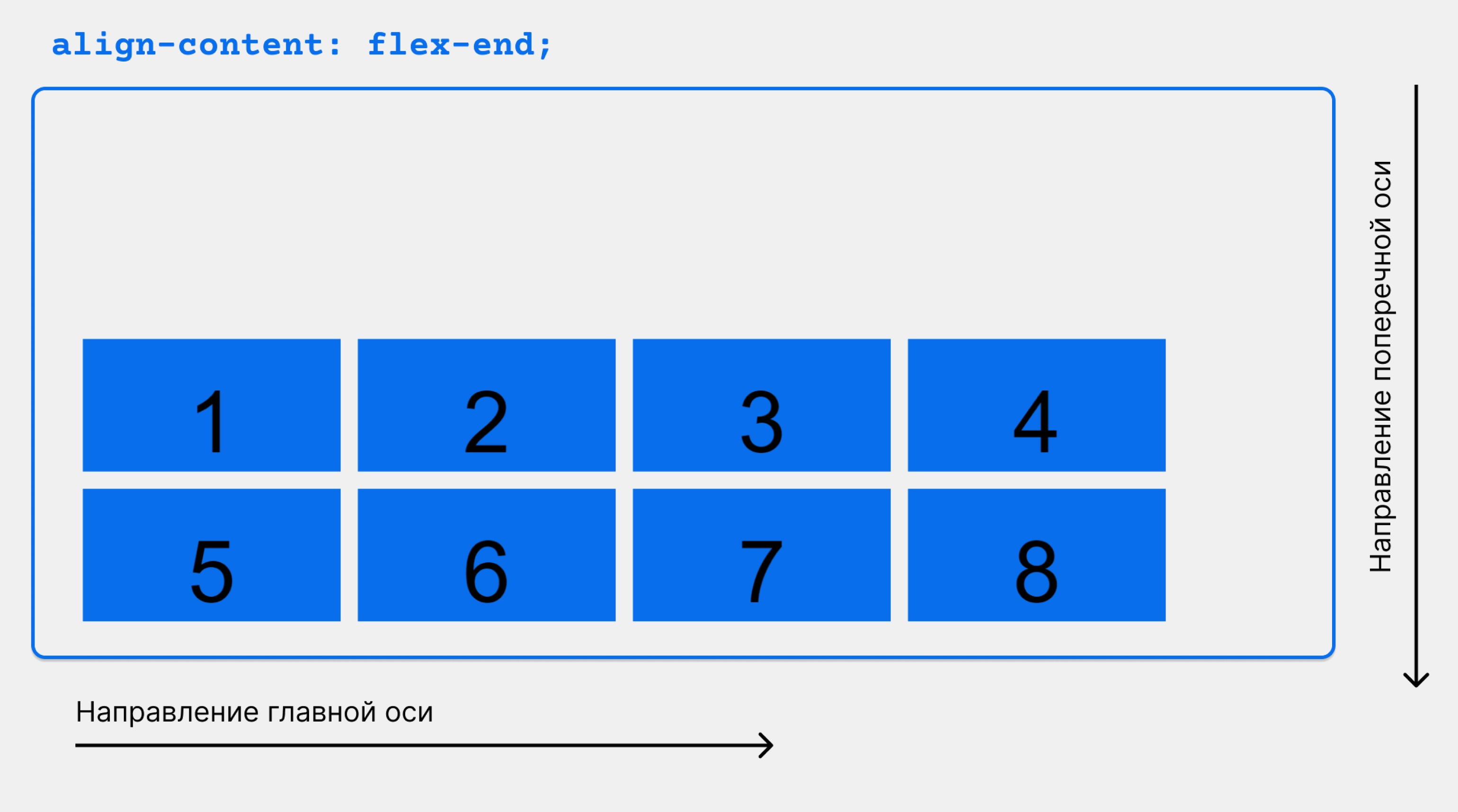
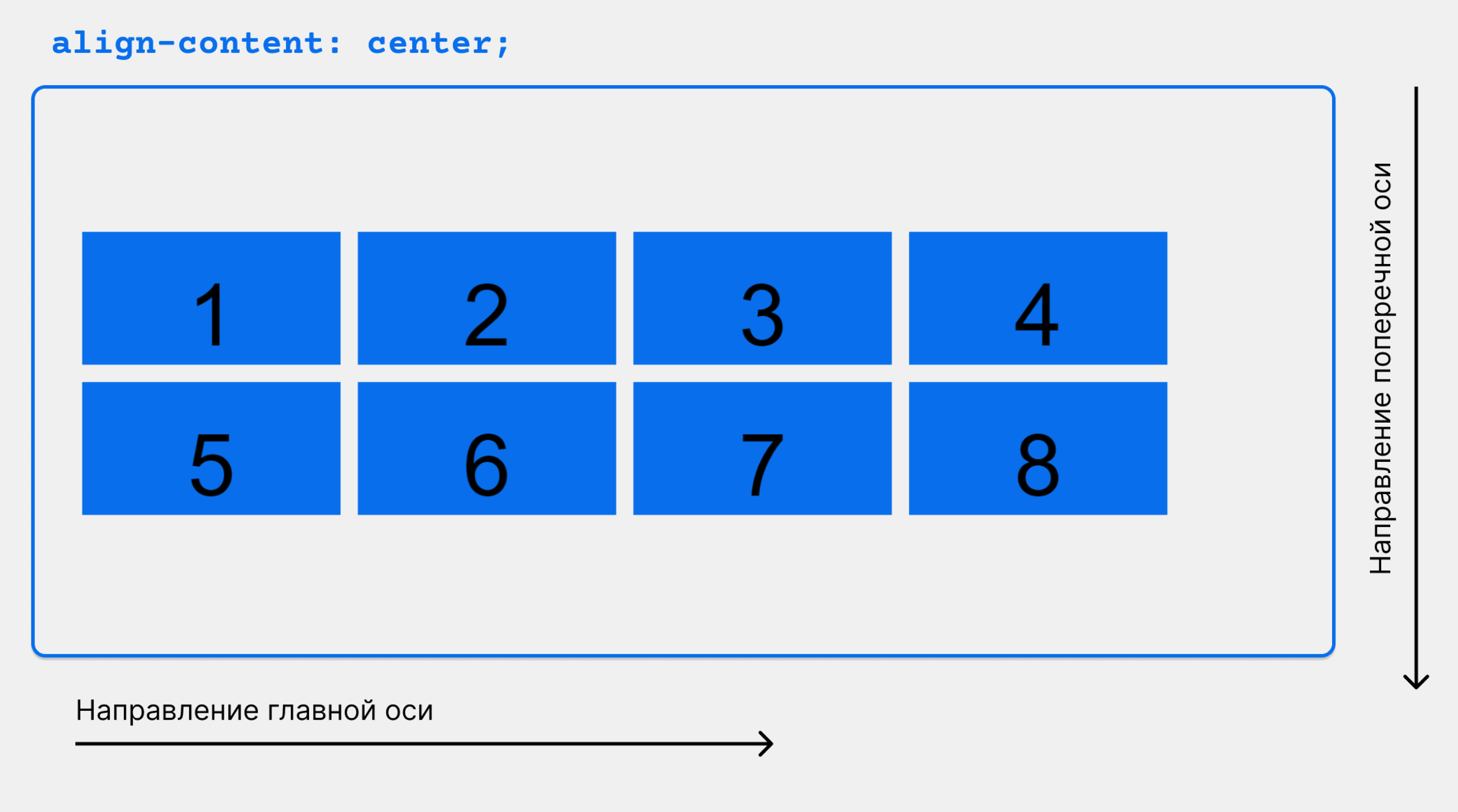
align-content: flex-start | flex-end | center | space-between | space-around | space-evenly | stretch | start | end | baseline | first baseline | last baseline + ... safe | unsafe;
}- flex-start / start: элементы, сдвинуты в начало контейнера. Более поддерживаемый flex-start использует, flex-direction в то время как start использует writing-mode направление.
- flex-end / end: элементы, сдвинуты в конец контейнера. Более поддерживаемый flex-end использует flex-direction в то время как end использует writing-mode направление.
- center: элементы выровнены по центру в контейнере
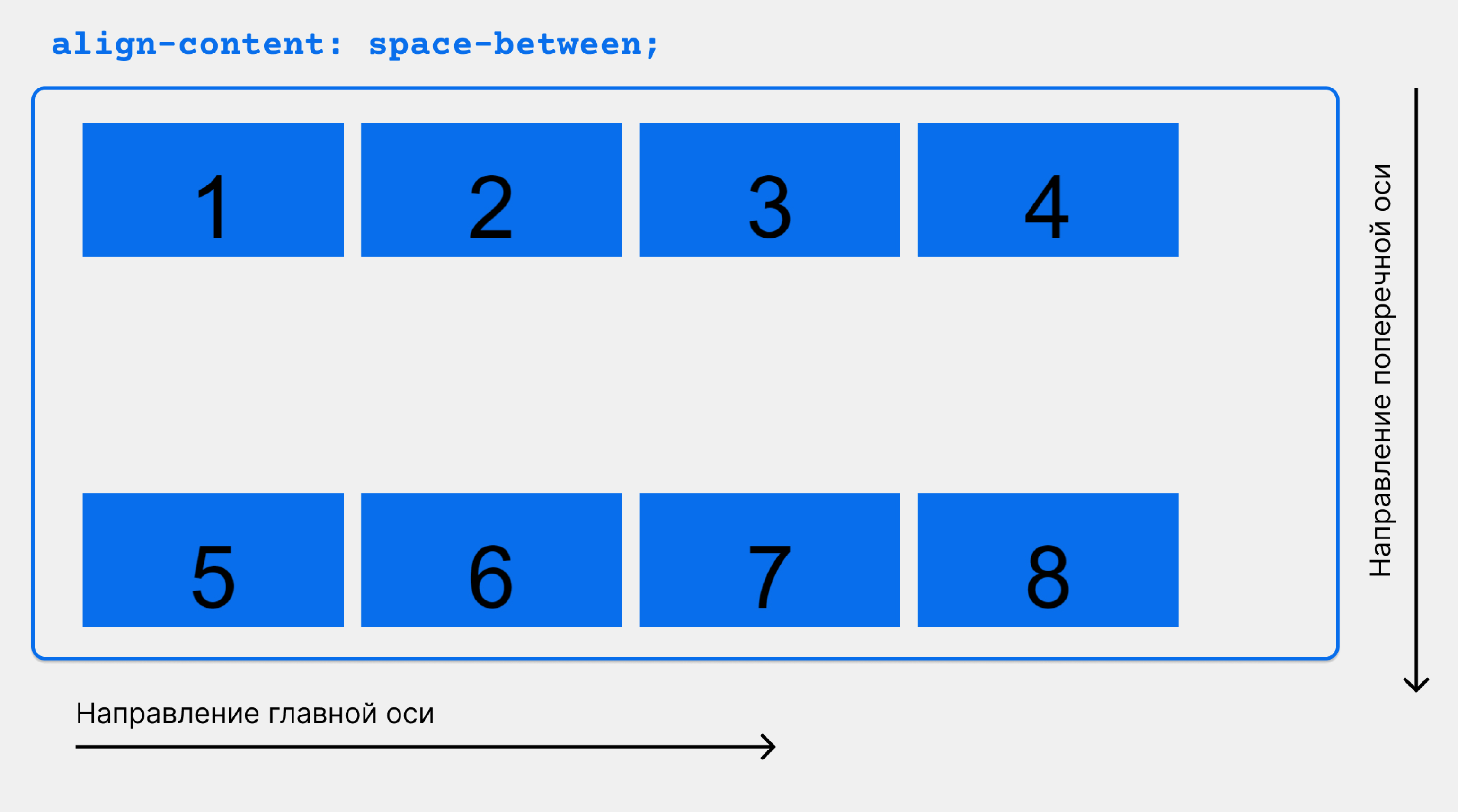
- space-between: элементы равномерно распределены; первая строка находится в начале контейнера, а последняя — в конце
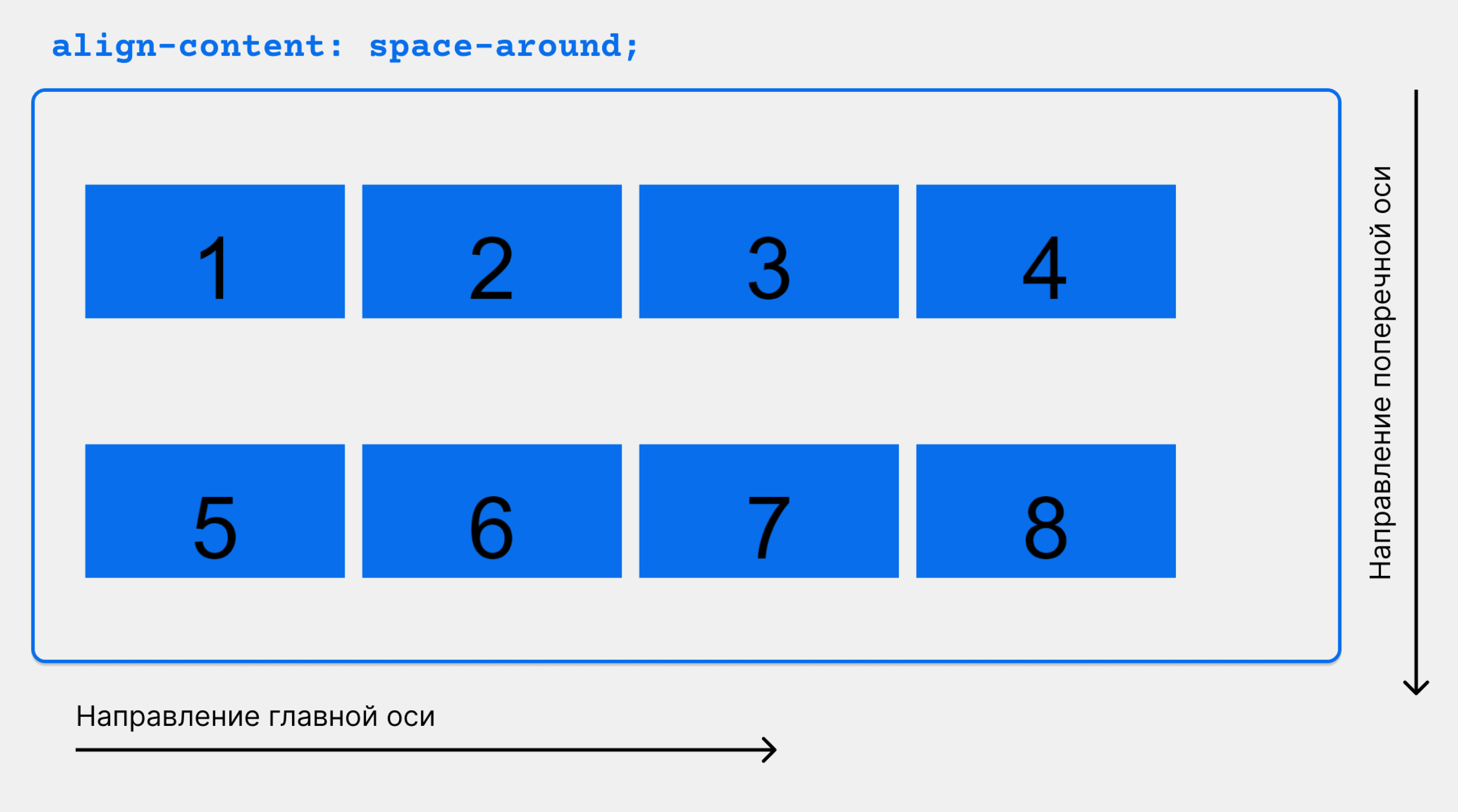
- space-around: элементы равномерно распределены с равным пространством вокруг каждой строки
- space-evenly: элементы распределены равномерно, вокруг них одинаковое пространство
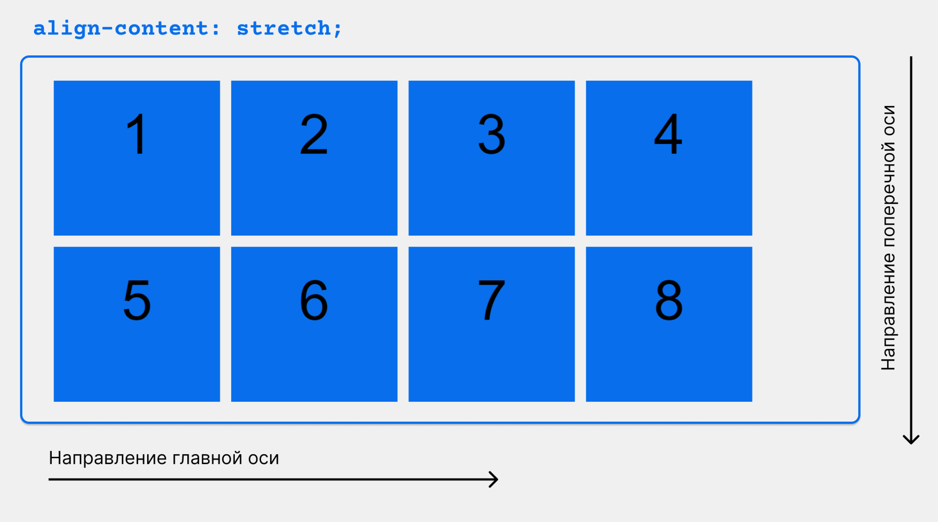
- stretch (по умолчанию): линии растягиваются, чтобы занять оставшееся пространство
safe и unsafe ключевые слова модификаторов могут быть использованы в сочетании со всеми из этих ключевых слов (хотя это поддерживается не всеми браузерами), это помогает предотвратить выравнивание элементов таким образом, что содержание становится недоступным.
Свойства для первых дочерних элементов(flex элементы)

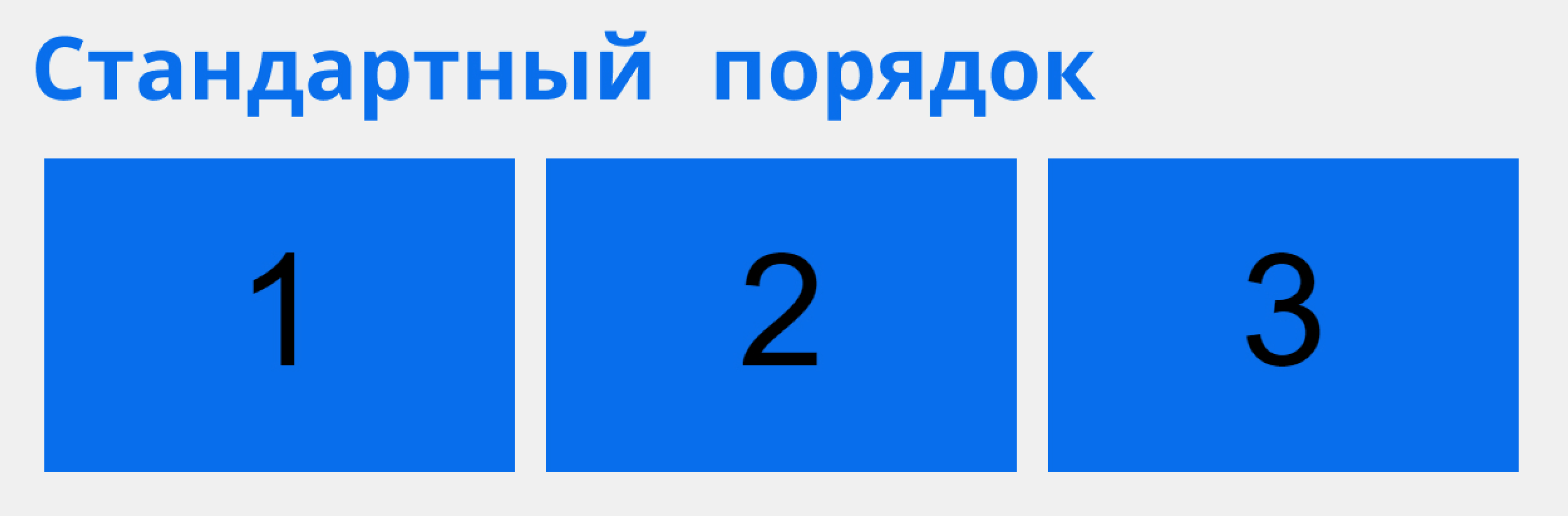
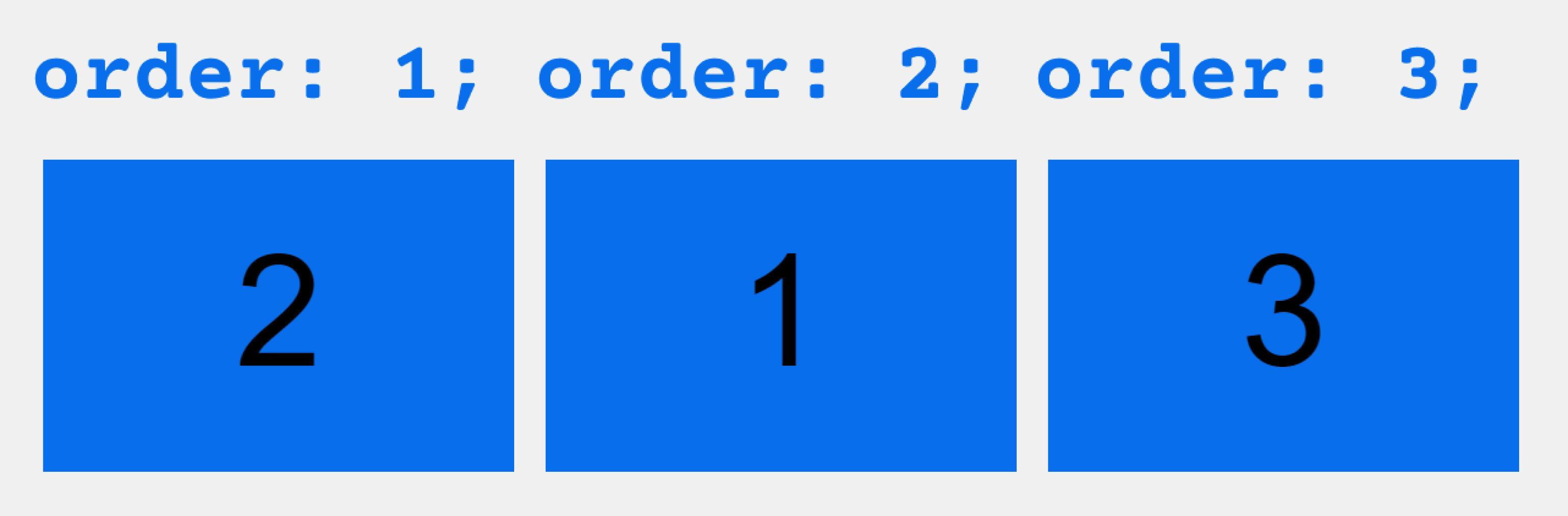
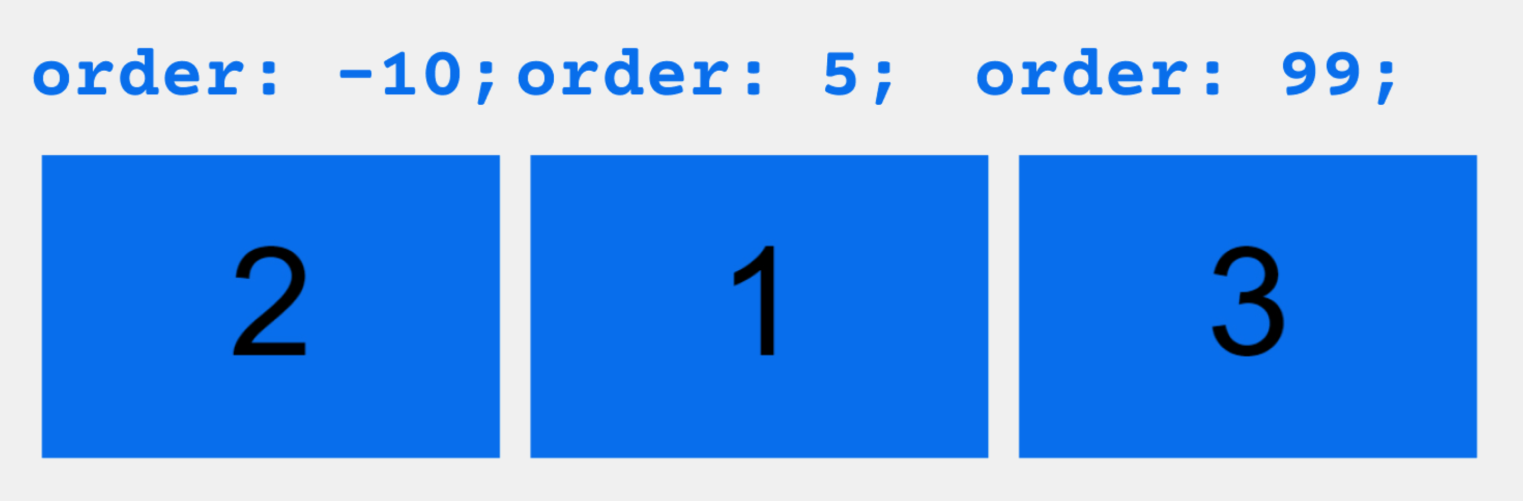
order
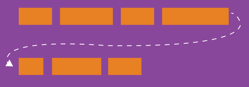
По умолчанию flex элементы располагаются в исходном порядке. Однако свойство order управляет порядком их появления в контейнере flex.
.item {
order: <integer>; /* default is 0 */
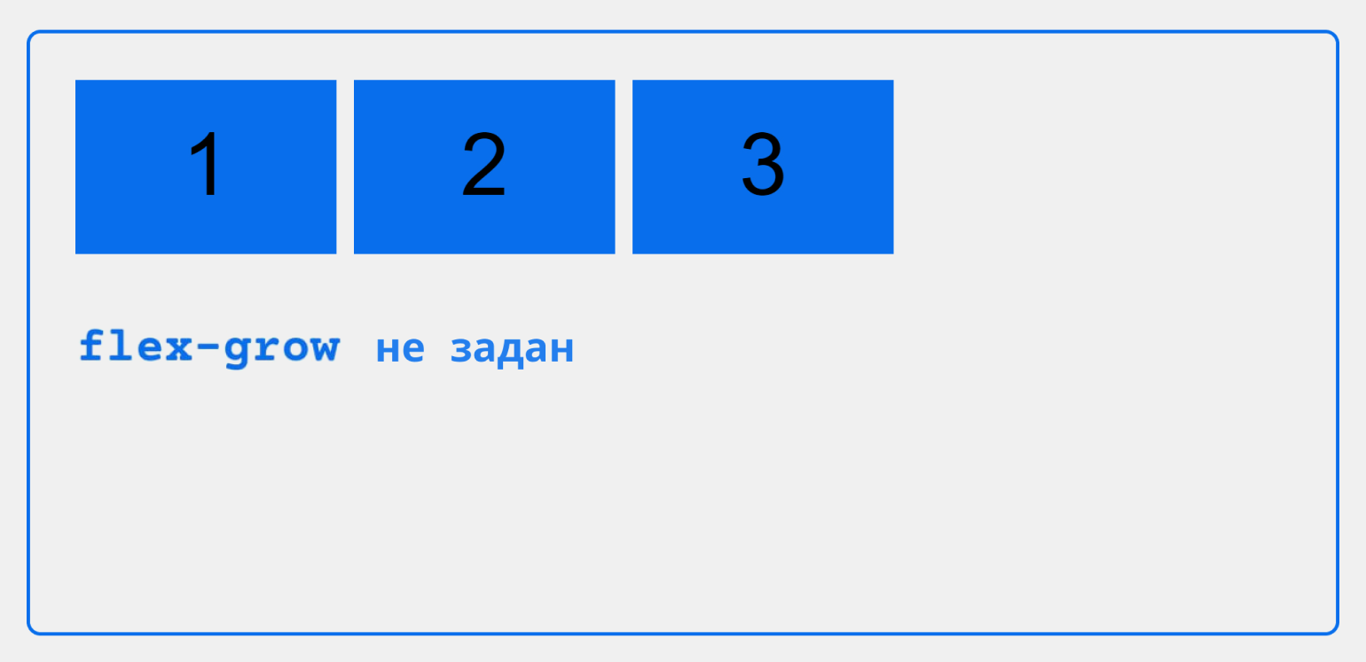
}flex-grow
Это свойство определяет способность flex элемента растягиваться в случае необходимости. Оно принимает значение от нуля, которое служит пропорцией. Это свойство, какое количество доступного пространства внутри гибкого контейнера должен занимать элемент.
Если для всех элементов flex-grow установлено значение 1, оставшееся пространство в контейнере будет равномерно распределено между всеми дочерними элементами. Если один из дочерних элементов имеет значение 2, этот элемент займет в два раза больше места, чем остальные (или попытается, по крайней мере).
.item {
  flex-grow: <number>; /* default 0 */
}
Отрицательные числа не поддерживаются.
flex-shrink
Это свойство определяет способность гибкого элемента сжиматься при необходимости.
.item {
  flex-shrink: <number>; /* default 1 */
}
Отрицательные числа не поддерживаются.
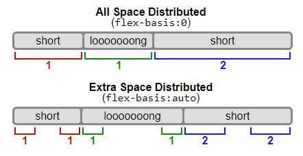
flex-basis
Это свойство определяет размер элемента по умолчанию перед распределением оставшегося пространства. Это может быть длина (например, 20%, 5rem и т.д.) Или ключевое слово. Ключевое слово auto означает «смотри на мое width или height свойство». Ключевое слово content означает «размер на основе содержимого элемента» — это ключевое слово все еще не очень хорошо поддерживается, так что трудно проверить что для него используется max-content, min-content или fit-content.
.item {
  flex-basis: <length> | auto; /* default auto */
}
Если установлено значение 0, дополнительное пространство вокруг содержимого не учитывается. Если установлено значение auto, дополнительное пространство распределяется в зависимости от его flex-grow значения.
Смотрите этот рисунок.
flex
Это сокращение для использования flex-grow, flex-shrink и flex-basis вместе. Второй и третий параметры (flex-shrink и flex-basis) являются необязательными. По умолчанию это 0 1 auto.
.item {
  flex: none | [ <'flex-grow'> <'flex-shrink'>? || <'flex-basis'> ]
}
Рекомендуется использовать это сокращенное свойство, а не устанавливать отдельные свойства. Это сокращение разумно устанавливает другие значения.
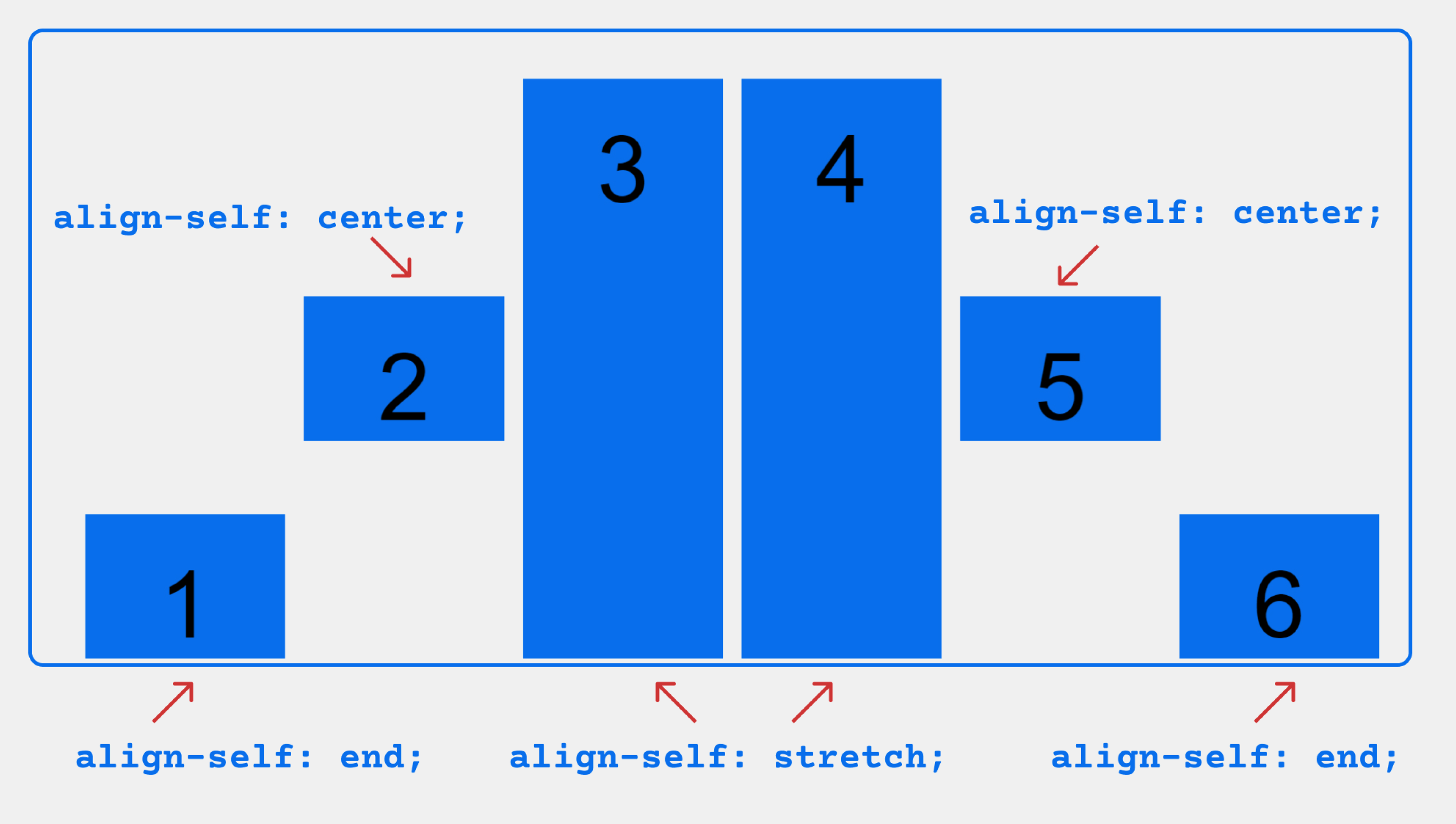
align-self
Это свойство позволяет переопределить выравнивание по умолчанию (или указанное с помощью align-items) для отдельных элементов flex.
Пожалуйста, смотрите align-items свойство, чтобы понять доступные значения.
.item {
  align-self: auto | flex-start | flex-end | center | baseline | stretch;
}
Обратите внимание что свойства float, clear и vertical-align не влияют на flex элементы.
Примеры
Давайте начнем с очень простого примера, решающего почти ежедневную проблему: идеальное центрирование. Самое простое решение для этой задачи — это использовать flexbox.
.parent {
  display: flex;
  height: 300px; /* Или что угодно */
}

.child {
  width: 100px;  /* Или что угодно */
  height: 100px; /* Или что угодно */
  margin: auto;  /* Магия! */
}
Так происходит благодаря тому, что свойство вертикального выравнивания margin установленное в auto во flex контейнере, поглощает дополнительное пространство. Таким образом, установка margin в auto сделает объект идеально отцентрированным по обеим осям.
Теперь давайте используем еще несколько свойств. Рассмотрим список из 6 элементов, все с фиксированными размерами, но могут быть и авторазмеры. Мы хотим, чтобы они были равномерно распределены по горизонтальной оси, чтобы при изменении размера браузера все масштабировалось хорошо и без медиа запросов.
.flex-container {
  /* Сначала мы создаем flex контекст */
  display: flex;

  /* Затем мы определяем flex-direction и разрешаем элементам переходить на новые строки
   * Запомните, что это то же самое что и:
   * flex-direction: row;
   * flex-wrap: wrap;
   */
  flex-flow: row wrap;

  /* Затем мы определяем, как распределяется оставшееся пространство */
  justify-content: space-around;
}
Готово. Все остальное — это просто стайлинг.
Если изменить разрешение экрана ли масштаб, то будет так:
Давайте попробуем что-нибудь еще. Представьте, что у нас есть выровненные по правому краю элементы навигации в верхней части нашего веб-сайта, но мы хотим, чтобы они были выровнены по ширине на экранах среднего размера и располагались в один столбец на небольших устройствах. Это достаточно просто.
/* Большие экраны */
.navigation {
  display: flex;
  flex-flow: row wrap;
  /* Это выровняет элементы по конечной части линии на главной оси */
  justify-content: flex-end;
}

/* Средние экраны */
@media all and (max-width: 800px) {
  .navigation {
    /* На экранах среднего размера мы центрируем элементы, равномерно распределяя пустое пространство вокруг элементов */
    justify-content: space-around;
  }
}

/* Маленькие экраны */
@media all and (max-width: 500px) {
  .navigation {
    /* На маленьких экранах мы больше не используем направление строки, а используем столбец */
    flex-direction: column;
  }
}
Большие экраны
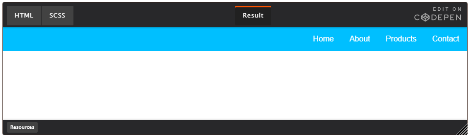
Средние экраны
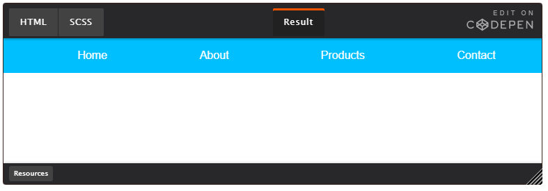
Маленькие экраны

Давайте попробуем что-то еще лучше, играя с гибкостью flex элементов! Как насчет 3-колоночного макета в полную высоту страницы с хедором и футером. И не зависит от исходного порядка элементов.
.wrapper {
  display: flex;
  flex-flow: row wrap;
}

/* Мы говорим, что все элементы имеют ширину 100%, через flex-base */
.wrapper > * {
  flex: 1 100%;
}

/* Мы используем исходный порядок для первого мобильно варианта
 * 1. header
 * 2. article
 * 3. aside 1
 * 4. aside 2
 * 5. footer
 */

/* Средние экраны */
@media all and (min-width: 600px) {
  /* Мы говорим обеим боковым панелям встать в одну строку */
  .aside { flex: 1 auto; }
}

/* Большие экраны */
@media all and (min-width: 800px) {
  /* Мы инвертируем порядок первой боковой панели и основной и говорим главному элементу, чтобы он занимал вдвое большую ширину, чем две другие боковые панели
   */
  .main { flex: 2 0px; }
  .aside-1 { order: 1; }
  .main    { order: 2; }
  .aside-2 { order: 3; }
  .footer  { order: 4; }
}
Большие экраны

Средние экраны

Маленькие экраны

Префикс для Flexbox
Flexbox требует префикса для лучшей поддержки в разных браузерах. Он не только включает в себя предварительные настройки с префиксом вендора, в нем есть совершенно разные имена свойств и значений. Это связано с тем, что спецификации Flexbox со временем менялись, существуют «старые», «tweener» и «новые» версии.
Возможно, лучший способ справиться с этим — написать новый (и последний) синтаксис и запустить свой CSS через Autoprefixer, который очень хорошо справляется с fallback.
Кроме того, вот Sass @mixin, чтобы помочь с некоторыми префиксами, который также дает вам представление о том, что нужно сделать:
@mixin flexbox() {
  display: -webkit-box;
  display: -moz-box;
  display: -ms-flexbox;
  display: -webkit-flex;
  display: flex;
}

@mixin flex($values) {
  -webkit-box-flex: $values;
  -moz-box-flex:  $values;
  -webkit-flex:  $values;
  -ms-flex:  $values;
  flex:  $values;
}

@mixin order($val) {
  -webkit-box-ordinal-group: $val;
  -moz-box-ordinal-group: $val;
  -ms-flex-order: $val;
  -webkit-order: $val;
  order: $val;
}

.wrapper {
  @include flexbox();
}

.item {
  @include flex(1 200px);
  @include order(2);
}
Ошибки
Flexbox, конечно, не без ошибок. Лучшая коллекция из них, которую я видел, — это Flexbugs Филипа Уолтона и Грега Витворта. Это репозиторий с открытым исходным кодом для отслеживания всех из них, поэтому я думаю, что лучше всего просто сослаться на него.
Поддержка в браузерах
Разбита по «версии» flexbox:
- (new) означает недавний синтаксис из спецификации (например display: flex;)
- (tweener) означает странный неофициальный синтаксис с 2011 года (например display: flexbox;)
- (old) означает старый синтаксис с 2009 года (например display: box;)
Blackberry Browser 10+ поддерживает новый синтаксис.
Для получения дополнительной информации о том, как смешивать синтаксисы, чтобы получить лучшую поддержку браузера, пожалуйста, обратитесь к этой статье (CSS-хитрости) или этой статье (DevOpera).
Table of contents
- Background
- Basics and terminology
- Flexbox properties
- Prefixing Flexbox
- Examples
- Flexbox tricks
- Browser support
- Bugs
- Related properties
- More information
- More sources
Get the poster!
Reference this guide a lot? Here’s a high-res image you can print!

Background
The Flexbox Layout (Flexible Box) module (a W3C Candidate Recommendation as of October 2017) aims at providing a more efficient way to lay out, align and distribute space among items in a container, even when their size is unknown and/or dynamic (thus the word “flex”).
The main idea behind the flex layout is to give the container the ability to alter its items’ width/height (and order) to best fill the available space (mostly to accommodate to all kind of display devices and screen sizes). A flex container expands items to fill available free space or shrinks them to prevent overflow.
Most importantly, the flexbox layout is direction-agnostic as opposed to the regular layouts (block which is vertically-based and inline which is horizontally-based). While those work well for pages, they lack flexibility (no pun intended) to support large or complex applications (especially when it comes to orientation changing, resizing, stretching, shrinking, etc.).
Note: Flexbox layout is most appropriate to the components of an application, and small-scale layouts, while the Grid layout is intended for larger scale layouts.
Basics and terminology
Since flexbox is a whole module and not a single property, it involves a lot of things including its whole set of properties. Some of them are meant to be set on the container (parent element, known as “flex container”) whereas the others are meant to be set on the children (said “flex items”).
If “regular” layout is based on both block and inline flow directions, the flex layout is based on “flex-flow directions”. Please have a look at this figure from the specification, explaining the main idea behind the flex layout.

Items will be laid out following either the main axis (from main-start to main-end) or the cross axis (from cross-start to cross-end).
- main axis – The main axis of a flex container is the primary axis along which flex items are laid out. Beware, it is not necessarily horizontal; it depends on the
flex-directionproperty (see below). - main-start | main-end – The flex items are placed within the container starting from main-start and going to main-end.
- main size – A flex item’s width or height, whichever is in the main dimension, is the item’s main size. The flex item’s main size property is either the ‘width’ or ‘height’ property, whichever is in the main dimension.
- cross axis – The axis perpendicular to the main axis is called the cross axis. Its direction depends on the main axis direction.
- cross-start | cross-end – Flex lines are filled with items and placed into the container starting on the cross-start side of the flex container and going toward the cross-end side.
- cross size – The width or height of a flex item, whichever is in the cross dimension, is the item’s cross size. The cross size property is whichever of ‘width’ or ‘height’ that is in the cross dimension.
Flexbox properties

Properties for the Parent
(flex container)
display
This defines a flex container; inline or block depending on the given value. It enables a flex context for all its direct children.
.container {
  display: flex; /* or inline-flex */
}
Note that CSS columns have no effect on a flex container.
flex-direction

This establishes the main-axis, thus defining the direction flex items are placed in the flex container. Flexbox is (aside from optional wrapping) a single-direction layout concept. Think of flex items as primarily laying out either in horizontal rows or vertical columns.
.container {
  flex-direction: row | row-reverse | column | column-reverse;
}row(default): left to right inltr; right to left inrtlrow-reverse: right to left inltr; left to right inrtlcolumn: same asrowbut top to bottomcolumn-reverse: same asrow-reversebut bottom to top
flex-wrap

By default, flex items will all try to fit onto one line. You can change that and allow the items to wrap as needed with this property.
.container {
  flex-wrap: nowrap | wrap | wrap-reverse;
}nowrap(default): all flex items will be on one linewrap: flex items will wrap onto multiple lines, from top to bottom.wrap-reverse: flex items will wrap onto multiple lines from bottom to top.
There are some visual demos of flex-wrap here.
flex-flow
This is a shorthand for the flex-direction and flex-wrap properties, which together define the flex container’s main and cross axes. The default value is row nowrap.
.container {
  flex-flow: column wrap;
}
justify-content

This defines the alignment along the main axis. It helps distribute extra free space leftover when either all the flex items on a line are inflexible, or are flexible but have reached their maximum size. It also exerts some control over the alignment of items when they overflow the line.
.container {
  justify-content: flex-start | flex-end | center | space-between | space-around | space-evenly | start | end | left | right ... + safe | unsafe;
}flex-start(default): items are packed toward the start of the flex-direction.flex-end: items are packed toward the end of the flex-direction.start: items are packed toward the start of thewriting-modedirection.end: items are packed toward the end of thewriting-modedirection.left: items are packed toward left edge of the container, unless that doesn’t make sense with theflex-direction, then it behaves likestart.right: items are packed toward right edge of the container, unless that doesn’t make sense with theflex-direction, then it behaves likeend.center: items are centered along the linespace-between: items are evenly distributed in the line; first item is on the start line, last item on the end linespace-around: items are evenly distributed in the line with equal space around them. Note that visually the spaces aren’t equal, since all the items have equal space on both sides. The first item will have one unit of space against the container edge, but two units of space between the next item because that next item has its own spacing that applies.space-evenly: items are distributed so that the spacing between any two items (and the space to the edges) is equal.
Note that that browser support for these values is nuanced. For example, space-between never got support from some versions of Edge, and start/end/left/right aren’t in Chrome yet. MDN has detailed charts. The safest values are flex-start, flex-end, and center.
There are also two additional keywords you can pair with these values: safe and unsafe. Using safe ensures that however you do this type of positioning, you can’t push an element such that it renders off-screen (e.g. off the top) in such a way the content can’t be scrolled too (called “data loss”).
align-items

This defines the default behavior for how flex items are laid out along the cross axis on the current line. Think of it as the justify-content version for the cross-axis (perpendicular to the main-axis).
.container {
  align-items: stretch | flex-start | flex-end | center | baseline | first baseline | last baseline | start | end | self-start | self-end + ... safe | unsafe;
}stretch(default): stretch to fill the container (still respect min-width/max-width)flex-start/start/self-start: items are placed at the start of the cross axis. The difference between these is subtle, and is about respecting theflex-directionrules or thewriting-moderules.flex-end/end/self-end: items are placed at the end of the cross axis. The difference again is subtle and is about respectingflex-directionrules vs.writing-moderules.center: items are centered in the cross-axisbaseline: items are aligned such as their baselines align
The safe and unsafe modifier keywords can be used in conjunction with all the rest of these keywords (although note browser support), and deal with helping you prevent aligning elements such that the content becomes inaccessible.
align-content

This aligns a flex container’s lines within when there is extra space in the cross-axis, similar to how justify-content aligns individual items within the main-axis.
Note: This property only takes effect on multi-line flexible containers, where flex-wrap is set to either wrap or wrap-reverse). A single-line flexible container (i.e. where flex-wrap is set to its default value, no-wrap) will not reflect align-content.
.container {
  align-content: flex-start | flex-end | center | space-between | space-around | space-evenly | stretch | start | end | baseline | first baseline | last baseline + ... safe | unsafe;
}normal(default): items are packed in their default position as if no value was set.flex-start/start: items packed to the start of the container. The (more supported)flex-starthonors theflex-directionwhilestarthonors thewriting-modedirection.flex-end/end: items packed to the end of the container. The (more support)flex-endhonors theflex-directionwhile end honors thewriting-modedirection.center: items centered in the containerspace-between: items evenly distributed; the first line is at the start of the container while the last one is at the endspace-around: items evenly distributed with equal space around each linespace-evenly: items are evenly distributed with equal space around themstretch: lines stretch to take up the remaining space
The safe and unsafe modifier keywords can be used in conjunction with all the rest of these keywords (although note browser support), and deal with helping you prevent aligning elements such that the content becomes inaccessible.
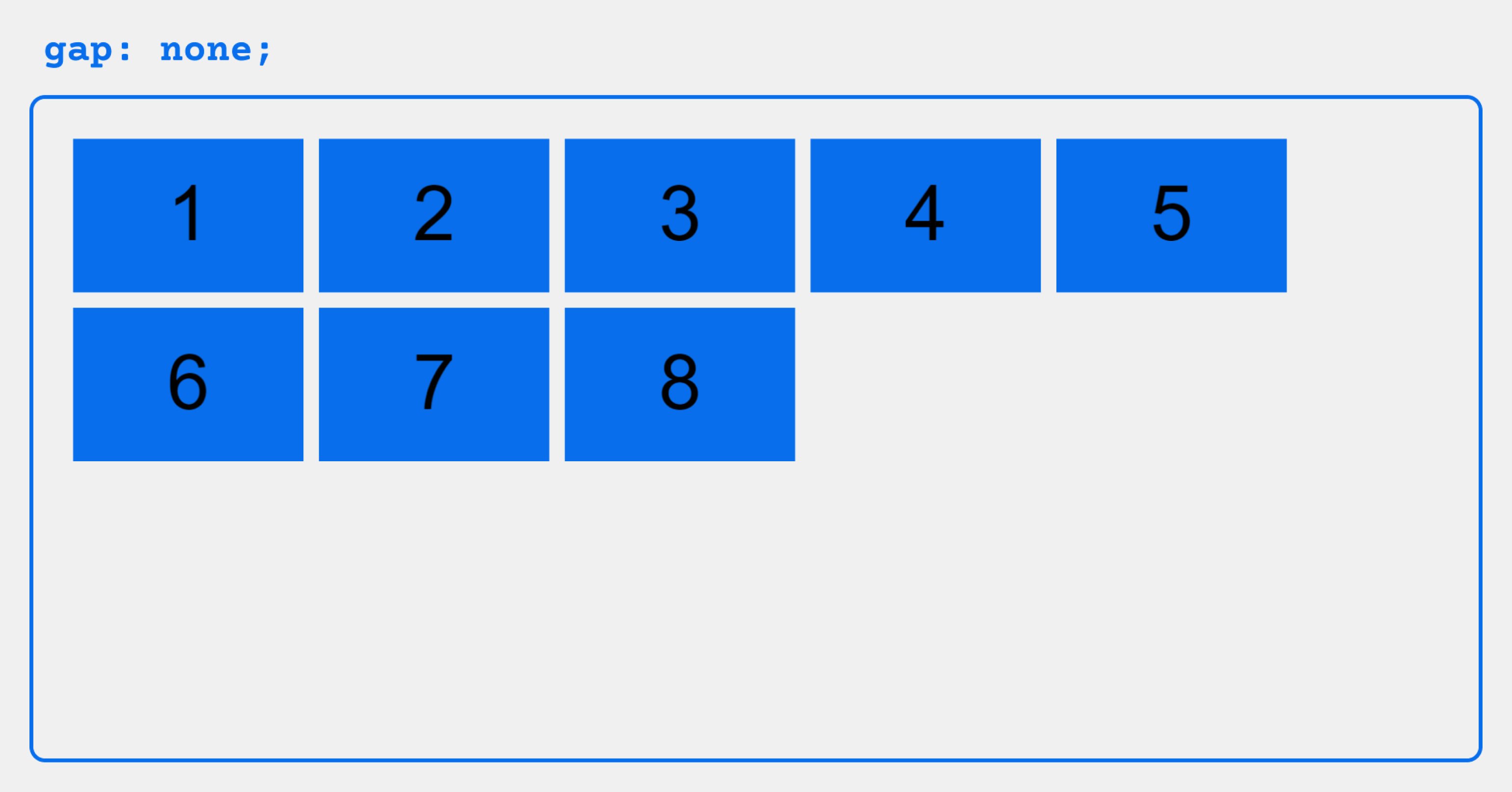
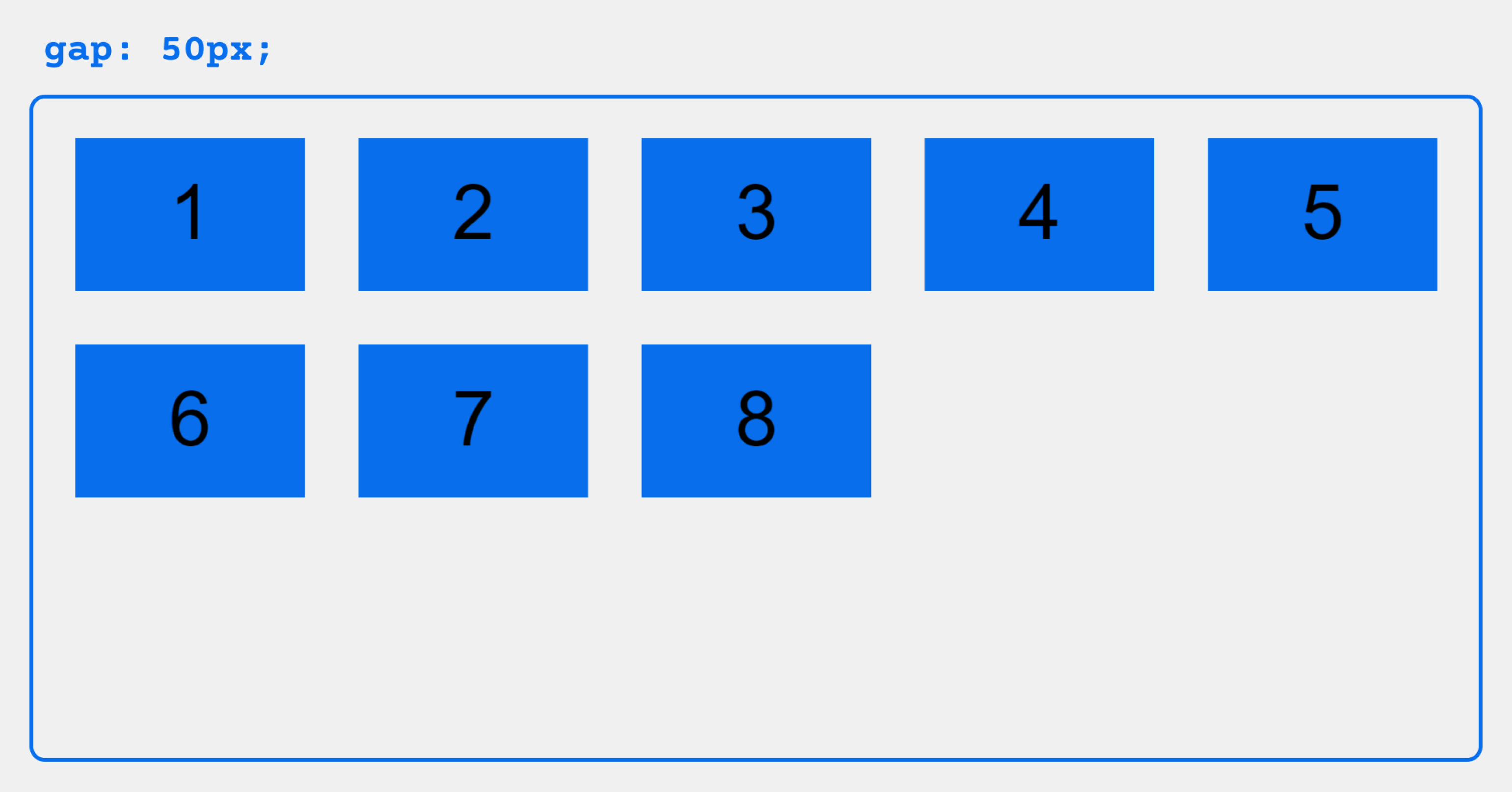
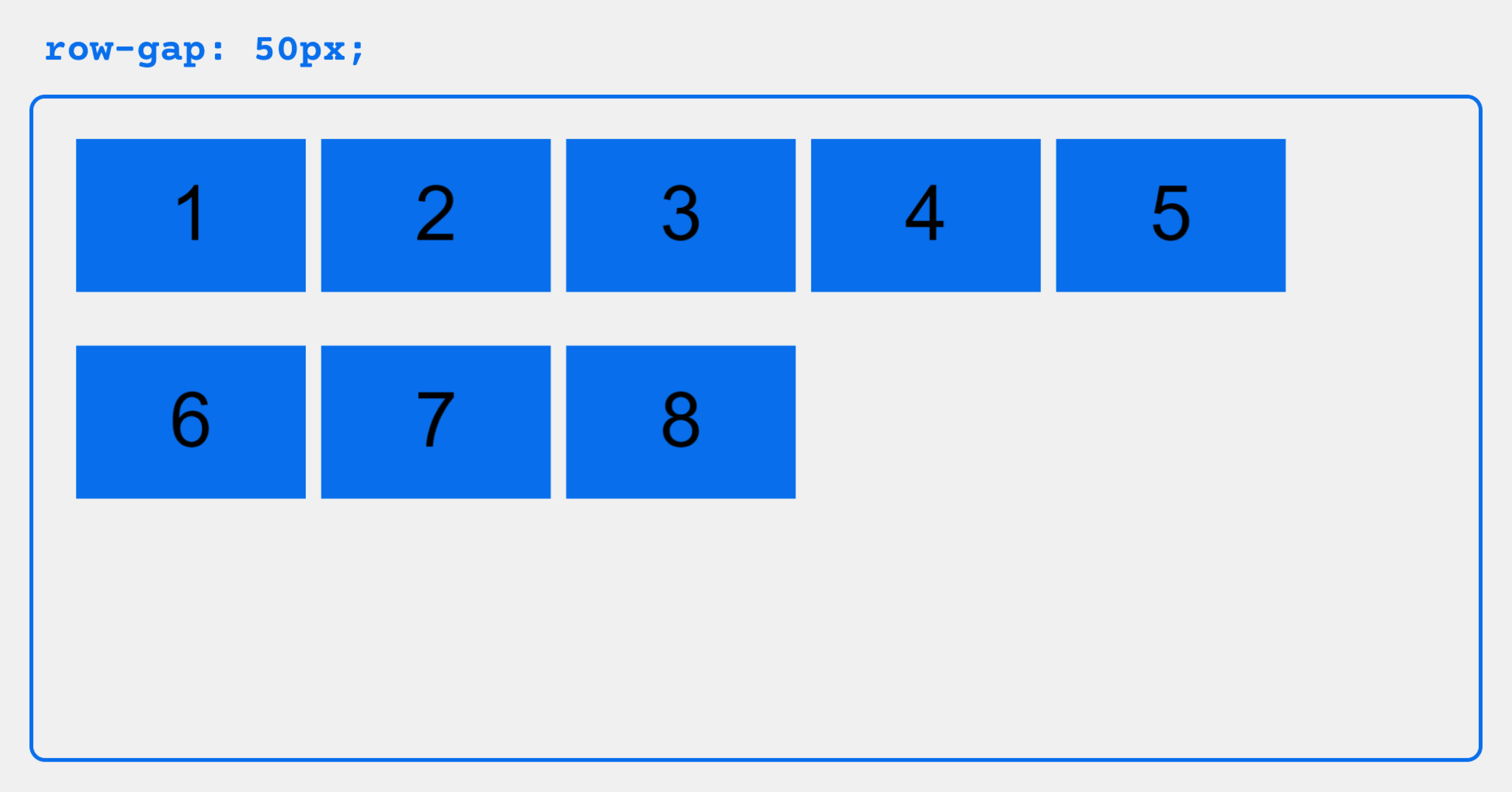
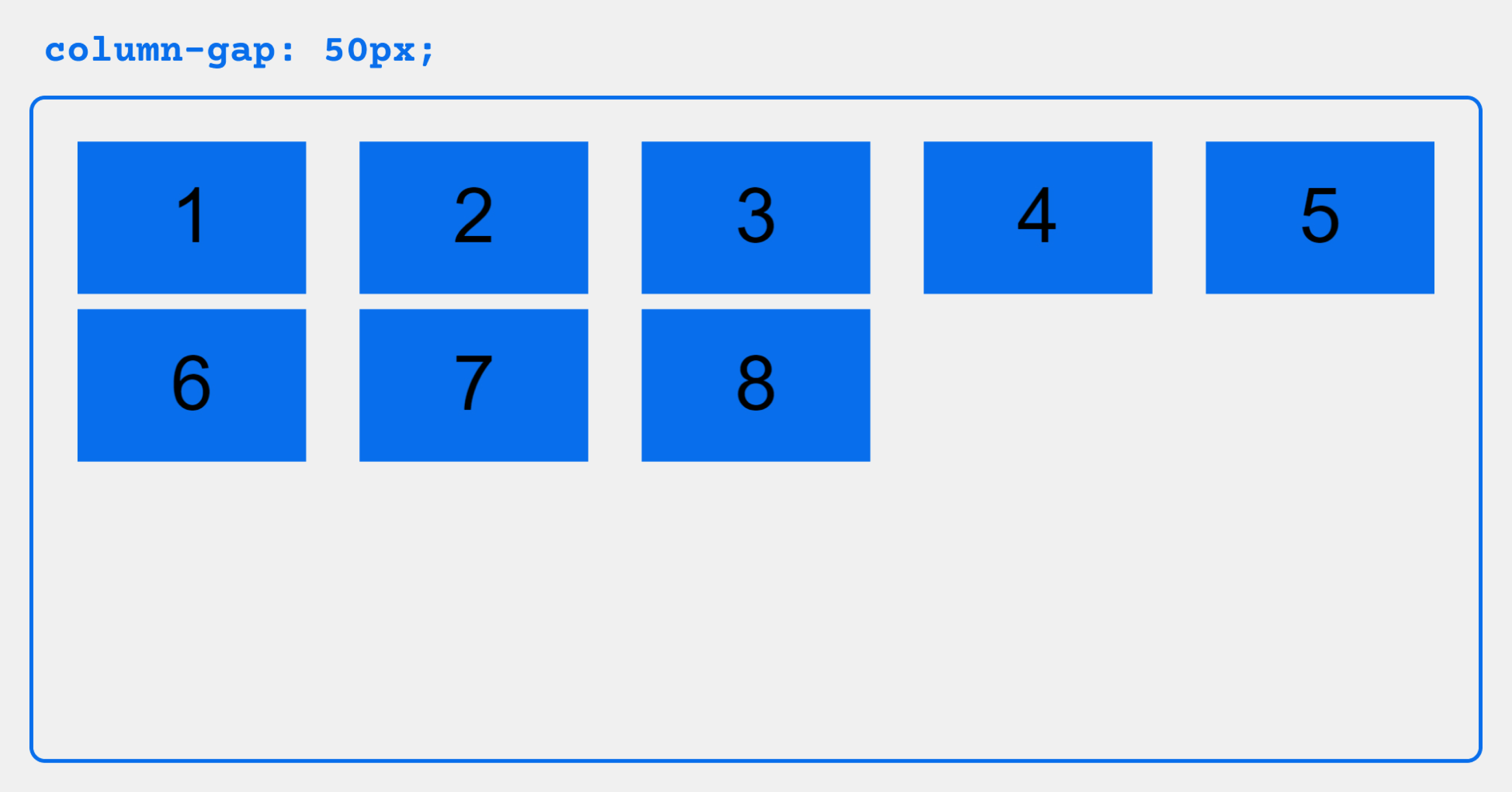
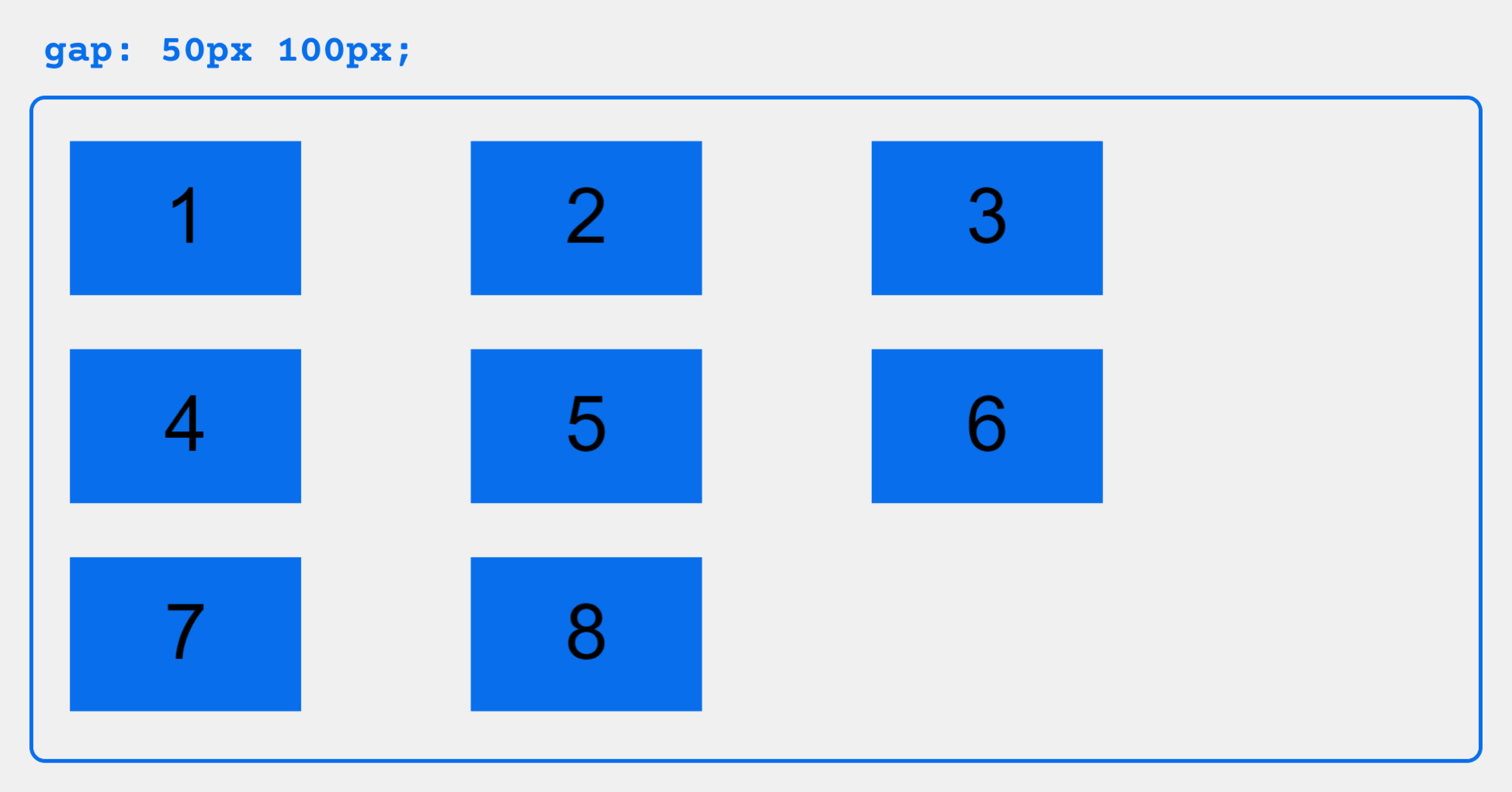
gap, row-gap, column-gap

The gap property explicitly controls the space between flex items. It applies that spacing only between items not on the outer edges.
.container {
  display: flex;
  ...
  gap: 10px;
  gap: 10px 20px; /* row-gap column gap */
  row-gap: 10px;
  column-gap: 20px;
}
The behavior could be thought of as a minimum gutter, as if the gutter is bigger somehow (because of something like justify-content: space-between;) then the gap will only take effect if that space would end up smaller.
It is not exclusively for flexbox, gap works in grid and multi-column layout as well.

Properties for the Children
(flex items)
order

By default, flex items are laid out in the source order. However, the order property controls the order in which they appear in the flex container.
.item {
  order: 5; /* default is 0 */
}
Items with the same order revert to source order.
flex-grow

This defines the ability for a flex item to grow if necessary. It accepts a unitless value that serves as a proportion. It dictates what amount of the available space inside the flex container the item should take up.
If all items have flex-grow set to 1, the remaining space in the container will be distributed equally to all children. If one of the children has a value of 2, that child would take up twice as much of the space either one of the others (or it will try, at least).
.item {
  flex-grow: 4; /* default 0 */
}
Negative numbers are invalid.
flex-shrink
This defines the ability for a flex item to shrink if necessary.
.item {
  flex-shrink: 3; /* default 1 */
}
Negative numbers are invalid.
flex-basis
This defines the default size of an element before the remaining space is distributed. It can be a length (e.g. 20%, 5rem, etc.) or a keyword. The auto keyword means “look at my width or height property” (which was temporarily done by the main-size keyword until deprecated). The content keyword means “size it based on the item’s content” – this keyword isn’t well supported yet, so it’s hard to test and harder to know what its brethren max-content, min-content, and fit-content do.
.item {
  flex-basis:  | auto; /* default auto */
}
If set to 0, the extra space around content isn’t factored in. If set to auto, the extra space is distributed based on its flex-grow value. See this graphic.
flex
This is the shorthand for flex-grow, flex-shrink and flex-basis combined. The second and third parameters (flex-shrink and flex-basis) are optional. The default is 0 1 auto, but if you set it with a single number value, like flex: 5;, that changes the flex-basis to 0%, so it’s like setting flex-grow: 5; flex-shrink: 1; flex-basis: 0%;.
.item {
  flex: none | [ <'flex-grow'> <'flex-shrink'>? || <'flex-basis'> ]
}
It is recommended that you use this shorthand property rather than set the individual properties. The shorthand sets the other values intelligently.
align-self

This allows the default alignment (or the one specified by align-items) to be overridden for individual flex items.
Please see the align-items explanation to understand the available values.
.item {
  align-self: auto | flex-start | flex-end | center | baseline | stretch;
}
Note that float, clear and vertical-align have no effect on a flex item.
Prefixing Flexbox
Flexbox requires some vendor prefixing to support the most browsers possible. It doesn’t just include prepending properties with the vendor prefix, but there are actually entirely different property and value names. This is because the Flexbox spec has changed over time, creating an “old”, “tweener”, and “new” versions.
Perhaps the best way to handle this is to write in the new (and final) syntax and run your CSS through Autoprefixer, which handles the fallbacks very well.
Alternatively, here’s a Sass @mixin to help with some of the prefixing, which also gives you an idea of what kind of things need to be done:
@mixin flexbox() {
  display: -webkit-box;
  display: -moz-box;
  display: -ms-flexbox;
  display: -webkit-flex;
  display: flex;
}

@mixin flex($values) {
  -webkit-box-flex: $values;
  -moz-box-flex:  $values;
  -webkit-flex:  $values;
  -ms-flex:  $values;
  flex:  $values;
}

@mixin order($val) {
  -webkit-box-ordinal-group: $val;
  -moz-box-ordinal-group: $val;
  -ms-flex-order: $val;
  -webkit-order: $val;
  order: $val;
}

.wrapper {
  @include flexbox();
}

.item {
  @include flex(1 200px);
  @include order(2);
}
Examples
Let’s start with a very very simple example, solving an almost daily problem: perfect centering. It couldn’t be any simpler if you use flexbox.
.parent {
  display: flex;
  height: 300px; /* Or whatever */
}

.child {
  width: 100px;  /* Or whatever */
  height: 100px; /* Or whatever */
  margin: auto;  /* Magic! */
}
This relies on the fact a margin set to auto in a flex container absorb extra space. So setting a margin of auto will make the item perfectly centered in both axes.
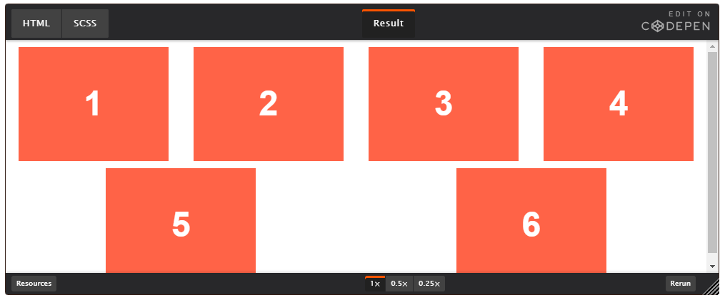
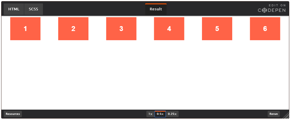
Now let’s use some more properties. Consider a list of 6 items, all with fixed dimensions, but can be auto-sized. We want them to be evenly distributed on the horizontal axis so that when we resize the browser, everything scales nicely, and without media queries.
.flex-container {
  /* We first create a flex layout context */
  display: flex;

  /* Then we define the flow direction
     and if we allow the items to wrap
   * Remember this is the same as:
   * flex-direction: row;
   * flex-wrap: wrap;
   */
  flex-flow: row wrap;

  /* Then we define how is distributed the remaining space */
  justify-content: space-around;
}
Done. Everything else is just some styling concern. Below is a pen featuring this example. Be sure to go to CodePen and try resizing your windows to see what happens.
Let’s try something else. Imagine we have a right-aligned navigation element on the very top of our website, but we want it to be centered on medium-sized screens and single-columned on small devices. Easy enough.
/* Large */
.navigation {
  display: flex;
  flex-flow: row wrap;
  /* This aligns items to the end line on main-axis */
  justify-content: flex-end;
}

/* Medium screens */
@media all and (max-width: 800px) {
  .navigation {
    /* When on medium sized screens, we center it by evenly distributing empty space around items */
    justify-content: space-around;
  }
}

/* Small screens */
@media all and (max-width: 500px) {
  .navigation {
    /* On small screens, we are no longer using row direction but column */
    flex-direction: column;
  }
}
Let’s try something even better by playing with flex items flexibility! What about a mobile-first 3-columns layout with full-width header and footer. And independent from source order.
.wrapper {
  display: flex;
  flex-flow: row wrap;
}

/* We tell all items to be 100% width, via flex-basis */
.wrapper > * {
  flex: 1 100%;
}

/* We rely on source order for mobile-first approach
 * in this case:
 * 1. header
 * 2. article
 * 3. aside 1
 * 4. aside 2
 * 5. footer
 */

/* Medium screens */
@media all and (min-width: 600px) {
  /* We tell both sidebars to share a row */
  .aside { flex: 1 auto; }
}

/* Large screens */
@media all and (min-width: 800px) {
  /* We invert order of first sidebar and main
   * And tell the main element to take twice as much width as the other two sidebars
   */
  .main { flex: 3 0px; }
  .aside-1 { order: 1; }
  .main    { order: 2; }
  .aside-2 { order: 3; }
  .footer  { order: 4; }
}
Flexbox tricks!
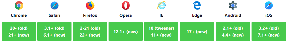
Browser support
Desktop
| Chrome | Firefox | IE | Edge | Safari |
|---|---|---|---|---|
| 21* | 28 | 11 | 12 | 6.1* |
Mobile / Tablet
| Android Chrome | Android Firefox | Android | iOS Safari |
|---|---|---|---|
| 113 | 113 | 4.4 | 7.0-7.1* |
Bugs
Flexbox is certainly not without its bugs. The best collection of them I’ve seen is Philip Walton and Greg Whitworth’s Flexbugs. It’s an open-source place to track all of them, so I think it’s best to just link to that.
Related properties
Almanac
on
Jul 28, 2021
align-content
.element { align-content: space-around; }
Almanac
on
Sep 28, 2022
align-items
.element { align-items: flex-start; }
Almanac
on
Dec 27, 2018
align-self
.box { align-self: flex-end; }
Almanac
on
Aug 30, 2021
column-gap
.example { column-gap: 25px; }
Almanac
on
Oct 15, 2021
display
.element { display: inline-block; }
Almanac
on
Sep 22, 2022
gap
.element { gap: 20px 30px; }
Almanac
on
Mar 2, 2021
justify-items
.element { justify-items: center; }
Almanac
on
Sep 30, 2022
flex
.element { flex: 1 1 100px; }
Almanac
on
Sep 30, 2022
flex-basis
.element { flex-basis: 100px; }
Almanac
on
Aug 4, 2021
flex-direction
.element { flex-direction: column-reverse; }

Almanac
on
Aug 4, 2021
flex-flow
.element { flex-flow: row wrap; }
Almanac
on
Aug 4, 2021
flex-grow
.flex-item { flex-grow: 2; }
Almanac
on
Aug 4, 2021
flex-shrink
.element { flex-shrink: 2; }
Almanac
on
Sep 30, 2022
flex-wrap
.example { flex-wrap: wrap; }
Almanac
on
Sep 22, 2022
justify-content
.element { justify-content: center; }
Almanac
on
Apr 28, 2022
justify-self
.element { justify-self: stretch; }
Almanac
on
Aug 30, 2021
row-gap
.element { row-gap: 2rem; }
More information
- CSS Flexible Box Layout Module Level 1 (W3C)
- A CSS Flexbox Cheatsheet (DigitalOcean)
- Centering Things in CSS With Flexbox (DigitalOcean)
Article
on
Sep 26, 2013
Solved by Flexbox
Article
on
Nov 25, 2013
Flexbox Cheat Sheet
Article
on
Dec 23, 2012
Dive Into Flexbox
Article
on
Oct 23, 2018
Use Cases for Flexbox
Article
on
Feb 14, 2019
Quick! What’s the Difference Between Flexbox and Grid?
Article
on
Feb 23, 2022
Does CSS Grid Replace Flexbox?
Article
on
Jun 25, 2020
Grid for layout, flexbox for components
Article
on
Apr 13, 2016
Should I use Grid or Flexbox?
Article
on
Aug 13, 2016
Don’t Overthink It (Flexbox) Grids
Article
on
Nov 24, 2021
Building Multi-Directional Layouts
Article
on
Jan 6, 2020
How Auto Margins Work in Flexbox
Article
on
Apr 10, 2017
`flex-grow` is weird. Or is it?
Article
on
Oct 18, 2022
Understanding flex-grow, flex-shrink, and flex-basis
Article
on
Feb 18, 2019
IE10-Compatible Grid Auto-Placement with Flexbox
Article
on
Aug 13, 2013
“Old” Flexbox and “New” Flexbox
Article
on
Jun 15, 2013
Using Flexbox: Mixing Old and New for the Best Browser Support
More sources
- CSS Flexible Box Layout Module Level 1 (W3C)
- A CSS Flexbox Cheatsheet (DigitalOcean)
- Centering Things in CSS With Flexbox (DigitalOcean)
- CSS Layout: Flexbox (MDN)
- Use Cases for Flexbox (Smashing Magazine)
#статьи
- 22 мар 2023
-

0
Всё об одном из самых востребованных инструментов современной вёрстки.
Иллюстрация: Оля Ежак для Skillbox Media

Онлайн-журнал для тех, кто влюблён в код и информационные технологии. Пишем для айтишников и об айтишниках.
Flexbox — это один из основных инструментов для создания адаптивных веб-страниц (наравне с CSS Grid), поэтому вот уже более 10 лет он остаётся мастхэв-технологией для верстальщиков и фронтенд-разработчиков.
В этой статье мы расскажем о концепциях Flexbox, свойствах flex-контейнеров и flex-элементов и покажем их действие на простых примерах. А также поделимся лайфхаками для работы с Flexbox в Google Chrome и ссылками на бесплатные тренажёры.
- Что такое Flexbox
- Как превратить элемент во flex-контейнер
- Свойства Flexbox:
- flex-direction
- flex-wrap
- flex-flow
- justify-content
- align-items
- align-content
- gap
- Свойства flex-элементов:
- order
- flex-grow
- flex-shrink
- flex-basis
- align-self
- Как работать с Flexbox в Google Chrome
- Где поупражняться с Flexbox
Flexbox (от англ. flex — гибкий) — это модуль CSS, который позволяет удобно управлять расположением, порядком, размерами и отступами между элементами веб-страницы. Сайты, свёрстанные «флексами», получаются адаптивными, то есть выглядят хорошо на разных устройствах: ПК, ноутбуках, планшетах и смартфонах.
До появления Flexbox разработчики верстали веб-страницы с помощью таблиц, CSS-свойств position, float и прочих инструментов, которые на самом деле для этого не предназначены. Например, float определяет, с какой стороны текст, а не группа блоков, будет обтекать элемент. Но так как до начала 2010-х других средств не было, разработчикам приходилось прибегать к подобным «костылям».
К счастью, в 2009 году инициативные разработчики решили навсегда избавиться от вёрстки таблицами и позиционирования и создали Flexbox. Сегодня он, как и CSS Grid, является частью стандарта CSS3 и его не нужно подключать отдельно.
Перед тем как приступить к вёрстке флексами, стоит познакомиться с составляющими Flexbox и их назначением. Это позволит осмысленно и эффективно использовать возможности инструмента.
Во Flexbox есть два вида свойств: одни применяются к flex-контейнеру, другие — к элементам, которые в нём расположены.
Flex-контейнер — это «коробка», в которой хранятся flex-элементы (flex item). Чтобы превратить элемент во flex-контейнер, нужно установить ему свойство display: flex или display: inline-flex.
Разница между flex и inline-flex в том, что в первом случае контейнер будет занимать всю ширину экрана (как блочный элемент), а во втором — лишь пространство, занимаемое его содержимым.
Flex-элементы (flex items) — это дочерние элементы flex-контейнера. Мы можем управлять их расположением, размерами и расстоянием между ними.
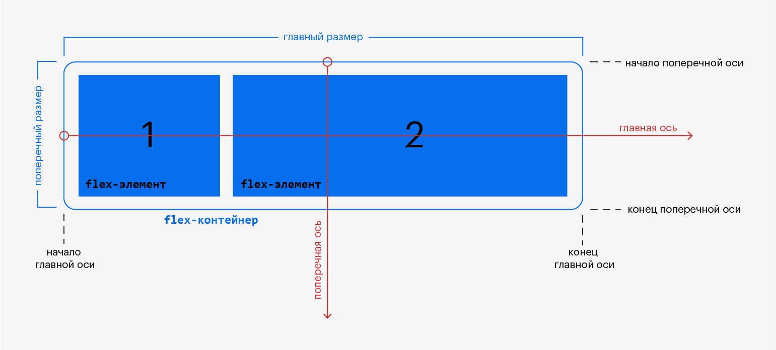
Главная ось (main axis) — направление, в котором располагаются flex-элементы.
Поперечная ось (cross axis) — ось, перпендикулярная главной оси.
Обратите внимание: направление главной и поперечной осей можно изменить с помощью свойства flex-direction (см. ниже).
Главный размер (main size) — размер, соответствующий направлению главной оси.
Начало главной оси (main start) — точка, в которой начинается последовательность flex-элементов, расположенных по главной оси.
Конец главной оси (main end) — точка, в которой заканчивается последовательность flex-элементов, расположенных по главной оси.
Поперечный размер (cross size) — размер, соответствующий поперечной оси.
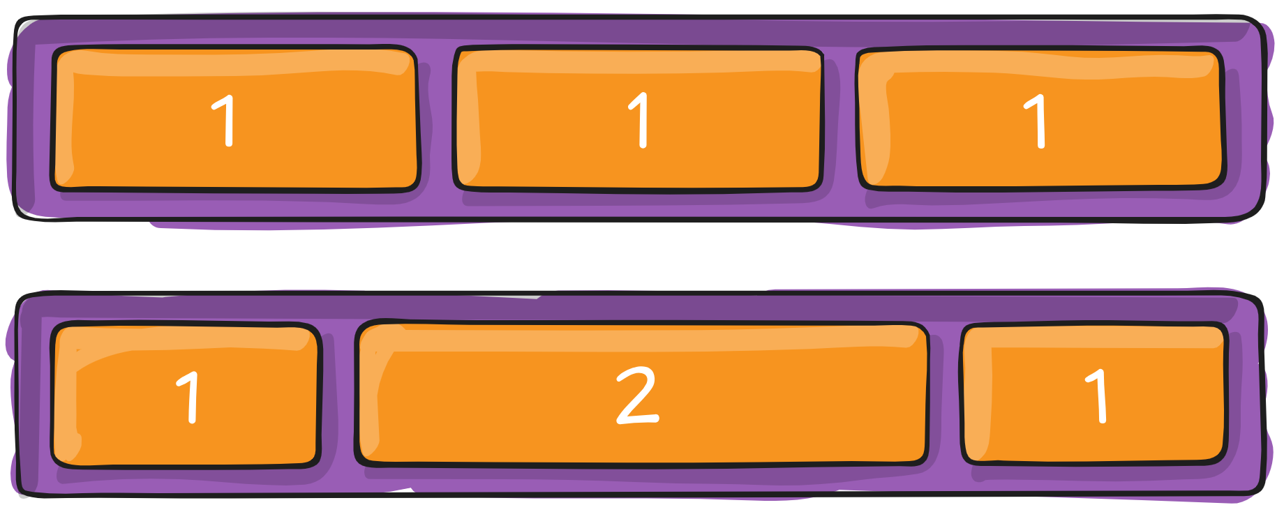
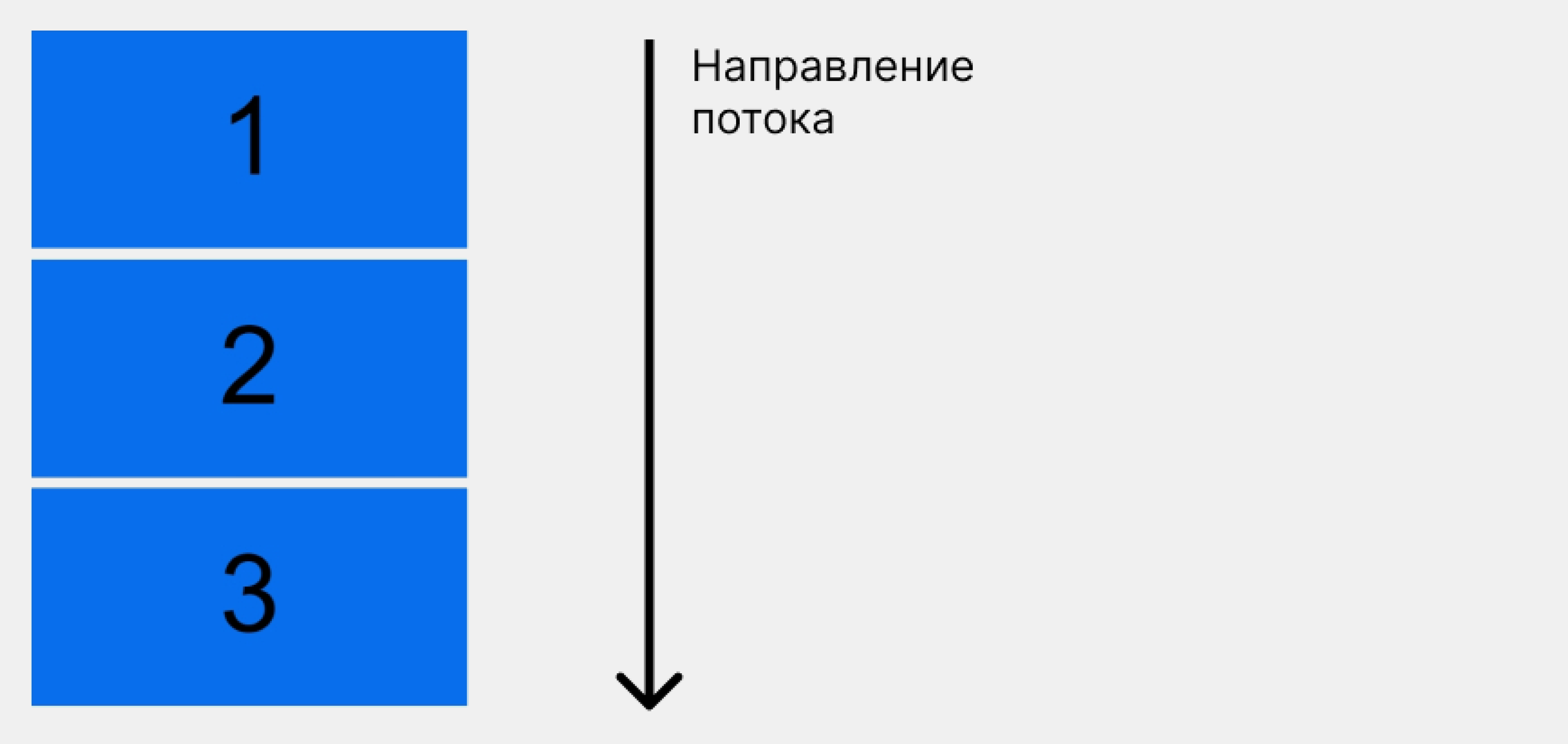
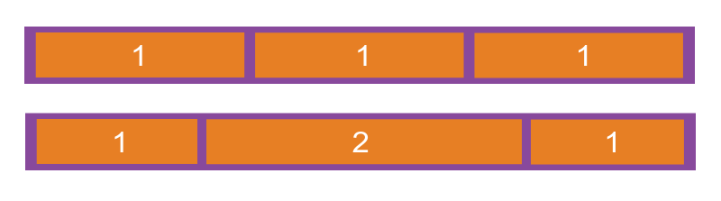
Теперь посмотрим, как ведут себя элементы, когда становятся гибкими. В примере ниже контейнер с классом container содержит три пронумерованных блока div.
HTML:
<div class="container">
        <div class="inner-div">
            <p>1</p>
        </div>
        <div class="inner-div">
            <p>2</p>
        </div>
        <div class="inner-div">
            <p>3</p>
        </div>
      </div>
CSS:
p {
    padding-top: 40px;
    margin: 0;
    font-size: 100px;
    font-family: sans-serif;
    text-align: center;
    vertical-align: middle;
  }


.inner-div {
    height: 200px;
    width: 400px;
    margin: 10px;
    background-color: #096eeb;
  }
Так как блочные элементы занимают всю ширину, то блоки .inner-div располагаются один под другим:
А теперь назначим родительскому элементу свойство display: flex:
.container {
    display: flex;
}
Вот как изменится расположение внутренних блоков:
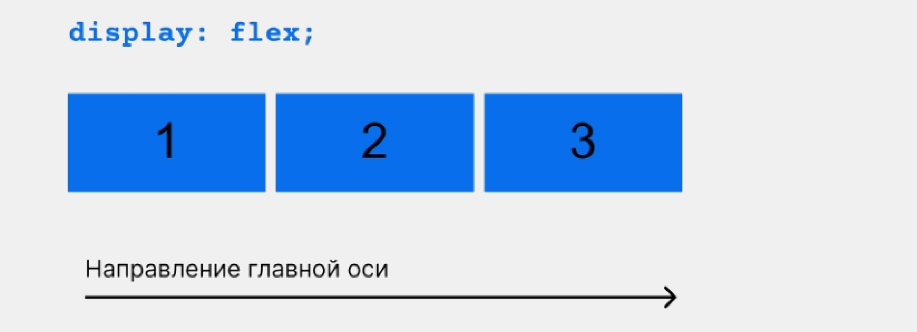
Магия! Блоки выстроились вдоль главной оси, а их ширина уменьшилась так, чтобы все уместились в одном ряду.
Теперь, когда мы умеем превращать обычные блоки во flex-контейнеры, можно изучить каждое свойство Flexbox.
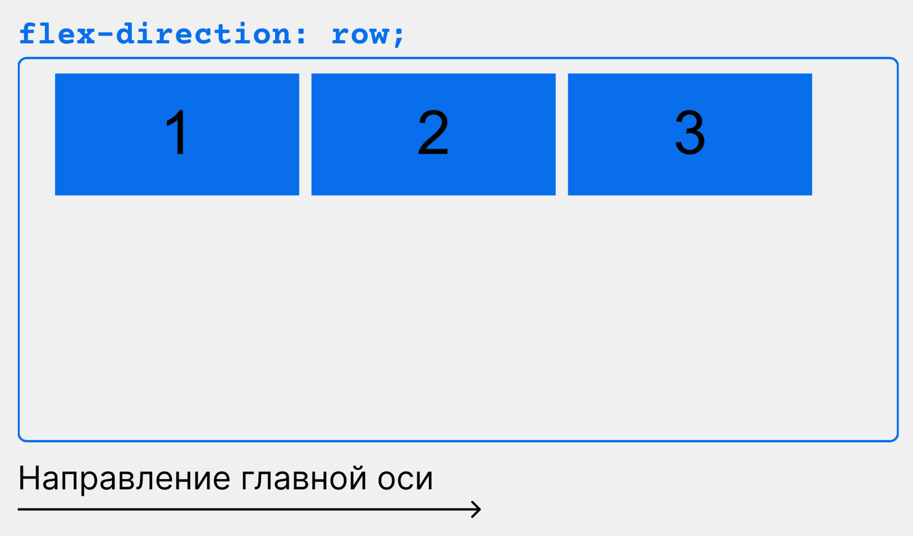
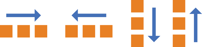
flex-direction определяет направление основной и поперечной осей в контейнере. Оно может принимать четыре значения:
- row (по умолчанию) — элементы располагаются в строку, слева направо;
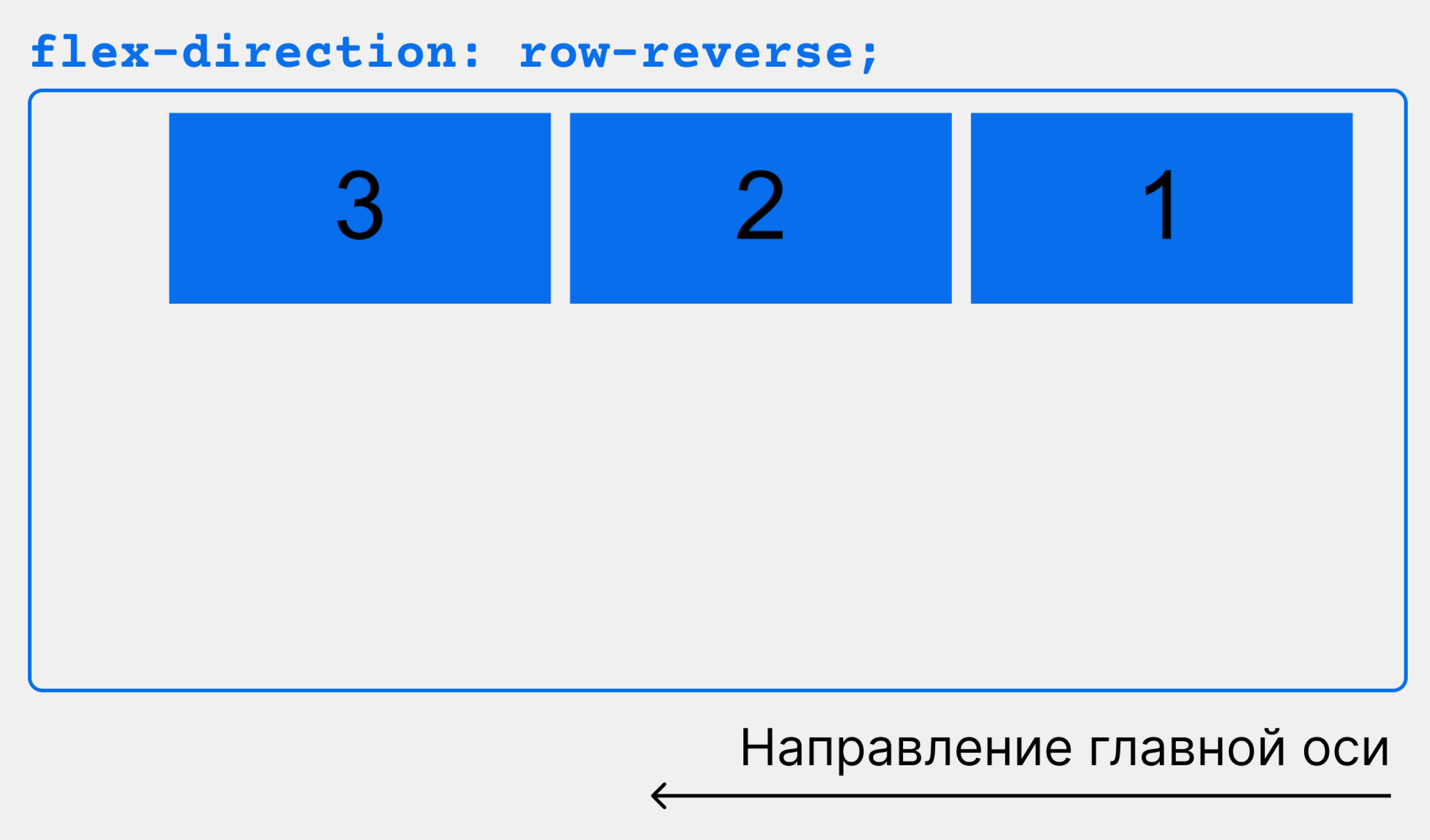
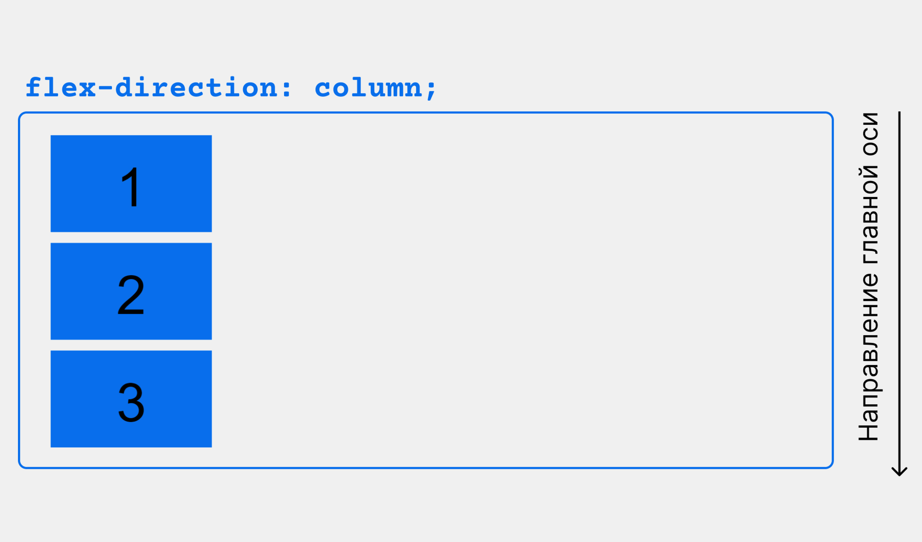
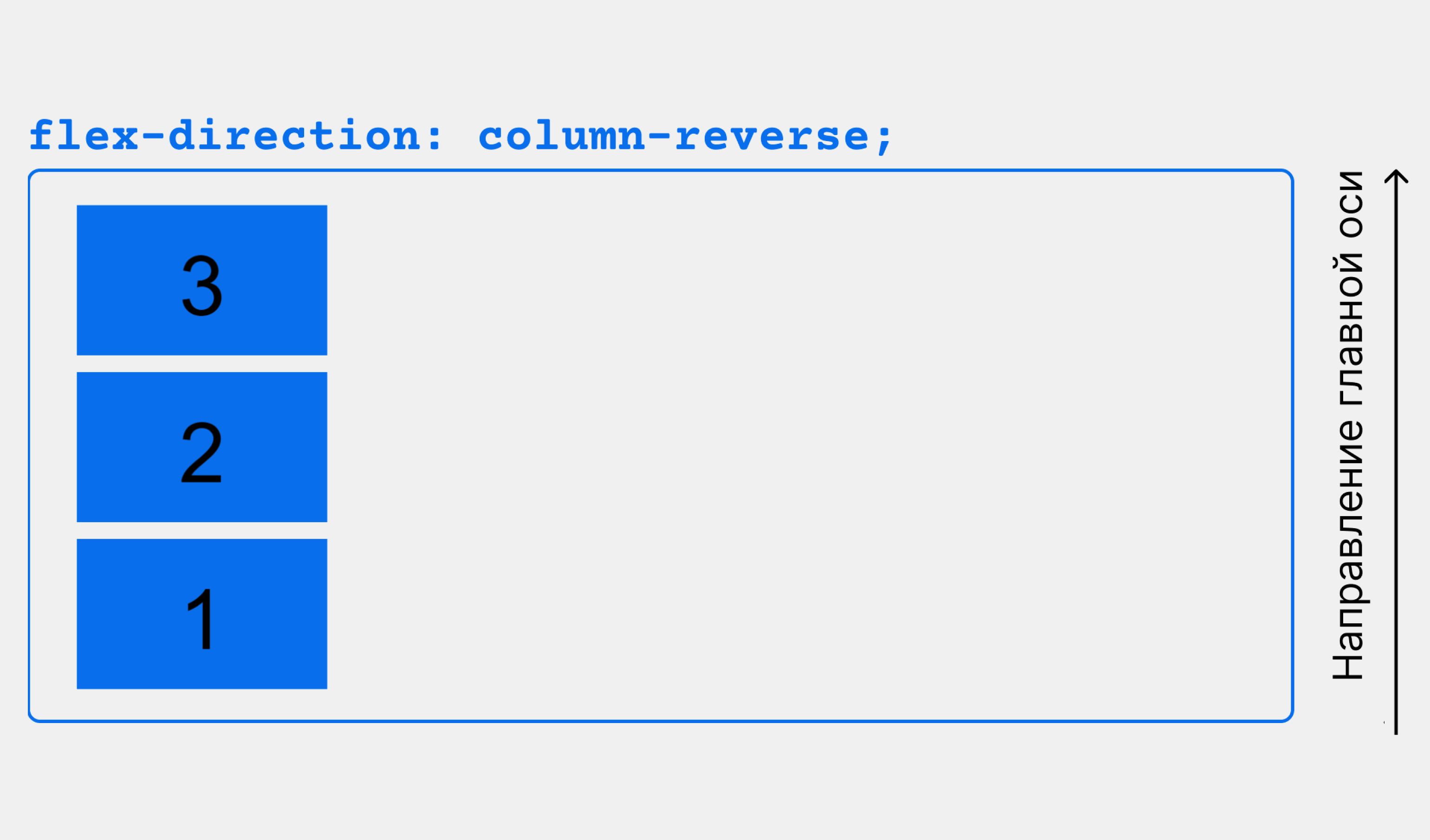
- row-reverse — элементы располагаются в строку, справа налево;
- column — элементы располагаются в столбец, сверху вниз;
- column-reverse — элементы располагаются в столбец, снизу вверх.
.container {
    display: flex;
    flex-direction: row;
    /*flex-direction: row-reverse; */
    /*flex-direction: column; */
    /*flex-direction: column-reverse; */
}
На слайдере ниже показано, как действует на расположение элементов каждое значение flex-direction:
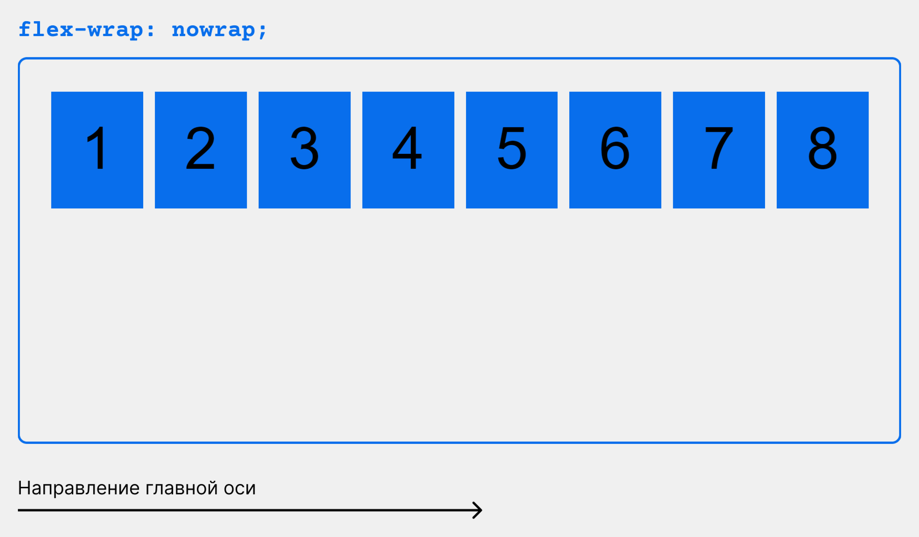
flex-wrap определяет, будут ли flex-элементы переноситься на другую строку, если им не хватит места в ряду.
Свойство может принимать одно из трёх значений:
- nowrap (по умолчанию) — элементы не переносятся на новую строку, а сжимаются;
- wrap — элементы переносятся на новую строку;
- wrap-reverse — элементы переносятся на новую строку в обратном порядке.
Продемонстрируем действие свойства flex-wrap, для наглядности увеличив количество элементов до восьми:
.container {
    display: flex;
    flex-wrap: nowrap;
    /*flex-wrap: wrap; */
    /* flex-wrap: wrap-reverse; */
}
flex-flow объединяет в одно свойство flex-direction и flex-wrap, позволяя задать их значения в одной строке:
.container {
  display: flex;
  flex-flow: row wrap;
}
Обратите внимание: при использовании flex-flow важно соблюдать правильный порядок: сначала задать значение для flex-direction, потом для flex-wrap, иначе свойство работать не будет.
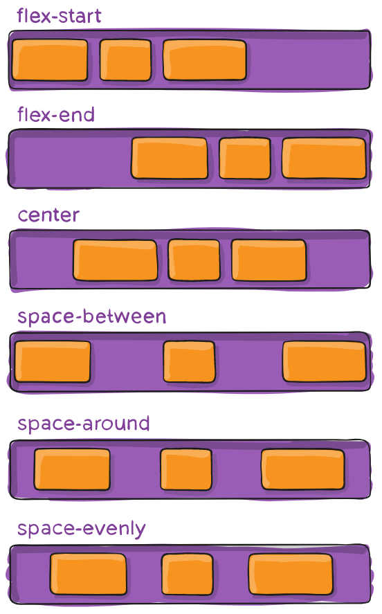
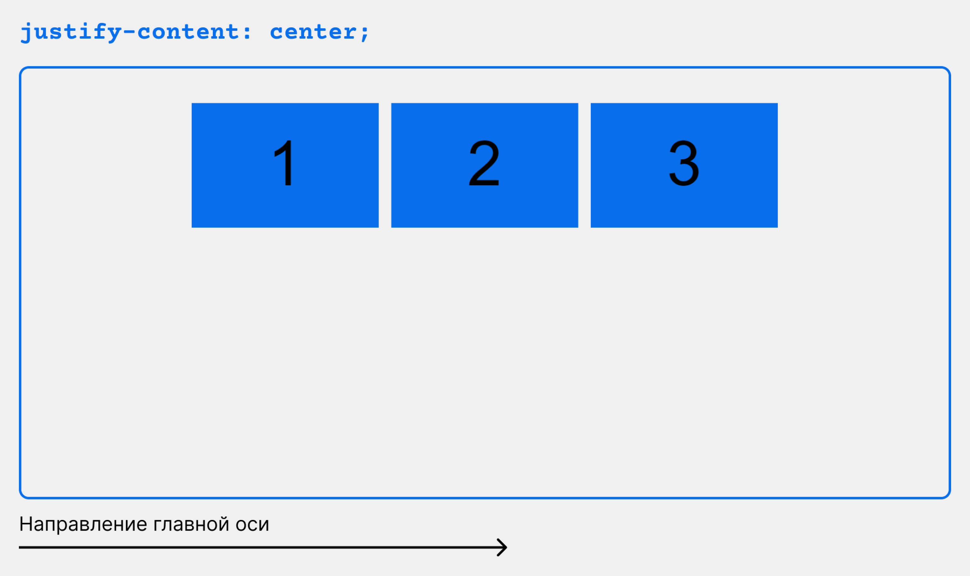
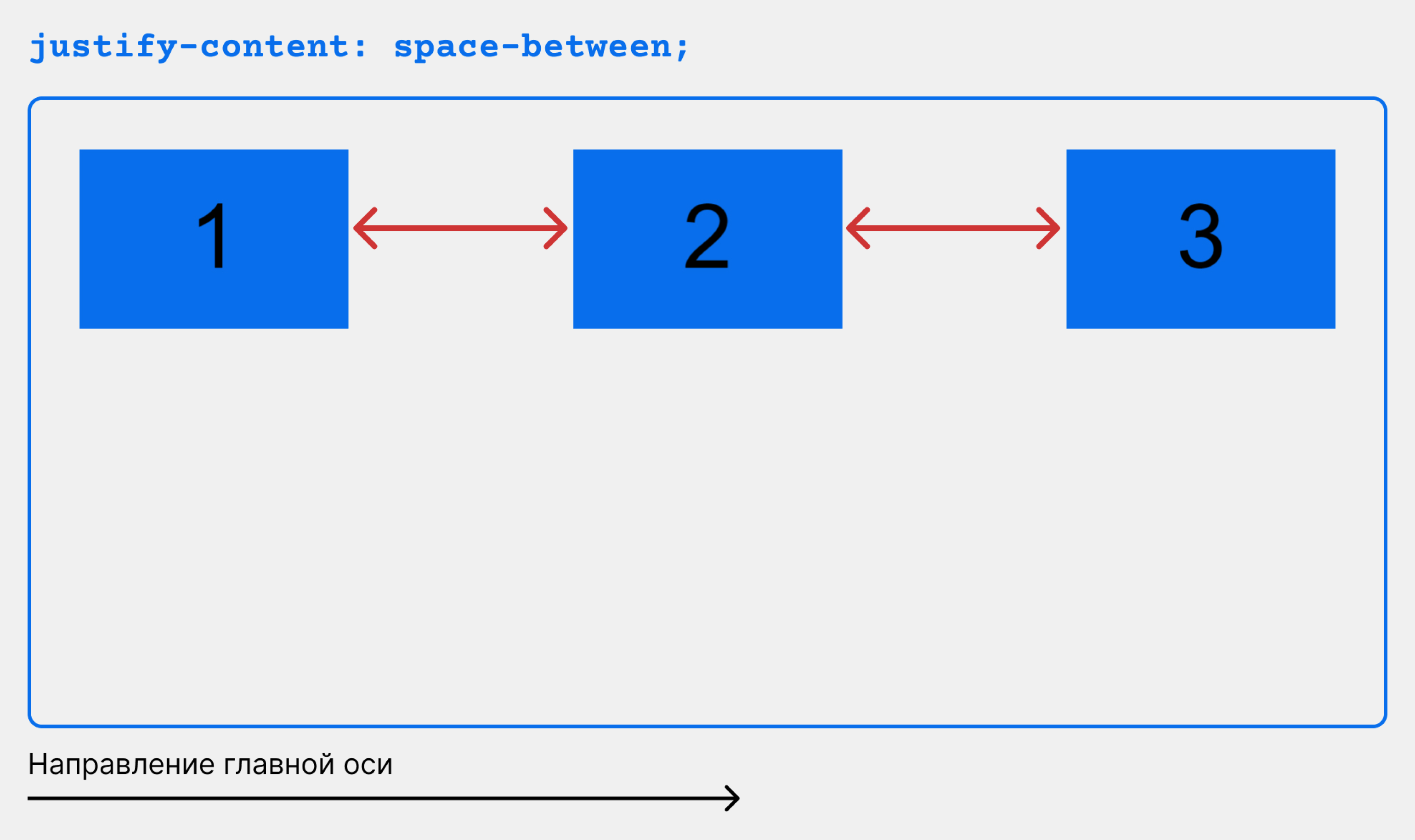
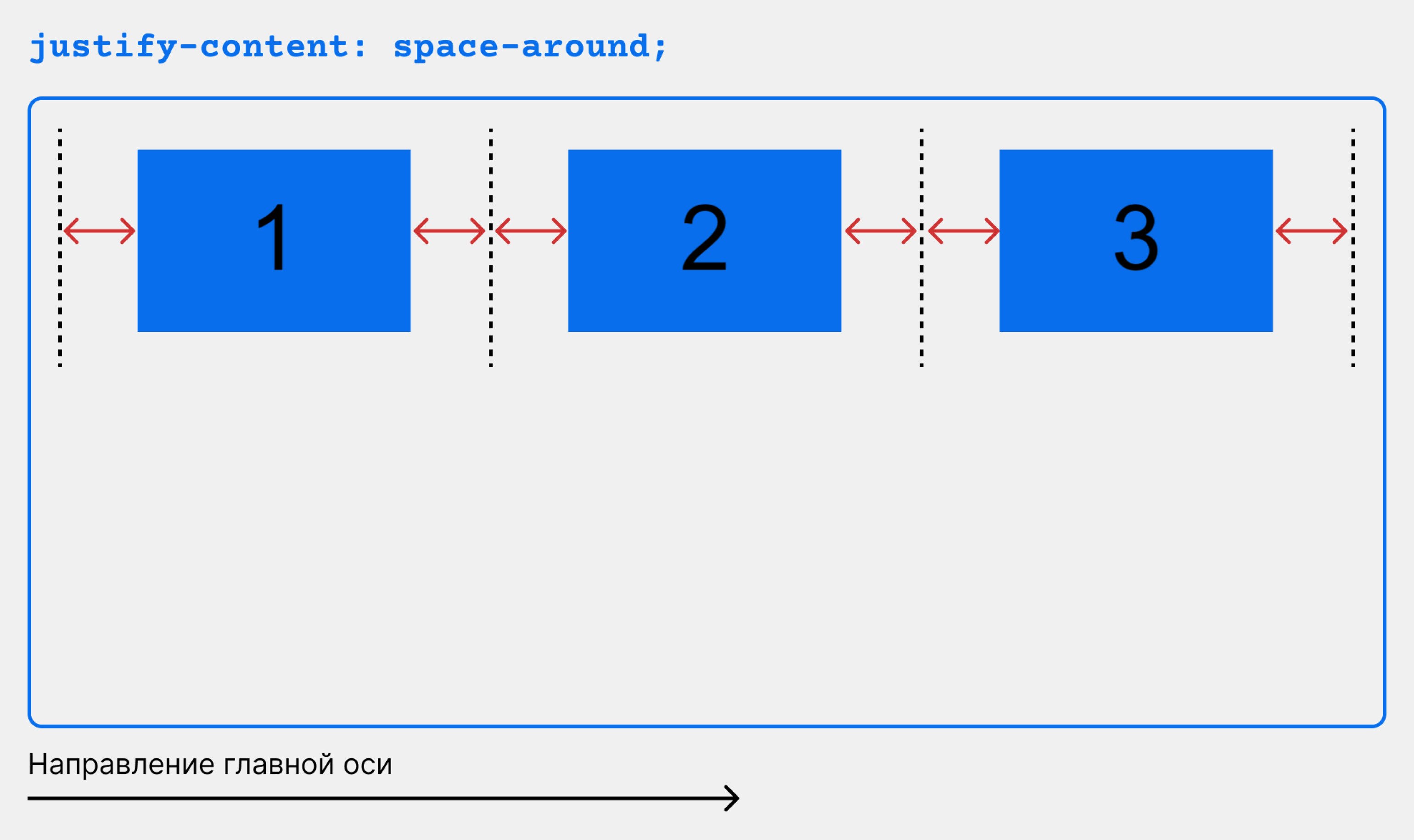
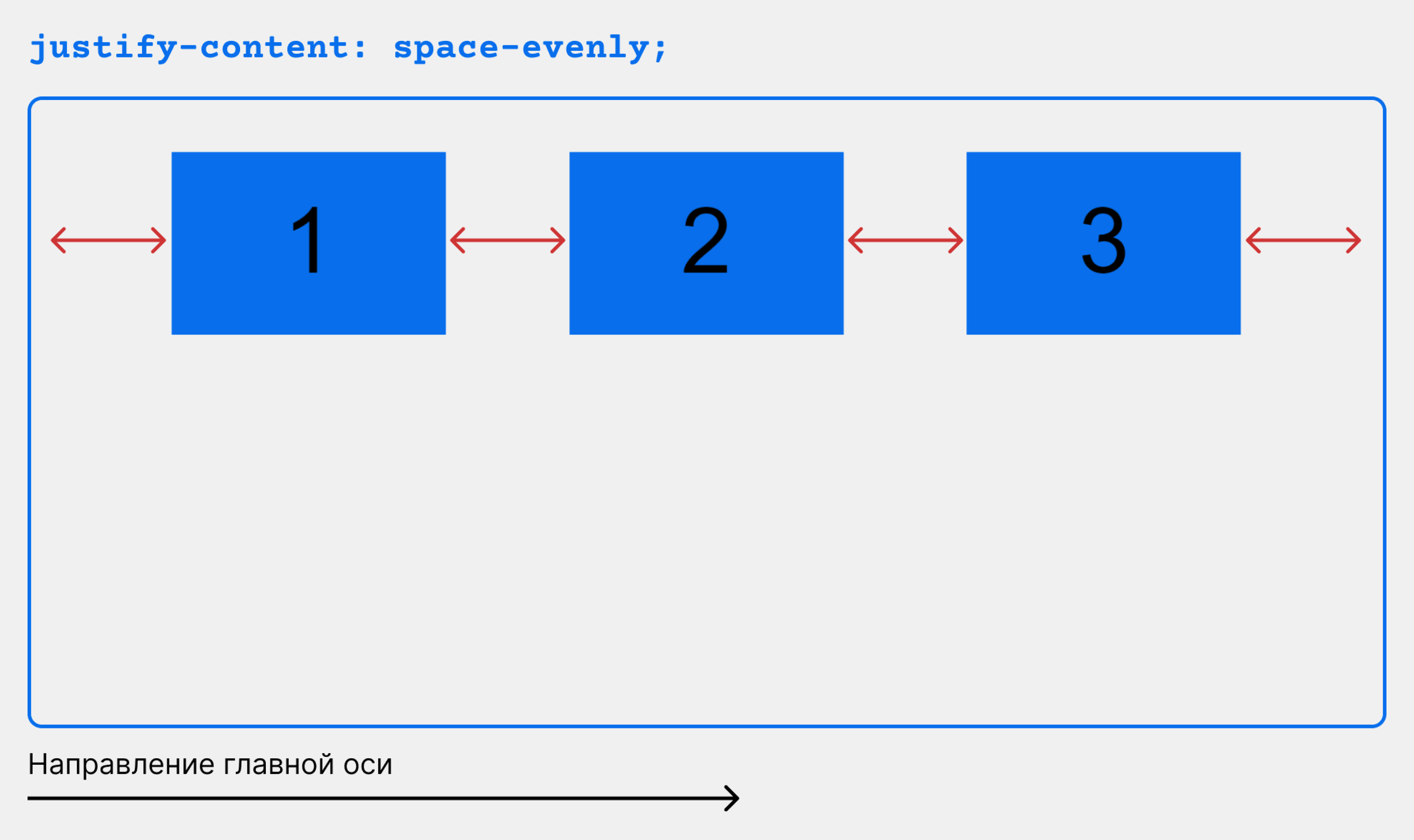
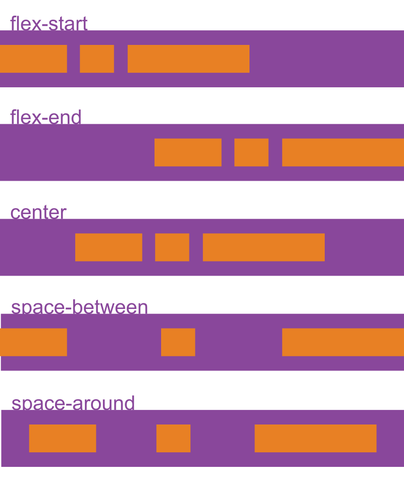
justify-content определяет, как будут распределены элементы вдоль главной оси.
Свойство насчитывает 10 значений, но стабильно во всех браузерах работают следующие:
- flex-start (по умолчанию): выравнивает элементы по началу главной оси;
- flex-end: выравнивает элементы по концу главной оси;
- center: центрирует элементы вдоль главной оси;
- space-between: распределяет элементы по ширине, с одинаковым пространством между ними. Не добавляет отступы между крайними дочерними элементами и границей родителя;
- space-around: добавляет пространство вокруг каждого элемента;
- space-evenly: добавляет пространство не только между элементами, но и между ними и границей контейнера (см. иллюстрации ниже).
.container {
    display: flex;
    justify-content: flex-start;
    /* justify-content: flex-end; */
    /* justify-content: center; */
    /* justify-content: space-between; */
    /* justify-content: space-around; */
    /* justify-content: space-evenly; */
}
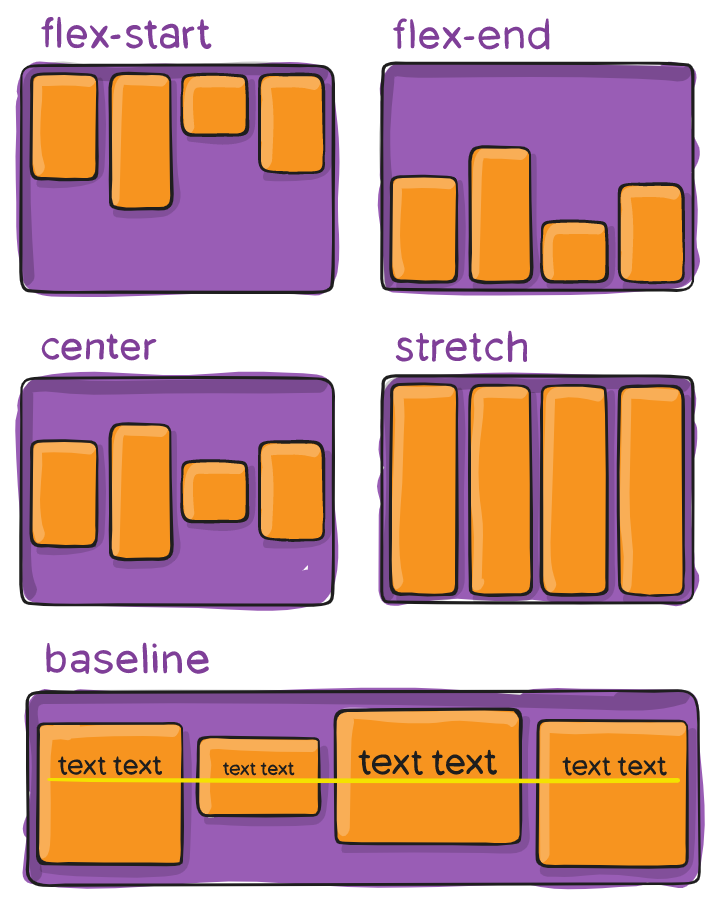
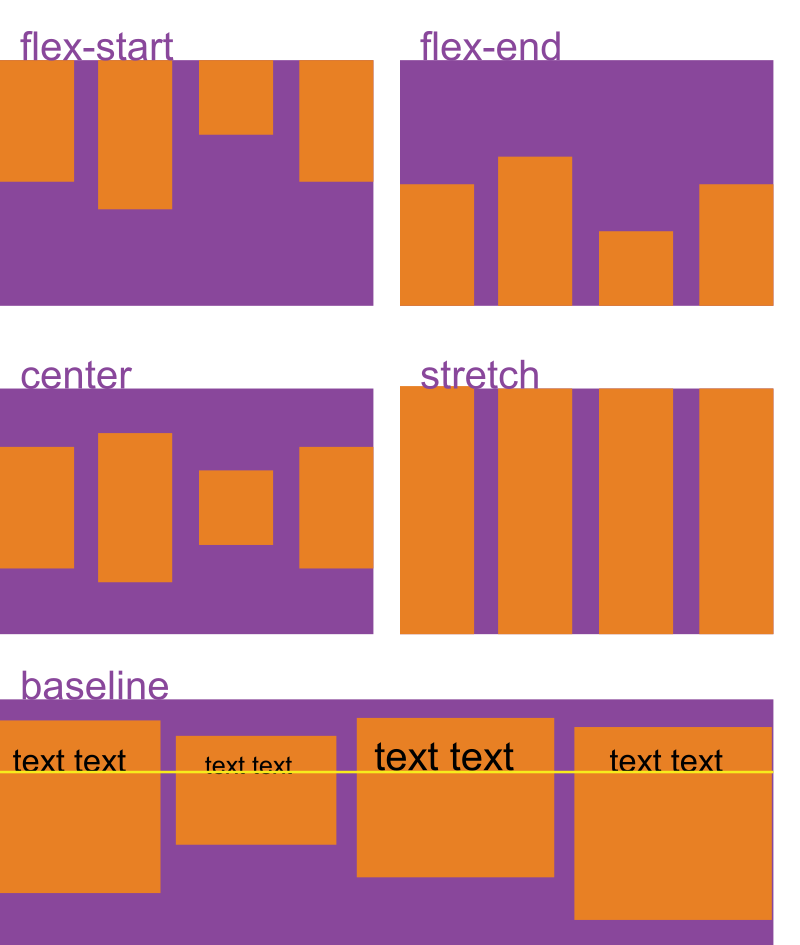
align-items выравнивает содержимое контейнера вдоль по поперечной оси.
У свойства есть пять возможных значений:
- flex-start: элементы выравниваются по верхнему краю контейнера;
- flex-end: элементы выравниваются по нижнему краю контейнера;
- center: содержимое контейнера выравнивается по центру;
- baseline: элементы выравниваются по базовой линии текста, который в них содержится;
- stretch: внутренние элементы растягиваются на всю высоту flex-контейнера.
.container {
    display: flex;
    align-items: stretch;
    /*align-items: flex-start;*/
    /*align-items: flex-end;*/
    /*align-items: center;*/
    /*align-items: baseline;*/
}
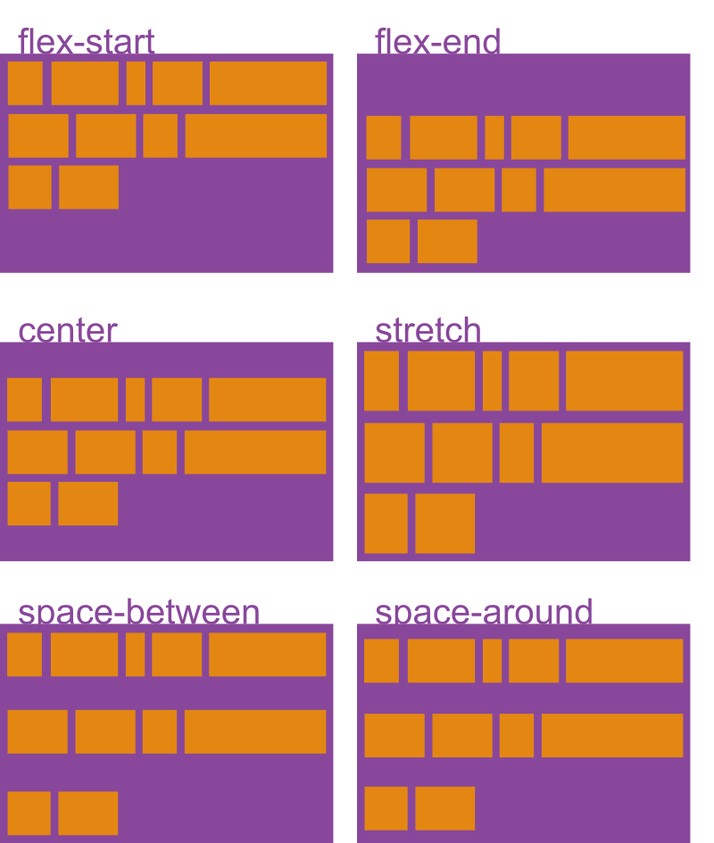
align-content действует подобно justify-content — только распределяет элементы относительно поперечной оси и работает с многострочными контейнерами.
Сделаем наш контейнер многострочным: установим фиксированную высоту и включим flex-wrap: wrap.
.container {
    height: 600px;
    flex-wrap: wrap;
    display: flex;
    align-content: flex-start;
/*  align-content: flex-end; */
/*  align-content: center; */
/*  align-content: space-between; */
/*  align-content: space-around; */
/*  align-content: stretch;  */
}
На слайдах ниже показано, как ведут себя ряды при установке разных значений align-content:
gap — это разрыв между отдельными элементами, строками или колонками внутри flex-контейнера. Значение по умолчанию — none; задаётся пикселями (px) или процентами.
Обратите внимание: разрывы устанавливаются только между элементами, а не между элементами и границами родителя.
Существует три версии свойства:
- row-gap — устанавливает разрыв между строками;
- column-gap — устанавливает разрыв между колонками;
- gap — устанавливает разрыв между строками и колонками. При этом, если задать только значение, оно применяется и к строкам, и к колонкам.
container {
	display: flex;
	gap: 50px;
  /*row-gap: 50px;*/
  /*column-gap: 50px;*/
  /*gap: 50px 100px;*/
}
Вот как будут располагаться блоки при разных значениях и версиях gap:
Свойства, с которыми мы познакомились в предыдущем разделе, устанавливаются в стилях контейнера и действуют на всё его содержимое. Но во Flexbox также можно управлять отдельными flex-элементами.
order устанавливает порядок расположения элементов во flex-контейнере относительно друг друга.
В качестве значения order принимает любое целое число: чем оно меньше, тем ближе к началу главной оси будет расположен элемент. По умолчанию у каждого элемента значение order равно 0.
HTML:
<div class="container container_view">
        <div class="inner-div item-1">
            <p>1</p>
        </div>
        <div class="inner-div item-2">
            <p>2</p>
        </div>
        <div class="inner-div item-3">
            <p>3</p>
        </div>
</div>
CSS:
.container {
    display: flex;
}

.item-1 {
    order: 2;
}

.item-2 {
    order: 1;
}

.item-3 {
    order: 3;
}
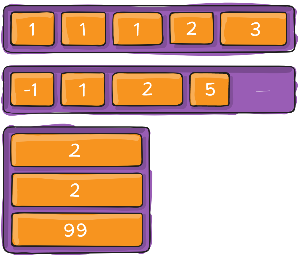
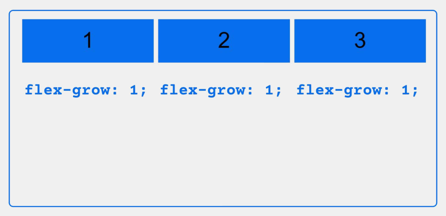
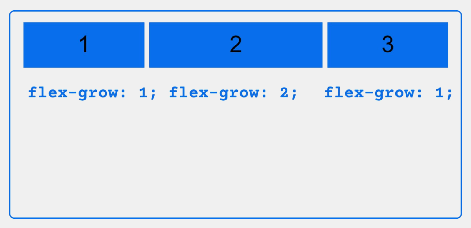
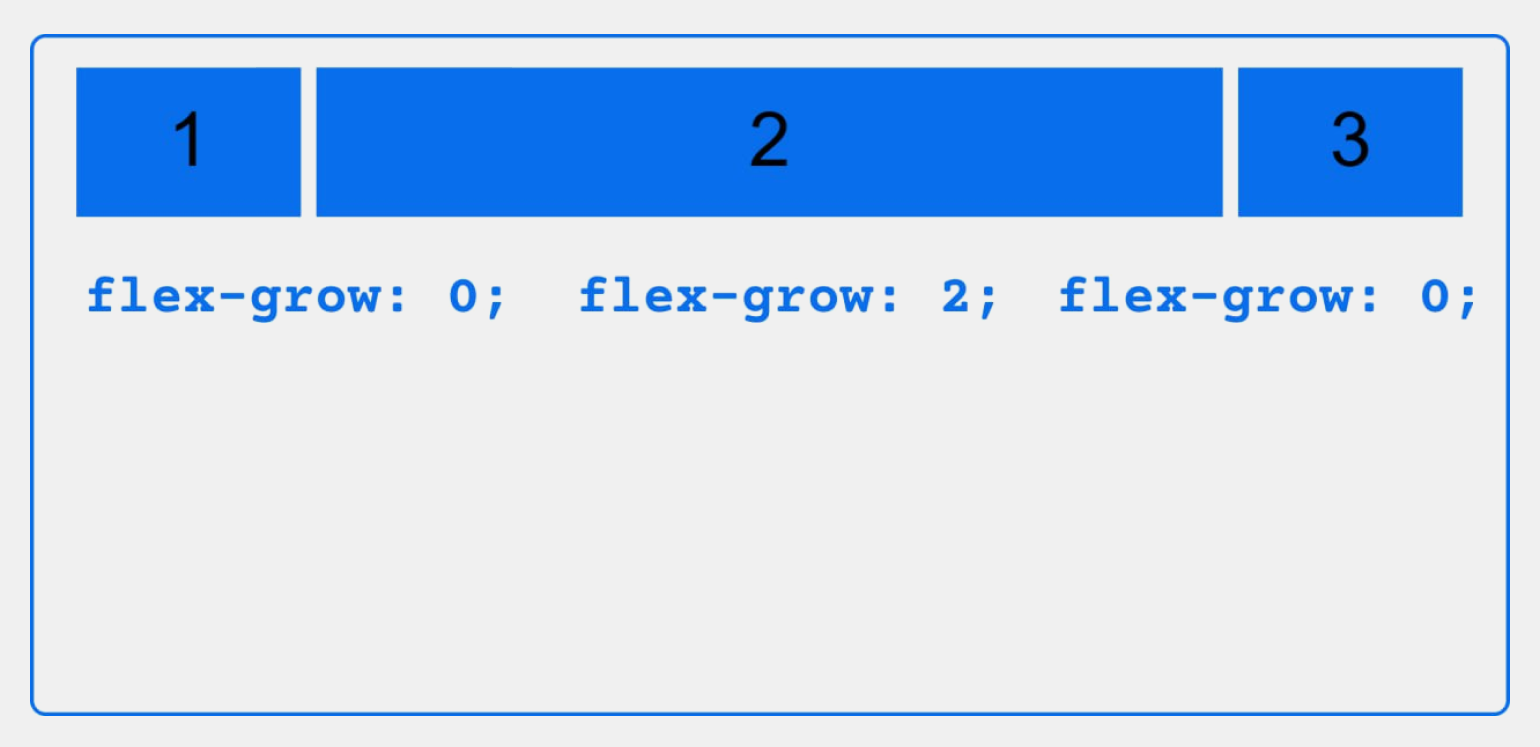
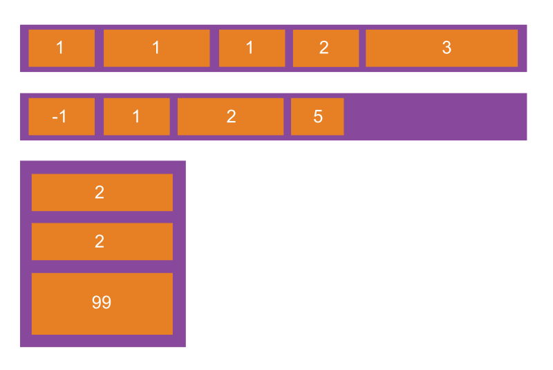
flex-grow позволяет указать, какую долю свободного пространства во flex-контейнере может занимать элемент, или, другими словами, в какой степени он может «расти» вдоль главной оси. В качестве значения можно задать любое неотрицательное число, по умолчанию это 0.
Когда для всех элементов установлено значение flex-grow:1, пространство между ними распределено равномерно. Если же какому-то элементу задать flex-grow: 2, то он вырастет в два раза относительно остальных. При изменении размеров экрана пропорция между элементами сохранится.
CSS:
.container {
  display: flex;
}

.item-1 {
  flex-grow: 0;
}

.item-2 {
  flex-grow: 0;
}

.item-3 {
  flex-grow: 0;
}
Вот как это будет выглядеть:
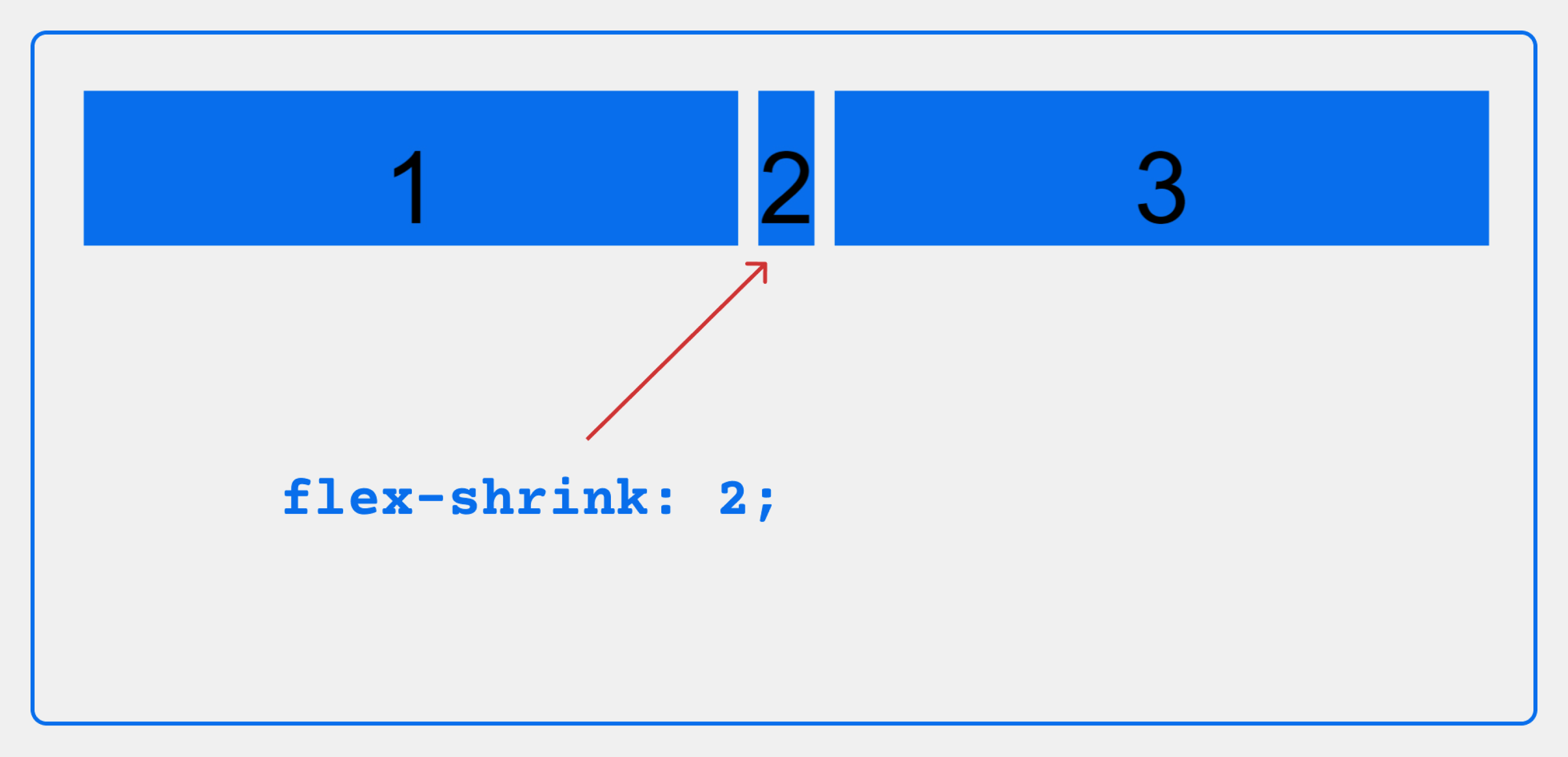
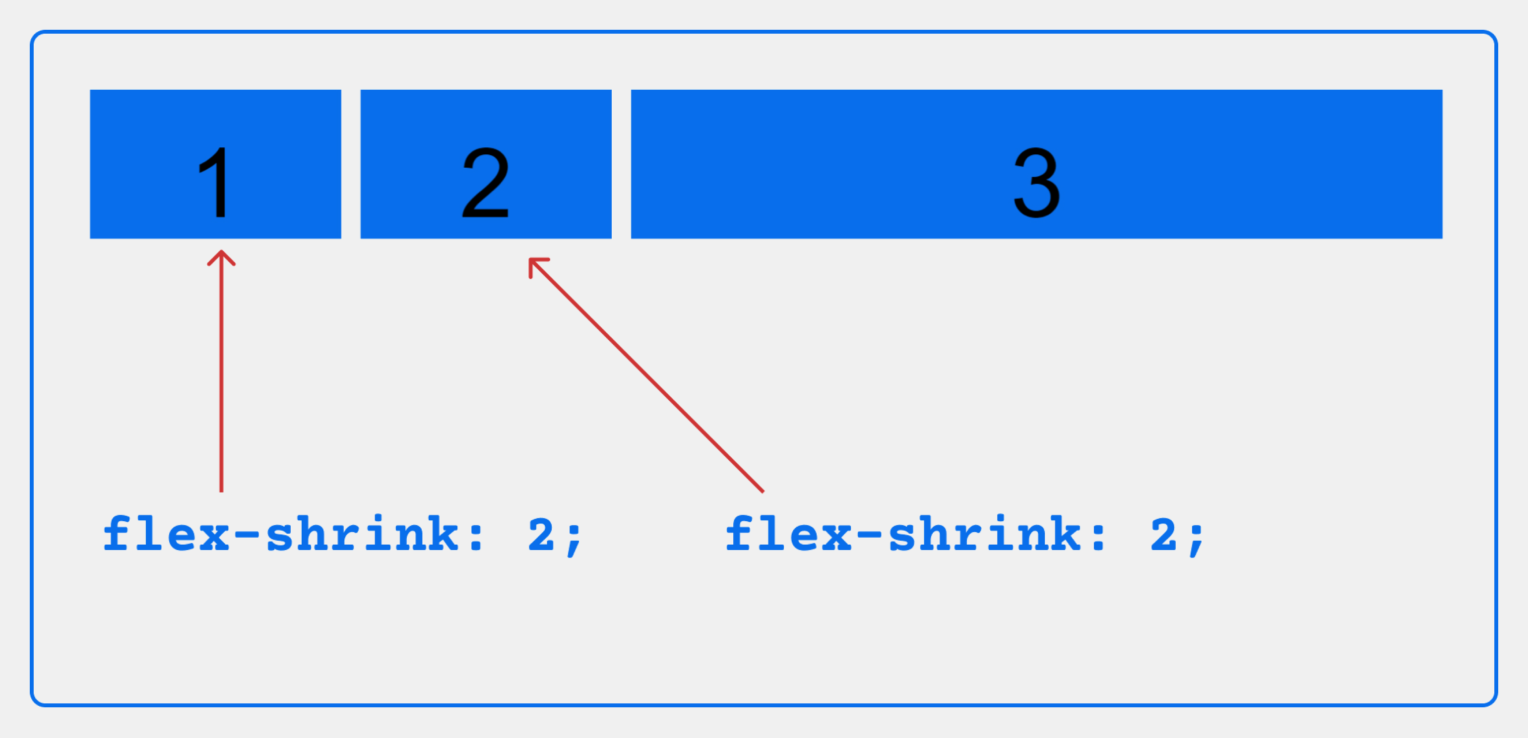
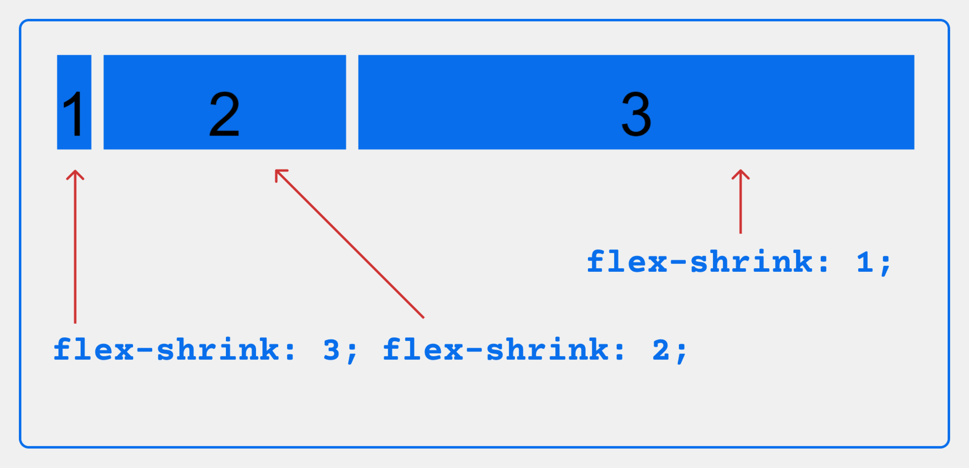
flex-shrink, в противоположность flex-grow, позволяет указать, насколько сильно элемент должен сжиматься, если суммарная ширина элементов превышает размер контейнера. Значение может быть любым положительным числом.
По умолчанию у всех дочерних элементов устанавливаетсязначение этого свойства 1. Элементы с ненулевым значением flex-shrink будут сжиматься, насколько это возможно, с учётом значений flex-shrink других элементов.
CSS:
.container {
    display: flex;
}


.item-1 {
    flex-shrink: 1;
  /*flex-shrink: 2;*/
  /*flex-shrink: 3;*/
}


.item-2 {
    flex-shrink: 2;
  /*flex-shrink: 2;*/
}


.item-3 {
    flex-shrink: 1;
}
Вот как это будет выглядеть в браузере:
flex-basis задаёт размер элемента по главной оси, перед тем как будет распределено оставшееся пространство.
Параметр можно задать в пикселях, в процентах или с помощью ключевых слов:
- auto (по умолчанию) — в зависимости от значения flex-direction примет значение свойства width или height. Если же соответствующее свойство тоже установлено в auto, то элемент примет размер содержимого;
- max-content — устанавливает предпочтительную ширину;
- min-content — устанавливает минимальную ширину;
- fit-content — устанавливает максимально возможный размер элемента, ограниченный значениями max-content и min-content.
Обратите внимание: flex-basis действует подобно свойству width, только имеет более высокий приоритет. Поэтому если для элемента будут заданы значения обоих свойств, то width будет игнорироваться.
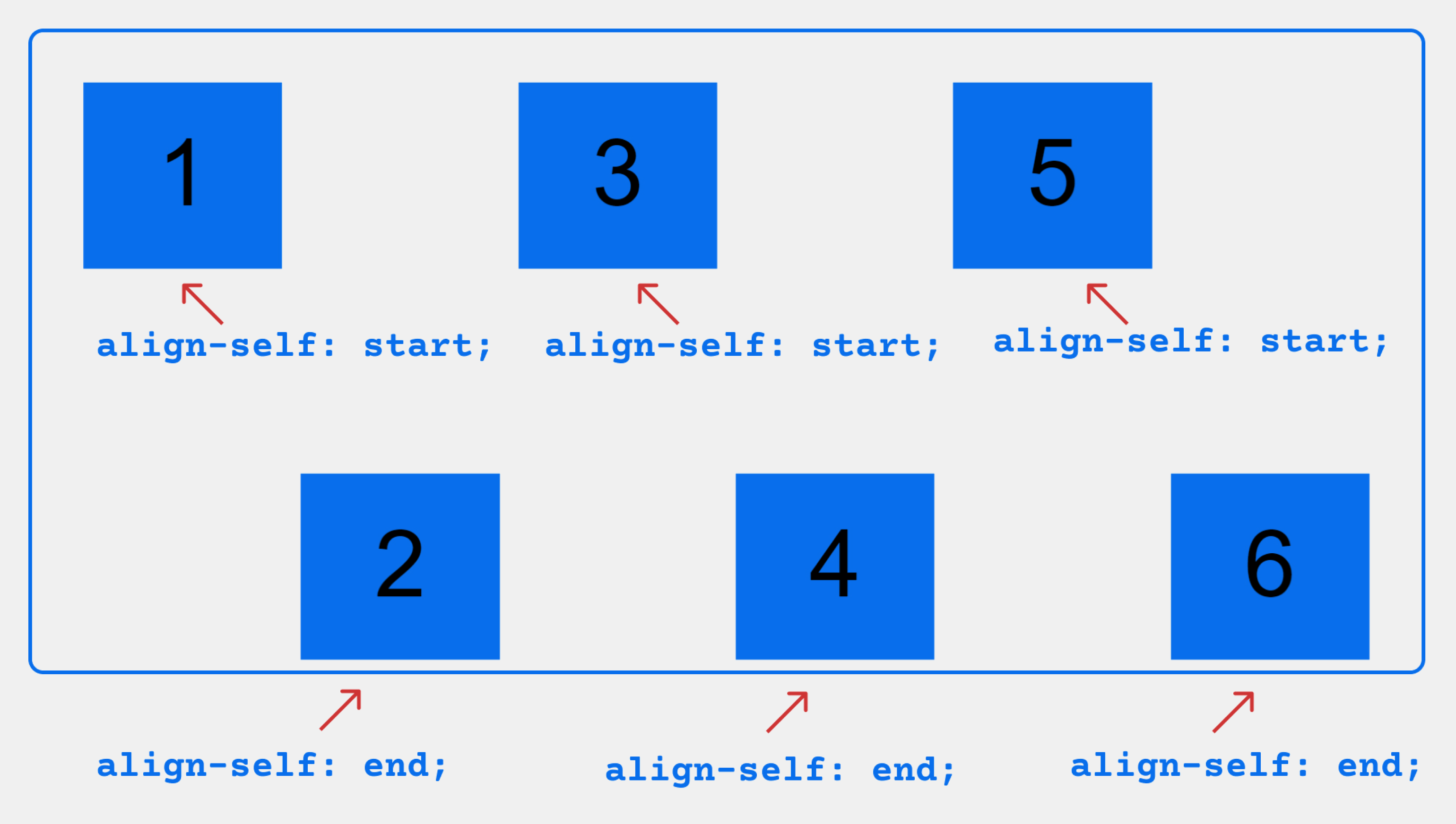
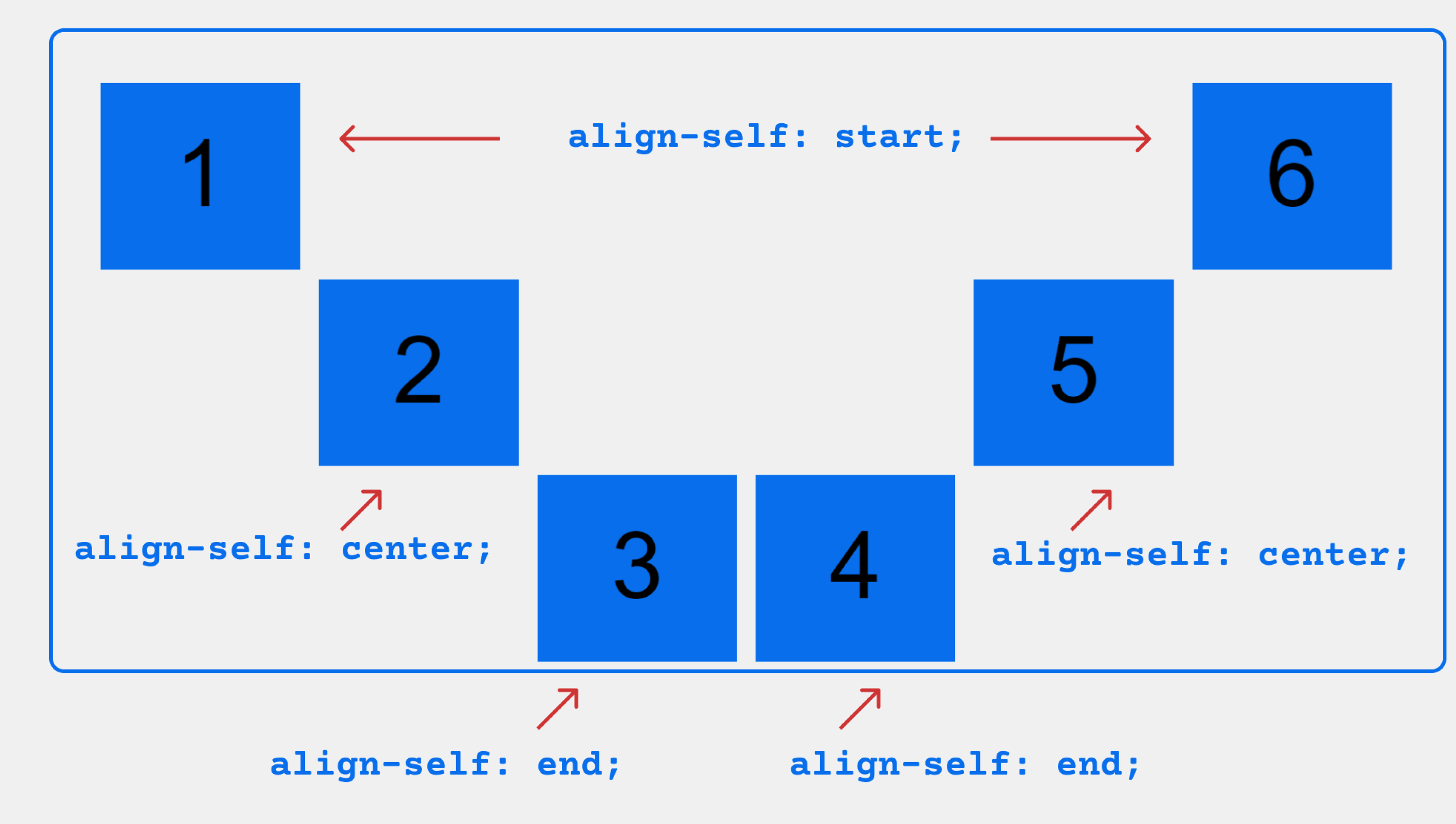
align-self устанавливает выравнивание отдельного flex-элемента вдоль поперечной оси, переопределяя значение свойства align-items.
Значения align-self задаются для каждого flex-элемента и могут быть следующими:
- flex-start — выравнивает элемент по началу поперечной оси (cross start);
- flex-end — выравнивает элемент по концу поперечной оси (cross end);
- center — выравнивает элемент по центру поперечной оси;
- stretch (по умолчанию для flex-элементов) — элементы растягиваются на всю высоту контейнера.
На слайдах ниже показано, как ведут себя flex-элементы при разных значениях align-self:
Мы познакомились с самыми важными свойствами Flexbox — их хватит, чтобы верстать полноценные веб-страницы и разбираться в чужом HTML- и CSS-коде. Больше технических деталей и дополнительную информацию о технологии можно найти в документации на портале W3C.
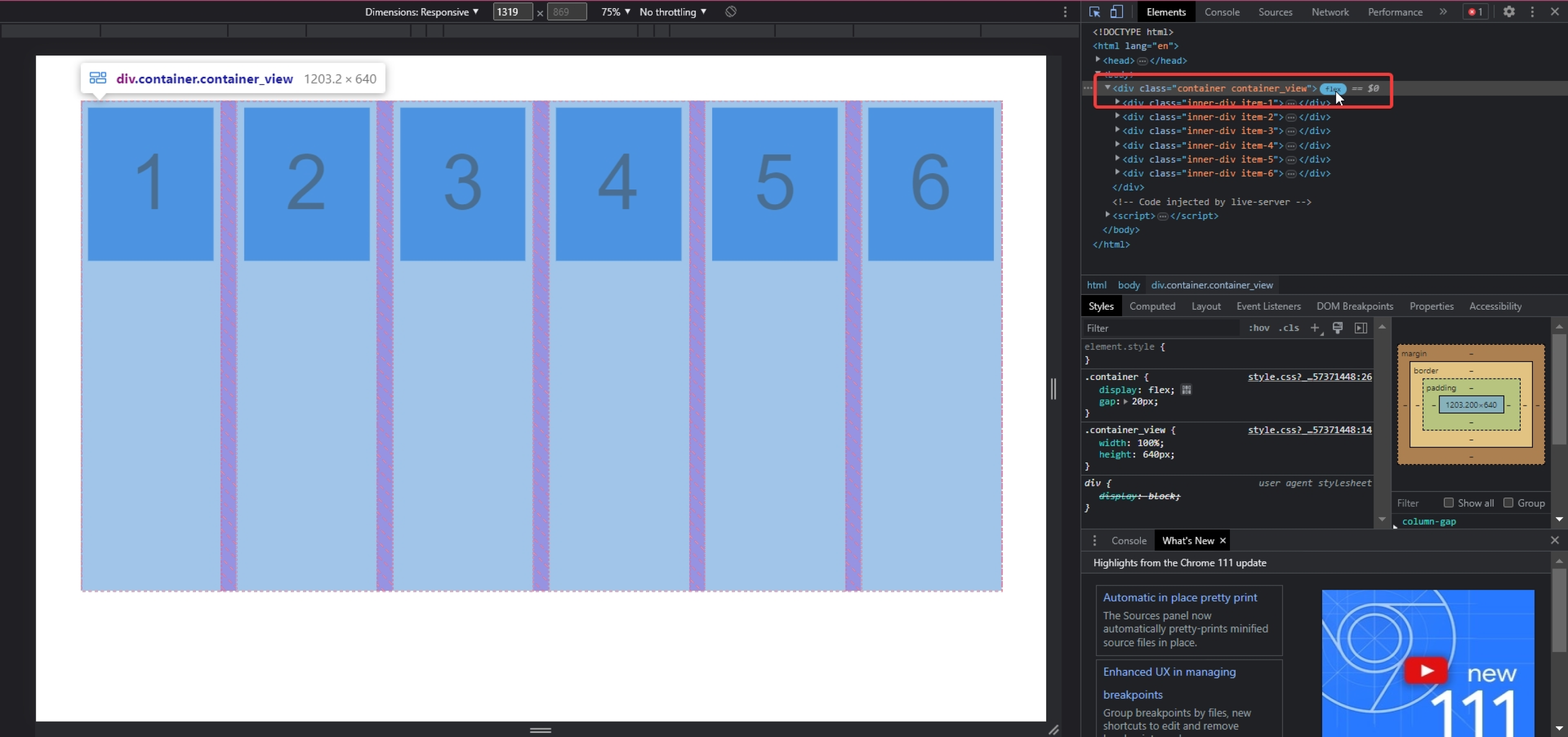
В Google Chrome есть фича, которая позволяет экспериментировать со свойствами Flexbox и отлаживать код, не выходя из браузера.
Откройте веб-страницу и зайдите в Chrome DevTools (клавиша F12). Во вкладке Elements рядом с flex-контейнером вы увидите значок flex. Если на него нажать, то вокруг каждого блока появится пунктирная граница, а разрывы (gap) будут заштрихованы.
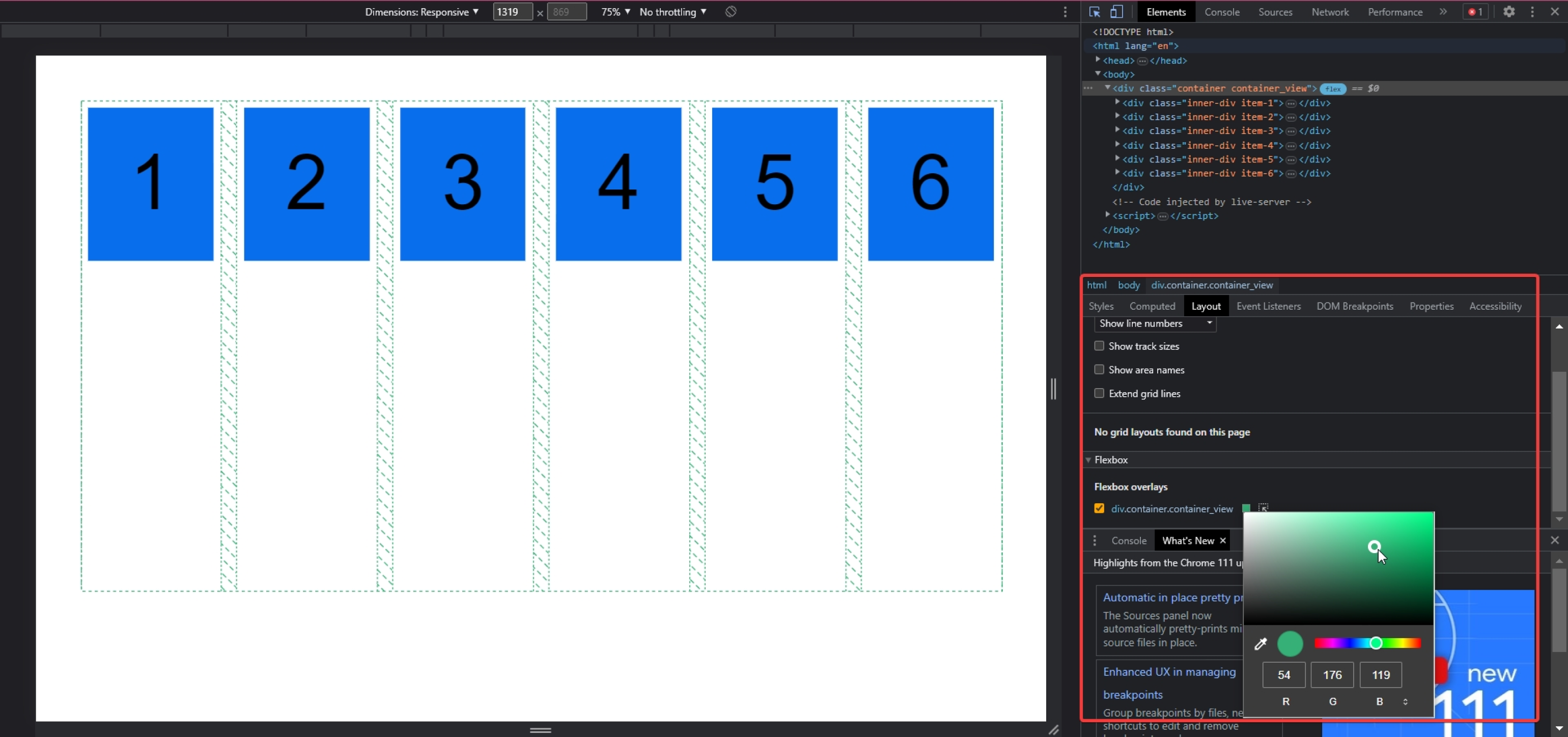
Цвет границ и штриховки можно изменить во вкладке Layout, в разделе Flexbox:
Теперь посмотрите на стили контейнера во вкладке Styles. Рядом с селектором, в котором задано свойство display: flex, расположен значок flexbox editor. Кликните на него, чтобы открыть панель редактора: в ней можно устанавливать значения свойств flex-direction, flex-wrap, align-content, justify-content и align-items.
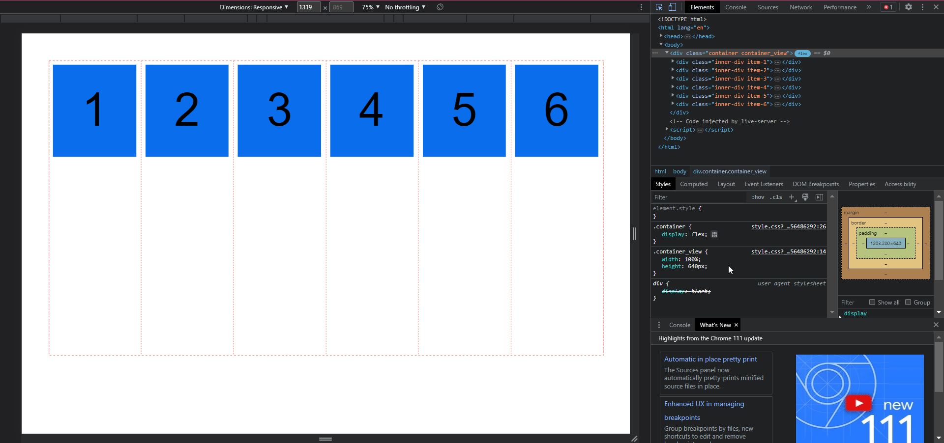
Так вы можете быстро проверить, какое влияние то или иное свойство окажет на веб-страницу, не переключаясь между браузером и редактором кода. Это упростит разработку и немного сэкономит ваше рабочее время.
Статьи и документация — это, конечно, хорошо, но иногда гораздо проще и быстрее осваивать технологии по играм. Вот три бесплатных тренажёра, которые помогут сделать это буквально за час.
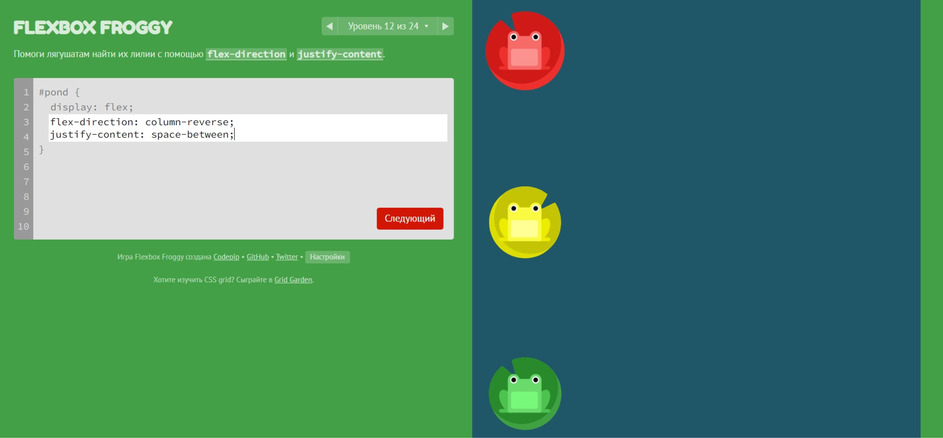
Замечательная минималистичная игра, в которой вам предстоит помочь лягушатам занять свои листья с помощью Flexbox. Каждый уровень сопровождается подсказками и подробной справкой, что позволяет освоить технологию с нуля.
Перейти на сайт Flexbox Froggy
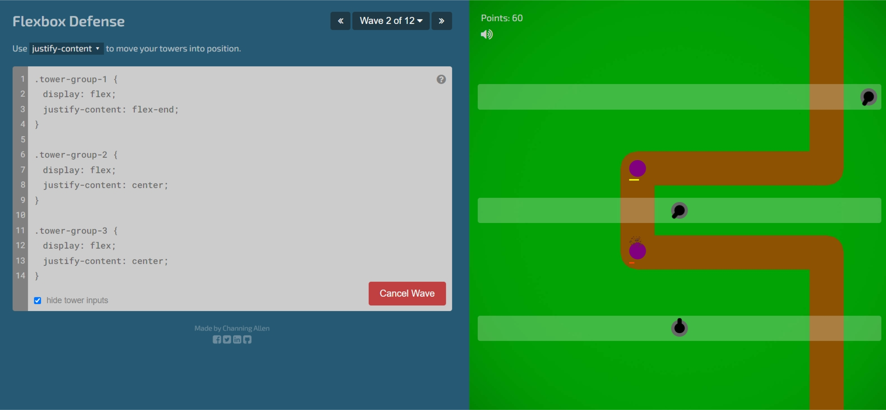
А здесь, помимо знания свойств Flexbox, пригодится смекалка: нужно расставить башни так, чтобы они успели убить всех врагов, бегущих по дороге. На последних уровнях будьте готовы поломать голову 
Перейти на сайт Flexbox Defense
Жил-был король Артур. Он правил своим королевством честно и справедливо, но у него было три злобных брата, которые похитили золото из его замка. Так начинается игра Flex Box Adventure.
Это, пожалуй, самый весёлый тренажёр по Flexbox. Вам предстоит выполнить 24 миссии, каждая из которых помогает отточить навыки владения инструментом до автоматизма. А если задания покажутся слишком простыми, вы всегда можете повысить уровень сложности.
Перейти на сайт Flex Box Adventure

Научитесь: Профессия Frontend-разработчик PRO
Узнать больше
Предисловие
Модуль Flexbox Layout (Flexible Box) направлен на то чтобы предоставить более эффективный способ расположения, выравнивания и распределения свободного пространства между элементами в контейнере, даже когда их размер заранее неизвестен и/или динамичен (поэтому слово «flex»).
Основная идея гибкой (flex) разметки заключается в том, чтобы предоставить контейнеру возможность изменять ширину/высоту (и порядок) своих элементов, для того чтобы наилучшим образом заполнить доступное пространство (в основном для размещения на всех типах и размерах экранов). Flexbox контейнер расширяет элементы чтобы заполнить свободное пространство или сжимает их чтобы избежать переполнения.
Самое главное, что Flexbox это направленный агностик в отличии от обычных раскладок (блоков основанных на вертикальном позиционировании и строковых элементов основанных на горизонтальном позиционировании). Не смотря на то что они достаточно хорошо работают, им не хватает гибкости для поддержки больших или сложных приложений (особенно когда речь идёт об изменении ориентации, изменении размеров, растягивании, сжатии и т. д.).
Примечание. Flexbox больше подходит для компонентов приложения и небольших макетов, тогда как CSS Grid предназначен для более масштабных макетов.
Основы и терминология
Так как Flexbox — это целый модуль, а не отдельное свойство, он содержит множество различных вещей, включая целый набор свойств. Некоторые из них предназначены для установки их контейнеру (родительский элемент, известный как «flex-контейнер»), а другие должны устанавливаться дочерним элементам (известные как «flex-элементы»).
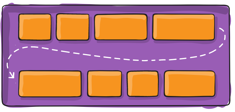
Если обычная система компоновки основана на блочных и строковых направлениях, то Flexbox основан на «flex-flow направлениях». Пожалуйста взгляните на этот рисунок из спецификации, объясняющий основную идею Flexbox.
В основном элементы будут располагаться вдоль основной оси (от main-start к main-end) или попереченой оси (от cross-start к cross-end).
- main axis — это основная ось flex-контейнера, вдоль которой расположены flex-элементы. Берегитесь того, что это не обязательно горизонтальная ось; Она зависит от свойства flex-direction;
- main-start | main-end — flex-элементы размещаются внутри контейнера, начиная с
main-startи заканчиваяmain-end; - main size — ширина или высота flex-элемента, в зависимости направления основной оси;
- cross axis — это ось перпендикулярная основной оси, которая называется «поперечной» осью. Её направление зависит от направления основной оси;
- cross-start | cross-end — — flex-элементы размещаются внутри контейнера, начиная с
cross-startи заканчиваяcross-end; - cross size — ширина или высота flex-элемента, в зависимости направления поперечной оси;
Поддержка браузерами
CSS Flexible Box Layout Module
Полная поддержка
Частичная поддержка
С префиксом
Не поддерживается
Браузер Blackberry начиная с 10 версии поддерживает новый синтаксис.
Содержание
Свойства для элементов
- order
- flex-grow
- flex-shrink
- flex-basis
- flex
- align-self
Свойства для родительского элемента
(Flex-контейнера)
display
Определяет flex-контейнер; строковый или блочный зависит от переданного значения. Включает flex-контекст для всех своих прямых, дочерних элементов.
.container {
  display: flex; /* или inline-flex */
}
Обратите внимание, что CSS колонки не влияют на flex-контейнер.
flex-direction
Устанавливает основную ось, таким образом определяет направление элементов расположенных в контейнере. Flexbox (помимо опциональной обёртки) представляет собой концепцию однонаправленного макета. Думайте о flex-элементах, прежде всего как горизонтальных строках или вертикальных колонках.
.container {
  flex-direction: row | row-reverse | column | column-reverse;
}- row (по умолчанию) — слева направо в
ltr; справа налево вrtl; - row-reverse — справа налево в
ltr; слева направо вrtl; - column — тоже самое что
row, только сверху вниз; - column-reverse — тоже самое что
row-reverse, только снизу вверх;
flex-wrap
По умолчанию, элементы будут пытаться заполнить только одну строк. Вы можете изменить это поведение и позволить элементам переноситься на следующую строку, при необходимости.
.container{
  flex-wrap: nowrap | wrap | wrap-reverse;
}- nowrap (по умолчанию) — все flex-элементы будут расположены на одной строке;
- wrap — flex-элементы будут расположены на нескольких строках, сверху вниз;
- wrap-reverse — flex-элементы будут расположены на нескольких строках, снизу вверх;
flex-flow
Это сокращение для свойств flex-direction и flex-wrap, которые вместе определяют основную и поперечные оси контейнера. По умолчанию row nowrap.
.container{
  flex-flow: <‘flex-direction’> || <‘flex-wrap’>;
}
justify-content
Определяет выравнивание вдоль основной оси. Это помогает распределить свободное пространство, оставшееся после того как все фиксированные и не фиксированные по ширине flex-элементы достигли максимального размера. Оно также помогает осуществлять некоторый контроль над выравниванием элементов, когда они переполняют строку.
.container {
  justify-content: flex-start | flex-end | center | space-between | space-around;
}- flex-start (по умолчанию) — элементы прижимаются к началу строки;
- flex-end — элементы прижимаются к концу строки;
- center — элементы располагаются по центру вдоль строки;
- space-between — элементы размещаются равномерно на линии; первый элемент находится в начале строки, последний элемент находится в конце строки;
- space-around — элементы размещаются равномерно на линии с одинаковым пространством возле них. Обратите внимание, что визуально пространство не одинаковое, так как у всех элементов одинаковое пространство с обеих сторон. У первого элемента будет одна единица пространства со стороны контейнера, но две единицы между ним и следующим элементом, потому что у следующего элемента также по одной единице с двух сторон.
align-items
Это свойство определяет поведение flex-элементов вдоль поперечной оси на текущей строке. Думайте о нём как о justify-content, только для поперечной оси (перпендикулярной основной оси).
.container {
  align-items: flex-start | flex-end | center | baseline | stretch;
}- flex-start — элементы размещаются в начале поперечной оси;
- flex-end — элементы размещаются в конце поперечной оси;
- center — элементы располагаются по центру поперечной оси;
- baseline — элементы выравниваются по базовой линии;
- stretch (по умолчанию) — растягиваются чтобы заполнить весь контейнер (по-прежнему соблюдают
min-width/max-width);
align-content
Примечание. Это свойство не действует, когда есть только одна строка flex-элементов.
.container {
  align-content: flex-start | flex-end | center | space-between | space-around | stretch;
}- flex-start — строки располагаются в начале контейнера;
- flex-end — строки располагаются в конце контейнера;
- center — строки размещаются по центру контейнера;
- space-between — строки распределяются равномерно, первая строка располагается в начале контейнера, а последняя строка в конце;
- space-around — строки распределяются равномерно, с одинаковым расстоянием между ними;
- stretch (по умолчанию) — строки растягиваются по всей ширине, чтобы занять оставшееся пространство;
Свойства для дочерних элементов
(Flex элементов)
order
По умолчанию, все элементы располагаются в исходном для них порядке. Однако, свойство order управляет порядком, в котором располагаются элементы внутри контейнера.
.item {
  order: <integer>;
}
flex-grow
Свойство определяет возможность элемента увеличиваться в размере, при необходимости. Оно принимает безразмерное значение в качестве пропорции, которое определяет какое количество свободного пространства внутри контейнера должен занимать элемент.
Если у всех элементов свойство flex-grow установлено в 1, то свободное пространство внутри контейнера будет равномерно распределено между всеми элементами. Если у одного из элементов значение установлено в 2, то элемент будет занимать в два раза больше пространства, чем остальные (по крайней мере, попытается).
.item {
  flex-grow: <number>; /* по умолчанию 0 */
}
Нельзя указывать отрицательные числа.
flex-shrink
Это свойство определяет возможность элемента уменьшаться в размере, при необходимости.
.item {
  flex-shrink: <number>; /* по умолчанию 1 */
}
Нельзя указывать отрицательные числа.
flex-basis
Определяет размер элемента по умолчанию, до распределения оставшегося пространства. Это может быть длина (20%, 5rem и т.д.) или ключевое слово. Ключевое слово auto означает «выглядеть как моё свойство width или height«. Ключевое слово content означает что «размер основан на содержимом элемента» — это ключевое слово пока не очень хорошо поддерживается, поэтому его трудно проверить, а ещё труднее узнать что делают его братья min-content, max-content и fit-content.
.item {
  flex-basis: <length> | auto; /* по умолчанию auto */
}
Если установить значение 0, то дополнительное пространство вокруг содержимого не будет учитываться. Если установить auto, дополнительное пространство будет распределяться на основе значения flex-grow. Смотрите этот рисунок.
flex
Это сокращение для flex-grow, flex-shrink и flex-basis. Второй и третий параметры (flex-shrink и flex-basis) не обязательны. Значение по умолчанию установлено в 0 1 auto.
.item {
  flex: none | [ <'flex-grow'> <'flex-shrink'>? || <'flex-basis'> ]
}
Рекомендуется использовать это сокращённое свойство, а не указывать значения индивидуально. Короткая комбинация задаёт другие значения разумно.
align-self
Это свойство позволяет переопределить выравнивание по умолчанию (или заданное с помощью свойства align-items) для отдельных flex-элементов.
Пожалуйста посмотрите на объяснение свойства align-items, чтобы понимать доступные значения.
.item {
  align-self: auto | flex-start | flex-end | center | baseline | stretch;
}

.item {
  align-self: auto | flex-start | flex-end | center | baseline | stretch;
}
Обратите внимание, что float, clear и vertical-align не оказывают никакого влияния на flex-элемент.
Примеры
Давайте начнём с самого простого примера, решающего задачу, которая возникает почти каждый день: идеальное центрирование. Не может быть ничего проще, если вы используете Flexbox.
.parent {
  display: flex;
  height: 300px;
}

.child {
  width: 100px;
  height: 100px;
  margin: auto;
}
Это зависит от того, что margin , установленный в auto у flex-контейнера, поглощает дополнительное пространство. Таким образом, установка вертикального margin в auto у элемента, сделает элемент идеально центрированным по обеим осям.
Теперь давайте используем ещё несколько свойств. Рассмотрим список из 6 элементов, все с фиксированным размером в эстетическом отношении, но они могут быть автоматическими. Мы хотим, чтобы они были равномерно распределены вдоль горизонтальной оси и чтобы при изменении размера браузера всё было в порядке (без медиа-запросов!).
.flex-container {
  display: flex;
  flex-flow: row wrap;
  justify-content: space-around;
}
Готово! Всё остальное, это лишь некоторые проблемы дизайна. Ниже приведён пример на CodePen, обязательно зайдите туда и попробуйте изменить размер окон, чтобы посмотреть что произойдёт.
Давайте попробуем что-нибудь ещё. Представьте, что у нас есть навигация расположенная по правому краю в самой верхней части экрана, но мы хотим чтобы она располагалась по центру на экранах среднего размера и была в одну колонку на маленьких экранах. Проще простого.
.navigation {
  display: flex;
  flex-flow: row wrap;
  justify-content: flex-end;
}

@media all and (max-width: 800px) {
  .navigation {
    justify-content: space-around;
  }
}

@media all and (max-width: 500px) {
  .navigation {
    flex-direction: column;
  }
}
Давайте попробуем сделать что-нибудь ещё лучше, играясь с гибкостью наших flex-элементов! Как насчёт трёхколоночного mobile-first макета с шапкой и футером на всю ширину экрана, и чтобы не было зависимости от исходного порядка элементов.
.wrapper {
  display: flex;
  flex-flow: row wrap;
}

.header, .main, .nav, .aside, .footer {
  flex: 1 100%;
}

@media all and (min-width: 600px) {
  .aside { flex: 1 auto; }
}

@media all and (min-width: 800px) {
  .main { flex: 2 0px; }
  .aside-1 { order: 1; }
  .main    { order: 2; }
  .aside-2 { order: 3; }
  .footer  { order: 4; }
}
Связанные свойства
Ошибки
Безусловно Flexbox не без ошибок. Лучшая коллекция, которую я видел представлена Philip Walton и Greg Whitworth’s Flexbugs. Это Open Source место для отслеживания всех ошибок, поэтому я думаю, что лучше всего просто оставить ссылку.
Introduction
Flexbox is a remarkably powerful layout mode. When we truly understand how it works, we can build dynamic layouts that respond automatically, rearranging themselves as-needed.
For example, check this out:
This demo is heavily inspired by Adam Argyle’s incredible “4 layouts for the price of 1” codepen. It uses no media/container queries. Instead of setting arbitrary breakpoints, it uses fluid principles to create a layout that flows seamlessly.
Here’s the relevant CSS:
I remember running into demos like this and being completely baffled. I knew the basics of Flexbox, but this seemed like absolute wizardry!
In this blog post, I want to refine your mental model for Flexbox. We’ll build an intuition for how the Flexbox algorithm works, by learning about each of these properties. Whether you’re a CSS beginner, or you’ve been using Flexbox for years, I bet you’ll learn quite a bit!
Let’s do this!
Link to this heading
Introduction to Flexbox
CSS is comprised of many different layout algorithms, known officially as “layout modes”. Each layout mode is its own little sub-language within CSS. The default layout mode is Flow layout, but we can opt in to Flexbox by changing the display property on the parent container:
When we flip display to flex, we create a “flex formatting context”. This means that, by default, all children will be positioned according to the Flexbox layout algorithm.
 Each layout algorithm is designed to solve a specific problem. The default “Flow” layout is meant to create digital documents; it’s essentially the Microsoft Word layout algorithm. Headings and paragraphs stack vertically as blocks, while things like text, links, and images sit inconspicuously within these blocks.
So, what problem does Flexbox solve? Flexbox is all about arranging a group of items in a row or column, and giving us a ridiculous amount of control over the distribution and alignment of those items. As the name suggests, Flexbox is all about flexibility. We can control whether items grow or shrink, how the extra space is distributed, and more.
Link to this heading
Flex direction
As mentioned, Flexbox is all about controlling the distribution of elements in a row or column. By default, items will stack side-by-side in a row, but we can flip to a column with the flex-direction property:
With flex-direction: row, the primary axis runs horizontally, from left to right. When we flip to flex-direction: column, the primary axis runs vertically, from top to bottom.
In Flexbox, everything is based on the primary axis. The algorithm doesn’t care about vertical/horizontal, or even rows/columns. All of the rules are structured around this primary axis, and the cross axis that runs perpendicularly.
This is pretty cool. When we learn the rules of Flexbox, we can switch seamlessly from horizontal layouts to vertical ones. All of the rules adapt automatically. This feature is unique to the Flexbox layout mode.
The children will be positioned by default according to the following 2 rules:
-
Primary axis: Children will be bunched up at the start of the container.
-
Cross axis: Children will stretch out to fill the entire container.
Here’s a quick visualization of these rules:
In Flexbox, we decide whether the primary axis runs horizontally or vertically. This is the root that all Flexbox calculations are pegged to.
We can change how children are distributed along the primary axis using the justify-content property:
When it comes to the primary axis, we don’t generally think in terms of aligning a single child. Instead, it’s all about the distribution of the group.
We can bunch all the items up in a particular spot (with flex-start, center, and flex-end), or we can spread them apart (with space-between, space-around, and space-evenly).
For the cross axis, things are a bit different. We use the align-items property:
It’s interesting… With align-items, we have some of the same options as justify-content, but there isn’t a perfect overlap.
Why don’t they share the same options? We’ll unravel this mystery shortly, but first, I need to share one more alignment property: align-self.
Unlike justify-content and align-items, align-self is applied to the child element, not the container. It allows us to change the alignment of a specific child along the cross axis:
align-self has all the same values as align-items. In fact, they change the exact same thing. align-items is syntactic sugar, a convenient shorthand that automatically sets the alignment on all the children at once.
There is no justify-self. To understand why not, we need to dig deeper into the Flexbox algorithm.
Link to this heading
Content vs. items
So, based on what we’ve learned so far, Flexbox might seem pretty arbitrary. Why is it justify-content and align-items, and not justify-items, or align-content?
For that matter, why is there an align-self, but not a justify-self??
These questions get at one of the most important and misunderstood things about Flexbox. To help me explain, I’d like to use a metaphor.
In Flexbox, items are distributed along the primary axis. By default, they’re nicely lined up, side-by-side. I can draw a straight horizontal line that skewers all of the children, like a kebab?:

The cross axis is different, though. A straight vertical line will only ever intersect one of the children.
It’s less like a kebab, and more like a group of cocktail wieners?:
There’s a significant difference here. With the cocktail wieners, each item can move along its stick without interfering with any of the other items:
By contrast, with our primary axis skewering each sibling, a single item can’t move along its stick without bumping into its siblings! Try dragging the middle piece side to side:
This is the fundamental difference between the primary/cross axis. When we’re talking about alignment in the cross axis, each item can do whatever it wants. In the primary axis, though, we can only think about how to distribute the group.
That’s why there’s no justify-self. What would it mean for that middle piece to set justify-self: flex-start? There’s already another piece there!
With all of this context in mind, let’s give a proper definition to all 4 terms we’ve been talking about:
-
justify— to position something along the primary axis. -
align— to position something along the cross axis. -
content— a group of “stuff” that can be distributed. -
items— single items that can be positioned individually.
And so: we have justify-content to control the distribution of the group along the primary axis, and we have align-items to position each item individually along the cross axis. These are the two main properties we use to manage layout with Flexbox.
There’s no justify-items for the same reason that there’s no justify-self; when it comes to the primary axis, we have to think of the items as a group, as content that can be distributed.
What about align-content? Actually, this does exist within Flexbox! We’ll cover it a little later on, when we talk about the flex-wrap property.
Link to this heading
Hypothetical size
Let’s talk about one of the most eye-opening realizations I’ve had about Flexbox.
Suppose I have the following CSS:
A reasonable person might look at this and say: “alright, so we’ll get an item that is 2000 pixels wide”. But will that always be true?
Let’s test it:
Code Playground
This is interesting, isn’t it?
Both items have the exact same CSS applied. They each have width: 2000px. And yet, the first item is much wider than the second!
The difference is the layout mode. The first item is being rendered using Flow layout, and in Flow layout, width is a hard constraint. When we set width: 2000px, we’ll get a 2000-pixel wide element, even if it has to burst through the side of the viewport like the Kool-Aid guy.
In Flexbox, however, the width property is implemented differently. It’s more of a suggestion than a hard constraint.
The specification has a name for this: the hypothetical size. It’s the size an element would be, in a perfect utopian world, with nothing getting in the way.
Alas, things are rarely so simple. In this case, the limiting factor is that the parent doesn’t have room for a 2000px-wide child. And so, the child’s size is reduced so that it fits.
This is a core part of the Flexbox philosophy. Things are fluid and flexible and can adjust to the constraints of the world.
Link to this heading
Growing and shrinking
So, we’ve seen that the Flexbox algorithm has some built-in flexibility, with hypothetical sizes. But to really see how fluid Flexbox can be, we need to talk about 3 properties: flex-grow, flex-shrink, and flex-basis.
Let’s look at each property.
Link to this heading
flex-basis
I admit it: for a long time, I didn’t really understand what the deal was with flex-basis. 😅
To put it simply: In a Flex row, flex-basis does the same thing as width. In a Flex column, flex-basis does the same thing as height.
As we’ve learned, everything in Flexbox is pegged to the primary/cross axis. For example, justify-content will distribute the children along the primary axis, and it works exactly the same way whether the primary axis runs horizontally or vertically.
width and height don’t follow this rule, though! width will always affect the horizontal size. It doesn’t suddenly become height when we flip flex-direction from row to column.
And so, the Flexbox authors created a generic “size” property called flex-basis. It’s like width or height, but pegged to the primary axis, like everything else. It allows us to set the hypothetical size of an element in the primary-axis direction, regardless of whether that’s horizontal or vertical.
Give it a shot here. Each child has been given flex-basis: 50px, but you can tweak the first child:
Like we saw with width, flex-basis is more of a suggestion than a hard constraint. At a certain point, there just isn’t enough space for all of the elements to sit at their assigned size, and so they have to compromise, in order to avoid an overflow.
By default, elements in a Flex context will shrink down to their minimum comfortable size along the primary axis. This often creates extra space.
We can specify how that space should be consumed with the flex-grow property:
The default value for flex-grow is 0, which means that growing is opt-in. If we want a child to gobble up any extra space in the container, we need to explicitly tell it so.
What if multiple children set flex-grow? In this case, the extra space is divvied up between children, proportionally based on their flex-grow value.
I think it’ll be easier to explain visually. Try incrementing/decrementing each child:
Link to this heading
flex-shrink
In most of the examples we’ve seen so far, we’ve had extra space to work with. But what if our children are too big for their container?
Let’s test it. Try shrinking the container to see what happens:
Interesting, right? Both items shrink, but they shrink proportionally. The first child is always 2x the width of the second child.
As a friendly reminder, flex-basis serves the same purpose as width. We’ll use flex-basis because it’s conventional, but we’d get the exact same result if we used width!
flex-basis and width set the elements’ hypothetical size. The Flexbox algorithm might shrink elements below this desired size, but by default, they’ll always scale together, preserving the ratio between both elements.
Now, what if we don’t want our elements to scale down proportionally? That’s where the flex-shrink property comes in.
Take a couple of minutes and poke at this demo. See if you can figure out what’s going on here. We’ll explore below.
Alright, so: we have two children, each with a hypothetical size of 250px. The container needs to be at least 500px wide to contain these children at their hypothetical size.
Let’s suppose we shrink the container to 400px. Well, we can’t stuff 500px worth of content into a 400px bag! We have a deficit of 100px. Our elements will need to give up 100px total, in order for them to fit.
The flex-shrink property lets us decide how that balance is paid.
Like flex-grow, it’s a ratio. By default, both children have flex-shrink: 1, and so each child pays ½ of the balance. They each forfeit 50px, their actual size shrinking from 250px to 200px.
Now, let’s suppose we crank that first child up to flex-shrink: 3:
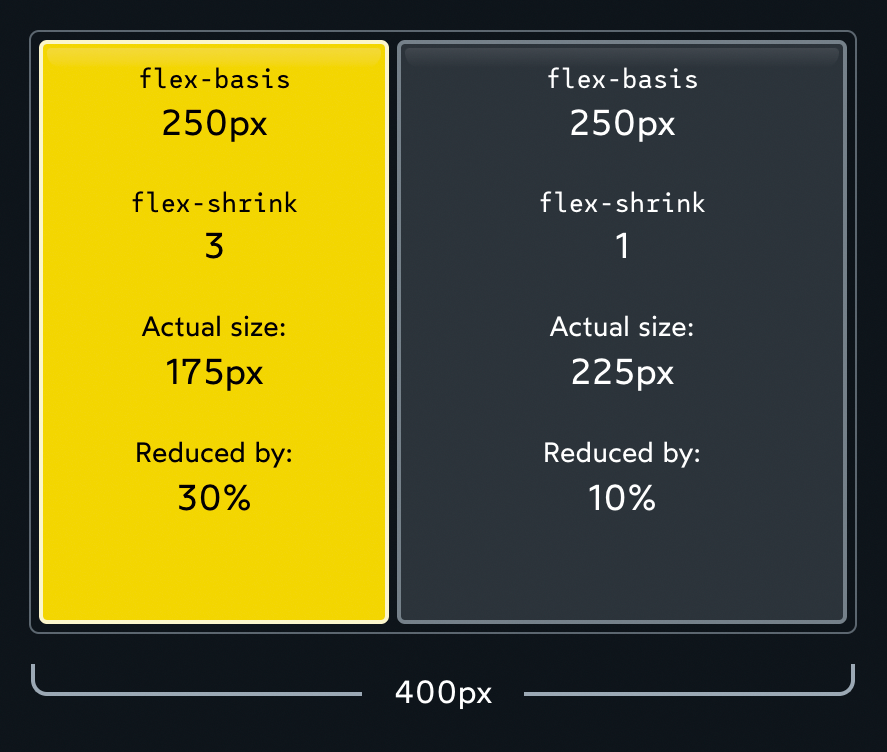
We have a total deficit of 100px. Normally, each child would pay ½, but because we’ve tinkered with flex-shrink, the first element winds up paying ¾ (75px), and the second element pays ¼ (25px).
Note that the absolute values don’t matter, it’s all about the ratio. If both children have flex-shrink: 1, each child will pay ½ of the total deficit. If both children are cranked up to flex-shrink: 1000, each child will pay 1000/2000 of the total deficit. Either way, it works out to the same thing.
I had an epiphany a while back about flex-shrink: we can think of it as the “inverse” of flex-grow. They’re two sides of the same coin:
-
flex-growcontrols how the extra space is distributed when the items are smaller than their container. -
flex-shrinkcontrols how space is removed when the items are bigger than their container.
This means that only one of these properties can be active at once. If there’s extra space, flex-shrink has no effect, since the items don’t need to shrink. And if the children are too big for their container, flex-grow has no effect, because there’s no extra space to divvy up.
I like to think of it as two separate realms. You’re either on Earth, or in the Upside Down?. Each world has its own rules.
Link to this heading
Preventing shrinking
Sometimes, we don’t want some of our Flex children to shrink.
I notice this all the time with SVG icons and shapes. Let’s look at a simplified example:
When the container gets narrow, our two circles get squashed into gross ovals. What if we want them to stay circular?
We can do this by setting flex-shrink: 0:
When we set flex-shrink to 0, we essentially “opt out” of the shrinking process altogether. The Flexbox algorithm will treat flex-basis (or width) as a hard minimum limit.
Here’s the full code for this demo, if you’re curious:
Flex Shrink ball demo
Link to this heading
The minimum size gotcha
There’s one more thing we need to talk about here, and it’s super important. It may be the single most helpful thing in this entire article!
Let’s suppose we’re building a fluid search form for an e-commerce store:
When the container shrinks below a certain point, the content overflows!
But why?? flex-shrink has a default value of 1, and we haven’t removed it, so the search input should be able to shrink as much as it needs to! Why is it refusing to shrink?
Here’s the deal: In addition to the hypothetical size, there’s another important size that the Flexbox algorithm cares about: the minimum size.
The Flexbox algorithm refuses to shrink a child below its minimum size. The content will overflow rather than shrink further, no matter how high we crank flex-shrink!
Text inputs have a default minimum size of 170px-200px (it varies between browsers). That’s the limitation we’re running into above.
In other cases, the limiting factor might be the element’s content. For example, try resizing this container:
For an element containing text, the minimum width is the length of the longest unbreakable string of characters.
Here’s the good news: We can redefine the minimum size with the min-width property.
By setting min-width: 0px directly on the Flex child, we tell the Flexbox algorithm to overwrite the “built-in” minimum width. Because we’ve set it to 0px, the element can shrink as much as necessary.
This same trick can work in Flex columns with the min-height property (although the problem doesn’t seem to come up as often).
One of the biggest Flexbox quality-of-life improvements in recent years has been the gap property:
gap allows us to create space in-between each Flex child. This is great for things like navigation headers:
gap is a relatively new addition to the Flexbox language, but it’s been implemented across all modern browsers since early 2021.
Link to this heading
Auto margins
There’s one other spacing-related trick I want to share. It’s been around since the early days of Flexbox, but it’s relatively obscure, and it blew my mind when I first discovered it.
The margin property is used to add space around a specific element. In some layout modes, like Flow and Positioned, it can even be used to center an element, with margin: auto.
Auto margins are much more interesting in Flexbox:
Earlier, we saw how the flex-grow property can gobble up any extra space, applying it to a child.
Auto margins will gobble up the extra space, and apply it to the element’s margin. It gives us precise control over where to distribute the extra space.
A common header layout features the logo on one side, and some navigation links on the other side. Here’s how we can build this layout using auto margins:
Code Playground
The Corpatech logo is the first list item in the list. By giving it margin-right: auto, we gather up all of the extra space, and force it between the 1st and 2nd item.
We can see what’s going on here using the browser devtools:
There are lots of other ways we could have solved this problem: we could have grouped the navigation links in their own Flex container, or we could have grown the first list item with flex-grow. But personally, I love the auto-margins solution. We’re treating the extra space as a resource, and deciding exactly where it should go.
Phew! We’ve covered a lot of stuff so far. There’s just one more big takeaway I want to share.
So far, all of our items have sat side-by-side, in a single row/column. The flex-wrap property allows us to change that.
Check it out:
Most of the time when we work in two dimensions, we’ll want to use CSS Grid, but Flexbox + flex-wrap definitely has its uses! This particular example showcases the “deconstructed pancake” layout, where 3 items stack into an inverted pyramid on mid-sized screens.
When we set flex-wrap: wrap, items won’t shrink below their hypothetical size. At least, not when wrapping onto the next row/column is an option!
But wait! What about our kebab / cocktail weenie metaphor??
With flex-wrap: wrap, we no longer have a single primary axis line that can skewer each item. Effectively, each row acts as its own mini flex container. Instead of 1 big skewer, each row gets its own skewer:

All of the rules we’ve learned so far continue to apply, within this reduced scope. justify-content, for example, will distribute the two pieces on each stick.
But hmm… How does align-items work, now that we have multiple rows? The cross axis could intersect multiple items now!
Take a moment to consider. What do you think will happen when we change this property? Once you have your answer (or at least an idea), see if it’s right:
Each row is its own mini Flexbox environment. align-items will move each item up or down within the invisible box that wraps around each row.
But what if we want to align the rows themselves? We can do that with the align-content property:
To summarize what’s happening here:
-
flex-wrap: wrapgives us two rows of stuff. -
Within each row,
align-itemslets us slide each individual child up or down -
Zooming out, however, we have these two rows within a single Flex context! The cross axis will now intersect two rows, not one. And so, we can’t move the rows individually, we need to distribute them as a group.
-
Using our definitions from above, we’re dealing with content, not items. But we’re also still talking about the cross axis! And so the property we want is
align-content.
Link to this heading
You made it!
So I want to acknowledge something: this has been a dense tutorial. We’ve gone way down the rabbit hole, and unless you’re already a Flexbox pro, I expect your head is spinning a bit. 😅
Like so much in CSS, Flexbox might seem simple when you first get started, but the complexity ramps up quickly when you get beyond the basics.
As a result, so many of us hit an early plateau with CSS. We know enough to get things done, but it’s a constant struggle. The language feels rickety and unpredictable, like an ancient rope bridge that could give out at any second. When it snaps, we hurl random StackOverflow snippets at the problem, hoping something will help.
It’s no fun. And that sucks, since CSS is a pretty big part of most front-end dev jobs!
The thing is, CSS is actually a deeply robust and consistent language. The problem is that most of our mental models are incomplete and inaccurate. When we take the time to build a proper intuition for the language, things start to click, and CSS becomes an absolute joy to use. ✨
Last year, I released a comprehensive course called CSS for JavaScript Developers.

The course is “multi-modality”, meaning that it uses lots of different forms of media. I built my own course platform from scratch, so that it supports:
-
Interactive articles (like this blog post!)
-
Videos (170+ short videos)
-
Exercises
-
Real-world-inspired projects
-
Mini-games
If you found this blog post helpful, you’ll love the course. It follows a similar approach, but for the entire CSS language, and with exercises and projects to make sure you’re actually developing new skills.
It’s specifically built for folks who use a JS framework like React/Angular/Vue. 80% of the course focuses on CSS fundamentals, but we also see how to integrate those fundamentals into a modern JS application, how to structure our CSS, stuff like that.
If you struggle with CSS, I hope you’ll check it out. Gaining confidence with CSS is game-changing, especially if you’re already comfortable with HTML and JS. When you complete the holy trinity, it becomes so much easier to stay in flow, to truly enjoy developing web applications.
Link to this heading
Bonus: Unpacking the demo
At the start of this tutorial, we saw the following “4 layouts for the price of 1” demo:
Now that we’ve learned all about the Flexbox algorithm, can you figure out how this works? Feel free to experiment with the code here:
Code Playground
Let’s walk through how this works:
Thanks so much for reading! This blog post was a ton of work, and I’m thrilled to have it out in the world! I hope you found it useful. 💖
Last Updated
February 20th, 2023