Introduction
Welcome! I wrote this book to help you quickly learn HTML and get familiar with the advanced HTML topics.
HTML, a shorthand for Hyper Text Markup Language, is one of the most fundamental building blocks of the Web.
HTML was officially born in 1993 and since then it evolved into its current state, moving from simple text documents to powering rich Web Applications.
This handbook is aimed at a vast audience.
First, the beginner. I explain HTML from zero in a succinct but comprehensive way, so you can use this book to learn HTML from the basics.
Then, the professional. HTML is often considered like a secondary thing to learn. It might be given for granted.
Yet lots of things are obscure to many people. Me included. I wrote this handbook to help my understanding of the topic, because when I need to explain something, I better make sure I first know the thing inside out.
Even if you don’t write HTML in your day to day work, knowing how HTML works can help save you some headaches when you need to understand it from time to time, for example while tweaking a web page.
You can reach me on Twitter @flaviocopes.
My website is flaviocopes.com.
Note: you can download a PDF / ePub / Mobi version of this book so you can read it offline.
Book Index
- Preface
- HTML Basics
- The document heading
- The document body
- Tags that interact with text
- Links
- Container tags and page structure HTML
- Forms
- Tables
- Multimedia tags: audio and video
- iframes
- Images
- Accessibility
PREFACE
HTML is the foundation of the marvel called the Web.
There is an incredible power underneath this rather simple and limited set of rules, which lets us — developers, makers, designers, writers, and tinkerers — craft documents, apps, and experiences for people all around the globe.
My first HTML book came out in 1997 and was called «HTML Unleashed». A big, lots-of-pages, long tome.
20+ years have passed, and HTML is still the foundation of the Web, with minimal changes from back then.
Sure, we got more semantic tags, presentational HTML is no longer a thing, and CSS has taken care of the design of things.
HTML’s success is based on one thing: simplicity.
It resisted being hijacked into an XML dialect via XHTML, when eventually people realized that thing was way, way too complex.
It did so because of another feature it provides us: forgiveness. There are some rules, right, but after you learn those, you have a lot of freedom.
Browsers learned to be resilient and to always try to do their best when parsing and presenting HTML to the users.
And the whole Web platform did one thing right: it never broke backward compatibility. Pretty incredibly, we can go back to HTML documents written in 1991, and they look pretty much as they looked back then.
We even know what the first web page was. It’s this: http://info.cern.ch/hypertext/WWW/TheProject.html
And you can see the source of the page, thanks to another big feature of the Web and HTML: we can inspect the HTML of any web page.
Don’t take this for granted. I don’t know any other platform that gives us this ability.
The exceptional Developer Tools built into any browser let us inspect and take inspiration from HTML written by anyone in the world.
If you are new to HTML this book aims to help you get started. If you are a seasoned Web Developer this book will improve your knowledge.
I learned so much while writing it, even though I’ve been working with the Web for 20+ years, and I’m sure you’ll find something new, too.
Or you’ll re-learn something old you forgot.
In any case, the goal of the book is to be useful to you, and I hope it succeeds.
HTML BASICS
HTML is a standard defined by the WHATWG, an acronym for Web Hypertext Application Technology Working Group, an organization formed by people working on the most popular web browser. This means it’s basically controlled by Google, Mozilla, Apple and Microsoft.
In the past the W3C (World Wide Web Consortium) was the organization in charge of creating the HTML standard.
The control informally moved from W3C to WHATWG when it became clear that the W3C push towards XHTML was not a good idea.
If you’ve never heard of XHTML, here’s a short story. In the early 2000s, we all believed the future of the Web was XML (seriously). So HTML moved from being an SGML-based authoring language to an XML markup language.
It was a big change. We had to know, and respect, more rules. Stricter rules.
Eventually browser vendors realized this was not the right path for the Web, and they pushed back, creating what is now known as HTML5.
W3C did not really agree on giving up control of HTML, and for years we had 2 competing standards, each one aiming to be the official one. Eventually on 28 May 2019 it was made official by W3C that the «true» HTML version was the one published by WHATWG.
I mentioned HTML5. Let me explain this little story. I know, it’s kind of confusing up to now, as with many things in life when many actors are involved, yet it’s also fascinating.
We had HTML version 1 in 1993. Here’s the original RFC.
HTML 2 followed in 1995.
We got HTML 3 in January 1997, and HTML 4 in December 1997.
Busy times!
20+ years went by, we had this entire XHTML thing, and eventually we got to this HTML5 «thing», which is not really just HTML any more.
HTML5 is a term that now defines a whole set of technologies, which includes HTML but adds a lot of APIs and standards like WebGL, SVG and more.
The key thing to understand here is this: there is no such thing (any more) as an HTML version now. It’s a living standard. Like CSS, which is called «3», but in reality is a bunch of independent modules developed separately. Like JavaScript, where we have one new edition each year, but nowadays, the only thing that matters is which individual features are implemented by the engine.
Yes we call it HTML5, but HTML4 is from 1997. That’s a long time for anything, let alone for the web.
This is where the standard now «lives»: https://html.spec.whatwg.org/multipage.
HTML is the markup language we use to structure content that we consume on the Web.
HTML is served to the browser in different ways.
- It can be generated by a server-side application that builds it depending on the request or the session data, for example a Rails or Laravel or Django application.
- It can be generated by a JavaScript client-side application that generates HTML on the fly.
- In the simplest case, it can be stored in a file and served to the browser by a Web server.
Let’s dive into this last case. Although in practice it’s probably the least popular way to generate HTML, it’s still essential to know the basic building blocks.
By convention, an HTML file is saved with a .html or .htm extension.
Inside this file, we organize the content using tags.
Tags wrap the content, and each tag gives a special meaning to the text it wraps.
Let’s make a few examples.
This HTML snippet creates a paragraph using the p tag:
<p>A paragraph of text</p>
This HTML snippet creates a list of items using the ul tag, which means unordered list, and the litags, which mean list item:
<ul>
  <li>First item</li>
  <li>Second item</li>
  <li>Third item</li>
</ul>
When an HTML page is served by the browser, the tags are interpreted, and the browser renders the elements according to the rules that define their visual appearance.
Some of those rules are built-in, such as how a list renders or how a link is underlined in blue.
Some other rules are set by you with CSS.
HTML is not presentational. It’s not concerned with how things look. Instead, it’s concerned with what things mean.
It’s up to the browser to determine how things look, with the directives defined by who builds the page, with the CSS language.
Now, those two examples I made are HTML snippets taken outside of a page context.
HTML page structure
Let’s make an example of a proper HTML page.
Things start with the Document Type Declaration (aka doctype), a way to tell the browser this is an HTML page, and which version of HTML we are using.
Modern HTML uses this doctype:
<!DOCTYPE html>
Then we have the html element, which has an opening and closing tag:
<!DOCTYPE html>
<html>
...
</html>
Most tags come in pairs with an opening tag and a closing tag. The closing tag is written the same as the opening tag, but with a /:
<sometag>some content</sometag>
There are a few self-closing tags, which means they don’t need a separate closing tag as they don’t contain anything in them.
The html starting tag is used at the beginning of the document, right after the document type declaration.
The html ending tag is the last thing present in an HTML document.
Inside the html element we have 2 elements: head and body:
<!DOCTYPE html>
<html>
    <head>
    ...
    </head>
    <body>
    ...
    </body>
</html>
Inside head we will have tags that are essential to creating a web page, like the title, the metadata, and internal or external CSS and JavaScript. Mostly things that do not directly appear on the page, but only help the browser (or bots like the Google search bot) display it properly.
Inside body we will have the content of the page. The visible stuff.
Tags vs elements
I mentioned tags and elements. What’s the difference?
Elements have a starting tag and a closing tag. In this example, we use the p starting and closing tags to create a p element:
<p>A paragraph of text</p>
So, an element constitutes the whole package:
- starting tag
- text content (and possibly other elements)
- closing tag
If an element has doesn’t have a closing tag, it is only written with the starting tag, and it cannot contain any text content.
That said, I might use the tag or element term in the book meaning the same thing, except if I explicitly mention starting tag or ending tag.
Attributes
The starting tag of an element can have special snippets of information we can attach, called attributes.
Attributes have the key="value" syntax:
<p class="a-class">A paragraph of text</p>
You can also use single quotes, but using double quotes in HTML is a nice convention.
We can have many of them:
<p class="a-class" id="an-id">A paragraph of text</p>
and some attributes are boolean, meaning you only need the key:
<script defer src="file.js"></script>
The class and id attributes are two of the most common you will find used.
They have a special meaning, and they are useful both in CSS and JavaScript.
The difference between the two is that an id is unique in the context of a web page; it cannot be duplicated.
Classes, on the other hand, can appear multiple times on multiple elements.
Plus, an id is just one value. class can hold multiple values, separated by a space:
<p class="a-class another-class">A paragraph of text</p>
It’s common to use the dash - to separate words in a class value, but it’s just a convention.
Those are just two of the possible attributes you can have. Some attributes are only used for one tag. They are highly specialized.
Other attributes can be used in a more general way. You just saw id and class, but we have other ones too, like style which can be used to insert inline CSS rules on an element.
Case insensitive
HTML is case insensitive. Tags can be written in all caps, or lowercase. In the early days, caps were the norm. Today lowercase is the norm. It is a convention.
You usually write like this:
<p>A paragraph of text</p>
not like this:
<P>A paragraph of text</P>
White space
Pretty important. In HTML, even if you add multiple white spaces into a line, it’s collapsed by the browser’s CSS engine.
For example the rendering of this paragraph:
<p>A paragraph of text</p>
is the same as this:
<p> A paragraph of text</p>
and the same as this:
<p>A paragraph

of
           text          </p>
> Using the white-space CSS property you can change how things behave. You can find more information on how CSS processes white space in the CSS Spec
I typically favor
<p>A paragraph of text</p>
or
<p>
    A paragraph of text
</p>
Nested tags should be indented with 2 or 4 characters, depending on your preference:
<body>
    <p>
        A paragraph of text
    </p>
    <ul>
        <li>A list item</li>
    </ul>
</body>
Note: this «white space is not relevant» feature means that if you want to add additional space, it can make you pretty mad. I suggest you use CSS to make more space when needed.
Note: in special cases, you can use the HTML entity (an acronym that means non-breaking space) — more on HTML entities later on. I think this should not be abused. CSS is always preferred to alter the visual presentation.
THE DOCUMENT HEADING
The head tag contains special tags that define the document properties.
It’s always written before the body tag, right after the opening html tag:
<!DOCTYPE html>
<html>
    <head>
        ...
    </head>
    ...
</html>
We never use attributes on this tag. And we don’t write content in it.
It’s just a container for other tags. Inside it we can have a wide variety of tags, depending on what you need to do:
titlescriptnoscriptlinkstylebasemeta
The title tag
The title tag determines the page title. The title is displayed in the browser, and it’s especially important as it’s one of the key factors for Search Engine Optimization (SEO).
The script tag
This tag is used to add JavaScript into the page.
You can include it inline, using an opening tag, the JavaScript code and then the closing tag:
<script>
..some JS
</script>
Or you can load an external JavaScript file by using the src attribute:
<script src="file.js"></script>
The type attribute by default is set to text/javascript, so it’s completely optional.
There is something pretty important to know about this tag.
Sometimes this tag is used at the bottom of the page, just before the closing </body> tag. Why? For performance reasons.
Loading scripts by default blocks the rendering of the page until the script is parsed and loaded.
By putting it at the bottom of the page, the script is loaded and executed after the whole page is already parsed and loaded, giving a better experience to the user over keeping it in the head tag.
My opinion is that this is now bad practice. Let script live in the head tag.
In modern JavaScript we have an alternative this is more performant than keeping the script at the bottom of the page — the defer attribute. This is an example that loads a file.js file, relative to the current URL:
<script defer src="file.js"></script>
This is the scenario that triggers the faster path to a fast-loading page, and fast-loading JavaScript.
Note: the async attribute is similar, but in my opinion a worse option than defer. I describe why, in more detail, on page https://flaviocopes.com/javascript-async-defer/
The noscript tag
This tag is used to detect when scripts are disabled in the browser.
Note: users can choose to disable JavaScript scripts in the browser settings. Or the browser might not support them by default.
It is used differently depending on whether it’s put in the document head or in the document body.
We’re talking about the document head now, so let’s first introduce this usage.
In this case, the noscript tag can only contain other tags:
linktagsstyletagsmetatags
to alter the resources served by the page, or the meta information, if scripts are disabled.
In this example I set an element with the no-script-alert class to display if scripts are disabled, as it was display: none by default:
<!DOCTYPE html>
<html>
    <head>
        ...
        <noscript>
            <style>
                .no-script-alert {
                    display: block;
                }
            </style>
        </noscript>

        ...
    </head>
    ...
</html>
Let’s solve the other case: if put in the body, it can contain content, like paragraphs and other tags, which are rendered in the UI.
The link tag
The link tag is used to set relationships between a document and other resources.
It’s mainly used to link an external CSS file to be loaded.
This element has no closing tag.
Usage:
<!DOCTYPE html>
<html>
    <head>
        ...
        <link href="file.css" rel="stylesheet">
        ...
    </head>
    ...
</html>
The media attribute allows the loading of different stylesheets depending on the device capabilities:
<link href="file.css" media="screen" rel="stylesheet">
<link href="print.css" media="print" rel="stylesheet">
We can also link to resources other than stylesheets.
For example we can associate an RSS feed using
<link rel="alternate" type="application/rss+xml" href="/index.xml">
Or we can associate a favicon using:
<link rel="apple-touch-icon" sizes="180x180" href="/assets/apple-touch-icon.png">

<link rel="icon" type="image/png" sizes="32x32" href="/assets/favicon-32x32.png">

<link rel="icon" type="image/png" sizes="16x16" href="/assets/favicon-16x16.png">
This tag was also used for multi-page content, to indicate the previous and next page using rel="prev" and rel="next". Mostly for Google. As of 2019, Google announced it does not use this tag any more because it can find the correct page structure without it.
The style tag
This tag can be used to add styles into the document, rather than loading an external stylesheet.
Usage:
<style>
.some-css {}
</style>
As with the link tag, you can use the media attribute to use that CSS only on the specified medium:
<style media="print">
.some-css {}
</style>
The base tag
This tag is used to set a base URL for all relative URLs contained in the page.
<!DOCTYPE html>
<html>
    <head>
        ...
        <base href="https://flaviocopes.com/">
        ...
    </head>
    ...
</html>
The meta tag
Meta tags perform a variety of tasks and they are very, very important.
Especially for SEO.
meta elements only have the starting tag.
The most basic one is the description meta tag:
<meta name="description" content="A nice page">
This might be used by Google to generate the page description in its result pages, if it finds it better describes the page than the on-page content (don’t ask me how).
The charset meta tag is used to set the page character encoding. utf-8 in most cases:
<meta charset="utf-8">
The robots meta tag instructs the Search Engine bots whether to index a page or not:
<meta name="robots" content="noindex">
Or if they should follow links or not:
<meta name="robots" content="nofollow">
You can set nofollow on individual links, too. This is how you can set nofollow globally.
You can combine them:
<meta name="robots" content="noindex, nofollow">
The default behavior is index, follow.
You can use other properties, including nosnippet, noarchive, noimageindex and more.
You can also just tell Google instead of targeting all search engines:
<meta name="googlebot" content="noindex, nofollow">
And other search engines might have their own meta tag, too.
Speaking of which, we can tell Google to disable some features. This prevents the translate functionality in the search engine results:
<meta name="google" content="notranslate">
The viewport meta tag is used to tell the browser to set the page width based on the device width.
<meta name="viewport" content="width=device-width, initial-scale=1">
See more about this tag.
Another rather popular meta tag is the http-equiv="refresh" one. This line tells the browser to wait 3 seconds, then redirect to that other page:
<meta http-equiv="refresh" content="3;url=http://flaviocopes.com/another-page">
Using 0 instead of 3 will redirect as soon as possible.
This is not a full reference; Other less-used meta tags exist.
After this document heading introduction, we can start diving into the document body.
THE DOCUMENT BODY
After the closing head tag, we can only have one thing in an HTML document: the body element.
<!DOCTYPE html>
<html>
    <head>
        ...
    </head>
    <body>
        ...
    </body>
</html>
Just like the head and html tags, we can only have one body tag in one page.
Inside the body tag we have all the tags that define the content of the page.
Technically, the start and ending tags are optional. But I consider it a good practice to add them. Just for clarity.
In the next chapters we’ll define the variety of tags you can use inside the page body.
But before, we must introduce a difference between block elements and inline elements.
Block elements vs inline elements
Visual elements, the ones defined in the page body, can be generally classified in 2 categories:
- block elements (
p,div, heading elements, lists and list items, …) - inline elements (
a,span,img, …)
What is the difference?
Block elements, when positioned in the page, do not allow other elements next to them. To the left, or to the right.
Inline elements instead can sit next to other inline elements.
The difference also lies in the visual properties we can edit using CSS. We can alter the width/height, margin, padding and border of block elements. We can’t do that for inline elements.
Note that using CSS we can change the default for each element, setting a p tag to be inline, for example, or a span to be a block element.
Another difference is that inline elements can be contained in block elements. The reverse is not true.
Some block elements can contain other block elements, but it depends. The p tag for example does not allow such option.
TAGS THAT INTERACT WITH TEXT
The p tag
This tag defines a paragraph of text.
<p>Some text</p>
It’s a block element.
Inside it, we can add any inline element we like, like span or a.
We cannot add block elements.
We cannot nest a p element into another one.
By default browsers style a paragraph with a margin on top and at the bottom. 16px in Chrome, but the exact value might vary between browsers.
This causes two consecutive paragraphs to be spaced, replicating what we think of a «paragraph» in printed text.
The span tag
This is an inline tag that can be used to create a section in a paragraph that can be targeted using CSS:
<p>A part of the text <span>and here another part</span></p>
The br tag
This tag represents a line break. It’s an inline element, and does not need a closing tag.
We use it to create a new line inside a p tag, without creating a new paragraph.
And compared to creating a new paragraph, it does not add additional spacing.
<p>Some text<br>A new line</p>
HTML provides us 6 heading tags. From most important to least important, we have h1, h2, h3, h4, h5, h6.
Typically a page will have one h1 element, which is the page title. Then you might have one or more h2 elements depending on the page content.
Headings, especially the heading organization, are also essential for SEO, and search engines use them in various ways.
The browser by default will render the h1 tag bigger, and will make the elements size smaller as the number near h increases:
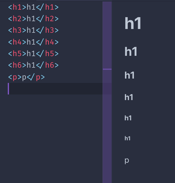
All headings are block elements. They cannot contain other elements, just text.
The strong tag
This tag is used to mark the text inside it as strong. This is pretty important, it’s not a visual hint, but a semantic hint. Depending on the medium used, its interpretation will vary.
Browsers by default make the text in this tag bold.
The em tag
This tag is used to mark the text inside it as emphasized. Like with strong, it’s not a visual hint but a semantic hint.
Browsers by default make the text in this italic.
Quotes
The blockquote HTML tag is useful to insert citations in the text.
Browsers by default apply a margin to the blockquote element. Chrome applies a 40px left and right margin, and a 10px top and bottom margin.
The q HTML tag is used for inline quotes.
Horizontal line
Not really based on text, but the hr tag is often used inside a page. It means horizontal rule, and it adds a horizontal line in the page.
Useful to separate sections in the page.
Code blocks
The code tag is especially useful to show code, because browsers give it a monospaced font.
That’s typically the only thing that browsers do. This is the CSS applied by Chrome:
code {
    font-family: monospace;
}
This tag is typically wrapped in a pre tag, because the code element ignores whitespace and line breaks. Like the p tag.
Chrome gives pre this default styling:
pre {
    display: block;
    font-family: monospace;
    white-space: pre;
    margin: 1em 0px;
}
which prevents white space collapsing and makes it a block element.
Lists
We have 3 types of lists:
- unordered lists
- ordered lists
- definition lists
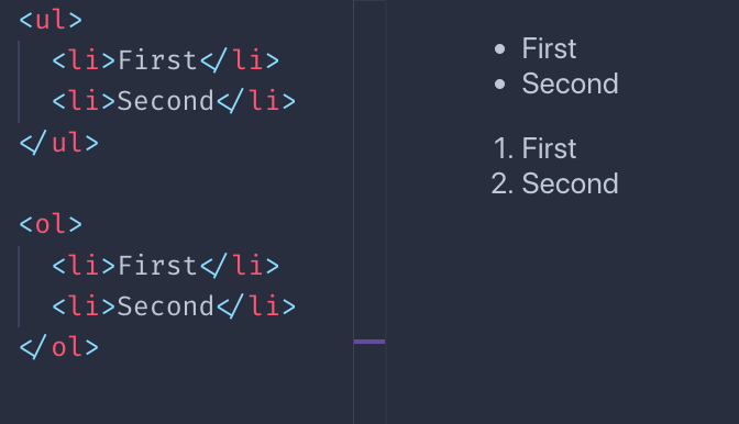
Unordered lists are created using the ul tag. Each item in the list is created with the li tag:
<ul>
    <li>First</li>
    <li>Second</li>
</ul>
Ordered lists are similar, just made with the ol tag:
<ol>
    <li>First</li>
    <li>Second</li>
</ol>
The difference between the two is that ordered lists have a number before each item:
Definition lists are a bit different. You have a term, and its definition:
<dl>
    <dt>Flavio</dt>
    <dd>The name</dd>
    <dt>Copes</dt>
    <dd>The surname</dd>
</dl>
This is how browsers typically render them:
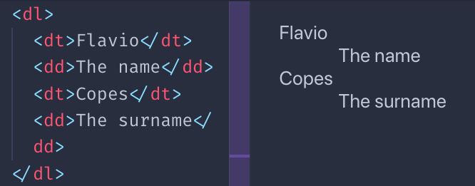
I must say you rarely see them in the wild, for sure not much as ul and ol, but sometimes they might be useful.
Other text tags
There is a number of tags with presentational purposes:
- the
marktag - the
instag - the
deltag - the
suptag - the
subtag - the
smalltag - the
itag - the
btag
This is an example of the visual rendering of them which is applied by default by browsers:
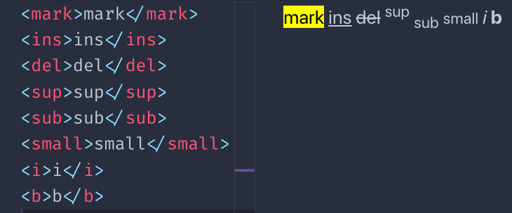
You might wonder, how is b different than strong? And how i is different than em?
The difference lies in the semantic meaning. While b and i are a direct hint at the browser to make a piece of text bold or italic, strong and em give the text a special meaning, and it’s up to the browser to give the styling. Which happens to be exactly the same as b and i, by default. Although you can change that using CSS.
There are a number of other, less used tags related to text. I just mentioned the ones that I see used the most.
LINKS
Links are defined using the a tag. The link destination is set via its href attribute.
Example:
<a href="https://flaviocopes.com">click here</a>
Between the starting and closing tag we have the link text.
The above example is an absolute URL. Links also work with relative URLs:
<a href="/test">click here</a>
In this case, when clicking the link the user is moved to the /test URL on the current origin.
Be careful with the / character. If omitted, instead of starting from the origin, the browser will just add the test string to the current URL.
Example, I’m on the page https://flaviocopes.com/axios/ and I have these links:
/testonce clicked brings me tohttps://flaviocopes.com/testtestonce clicked brings me tohttps://flaviocopes.com/axios/test
Link tags can include other things inside them, not just text. For example, images:
<a href="https://flaviocopes.com">
    <img src="test.jpg">
</a>
or any other elements, except other <a> tags.
If you want to open the link in a new tab, you can use the target attribute:
<a href="https://flaviocopes.com" target="_blank">open in new tab</a>
CONTAINER TAGS AND PAGE STRUCTURE HTML
HTML provides a set of container tags. Those tags can contain an unspecified set of other tags.
We have:
articlesectiondiv
and it can be confusing to understand the difference between them.
Let’s see when to use each one of them.
article
The article tag identifies a thing that can be independent from other things in a page.
For example a list of blog posts in the homepage.
Or a list of links.
<div>
    <article>
        <h2>A blog post</h2>
        <a ...>Read more</a>
    </article>
    <article>
        <h2>Another blog post</h2>
        <a ...>Read more</a>
    </article>
</div>
We’re not limited to lists: an article can be the main element in a page.
<article>
    <h2>A blog post</h2>
    <p>Here is the content...</p>
</article>
Inside an article tag we should have a title (h1—h6) and
section
Represents a section of a document. Each section has a heading tag (h1—h6), then the section body.
Example:
<section>
    <h2>A section of the page</h2>
    <p>...</p>
    <img ...>
</section>
It’s useful to break a long article into different sections.
Shouldn’t be used as a generic container element. div is made for this.
div
div is the generic container element:
<div>
    ...
</div>
You often add a class or id attribute to this element, to allow it to be styled using CSS.
We use div in any place where we need a container but the existing tags are not suited.
nav
This tag is used to create the markup that defines the page navigation. Into this we typically add an ulor ol list:
<nav>
    <ol>
        <li><a href="/">Home</a></li>
        <li><a href="/blog">Blog</a></li>
    </ol>
</nav>
aside
The aside tag is used to add a piece of content that is related to the main content.
A box where to add a quote, for example. Or a sidebar.
Example:
<div>
  <p>some text..</p>
  <aside>
    <p>A quote..</p>
  </aside>
  <p>other text...</p>
</div>
Using aside is a signal that the things it contains are not part of the regular flow of the section it lives into.
The header tag represents a part of the page that is the introduction. It can for example contain one or more heading tag (h1—h6), the tagline for the article, an image.
<article>
  <header>
      <h1>Article title</h1>
  </header>
  ...
</div>
main
The main tag represents the main part of a page:
<body>
  ....
  <main>
    <p>....</p>
  </main>
</body>
The footer tag is used to determine the footer of an article, or the footer of the page:
<article>
 ....
  <footer>
    <p>Footer notes..</p>
  </footer>
</div>
FORMS
Forms are the way you can interact with a page, or an app, built with Web technologies.
You have a set of controls, and when you submit the form, either with a click to a «submit» button or programmatically, the browser will send the data to the server.
By default this data sending causes the page to reload after the data is sent, but using JavaScript you can alter this behavior (not going to explain how in this book).
A form is created using the form tag:
<form>
    ...
</form>
By default forms are submitted using the GET HTTP method. Which has its drawbacks, and usually you want to use POST.
You can set the form to use POST when submitted by using the method attribute:
<form method="POST">
    ...
</form>
The form is submitted, either using GET or POST, to the same URL where it resides.
So if the form is in the https://flaviocopes.com/contacts page, pressing the «submit» button will make a request to that same URL.
Which might result in nothing happening.
You need something server-side to handle the request, and typically you «listen» for those form submit events on a dedicated URL.
You can specify the URL via the action parameter:
<form action="/new-contact" method="POST">
    ...
</form>
This will cause the browser to submit the form data using POST to the /new-contact URL on the same origin.
If the origin (protocol + domain + port) is https://flaviocopes.com (port 80 is the default), this means the form data will be sent to https://flaviocopes.com/new-contact.
I talked about data. Which data?
Data is provided by users via the set of controls that are available on the Web platform:
- input boxes (single line text)
- text areas (multiline text)
- select boxes (choose one option from a drop-down menu)
- radio buttons (choose one option from a list always visible)
- checkboxes (choose zero, one or more option)
- file uploads
- and more!
Let’s introduce each one of them in the following form fields overview.
The input tag
The input field is one of the most widely used form elements. It’s also a very versatile element, and it can completely change behavior based on the type attribute.
The default behavior is to be a single-line text input control:
<input>
Equivalent to using:
<input type="text">
As with all the other fields that follow, you need to give the field a name in order for its content to be sent to the server when the form is submitted:
<input type="text" name="username">
The placeholder attribute is used to have some text showing up, in light gray, when the field is empty. Useful to add a hint to the user for what to type in:
<input type="text" name="username" placeholder="Your username">
Using type="email" will validate client-side (in the browser) an email for correctness (semantic correctness, not ensuring the email address is existing) before submitting.
<input type="email" name="email" placeholder="Your email">
Password
Using type="password" will make every key entered appear as an asterisk (*) or dot, useful for fields that host a password.
<input type="password" name="password" placeholder="Your password">
Numbers
You can have an input element accept only numbers:
<input type="number" name="age" placeholder="Your age">
You can specify a minimum and maximum value accepted:
<input type="number" name="age" placeholder="Your age" min="18" max="110">
The step attribute helps identify the steps between different values. For example this accepts a value between 10 and 50, at steps of 5:
<input type="number" name="a-number" min="10" max="50" step="5">
Hidden field
Fields can be hidden from the user. They will still be sent to the server upon the form submit:
<input type="hidden" name="some-hidden-field" value="some-value">
This is commonly used to store values like a CSRF token, used for security and user identification, or even to detect robots sending spam, using special techniques.
It can also just be used to identify a form and its action.
Setting a default value
All those fields accept a predefined value. If the user does not change it, this will be the value sent to the server:
<input type="number" name="age" value="18">
If you set a placeholder, that value will appear if the user clears the input field value:
<input type="number" name="age" placeholder="Your age" value="18">
Form submit
The type="submit" field is a button that, once pressed by the user, submits the form:
<input type="submit">
The value attribute sets the text on the button, which if missing shows the «Submit» text:
<input type="submit" value="Click me">
Form validation
Browsers provide client-side validation functionality to forms.
You can set fields as required, ensuring they are filled, and enforce a specific format for the input of each field.
Let’s see both options.
Set fields as required
The required attribute helps you with validation. If the field is not set, client-side validation fails and the browser does not submit the form:
<input type="text" name="username" required>
Enforce a specific format
I described the type="email" field above. It automatically validates the email address according to a format set in the specification.
In the type="number" field, I mentioned the min and max attribute to limit values entered to an interval.
You can do more.
You can enforce a specific format on any field.
The pattern attribute gives you the ability to set a regular expression to validate the value against.
I recommend reading my Regular Expressions Guide at flaviocopes.com/javascript-regular-expressions/.
pattern=»https://.*»
<input type="text" name="username" pattern="[a-zA-Z]{8}">
Other fields
File uploads
You can load files from your local computer and send them to the server using a type="file" input element:
<input type="file" name="secret-documents">
You can attach multiple files:
<input type="file" name="secret-documents" multiple>
You can specify one or more file types allowed using the accept attribute. This accepts images:
<input type="file" name="secret-documents" accept="image/*">
You can use a specific MIME type, like application/json or set a file extension like .pdf. Or set multiple file extensions, like this:
<input type="file" name="secret-documents" accept=".jpg, .jpeg, .png">
Buttons
The type="button" input fields can be used to add additional buttons to the form, that are not submit buttons:
<input type="button" value="Click me">
They are used to programmatically do something, using JavaScript.
There is a special field rendered as a button, whose special action is to clear the entire form and bring back the state of the fields to the initial one:
<input type="reset">
Radio buttons
Radio buttons are used to create a set of choices, of which one is pressed and all the others are disabled.
The name comes from old car radios that had this kind of interface.
You define a set of type="radio" inputs, all with the same name attribute, and different valueattribute:
<input type="radio" name="color" value="yellow">
<input type="radio" name="color" value="red">
<input type="radio" name="color" value="blue">
Once the form is submitted, the color data property will have one single value.
There’s always one element checked. The first item is the one checked by default.
You can set the value that’s pre-selected using the checked attribute. You can use it only once per radio inputs group.
Checkboxes
Similar to radio boxes, but they allow multiple values to be chosen, or none at all.
You define a set of type="checkbox" inputs, all with the same name attribute, and different valueattribute:
<input type="checkbox" name="color" value="yellow">
<input type="checkbox" name="color" value="red">
<input type="checkbox" name="color" value="blue">
All those checkboxes will be unchecked by default. Use the checked attribute to enable them on page load.
Since this input field allows multiple values, upon form submit the value(s) will be sent to the server as an array.
Date and time
We have a few input types to accept date values.
The type="date" input field allows the user to enter a date, and shows a date picker if needed:
<input type="date" name="birthday">
The type="time" input field allows the user to enter a time, and shows a time picker if needed:
<input type="time" name="time-to-pickup">
The type="month" input field allows the user to enter a month and a year:
<input type="month" name="choose-release-month">
The type="week" input field allows the user to enter a week and a year:
<input type="week" name="choose-week">
All those fields allow to limit the range and the step between each value. I recommend checking MDN for the little details on their usage.
The type="datetime-local" field lets you choose a date and a time.
<input type="datetime-local" name="date-and-time">
Here is a page to test them all: https://codepen.io/flaviocopes/pen/ZdWQPm
Color picker
You can let users pick a color using the type="color" element:
<input type="color" name="car-color">
You set a default value using the value attribute:
<input type="color" name="car-color" value="#000000">
The browser will take care of showing a color picker to the user.
Range
This input element shows a slider element. People can use it to move from a starting value to an ending value:
<input type="range" name="age" min="0" max="100" value="30">
You can provide an optional step:
<input type="range" name="age" min="0" max="100" value="30" step="10">
Telephone
The type="tel" input field is used to enter a phone number:
<input type="tel" name="telephone-number">
The main selling point for using tel over text is on mobile, where the device can choose to show a numeric keyboard.
Specify a pattern attribute for additional validation:
<input type="tel" pattern="[0-9]{3}-[0-9]{8}" name="telephone-number">
URL
The type="url" field is used to enter a URL.
<input type="url" name="website">
You can validate it using the pattern attribute:
<input type="url" name="website" pattern="https://.*">
The textarea tag
The textarea element allows users to enter multi-line text. Compared to input, it requires an ending tag:
<textarea></textarea>
You can set the dimensions using CSS, but also using the rows and cols attributes:
<textarea rows="20" cols="10"></textarea>
As with the other form tags, the name attribute determines the name in the data sent to the server:
<textarea name="article"></textarea>
The select tag
This tag is used to create a drop-down menu.
The user can choose one of the options available.
Each option is created using the option tag. You add a name to the select, and a value to each option:
<select name="color">
    <option value="red">Red</option>
    <option value="yellow">Yellow</option>
</select>
You can set an option disabled:
<select name="color">
    <option value="red" disabled>Red</option>
    <option value="yellow">Yellow</option>
</select>
You can have one empty option:
<select name="color">
    <option value="">None</option>
    <option value="red">Red</option>
    <option value="yellow">Yellow</option>
</select>
Options can be grouped using the optgroup tag. Each option group has a label attribute:
<select name="color">
    <optgroup label="Primary">
        <option value="red">Red</option>
        <option value="yellow">Yellow</option>
        <option value="blue">Blue</option>
    </optgroup>
    <optgroup label="Others">
        <option value="green">Green</option>
        <option value="pink">Pink</option>
    </optgroup>
</select>
TABLES
In the early days of the web tables were a very important part of building layouts.
Later on they were replaced by CSS and its layout capabilities, and today we have powerful tools like CSS Flexbox and CSS Grid to build layouts. Tables are now used just for, guess what, building tables!
The table tag
You define a table using the table tag:
<table>

</table>
Inside the table we’ll define the data. We reason in terms of rows, which means we add rows into a table (not columns). We’ll define columns inside a row.
Rows
A row is added using the tr tag, and that’s the only thing we can add into a table element:
<table>
  <tr></tr>
  <tr></tr>
  <tr></tr>
</table>
This is a table with 3 rows.
The first row can take the role of the header.
Column headers
The table header contains the name of a column, typically in a bold font.
Think about an Excel / Google Sheets document. The top A-B-C-D... header.
We define the header using the th tag:
<table>
  <tr>
    <th>Column 1</th>
    <th>Column 2</th>
    <th>Column 3</th>
  </tr>
  <tr></tr>
  <tr></tr>
</table>
The table content
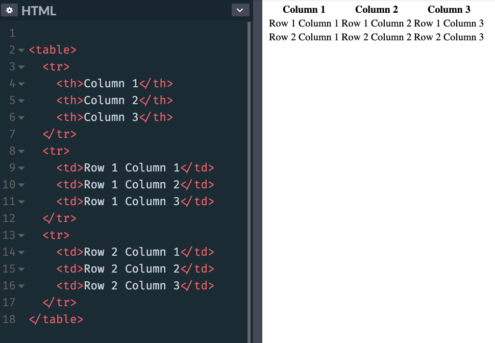
The content of the table is defined using td tags, inside the other tr elements:
<table>
  <tr>
    <th>Column 1</th>
    <th>Column 2</th>
    <th>Column 3</th>
  </tr>
  <tr>
    <td>Row 1 Column 1</td>
    <td>Row 1 Column 2</td>
    <td>Row 1 Column 3</td>
  </tr>
  <tr>
    <td>Row 2 Column 1</td>
    <td>Row 2 Column 2</td>
    <td>Row 2 Column 3</td>
  </tr>
</table>
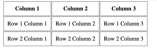
This is how browsers render it, if you don’t add any CSS styling:
Adding this CSS:
th, td {
  padding: 10px;
  border: 1px solid #333;
}
makes the table look more like a proper table:
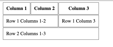
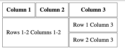
Span columns and rows
A row can decide to span over 2 or more columns, using the colspan attribute:
<table>
  <tr>
    <th>Column 1</th>
    <th>Column 2</th>
    <th>Column 3</th>
  </tr>
  <tr>
    <td colspan="2">Row 1 Columns 1-2</td>
    <td>Row 1 Column 3</td>
  </tr>
  <tr>
    <td colspan="3">Row 2 Columns 1-3</td>
  </tr>
</table>
Or it can span over 2 or more rows, using the rowspan attribute:
<table>
  <tr>
    <th>Column 1</th>
    <th>Column 2</th>
    <th>Column 3</th>
  </tr>
  <tr>
    <td colspan="2" rowspan="2">Rows 1-2 Columns 1-2</td>
    <td>Row 1 Column 3</td>
  </tr>
  <tr>
    <td>Row 2 Column 3</td>
  </tr>
</table>
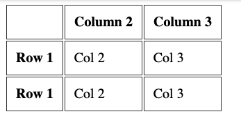
Row headings
Before I explained how you can have column headings, using the th tag inside the first tr tag of the table.
You can add a th tag as the first element inside a tr that’s not the first tr of the table, to have row headings:
<table>
  <tr>
    <th></th>
    <th>Column 2</th>
    <th>Column 3</th>
  </tr>
  <tr>
    <th>Row 1</th>
    <td>Col 2</td>
    <td>Col 3</td>
  </tr>
  <tr>
    <th>Row 2</th>
    <td>Col 2</td>
    <td>Col 3</td>
  </tr>
</table>
More tags to organize the table
You can add 3 more tags into a table, to have it more organized.
This is best when using big tables. And to properly define a header and a footer, too.
Those tags are
theadtbodytfoot
They wrap the tr tags to clearly define the different sections of the table. Here’s an example:
<table>
  <thead>
    <tr>
      <th></th>
      <th>Column 2</th>
      <th>Column 3</th>
    </tr>
  </thead>
  <tbody>
    <tr>
      <th>Row 1</th>
      <td>Col 2</td>
      <td>Col 3</td>
    </tr>
    <tr>
      <th>Row 2</th>
      <td>Col 2</td>
      <td>Col 3</td>
    </tr>
  </tbody>
  <tfoot>
    <tr>
      <td></td>
      <td>Footer of Col 1</td>
      <td>Footer of Col 2</td>
    </tr>
  </tfoot>
</table>
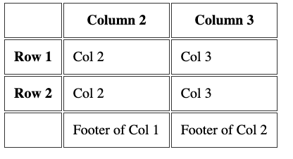
Table caption
A table should have a caption tag that describes its content. That tag should be put immediately after the opening table tag:
<table>
  <caption>Dogs age</caption>
  <tr>
    <th>Dog</th>
    <th>Age</th>
  </tr>
  <tr>
    <td>Roger</td>
    <td>7</td>
  </tr>
</table>
In this section I want to show you the audio and video tags.
The audio tag
This tag allows you to embed audio content in your HTML pages.
This element can stream audio, maybe using a microphone via getUserMedia(), or it can play an audio source which you reference using the src attribute:
<audio src="file.mp3">
By default the browser does not show any controls for this element. Which means the audio will play only if set to autoplay (more on this later) and the user can’t see how to stop it or control the volume or move through the track.
To show the built-in controls, you can add the controls attribute:
<audio src="file.mp3" controls>
Controls can have a custom skin.
You can specify the MIME type of the audio file using the type attribute. If not set, the browser will try to automatically determine it:
<audio src="file.mp3" controls type="audio/mpeg">
An audio file by default does not play automatically. Add the autoplay attribute to play the audio automatically:
<audio src="file.mp3" controls autoplay>
Note: mobile browsers don’t allow autoplay
The loop attribute restarts the audio playing at 0:00 if set; otherwise, if not present, the audio stops at the end of the file:
<audio src="file.mp3" controls autoplay loop>
You can also play an audio file muted using the muted attribute (not really sure what’s the usefulness of this):
<audio src="file.mp3" controls autoplay loop muted>
Using JavaScript you can listen for various events happening on an audio element, the most basic of which are:
playwhen the file starts playingpausewhen the audio playing was pausedplayingwhen the audio is resumed from a pauseendedwhen the end of the audio file was reached
The video tag
This tag allows you to embed video content in your HTML pages.
This element can stream video, using a webcam via getUserMedia() or WebRTC, or it can play a video source which you reference using the src attribute:
<video src="file.mp4">
By default the browser does not show any controls for this element, just the video.
Which means the video will play only if set to autoplay (more on this later) and the user can’t see how to stop it, pause it, control the volume or skip to a specific position in the video.
To show the built-in controls, you can add the controls attribute:
<video src="file.mp4" controls>
Controls can have a custom skin.
You can specify the MIME type of the video file using the type attribute. If not set, the browser will try to automatically determine it:
<video src="file.mp4" controls type="video/mp4">
A video file by default does not play automatically. Add the autoplay attribute to play the video automatically:
<video src="file.mp4" controls autoplay>
Some browsers also require the muted attribute to autoplay. The video autoplays only if muted:
<audio src="file.mp3" controls autoplay muted>
The loop attribute restarts the video playing at 0:00 if set; otherwise, if not present, the video stops at the end of the file:
<video src="file.mp4" controls autoplay loop>
You can set an image to be the poster image:
<video src="file.mp4" poster="picture.png">
If not present, the browser will display the first frame of the video as soon as it’s available.
You can set the width and height attributes to set the space that the element will take so that the browser can account for it and it does not change the layout when it’s finally loaded. It takes a numeric value, expressed in pixels.
Using JavaScript you can listen for various events happening on an video element, the most basic of which are:
playwhen the file starts playingpausewhen the video was pausedplayingwhen the video is resumed from a pauseendedwhen the end of the video file was reached
IFRAMES
The iframe tag allows us to embed content coming from other origins (other sites) into our web page.
Technically, an iframe creates a new nested browsing context. This means that anything in the iframe does not interfere with the parent page, and vice versa. JavaScript and CSS do not «leak» to/from iframes.
Many sites use iframes to perform various things. You might be familiar with Codepen, Glitch or other sites that allow you to code in one part of the page, and you see the result in a box. That’s an iframe.
You create one this way:
<iframe src="page.html"></iframe>
You can load an absolute URL, too:
<iframe src="https://site.com/page.html"></iframe>
You can set a set of width and height parameters (or set them using CSS) otherwise the iframe will use the defaults, a 300×150 pixels box:
<iframe src="page.html" width="800" height="400"></iframe>
Srcdoc
The srcdoc attribute lets you specify some inline HTML to show. It’s an alternative to src, but recent and not supported in Edge 18 and lower, and in IE:
<iframe srcdoc="<p>My dog is a good dog</p>"></iframe>
Sandbox
The sandbox attribute allows us to limit the operations allowed in the iframes.
If we omit it, everything is allowed:
<iframe src="page.html"></iframe>
If we set it to «», nothing is allowed:
<iframe src="page.html" sandbox=""></iframe>
We can select what to allow by adding options in the sandbox attribute. You can allow multiple ones by adding a space in between. Here’s an incomplete list of the options you can use:
allow-forms: allow to submit formsallow-modalsallow to open modals windows, including callingalert()in JavaScriptallow-orientation-lockallow to lock the screen orientationallow-popupsallow popups, usingwindow.open()andtarget="_blank"linksallow-same-origintreat the resource being loaded as same originallow-scriptslets the loaded iframe run scripts (but not create popups).allow-top-navigationgives access to the iframe to the top level browsing context
Allow
Currently experimental and only supported by Chromium-based browsers, this is the future of resource sharing between the parent window and the iframe.
It’s similar to the sandbox attribute, but lets us allow specific features, including:
accelerometergives access to the Sensors API Accelerometer interfaceambient-light-sensorgives access to the Sensors API AmbientLightSensor interfaceautoplayallows to autoplay video and audio filescameraallows to access the camera from the getUserMedia APIdisplay-captureallows to access the screen content using the getDisplayMedia APIfullscreenallows to access fullscreen modegeolocationallows to access the Geolocation APIgyroscopegives access to the Sensors API Gyroscope interfacemagnetometergives access to the Sensors API Magnetometer interfacemicrophonegives access to the device microphone using the getUserMedia APImidiallows access to the Web MIDI APIpaymentgives access to the Payment Request APIspeakerallows access to playing audio through the device speakersusbgives access to the WebUSB API.vibrategives access to the Vibration APIvrgives access to the WebVR API
Referrer
When loading an iframe, the browser sends it important information about who is loading it in the Referer header (notice the single r, a typo we must live with).
The misspelling of referrer originated in the original proposal by computer scientist Phillip Hallam-Baker to incorporate the field into the HTTP specification. The misspelling was set in stone by the time of its incorporation into the Request for Comments standards document RFC 1945
The referrerpolicy attribute lets us set the referrer to send to the iframe when loading it. The referrer is an HTTP header that lets the page know who is loading it. These are the allowed values:
no-referrer-when-downgradeit’s the default, and does not send the referrer when the current page is loaded over HTTPS and the iframe loads on the HTTP protocolno-referrerdoes not send the referrer headeroriginthe referrer is sent, and only contains the origin (port, protocol, domain), not the origin + path which is the defaultorigin-when-cross-originwhen loading from the same origin (port, protocol, domain) in the iframe, the referrer is sent in its complete form (origin + path). Otherwise only the origin is sentsame-originthe referrer is sent only when loading from the same origin (port, protocol, domain) in the iframestrict-originsends the origin as the referrer if the current page is loaded over HTTPS and the iframe also loads on the HTTPS protocol. Sends nothing if the iframe is loaded over HTTPstrict-origin-when-cross-originsends the origin + path as the referrer when working on the same origin. Sends the origin as the referrer if the current page is loaded over HTTPS and the iframe also loads on the HTTPS protocol. Sends nothing if the iframe is loaded over HTTPunsafe-url: sends the origin + path as the referrer even when loading resources from HTTP and the current page is loaded over HTTPS
IMAGES
Images can be displayed using the img tag.
This tag accepts a src attribute, which we use to set the image source:
<img src="image.png">
We can use a wide set of images. The most common ones are PNG, JPEG, GIF, SVG and more recently WebP.
The HTML standard requires an alt attribute to be present, to describe the image. This is used by screen readers and also by search engine bots:
<img src="dog.png" alt="A picture of a dog">
You can set the width and height attributes to set the space that the element will take, so that the browser can account for it and it does not change the layout when it’s fully loaded. It takes a numeric value, expressed in pixels.
<img src="dog.png" alt="A picture of a dog" width="300" height="200">
The figure tag
The figure tag is often used along with the img tag.
figure is a semantic tag often used when you want to display an image with a caption. You use it like this:
<figure>
    <img src="dog.png"
         alt="A nice dog">
    <figcaption>A nice dog</figcaption>
</figure>
The figcaption tag wraps the caption text.
Responsive images using srcset
The srcset attribute allows you to set responsive images that the browser can use depending on the pixel density or window width, according to your preferences. This way, it can only download the resources it needs to render the page, without downloading a bigger image if it’s on a mobile device, for example.
Here’s an example, where we give 4 additional images for 4 different screen sizes:
<img src="dog.png"
    alt="A picture of a dog"
    srcset="dog-500.png 500w,
               dog-800.png 800w,
             dog-1000.png 1000w,
             dog-1400.png 1400w">
In the srcset we use the w measure to indicate the window width.
Since we do so, we also need to use the sizes attribute:
<img src="dog.png"
    alt="A picture of a dog"
    sizes="(max-width: 500px) 100vw, (max-width: 900px) 50vw, 800px"
    srcset="dog-500.png 500w,
               dog-800.png 800w,
             dog-1000.png 1000w,
             dog-1400.png 1400w">
In this example the (max-width: 500px) 100vw, (max-width: 900px) 50vw, 800px string in the sizes attribute describes the size of the image in relation to the viewport, with multiple conditions separated by a semicolon.
The media condition max-width: 500px sets the size of the image in correlation to the viewport width. In short, if the window size is < 500px, it renders the image at 100% of the window size.
If the window size is bigger but < 900px, it renders the image at 50% of the window size.
And if even bigger, it renders the image at 800px.
The vw unit of measure can be new to you, and in short we can say that 1 vw is 1% of the window width, so 100vw is 100% of the window width.
A useful website to generate the srcset and progressively smaller images is https://responsivebreakpoints.com/.
The picture tag
HTML also gives us the picture tag, which does a very similar job to srcset, and the differences are very subtle.
You use picture when instead of just serving a smaller version of a file, you completely want to change it. Or serve a different image format.
The best use case I found is when serving a WebP image, which is a format still not widely supported. In the picture tag you specify a list of images, and they will be used in order, so in the next example, browsers that support WebP will use the first image, and fallback to JPG if not:
<picture>
  <source type="image/webp" srcset="image.webp">
  <img src="image.jpg" alt="An image">
</picture>
The source tag defines one (or more) formats for the images. The img tag is the fallback in case the browser is very old and does not support the picture tag.
In the source tag inside picture you can add a media attribute to set media queries.
The example that follows kind of works like the above example with srcset:
<picture>
  <source media="(min-width: 500w)" srcset="dog-500.png" sizes="100vw">
  <source media="(min-width: 800w)" srcset="dog-800.png" sizes="100vw">
  <source media="(min-width: 1000w)" srcset="dog-1000.png"    sizes="800px">
  <source media="(min-width: 1400w)" srcset="dog-1400.png"    sizes="800px">
  <img src="dog.png" alt="A dog image">
</picture>
But that’s not its use case, because as you can see it’s much more verbose.
The picture tag is recent but is now supported by all the major browsers except Opera Mini and IE (all versions).
ACCESSIBILITY
It’s important we design our HTML with accessibility in mind.
Having accessible HTML means that people with disabilities can use the Web. There are totally blind or visually impaired users, people with hearing loss issues and a multitude of other different disabilities.
Unfortunately this topic does not take the importance it needs, and it doesn’t seem as cool as others.
What if a person can’t see your page, but still wants to consume its content? First, how do they do that? They can’t use the mouse, they use something called a screen reader. You don’t have to imagine that. You can try one now: Google provides the free ChromeVox Chrome Extension. Accessibility must also take care of allowing tools to easily select elements or navigate through the pages.
Web pages and Web apps are not always built with accessibility as one of their first goals, and maybe version 1 is released not accessible but it’s possible to make a web page accessible after the fact. Sooner is better, but it’s never too late.
It’s important and in my country, websites built by the government or other public organizations must be accessible.
What does this mean to make an HTML accessible? Let me illustrate the main things you need to think about.
Note: there are several other things to take care about, which might go in the CSS topic, like colors, contrast and fonts. Or how to make SVG images accessible. I don’t talk about them here.
Use semantic HTML
Semantic HTML is very important and it’s one of the main things you need to take care of. Let me illustrate a few common scenarios.
It’s important to use the correct structure for heading tags. The most important is h1, and you use higher numbers for less important ones, but all the same-level headings should have the same meaning (think about it like a tree structure)
h1
    h2
        h3
    h2
    h2
        h3
            h4
Use strong and em instead of b and i. Visually they look the same, but the first 2 have more meaning associated with them. b and i are more visual elements.
Lists are important. A screen reader can detect a list and provide an overview, then let the user choose to get into the list or not.
A table should have a caption tag that describes its content:
<table>
  <caption>Dogs age</caption>
  <tr>
    <th>Dog</th>
    <th>Age</th>
  </tr>
  <tr>
    <td>Roger</td>
    <td>7</td>
  </tr>
</table>
Use alt attributes for images
All images must have an alt tag describing the image content. It’s not just a good practice, it’s required by the HTML standard and your HTML without it is not validated.
<img src="dog.png" alt="picture of my dog">
It’s also good for search engines, if that’s an incentive for you to add it.
Use the role attribute
The role attribute lets you assign specific roles to the various elements in your page.
You can assign lots of different roles: complementary, list, listitem, main, navigation, region, tab, alert, application, article, banner, button, cell, checkbox, contentinfo, dialog, document, feed, figure, form, grid, gridcell, heading, img, listbox, row, rowgroup, search, switch, table, tabpanel, textbox, timer.
It’s a lot and for the full reference of each of them I give you this MDN link. But you don’t need to assign a role to every element in the page. Screen readers can infer from the HTML tag in most cases. For example you don’t need to add a role tag to semantic tags like nav, button, form.
Let’s take the nav tag example. You can use it to define the page navigation like this:
<nav>
  <ul>
    <li><a href="/">Home</a></li>
    <li><a href="/blog">Blog</a></li>
  </ul>
</nav>
If you were forced to use a div tag instead of nav, you’d use the navigation role:
<div role="navigation">
  <ul>
    <li><a href="/">Home</a></li>
    <li><a href="/blog">Blog</a></li>
  </ul>
</div>
So here you got a practical example: role is used to assign a meaningful value when the tag does not convey the meaning already.
Use the tabindex attribute
The tabindex attribute allows you to change the order of how pressing the Tab key selects «selectable» elements. By defaults only links and form elements are «selectable» by navigation using the Tab key (and you don’t need to set tabindex on them).
Adding tabindex="0" makes an element selectable:
<div tabindex="0">
...
</div>
Using tabindex="-1" instead removes an element from this tab-based navigation, and it can be pretty useful.
Use the aria attributes
ARIA is an acronym that means Accessible Rich Internet Applications and defines semantics that can be applied to elements.
aria-label
This attribute is used to add a string to describe an element.
Example:
<p aria-label="The description of the product">...</p>
I use this attribute on my blog sidebar, where I have an input box for search without an explicit label, as it has a placeholder attribute.
aria-labelledby
This attribute sets a correlation between the current element and the one that labels it.
If you know how an input element can be associated to a label element, that’s similar.
We pass the item id that describes the current element.
Example:
<h3 id="description">The description of the product</h3>

<p aria-labelledby="description">
...
</p>
aria-describedby
This attribute lets us associate an element with another element that serves as description.
Example:
<button aria-describedby="payNowDescription" >Pay now</button>

<div id="payNowDescription">Clicking the button will send you to our Stripe form!</div>
Use aria-hidden to hide content
I like a minimalistic design in my sites. My blog for example is mostly just content, with some links in the sidebar. But some things in the sidebar are just visual elements that don’t add up to the experience of a person that can’t see the page. Like my logo picture, or the dark/bright theme selector.
Adding the aria-hidden="true" attribute will tell screen readers to ignore that element.
Where to learn more
This is just an introduction to the topic. To learn more, I recommend these resources:
- https://www.w3.org/TR/WCAG20/
- https://webaim.org
- https://developers.google.com/web/fundamentals/accessibility/
You reached the end of the HTML Handbook.

Click here to get a PDF / ePub / Mobi version of this book to read offline!
Learn to code for free. freeCodeCamp’s open source curriculum has helped more than 40,000 people get jobs as developers. Get started
Представляем самые необходимые книги для веб-разработчиков. В них описаны все возможности HTML и CSS по работе с текстом, графикой, анимацией, аудио и видео, таблицами, средствами навигации и веб-формами.
Некоторых книг, приведенных в обзоре, может не оказаться в продаже. Поэтому даю дополнительные ссылки на разделы книжных магазинов с большим выбором по этой теме.
Технология CSS3 позволяет создавать профессионально оформленные сайты, но тонкости этого языка могут оказаться довольно сложными даже для опытных веб-разработчиков. Полностью переработанное четвертое издание этой книги поможет вам поднять навыки работы с HTML и CSS на новый уровень.
В книге есть множество ценных советов, описаний приемов, а также инструкции, написанные в стиле справочного руководства. И начинающие, и опытные веб-дизайнеры быстро научатся создавать красивые веб-страницы, которые при этом молниеносно загружаются как на ПК, так и на мобильных устройствах.
Все электронные книги по HTML5 и CSS3
Джон Дакетт. “HTML и CSS. Разработка и дизайн веб-сайтов”
Это популярное руководство – самая простая возможность за короткое время изучить языки HTML и CSS.
Не имеет значения, какую задачу вы сейчас решаете – разрабатываете новый или полностью модернизируете устаревший сайт – эта книга станет вашим лучшим инструментом для создания оригинального веб-контента с отличным юзабилити.
Современный визуальный метод подачи информации с большим количеством практических примеров и демонстрацией фрагментов кода поможет вам разработать профессиональный сайт с удобным пользовательским интерфейсом.
Купить электронную книгу в ЛитРес
Где купить бумажную книгу
Все электронные книги по HTML5 и CSS3
Бесплатный интенсив в Skillbox: “Я — веб-разработчик: создаём свой первый веб-сайт за один день”

Робсон Э., Фримен Э. “Изучаем HTML, XHTML и CSS”
Устали от чтения книг по HTML, которые понятны только специалистам в этой области? Тогда самое время взять в руки второе издание «Изучаем HTML, XHTML и CSS».
Хотите изучить HTML, чтобы уметь создавать веб-страницы, о которых вы всегда мечтали? Так, чтобы более эффективно общаться с друзьями, семьей и привередливыми клиентами? Тогда эта книга для вас. Прочитав ее, вы изучите все секреты создания веб-страниц. Вы узнаете, как работают профессионалы, чтобы получить визуально привлекательный дизайн, и как максимально эффективно использовать HTML, CSS и XHTML, чтобы создавать такие веб-страницы, мимо которых не пройдет ни один пользователь
Используя новейший стандарт HTML5, вы сможете поддерживать и совершенствовать свои веб-страницы в соответствии с современными требованиями, тем самым обеспечивая их работу во всех браузерах и мобильных устройствах.
Купить электронную книгу в ЛитРес
Все электронные книги по HTML5 и CSS3
Титтел, Минник. “HTML5 и CSS3 для чайников”
С помощью этой книги, написанной простым и понятным языком, вы освоите искусство веб-дизайна, изучите основы HTML5 и CSS3 и научитесь создавать собственные сайты.
Основные темы книги:
– создание веб-страниц
– форматирование веб-страниц с помощью (X)HTML
– просмотр и публикация веб-страниц в Интернете
– применение метаданных поисковыми системами
– управление текстовыми блоками, списками и таблицами
– создание ссылок на документы и другие веб-сайты
– настройка стилевых правил CSS
Все электронные книги по HTML5 и CSS3
Владимир Дронов. “HTML и CSS. 25 уроков для начинающих”
В книге 25 иллюстрированных уроков, 100 практических упражнений на тему разработки простых веб-сайтов и более 50 заданий для самостоятельной работы. Дано введение в веб-разработку, раскрыты основы HTML, CSS и работы в WWW.
Объяснено, как с помощью HTML структурировать и форматировать текст, работать с графикой и мультимедиа, таблицами, гиперссылками, веб-формами, фреймами и метаданными.
Рассказано, как средствами CSS оформлять веб-страницы, использовать блоки, списки и таблицы, изображения и гиперссылки, элементы управления, фон и колонки, располагать, выводить и скрывать элементы, делать макеты веб-страниц, выполнять преобразования, анимацию, медиазапросы и др.
Все электронные книги по HTML5 и CSS3
Топ-7 лучших онлайн-курсов по HTML и CSS
для начинающих со скидками – 20-50%
СЭКОНОМЬТЕ ДО 70 ТЫСЯЧ РУБЛЕЙ НА ОБУЧЕНИИ!
От нуля до героя веб-разработки.

Эта статья предназначена для людей, которые хотят начать веб-разработку с изучения HTML, CSS и JavaScript, прежде чем переходить к более сложным темам, таким как React и NodeJS.
Я предполагаю, что у вас нулевые знания в области программирования. Я также постараюсь разобраться в том, почему, а не только в том, как программировать веб-страницы. Вы можете узнать больше на сайте W3Schools, если хотите получить еще более глубокие знания или если что-то непонятно объяснено в этой статье.
В конце этой статьи я дам несколько ссылок, если вы хотите перейти к более сложным темам.
Что такое HTML
HTML — это аббревиатура от языка гипертекстовой разметки, который является стандартом для создания веб-страниц. HTML описывает структуру веб-страницы, где CSS определяет стиль или внешний вид, а JavaScript добавляет интерактивности веб-странице.
Элементы HTML сообщают веб-браузеру, чего ожидать. Например: «Это абзац. Это стол, а это образ». Мы делаем это с помощью тегов и атрибутов.
Теги
Теги HTML состоят из двух частей (за некоторыми исключениями) и определяют элементы. Начальный тег и конечный тег. Теги состоят из слов, заключенных в треугольные скобки, где завершающий тег также имеет косую черту.
В этом примере <p> и </p> — это теги, а This is a paragraph — это контент. Обратите внимание, что содержимое между тегами может быть и самим новым элементом. Мы называем это вложением.
Очень простой HTML-документ содержит шаблонный код. Давайте посмотрим на пример и проверим, что все это такое и на что обращать внимание.
Первая строка является одним из таких исключений. <!DOCTYPE html> сообщает браузеру, что он просматривает документ HTML5. У него нет конечного тега.
если вы внимательно посмотрите на документ, в нашем теге <html>, который определяет начало нашей страницы, вы можете увидеть, что у нас есть <head> и <body>.
<head> документа HTML определяет метаданные нашей веб-страницы. Большая часть кода внутри <head> не видна пользователю. Однако <title> виден пользователю. Google Chrome, Microsoft Edge, Firefox и все другие браузеры используют этот заголовок на вкладках.

Затем элемент <body> определяет каждый визуальный элемент нашей страницы. В нем мы определяем большой заголовок с <h1> вместе с простым абзацем с использованием <p> .
Примечание: все элементы от начального до конечного тега и все, что находится между ними, является элементом.
Запуск веб-страницы
HTML-документы можно создавать с помощью простого блокнота по умолчанию, но я предпочитаю использовать подходящую IDE. Интегрированная среда разработки. По сути, это текстовый редактор со специальными инструментами для разработчиков, такими как автозаполнение и подсветка кода.
Хорошими вариантами для веб-разработки являются Visual Studio Code и Notepad++. На данный момент я использую WebStorm со студенческой лицензией, но это может быть слишком для простых проектов, подобных этому.
Установите один из них и создайте новый файл с именем index.html.
Если вы скопируете код из приведенного выше фрагмента и сохраните файл где-нибудь, вы можете просто дважды щелкнуть файл HTML, чтобы открыть его в предпочитаемом веб-браузере.

Мы можем запускать файлы HTML без веб-сервера, потому что он обслуживает статическое содержимое. Для этого не требуется сервер, поскольку у него нет кода на стороне сервера для запуска.
Атрибуты
Как я упоминал ранее, элементы могут содержать теги и атрибуты. Но что такое атрибуты и как их добавить?
Атрибуты — это дополнительные свойства, которыми может обладать элемент. Это могут быть style, href, alt и многие другие в зависимости от элемента. Одним из наиболее распространенных примеров атрибутов является тег привязки.
Тег <a> используется для гиперссылок. При нажатии на нее вы будете перемещены на другую веб-страницу, например https://google.com . Мы можем добавить эту информацию, используя атрибут href.
Добавьте эту строку кода в свой элемент body и перезагрузите страницу. Теперь вы должны увидеть ссылку, которая переместит вас в Google.
Вы также можете добавить стиль к элементам. Здесь используется атрибут style с некоторым кодом CSS между кавычками.
Это все основы HTML-разработки. Вы можете прочитать больше на этом сайте. Вы также можете продолжить чтение этой статьи, так как мы собираемся перейти к более сложным темам, таким как основы CSS и JavaScript, а также HTML.
Проверка элементов
Во всех основных веб-браузерах есть инструменты, которые разработчики могут использовать, когда сталкиваются с неожиданным поведением или ошибками. Эти инструменты называются инструментами разработчика, и к ним можно получить доступ, щелкнув правой кнопкой мыши веб-страницу и выбрав «Проверить элемент» или просто «Проверить». Распространенным ярлыком является нажатие F12 на клавиатуре.

Первая вкладка «Элементы» полезна для разработки внешнего интерфейса веб-страницы. Вкладка «Консоль» в основном используется для разработки JavaScript и бэкэнда. Остальные вкладки нам пока не нужны и связаны с сетями и производительностью.
На вкладке элементов мы видим представление нашей HTML-структуры. Это называется DOM или объектная модель документа. Эта тема будет чаще всплывать при разговоре о JavaScript.
В правой части изображения у нас есть инструменты для проверки стиля и CSS нашей веб-страницы. Это полезно для веб-дизайна.
Вы не можете вносить постоянные изменения с помощью инструментов разработчика, но можете вносить временные изменения. Попробуйте изменить некоторые значения CSS или удалить/изменить элемент в DOM. Если вы перезагрузите страницу, она снова станет нормальной.
Контейнеры
Визуальная структура веб-страницы в основном состоит из различных контейнеров или областей, в которых размещены некоторые элементы. Подумайте о верхней панели с функцией поиска, боковой панели со ссылками или основном контейнере, внутри которого размещается самый важный контент. В основном они состоят из div элементов.

Слева у нас есть простой макет веб-страницы.
Верхняя панель, боковая панель и основной квадрат содержимого.
Все они находятся на одной веб-странице, в нашем элементе <body>. Но они разные. Итак, мы размещаем несколько элементов в <body>, но какой элемент мы должны добавить, чтобы разделить эти части контента?
Элемент <div> предназначен для этой работы. Элемент div — это невидимый элемент, стиль которого можно использовать для создания контейнеров.Элемент div определяет раздел или раздел веб-страницы.
Это будет примерно наш скелет, наш список контейнеров. Нам просто нужно добавить некоторые базовые стили, чтобы расположить их в правильном порядке. Потому что, если вы проверите страницу, которую это возвращает, все элементы div будут находиться друг под другом.
div имеет значение для своего display , мы можем проверить это, используя элемент проверки. Значение по умолчанию — block, что означает, что создается блок, охватывающий всю ширину родительского элемента. Наша верхняя панель должна иметь это, но наша боковая панель и контент могут быть лучше, если они будут inline или inline-block.
используя атрибут style, мы устанавливаем значение display двух наших нижних элементов равным inline-block, чтобы они могли существовать рядом друг с другом. Наша верхняя панель останется block по умолчанию. Мы также задаем всем элементам фоновый цвет, чтобы они выглядели похожими на наше изображение выше.

Как вы могли заметить, элементы не очень точно выровнены. Они оставляют пробелы. Это связано со значениями по умолчанию margin и padding наших элементов <p>, которые находятся внутри наших элементов <div>. Это означает, что нам, возможно, потребуется немного углубиться в стилизацию наших элементов с помощью CSS.
Стилизация веб-страницы с помощью CSS
Мы уже использовали CSS в нашем коде, используя атрибут style. Но, как вы можете видеть, очень скоро это может стать очень уродливым, если вы будете писать весь свой стиль «встроенным», используя атрибут style. Вот почему мы можем захотеть перейти к файлам CSS.
Если вы используете IDE, например Visual Studio Code, вы можете добавить файл в ту же папку, что и ваш HTML-файл, с именем style.css. В этом файле мы можем определить стили, которые применяются ко всем элементам одного и того же типа, или мы можем применить их к определенным элементам, используя classes и id.
В head HTML-файла добавьте следующую строку.
Это соединяет два файла вместе, поэтому мы можем использовать стили из таблицы стилей в нашем файле HTML. Теперь давайте взглянем на базовый CSS и на то, как использовать его на вашей веб-странице.
Примечание. Вместо отдельного файла CSS можно использовать элемент style в head . Точно так же вы пишете CSS в элементе style и в отдельном файле.
Базовый синтаксис CSS
Синтаксис CSS очень прост и не имеет большого разнообразия, хотя есть некоторые вещи, которые вам нужно помнить.
## CSS
.h1 {...} /* This is applied to a class called "h1" */
h1 {...}  /* This is applied to the h1 element */
#h1 {...} /* This is applied to an element with "h1" as id */
## HTML ##
<h1 class="h1">This is with a class</h1>
<h1>This is without a class or id</h1>
<h1 id="h1">This is with an id</h1>
## CSS syntax
element {
    key: value;
    key: value;
}
CSS использует сокращение с использованием точки или хэштега для обозначения классов или идентификаторов. Вместо тегов мы используем скобки {}, чтобы открывать и закрывать то, что мы хотим между ними.
/* Sample styled class */
.large-red-text {
    font-size: 32px;
    font-weight: bold;
    color: red;
}
В скобках мы определяем наши стили. Это делается с помощью пары ключ-значение, где ключ является одним из сотен стандартных имен, а значения должны быть действительными. О разных ценностях и стилях можно прочитать здесь.
Даже мне и другим веб-разработчикам по-прежнему нужно проверять, не пишут ли они бессмысленные записи и действителен ли ключ. Может быть трудно различить стили на основе font и text, такие как размер, вес и цвет. Но со временем ситуация улучшится.
Строки с /* */ являются комментариями. Они не влияют на стиль и улучшают читабельность. Например, вы можете прокомментировать, для чего используется определенный стиль.
Наконец, вы могли заметить, что мы заканчиваем все строки точкой с запятой. Это делается для того, чтобы браузер знал, что это конец строки. Вы также можете хранить все в одной строке таким образом, но это вряд ли читаемо.
Отступы, поля и границы
Отступы и поля, а также атрибуты границ полезно знать, но их трудно освоить. Если вы используете инструменты разработчика, возможно, вы видели следующий квадрат.

Квадрат в центре — это элемент, в данном случае это один из тегов <p>, на котором я удалил margin и padding. Если есть значения, они будут отображаться здесь.
- Отступ находится в элементе.
- Поля находятся за пределами элемента.
- Граница находится между отступом и полем.
Вы можете проверить различные свойства отступов, полей и границ, используя border-color, background-color, padding, margin вместе с border-width, чтобы увидеть, как они реагируют на другие элементы и на самих себя.
Позиционирование
Позиционирование, пожалуй, одна из самых сложных вещей в веб-разработке. Особенно при создании адаптивной веб-страницы. Но пока мы только углубимся в основы.
Для позиционирования нам нужно знать атрибут CSS position. Может иметь одно из 5 значений: static relative fixed absolute sticky, где static — значение по умолчанию.
- Относительно располагается относительно своего нормального положения.
- Fixed позиционируется относительно области просмотра, что означает, что он всегда остается на одном и том же месте, даже если страница прокручивается. Свойства top, right, bottom и left используются для позиционирования элемента.
- Абсолютный позиционируется относительно ближайшего позиционированного предка (а не позиционируется относительно окна просмотра, как фиксированный).
- Sticky позиционируется в зависимости от положения прокрутки пользователя. Липкий элемент переключается между
relativeиfixedв зависимости от положения прокрутки. Он позиционируется относительно до тех пор, пока в окне просмотра не встретится заданное положение смещения, после чего он «застревает» на месте (например,position: fixed).
Взято из W3Schools.
Все это кажется очень трудным для запоминания, но все станет ясно, как только вы поработаете с этим несколько раз. Давайте посмотрим, как мы можем их использовать.
Это создаст div в правом нижнем углу веб-страницы. Попробуйте изменить размер страницы, она останется в углу. Он остается там из-за position: fixed . Мы также используем bottom и right, чтобы было немного места от угла. Мы могли бы также использовать margin для этого.
Если вы измените position на absolute , произойдет то же самое, но почему? Это связано с прокруткой. Элемент fixed останется на экране, если вы прокрутите его вниз, элемент absolute исчезнет с экрана. Вы можете проверить это, если добавите height: 1000px; к другому элементу, чтобы можно было прокручивать.
Цвета
Цвета являются важной частью каждого веб-сайта. Кто бы узнал банки Coca-Cola, если бы они не были такими яркими и красными? Наверное, любой, но все же цвета — огромная часть создания сайтов.
До сих пор мы использовали такие цвета, как red , blue и так далее, но есть целый список, который вы можете найти здесь. Но где специфический красный цвет голландского флага? Его нет. Вот почему у нас есть больше способов добавить наши собственные цвета, используя HEX-коды и другие значения.
Самый простой способ добавить другой цвет — использовать шестнадцатеричные коды. Шестнадцатеричные «числа» идут от 0 до F, 16 различных значений. если мы добавим два рядом друг с другом, например FF, у нас будет 255. Это именно то, из чего состоят цвета в классическом шестнадцатеричном формате RGB. Три значения от 0 до 255 в шестнадцатеричном формате.
Помните: поместите код CSS в head или таблицу стилей!
Мы также используем несколько классов для стилизации этих элементов! Просто добавьте больше слов в атрибут class и добавьте их в свою таблицу стилей. Это отличный способ разделить стили на более мелкие повторно используемые части.
Но это не единственный способ добавить цвет на веб-страницу. Мы также можем использовать HSL и полные значения RGBA. Об этом можно прочитать на этой странице. За время работы разработчиком я чаще всех остальных сталкивался с шестнадцатеричной системой счисления. При необходимости его также очень легко преобразовать в шестнадцатеричный формат.
Добавление интерактивности на вашу веб-страницу с помощью JavaScript
Теперь мы собираемся перейти к самой сложной части. Интерактивность. Наша веб-страница может выглядеть не так, как надо, но если вы все сделали правильно, теперь у вас есть основы, и вы сможете создать что-то хорошее. Мы также рассмотрели один из лучших ресурсов для получения знаний о веб-разработке: W3Schools.
Интерактивность веб-страниц реализована на JavaScript. JavaScript, или сокращенно JS, — это язык сценариев. Он предлагает гораздо больше функциональных возможностей, чем HTML и CSS вместе взятые, например, взаимодействие с кнопками и манипулирование DOM.
Это также послужит очень хорошим шагом к мастерству веб-разработки, если вы планируете использовать NodeJS для разработки на стороне сервера. Или любую внешнюю библиотеку, такую как React. Но это сейчас не важно.
Пишем свой первый код
JavaScript, как и CSS, может выполняться в самом файле HTML или в другом файле, файле .js. В HTML у нас есть тег <script>. Между тегами <script> вы можете написать код JS.
Эта строка кода будет «печатать» или записывать текст в консоль в инструментах разработчика, которые мы видели раньше. Вы можете «логировать» что угодно, от определенных типов данных, таких как объекты и массивы, до простых строк, таких как эта, или чисел.
Мы вызываем функцию log, которая находится внутри объекта console. Мы используем точечную нотацию для доступа к вложенным данным или объектам.
object.subObject.subSubObject.func()
Мы вызываем функцию, используя скобки (). В этих скобках мы помещаем наши параметры. О функциях мы поговорим позже, но это просто для того, чтобы вы знали, что происходит с console.log .
Если вы хотите запускать код из внешнего файла, а не внутри HTML, вам нужно создать файл JS и импортировать его в HTML с помощью тега script.
Обычно это делается в нижней части элемента body, чтобы сократить время загрузки. Вы также можете добавить его в head, если загрузка скрипта будет выгодна в ближайшее время.
Переменные
Мы уже рассмотрели console.log, теперь приступим к реальному программированию. Мы знаем, что можем регистрировать что угодно с помощью функции log, и что это будет отображаться в консоли нашего браузера, к которой мы можем получить доступ, используя «Проверить элемент».
Переменные являются неотъемлемой частью программирования. Они могут быть чем угодно. Их можно изменить во время выполнения вашей программы. Их приятно иметь, когда вы не знаете, какова будет ценность чего-либо. Как имя пользователя.
Переменная может быть любым допустимым типом данных. В JS самыми основными типами данных являются числа и строки. Строки — это фрагменты текста, заключенные в кавычки. Числа не должны быть окружены чем-либо.
Есть и более продвинутые типы данных, но мы рассмотрим их позже.
Переменные создаются с помощью let, var или const. Разница между let и var невелика, поэтому рекомендуется использовать let. Отличие от const в том, что это значение нельзя изменить. Это константа. Но с этого момента мы будем использовать только let.
Приведенный выше код будет регистрировать приветствие для любого значения yourName. Если мы изменим значение yourName, изменится и приветствие.
Мы используем нечто, называемое объединением строк между скобками функции console.log . По сути, это означает объединение двух строк текста в одну строку.
"Hello " + "Steven" = "Hello Steven"
Условные операторы
Условные операторы являются неотъемлемой частью программирования. Это позволяет нам отображать несколько путей, по которым может следовать наш код. Например:
Мы объявляем возраст в переменной с именем age. Мы проверяем, является ли возраст больше или равен 18, используя >= . Если оно не больше или равно 18, мы используем else, чтобы перехватить все возможности, которые еще не перехвачены.
Условные операторы состоят из трех частей. Требуется только первая часть, оператор if. Если вам нужны более конкретные тесты, вы можете объединить несколько операторов, используя else if . Операторы Else if выполняют определенную проверку, например if . Операторы Else просто перехватывают все другие возможности.
Вы можете посмотреть this Gist для более подробного объяснения ловушек условных операторов и того, на что следует обратить внимание. Все, от порядка проверок до использования нескольких проверок с использованием else if .
Мы не говорили о что заключать в скобки оператора if. Нам нужно поместить в него оператор, который разрешается в логическое значение, поэтому либо true, либо false.
Выше приведен список некоторых возможных условий для оператора if. Имейте в виду, что любой из них может содержать переменные вместо жестко закодированных значений.
Петли
Теперь, когда мы немного освоились с условными операторами и булевой логикой, мы можем перейти к циклу. Цикл будет многократно выполнять часть кода, пока не будет выполнено условие.
В зависимости от типа цикла, это произойдет после того, как будет выполнено определенное количество циклов, или переменная получит определенное значение. Не волнуйтесь, если сейчас это звучит странно, мы перейдем к самым основным циклам.
Цикл, который вам, скорее всего, будет показан, — это цикл while. Цикл while будет выполнять блок кода до тех пор, пока не будет выполнено условие. Это условие вам придется запрограммировать самостоятельно, иначе вы получите бесконечный цикл.
Типичным примером является простой счетчик. Если вы хотите, вы можете добавить console.log в тело цикла, чтобы увидеть его в действии. Мы определяем две переменные вне цикла и меняем их внутри него. Логическое значение loop останется прежним, пока мы его не изменим.
Другой тип петли — это петля for. Цикл for будет повторяться до тех пор, пока он не будет повторяться определенное количество раз. Например, для каждого элемента в списке или для каждой буквы в строке.
Синтаксис выглядит более продвинутым, но его нетрудно понять. Мы устанавливаем переменную, добавляем условие и добавляем наше значение приращения. В этом случае условие должно быть true, когда цикл должен работать. Мы используем «индекс меньше, чем длина нашей строки».
for (
    let i = 0; // set initial number using a variable name
    i < str.length; // Set our condition.
    i++ // Set our incrementer.
)
Вот еще несколько допустимых примеров циклов for и while.
На этом мы закончим нашу главу о циклах. Если это все еще кажется вам немного странным, не волнуйтесь, для полного понимания циклов требуется время и практика, и большинству студентов это не удается.
Функции
Функции — это способ разделения блоков кода и их повторного использования, возможно, с переменными, которые вы можете изменить. Синтаксис прост:
function funcName(parameters) {
    // Function body
}
// Calling the function
funcName(6)
Функцию можно сделать, после того, как она сделана, ее можно вызвать. Если функция returns имеет значение, вы также можете добавить значение к переменной. Давайте посмотрим на некоторые примеры.
Функция может использовать только переменные из параметров или изменять переменные вне функции. Функция также может вызывать функцию внутри своего тела. Он даже может вызывать сам себя, что называется рекурсией. В этой статье мы не будем касаться рекурсии, но вам следует опасаться бесконечных циклов при вызове функций внутри функций.
Больше типов переменных
Мы уже рассмотрели много кода. И может показаться, что это уже тяжело. Будет еще веселее. Я чуть не забыл включить это, но это очень важно знать, когда вы становитесь разработчиком JavaScript. Массивы, объекты, null и undefined.
Иногда JavaScript работает загадочным образом. Но есть некоторые типы переменных, с которыми мы можем столкнуться случайно. Возможно, вы уже видели один из них. Null и undefined — это типы переменных, которые кажутся похожими. Одно — это отсутствие значения, а другое — полное отсутствие переменной. вот простое изображение, чтобы показать вам.

Вот небольшой фрагмент кода, чтобы показать вам.
Значение undefined — это то, что вы вряд ли захотите обнаружить. Это может означать, что ваш код находится не в том месте и что переменная еще не создана, или это может означать, что у вас опечатка. Мы не будем углубляться в это, но было бы полезно узнать разницу между null и undefined .
Далее идут массивы. Массивы — это, по сути, списки, которые могут содержать значения. Эти значения можно запросить с помощью индекса. Индекс — это число от 0 до конца списка. Давайте покажем вам код
Массив создается с помощью квадратных скобок [ ... ] . Внутри него у нас есть значения, разделенные запятыми. Значения могут быть любыми: функциями, числами, логическими значениями, строками, объектами и другими массивами (так называемыми вложенными массивами).
Мы получаем каждый элемент, используя индекс в квадратных скобках. Если у нас есть несколько массивов внутри друг друга, также будет другой набор скобок с другим числом внутри них. Мы можем использовать циклы для регистрации каждого элемента в массиве.
Но что мы можем сделать с массивами? Или вложенные массивы? Мы можем делать много вещей, в основном темы, которые я не буду здесь обсуждать, например, использовать их для хранения элементов в React. Но мы также можем составить хорошую повестку дня.
Однако мы могли бы захотеть иметь лучший способ получения дней вместо чисел от 0 до 6. Для этого мы могли бы использовать объекты.
Объекты в некотором роде являются более продвинутыми списками. Они написаны в JSON, нотации объектов JavaScript. Я написал статью о JSON, которую вы можете найти здесь, но мы все же рассмотрим основы в этой статье.
Объекты представляют собой пары ключ-значение, заключенные в скобки. Ключи должны быть строками, значения могут быть любыми, от чисел до самих объектов. Другой случай вложенных значений.
Вот наша повестка дня в форме объекта вместо вложенного массива. Использование массивов на каждый день.
Вы также можете использовать вложенные объекты для частей каждого дня.
Как видно из этого фрагмента, объекты также можно вызывать с помощью точечной нотации. Это намного проще писать, а также более чисто выглядит. Удобочитаемость кода важна в больших проектах, поэтому использование точечной записи может иметь большое значение.
Это все для этих продвинутых типов, давайте продолжим.
Соединение HTML и JavaScript
Соединение HTML и JavaScript можно осуществить несколькими способами. Мы уже рассмотрели, как подключить файлы, но пока не знаем, как использовать функции JavaScript на нашей веб-странице.
В HTML у нас есть button элементов, которые могут иметь атрибут onClick. Вероятно, это самый простой способ подключить функции JavaScript к вашей HTML-странице. Вы можете вызывать только функции таким образом, но с функциями вы можете делать все что угодно.
Но при этом мы не можем манипулировать DOM так, как, вероятно, хотим. Мы можем захотеть показать результаты функции или изменить некоторые переменные, которые мы хотим использовать внутри нашей функции.
Теперь он может стать намного более продвинутым, и вам может быть трудно следить за ним. Не волнуйтесь и не торопитесь. Попробуйте поэкспериментировать со всем вышеперечисленным, если хотите освоиться в веб-разработке.
В JavaScript у нас есть функция document.getElementById. Эта функция вернет элемент HTML, если он имеет идентификатор, который вы передаете в качестве параметра. Это одна из причин, по которой атрибут ID всегда должен быть уникальным.
Этот фрагмент является простым примером того, как использовать поля ввода и JavaScript для добавления интерактивности на веб-страницу. Вы можете сохранить эту страницу и открыть ее в своем браузере, чтобы увидеть, как она работает.
Мы могли бы добавить меры безопасности на случай, если одно из полей будет пустым, используя операторы if, но чтобы не отходить от темы, мы не делаем этого здесь. Но здесь еще есть что распаковать.
Во-первых, мы определяем наши элементы в HTML и присваиваем им уникальные идентификаторы, используя атрибут id. Мы создаем два поля ввода с type="number" , таким образом можно вводить только числа. Мы также добавляем кнопку и элемент абзаца, чтобы показать ответ суммы обоих значений.
В элементе script мы определяем наши переменные, чтобы мы могли получить доступ к нашим полям. Это также может быть сделано внутри функции. Мы получаем поля, используя getElementById.
В созданной нами функции add мы получаем элемент абзаца и получаем ответ. Поскольку value возвращает строку, нам нужно привести значения к числам.
Наконец, мы устанавливаем innerHTML абзаца на ответ. Поскольку ответ является числом, нам нужно снова преобразовать его в строку.
innerHTML — это строковая версия всего, что находится между тегами элемента. Это может быть больше элементов или просто текст, как здесь.
Если бы вы приложили к этому некоторые усилия, то, обладая этими знаниями, уже сейчас можете создать работающий калькулятор. Вы можете подумать, что вам не хватает знаний, но теперь все здесь.
Еще одно отличное упражнение – создание приложения для работы со списком дел. Нам известны списки, мы можем добавлять значения с помощью элементов ввода и можем отображать текст из нашего скрипта.
Обратите внимание, что вам нужно, чтобы скрипт находился под элементами, или вам нужно искать элементы в теле функции, чтобы он работал. В противном случае элементы не загружаются, когда он пытается найти их, что приводит к пустым значениям.
Вывод
Веб-разработка может показаться сложной, но если вы следовали этому курсу, вы уже на пути к тому, чтобы стать веб-разработчиком. Я тоже начал с этого, изучив основы трех «столпов» веб-разработки. Javascript, CSS и HTML.
Хотя еще многому предстоит научиться. Существуют фреймворки для изучения стилей, адаптивного веб-дизайна, бэкэнд-разработки и многого другого.
Я за полтора года работы на Medium написал более сотни статей, связанных с веб-разработкой. Статьи для начинающих и статьи для более продвинутых программистов. Вы можете ознакомиться с ними в моем профиле или в моей публикации: Быстрое программирование.
Если вы хотите поддержать меня, вы можете стать участником Medium, используя эту ссылку, и подписаться на меня в Twitter, чтобы получать новости о моей жизни и моих статьях.
Ниже приведены некоторые ссылки, которые помогут вам перейти к более сложным темам разработки. Я больше рекомендую жирные, так как, на мой взгляд, они являются отличным способом улучшить ваши навыки развития или хорошо сочетаются с вашими текущими новыми навыками.
- Статья о jQuery, простой в использовании библиотеке для работы с DOM.
- Веб-сайт Node Package Manager для бэкенд-разработки с использованием NodeJS.
- Введение в Python, статья для изучения программирования на Python, если вы хотите узнать больше о программировании за пределами Интернета.
- Сайт Bootstrap, самый известный фреймворк для оформления веб-сайтов.
- Подробнее об объекте
consoleв JavaScript. - Создание веб-сайтов с использованием GatsbyJS, фреймворка, использующего React.
- Создание сайтов с помощью NextJS, мой любимый фреймворк.
- Анонимные функции в JavaScript.
- Все разные циклы JavaScript.
- Создание бота Discord с помощью JavaScript с использованием NodeJS.
Большое спасибо за чтение, если вы зашли так далеко. Удачного путешествия по изучению программирования и прекрасного дня.
Последнее обновление: 14.07.2021

-
Глава 1. Введение в HTML5
-
Что такое HTML
-
Элементы и атрибуты
-
Создание документа
-
Разновидности синтаксиса
-
-
Глава 2. Элементы в HTML5
-
Элемент head и метаданные веб-страницы
-
Элементы группировки
-
Заголовки
-
Форматирование текста
-
Работа с изображениями
-
Списки
-
Элемент details
-
Список определений
-
Таблицы
-
Ссылки
-
Элементы figure и figcaption
-
Фреймы
-
-
Глава 3. Работа с формами
-
Формы
-
Элементы форм
-
Кнопки
-
Текстовые поля
-
Метки и автофокус
-
Элементы для ввода чисел
-
Флажки и переключатели
-
Элементы для ввода цвета, url, email, телефона
-
Элементы для ввода даты и времени
-
Отправка файлов
-
Список select
-
Textarea
-
Валидация форм
-
Элементы fieldset и legend
-
-
Глава 4. Семантическая структура страницы
-
Элемент article
-
Элемент section
-
Элемент nav
-
Элементы header, footer и address
-
Элемент aside
-
Элемент main
-
-
Глава 5. Основы CSS3. Селекторы
-
Введение в стили
-
Селекторы
-
Селекторы потомков
-
Селекторы дочерних элементов
-
Селекторы элементов одного уровня
-
Псевдоклассы
-
Псевдоклассы дочерних элементов
-
Псевдоклассы форм
-
Псевдоэлементы
-
Селекторы атрибутов
-
Наследование стилей
-
Каскадность стилей
-
Псевдоклассы :is() и :where()
-
-
Глава 6. Основы CSS3. Свойства
-
Цвет в CSS
-
Стилизация шрифтов
-
Внешние шрифты
-
Высота шрифта
-
Форматирование текста
-
Стилизация абзацев
-
Стилизация списков
-
Стилизация таблиц
-
Блочная модель
-
Внешние отступы
-
Внутренние отступы
-
Границы
-
Размеры элементов. Box-sizing
-
Фон элемента
-
Создание тени у элемента
-
Контуры элементов
-
Обтекание элементов
-
Прокрутка элементов
-
Линейный градиент
-
Радиальный градиент
-
Стилизация элемента details
-
-
Глава 7. Создание макета страницы и верстка
-
Блочная верстка. Часть 1
-
Блочная верстка. Часть 2
-
Вложенные плавающие блоки
-
Выравнивание столбцов по высоте
-
Свойство display
-
Создание панели навигации
-
Выравнивание плавающих элементов
-
Создание простейшего макета
-
Позиционирование
-
Фиксированное позиционирование
-
-
Глава 8. Трансформации, переходы и анимации
-
Трансформации
-
Переходы
-
Анимация
-
-
Глава 9. Адаптивный дизайн
-
Введение в адаптивный дизайн
-
Метатег Viewport
-
Media Query в CSS
-
-
Глава 10. Мультимедиа
-
Видео
-
Аудио
-
Media API. Управление видео из JavaScript
-
-
Глава 11. Canvas
-
Доступ к canvas и рисование прямоугольников
-
Настройка рисования
-
Фоновые изображения
-
Создание градиента
-
Рисование текста
-
Рисование фигур
-
Рисование изображений
-
Добавление теней
-
Редактирование пикселей
-
Трансформации
-
Рисование мышью
-
-
Глава 12. Flexbox
-
Что такое Flexbox. Flex Container
-
Направление flex-direction
-
flex-wrap
-
flex-flow. Порядок элементов
-
Выравнивание элементов. justify-content
-
Выравнивание элементов. align-items и align-self
-
Выравнивание строк и столбцов. align-content
-
Управление элементами. flex-basis, flex-shrink и flex-grow
-
Многоколоночный дизайн на Flexbox
-
Макет страницы на Flexbox
-
-
Глава 13. Grid Layout
-
Что такое Grid Layout. Grid Container
-
Строки и столбцы
-
Функция repeat и свойство grid
-
Размеры строк и столбцов
-
Отступы между столбцами и строками
-
Позиционирование элементов
-
Наложение элементов
-
Направление и порядок элементов
-
Именованные grid-линии
-
Именованные grid-линии и функция repeat
-
Области грида
-
Макет страницы в Grid Layout
-
-
Глава 14. Переменные CSS
-
Стилизация с помощью переменных
-
Создание тем CSS с помощью переменных
-
Стили CSS как хранилище данных
-
- Глава 1. Введение в HTML5
- Что такое HTML
- Элементы и атрибуты
- Создание документа
- Разновидности синтаксиса
- Глава 2. Элементы в HTML5
- Элемент head и метаданные веб-страницы
- Элементы группировки
- Заголовки
- Форматирование текста
- Работа с изображениями
- Списки
- Элемент details
- Список определений
- Таблицы
- Ссылки
- Элементы figure и figcaption
- Фреймы
- Глава 3. Работа с формами
- Формы
- Элементы форм
- Кнопки
- Текстовые поля
- Метки и автофокус
- Элементы для ввода чисел
- Флажки и переключатели
- Элементы для ввода цвета, url, email, телефона
- Элементы для ввода даты и времени
- Отправка файлов
- Список select
- Textarea
- Валидация форм
- Элементы fieldset и legend
- Глава 4. Семантическая структура страницы
- Элемент article
- Элемент section
- Элемент nav
- Элементы header, footer и address
- Элемент aside
- Элемент main
- Глава 5. Основы CSS3. Селекторы
- Введение в стили
- Селекторы
- Селекторы потомков
- Селекторы дочерних элементов
- Селекторы элементов одного уровня
- Псевдоклассы
- Псевдоклассы дочерних элементов
- Псевдоклассы форм
- Псевдоэлементы
- Селекторы атрибутов
- Наследование стилей
- Каскадность стилей
- Псевдоклассы :is() и :where()
- Глава 6. Основы CSS3. Свойства
- Цвет в CSS
- Стилизация шрифтов
- Внешние шрифты
- Высота шрифта
- Форматирование текста
- Стилизация абзацев
- Стилизация списков
- Стилизация таблиц
- Блочная модель
- Внешние отступы
- Внутренние отступы
- Границы
- Размеры элементов. Box-sizing
- Фон элемента
- Создание тени у элемента
- Контуры элементов
- Обтекание элементов
- Прокрутка элементов
- Линейный градиент
- Радиальный градиент
- Стилизация элемента details
- Глава 7. Создание макета страницы и верстка
- Блочная верстка. Часть 1
- Блочная верстка. Часть 2
- Вложенные плавающие блоки
- Выравнивание столбцов по высоте
- Свойство display
- Создание панели навигации
- Выравнивание плавающих элементов
- Создание простейшего макета
- Позиционирование
- Фиксированное позиционирование
- Глава 8. Трансформации, переходы и анимации
- Трансформации
- Переходы
- Анимация
- Глава 9. Адаптивный дизайн
- Введение в адаптивный дизайн
- Метатег Viewport
- Media Query в CSS
- Глава 10. Мультимедиа
- Видео
- Аудио
- Media API. Управление видео из JavaScript
- Глава 11. Canvas
- Доступ к canvas и рисование прямоугольников
- Настройка рисования
- Фоновые изображения
- Создание градиента
- Рисование текста
- Рисование фигур
- Рисование изображений
- Добавление теней
- Редактирование пикселей
- Трансформации
- Рисование мышью
- Глава 12. Flexbox
- Что такое Flexbox. Flex Container
- Направление flex-direction
- flex-wrap
- flex-flow. Порядок элементов
- Выравнивание элементов. justify-content
- Выравнивание элементов. align-items и align-self
- Выравнивание строк и столбцов. align-content
- Управление элементами. flex-basis, flex-shrink и flex-grow
- Многоколоночный дизайн на Flexbox
- Макет страницы на Flexbox
- Глава 13. Grid Layout
- Что такое Grid Layout. Grid Container
- Строки и столбцы
- Функция repeat и свойство grid
- Размеры строк и столбцов
- Отступы между столбцами и строками
- Позиционирование элементов
- Наложение элементов
- Направление и порядок элементов
- Именованные grid-линии
- Именованные grid-линии и функция repeat
- Области грида
- Макет страницы в Grid Layout
- Глава 14. Переменные в CSS
- Стилизация с помощью переменных
- Создание тем CSS с помощью переменных
- Стили CSS как хранилище данных
Помощь сайту
YooMoney:
410011174743222
Перевод на карту
Номер карты:
4048415020898850
Просмотров 118k.
Обновлено 26.01.2021
Подборка лучших книг по HTML и CSS для начинающих с нуля. Актуальная литература на русском языке с лучшими оценками и отзывами веб-программистов и верстальщиков.
Изучаем HTML, XHTML и CSS (Head First). Элизабет Робсон, Эрик Фримен

Показывает на простых примерах, как начать верстать сайты с нуля. Подходит как новичкам, так и профессионалам. Однако не стоит рассматривать данное учебное пособие как современный справочник. Это больше фундаментальная книга по основам. В последнем издании рассматриваются основы программирования на HTML 5. Есть множество наглядных примеров и скриншотов.
Большая книга CSS. Дэвид Макфарланд

Последнее издание книги поможет разобраться в основах HTML, но главная ее цель – это создание быстрых и динамичных страниц с помощью разметки CSS3. Книгу можно рассматривать как справочное руководство. Она будет полезна как верстальщикам, так и веб-дизайнерам. На страницах есть примеры кода, а также скриншоты с реальных сайтов.
Создаем динамические веб-сайты с помощью PHP, MySQL, JavaScript, CSS и HTML5. Робин Никсон

Большая книга-справочник, которая поможет понять работу сайта на программном и серверном уровне. В последнем издании читатель может изучить такие программные среды как: HTML5, CSS, JavaScript, PHP. Поймет принципы работы базы данных MySQL, научится работать с cookie-файлами, а также применять вызовы AJAX для повышения скорости загрузки страниц сайта. Книга будет полезна опытным пользователям, которые уже разбираются в базовых принципах верстки.
HTML5. Разработка приложений для мобильных устройств. Эстель Вейл

Толковый справочник для усвоения механизмов работы сайтов и мобильных приложений. Также в книге представлены языки верстки и разметки: HTML5 и CSS3. Рассмотрены принципы работы множества API.
Автор делает акцент на создании страниц, которые будут быстро загружаться и правильно отображаться во всех известных ОС: iOS, Android, Blackberry или Windows Phone. При этом верстка «не улетит» и не собьётся на мониторе ПК, ноутбука или смартфона.
HTML и CSS. Разработка и дизайн веб-сайтов. Джон Дакетт

Удобное руководство по работе с HTML и CSS. На страницах есть масса визуальных примеров с фрагментами реального кода. Такой подход позволяет быстро вникнуть в принципы верстки и разметки страницы. Книга написана по принципу: «как построить сайт с нуля». Книга будет полезна к прочтению начинающим вебмастерам и дизайнерам.
Большая книга веб-дизайна. Терри Фельке-Моррис

Книга написана для создания сайтов, которые будут одинаково хорошо смотреться на обычном мониторе или на дисплее смартфона и планшета. В последнем издании читатель может ознакомиться с принципами верстки на HTML, изучить работу таблиц стилей CSS. Есть и сравнительные таблицы RGB. Особые разделы – принципы работы поисковых систем и монетизация сайтов. Изучение этих глав позволит извлекать реальную выгоду из интернет-проекта.
Книга будет полезна веб-мастерам разного уровня, а также дизайнерам.
HTML5 и CSS3. Разработка сайтов для любых браузеров и устройств. Бен Фрэйн

В данной книге сделан акцент на кроссплатформенность. Автор показывает на примерах, как можно сделать отличный и быстрый сайт, который будет правильно отображаться в разных браузерах и на экранах разных устройств. На страницах расписаны принципы работы в HTML5 и CSS3. Верстка и разметка разбирается на примере одного сайта. Его раскладывают по блокам от первой до последней страницы. Издание будет интересно начинающим веб-мастерам.
Как создать сайт. Комикс-путеводитель по HTML, CSS и WordPress. Нейт Купер, Ким Джи

Этот шедевр по изучению основ веб-программирования заслужил высокую оценку среди читателей и пользователей сети. Книга оформлена как комикс с короткими историями. После каждой отдельной темы с картинками идет пояснение с кусками кода и скриншотами. Книга-комикс понятна и проста. Ее оценили по достоинству как взрослые, так и школьники. На страницах издания описаны принципы работы HTML и СSS. Есть отдельная тема по CMS WordPress. Книга будет интересна читателям, которые только начинают познавать мир веб-программирования. Также подойдет детям школьного возраста и подросткам.
HTML5 и CSS3 для чайников. Крис Минник, Эд Титтел

Книга с говорящим названием. Она нацелена на полных новичков. На странице издания подробно расписаны принципы работы HTML5 и СSS3. В последнем издании есть масса картинок, практических советов, рекомендаций по созданию сайтов. Учебник создан для начинающих. Опытные веб-мастера вряд ли найдут для себя что-либо новое.
CSS для профи. Кит Грант

Из названия книги становится понятно, что она нацелена на глубокое погружение в тему каскадных таблиц стилей CSS. Издание можно рассматривать как справочник. Книга будет полезна опытным веб-мастерам и дизайнерам. Новички могут брать из нее дополнительные примеры и объяснения при работе с более простыми изданиями. В книге есть описания принципов работы WebPack, Flex и Grid, а также методы подборки оптимальных шрифтов.
Выводы
- Фундаментальная книга для изучения HTML и CSS: «Изучаем HTML, XHTML и CSS» (серия Head First). Элизабет Робсон, Эрик Фримен.
- Лучшая книга для старта в CSS и верстке сайтов: «Большая книга CSS». Дэвид Макфарланд.
- Книга для комплексного изучения веб-программирования и создания сайтов: «Создаем динамические веб-сайты с помощью PHP, MySQL, JavaScript, CSS и HTML5». Робин Никсон.
Делитесь своим мнением и хорошими книгами по HTML и CSS не попавшими в эту подборку в комментариях!