Визуализация данных
Система Orange является инструментом для визуализации и анализа данных с
открытым исходным кодом. Интеллектуальный анализ данных проводится путем
визуального программирования и с помощью Python сценариев.
На рисунке представлен скриншот главного окна программы Orange3.
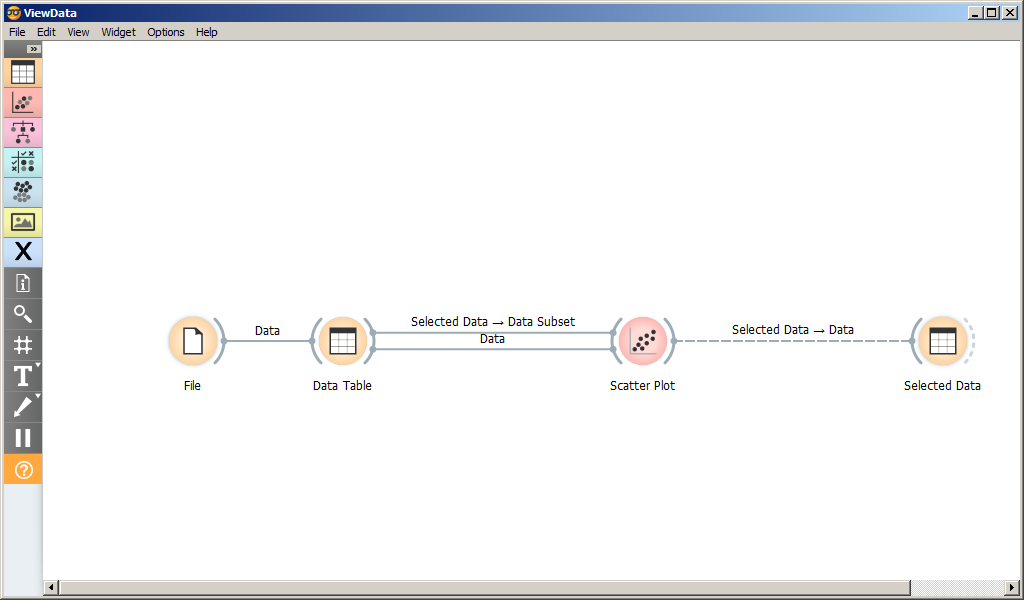
Рабочее пространство состоит из виджетов и связей между ними.
Каждый виджет имеет свой тип. Тип виджета можно определить по его
иконке.
Виджеты сгруппированы по разделам: Data, Visualization, Predictions и
пр. Группа виджета определяет цвет иконки.
Каждый виджет имеет множество (возможно, пустое) входных и множество
выходных сигналов. Сигнал определяет данные, которые поступают на вход
виджету или являются его результатом. При получении входного сигнала
виджет выполняет определенные действия и оповещает связанные с ним
виджеты путем отправки им соответсвующих сигналов.
Сигнал представляет собой экземпляр класса-наследника
Orange.util.Reprable.
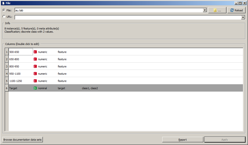
Для загрузки датасета имеется множество виджетов. Самый простой (File)
считывает данные из файла или загружает по URL. Существуют виджеты для
получения данных из базы данных PostgreSQL, Google Docs и других
источников.
Скриншот параметров виджета File представлен на рисунке. Виджет
позволяет выбрать файл с жесткого диска или загрузить из интернета по
URL, а также выводит основные параметры датасета.
Виджет File имеет единственный выходной сигнал Data (тип
Orange.data.Table). Он связан с единственным входным сигналом Data
виджета Data Table.
Виджет Data Table выводит данные из файла на экран.
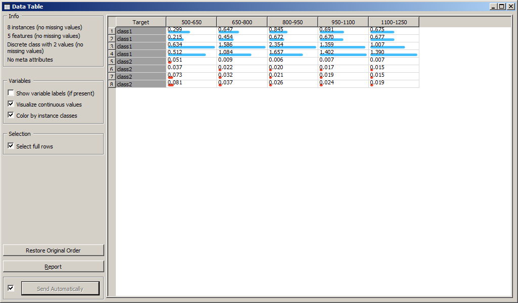
При обновлении файла обновляется Data Table. При создании связи между
виджетами входной и выходной сигналы выбираются автоматически. Если
сигналов виджета много, то могут возникнуть ошибки. Для редактирования
связи необходимо дважды кликнуть по ней мышью (рисунок [view1a]).
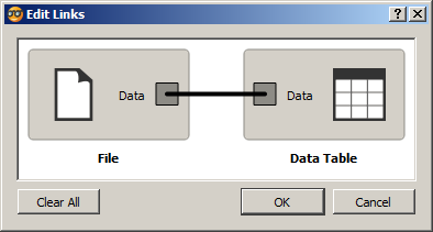
Связь между двумя виджетами подписывается над стрелкой. Если названия
входного и выходного сигнала совпадают, то указывается это название.
Если не совпадают, то указываются оба сигнала.
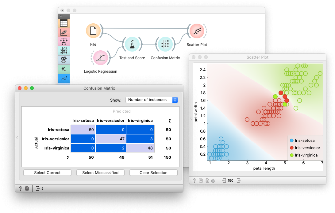
Виджет Scatter Plot позволяет строить двумерные графики по выбранным
признакам.
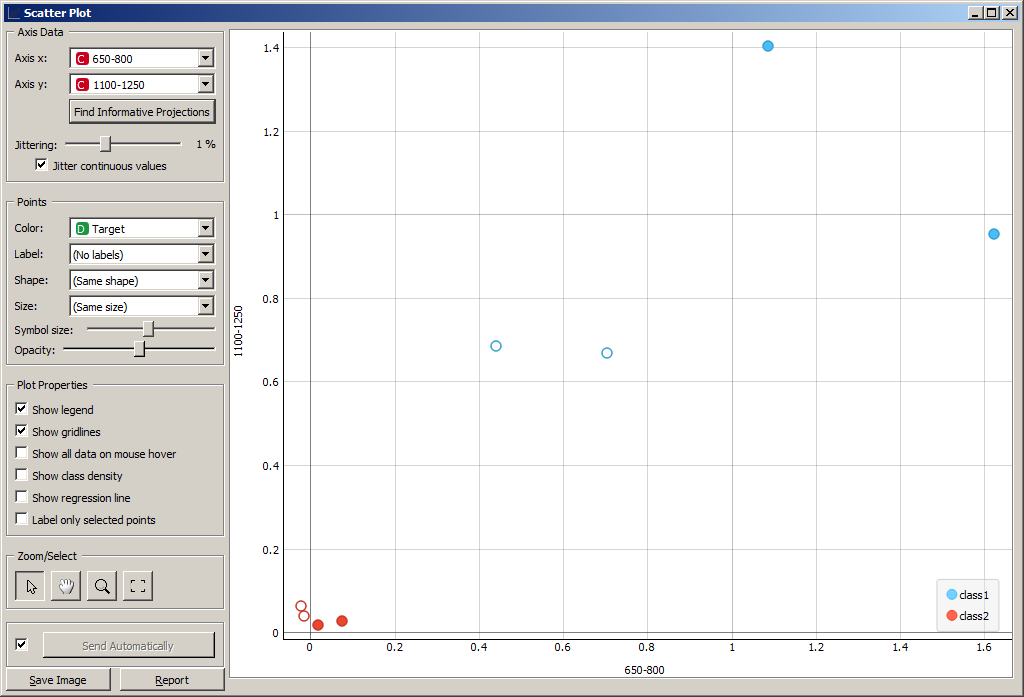
Виджет Scatter Plot имеет три входных сигнала:
-
Data (
Orange.data.Table); -
Data Subset (
Orange.data.Table); -
Features (
Orange.widgets.widget.AttributeList).
Сигнал Data принимает данные для отображения на графике, а сигнал Data
Subset – подмножество данных. Если Data Subset определен, то на графике
будут заштрихованы точки, соответствующие Data Subset.
Так, можно выбрать некоторые элементы из таблицы данных Data Table, и
увидеть, как они расположены на графике по отношению к другим точкам. В
примере на рисунке выбраны образы 3, 4, 5, 6.
Можно выделить некоторые точки на графике и изучить значения признаков
соответствующих им объектов в таблице.
Система Orange содержит большое количество виджетов для визуализации
данных, не рассмотренных выше. Среди них:
-
Box Plot для построения диаграммы размаха (<<ящик с усами>>);
-
Distributions для построения диаграммы частотного распределения
признака; -
Heat Map для построения тепловой диаграммы;
-
Venn Diagram для построения диаграммы Венна;
-
Sieve Diagram для построения паркетной диаграммы Ридвиля и Шюпбаха;
-
Pythagorean Tree и Pythagorean Forest для построения деревьев
Пифагора; -
Mosaic Display для построения мозаичной диаграммы;
-
Tree Viewer для визуального представления древовидных структур;
-
FreeViz и Radviz для визуализации многомерных данных;
и другие.
Тестирование классификаторов
Схема программы для тестирования классификаторов приведена на рисунке.
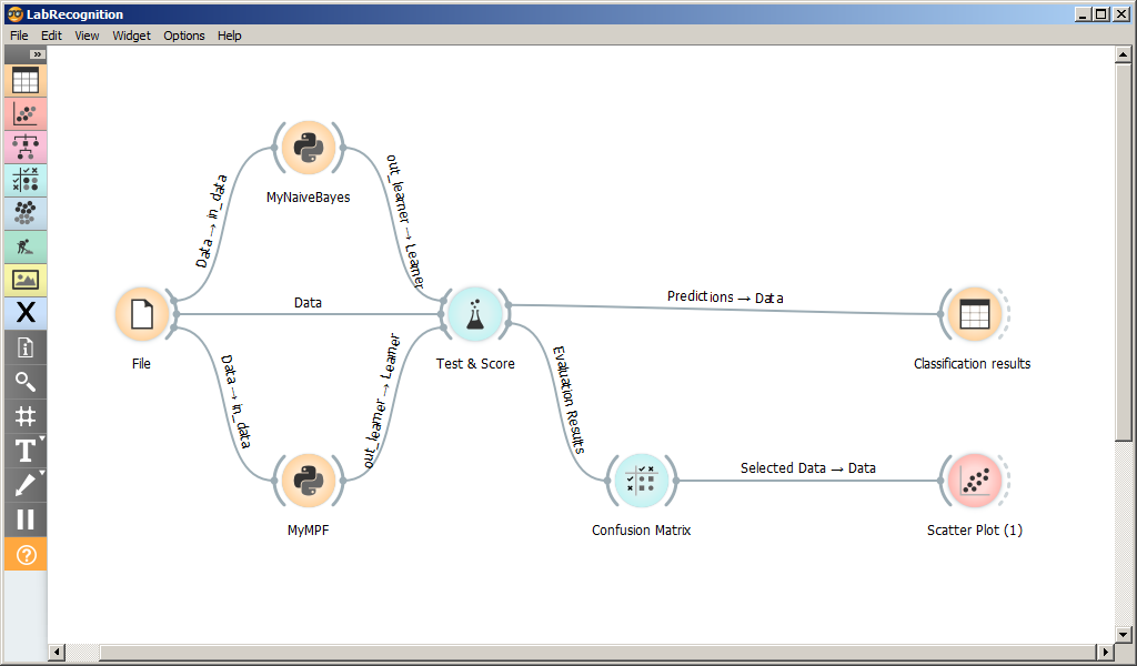
На форме размещены следующие виджеты:
-
File для чтения датасета из файла;
-
Python-скрипты MyNaiveBayes и MyMPF, классификаторы Байеса и методом
потенциальных функций; -
Test and Score, виджет для сравнения и оценки классификаторов;
-
Confusion Matrix, Scatter Plot, Classification results виджет для
вывода результатов классификации;
MyNaiveBayes и MyMPF подробно рассмотрены в следующем разделе.
Виджет Test and Score принимает следующие входные сигналы @tas:
-
Data (
Orange.data.Table) – данные, на которых будет обучена
модель; -
Test Data (
Orange.data.Table) – данные для проверки модели; -
Learner (
Orange.classification) – один или несколько
<<учеников>> – обученных моделей классификации, которые будут
тестироваться.
В качестве результата виджет имеет следующие выходные сигналы:
-
Evaluation results (
Orange.evaluation.Results) – результаты
проверки классификаторов; -
Predictions (
Orange.data.Table) – размеченная тестовая выборка.
Виджет Test and Score позволяет тестировать классификаторы одним из
следующих методов:
-
кросс-валидация;
-
выделение одного;
-
случайная разбивка в заданном соотношении;
-
проверка на обучающей выборке;
-
проверка на тестовой выборке.
Проверка классификатора осуществлялась методом случайного деления
обучающей выборки в соотношении 33:66, т.е. треть данных была выделена
для тестирования. Операция повторится два раза без сохранения
промежуточной информации.
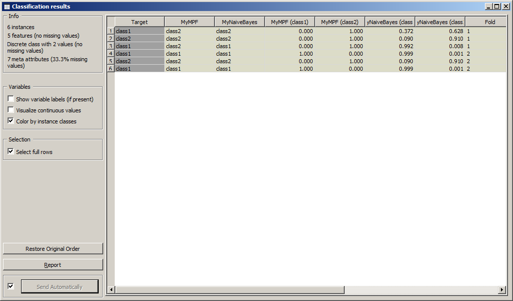
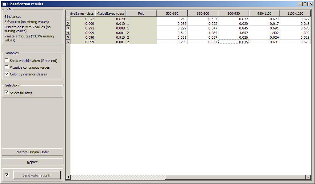
Результаты классификации приведены на рисунке.
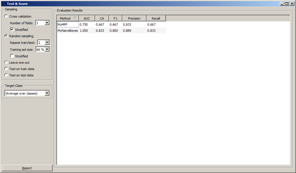
Были вычислены численные характеристики классификации:
-
Area under ROC;
-
Classification accuracy;
-
F-1;
-
Precision;
-
Recall.
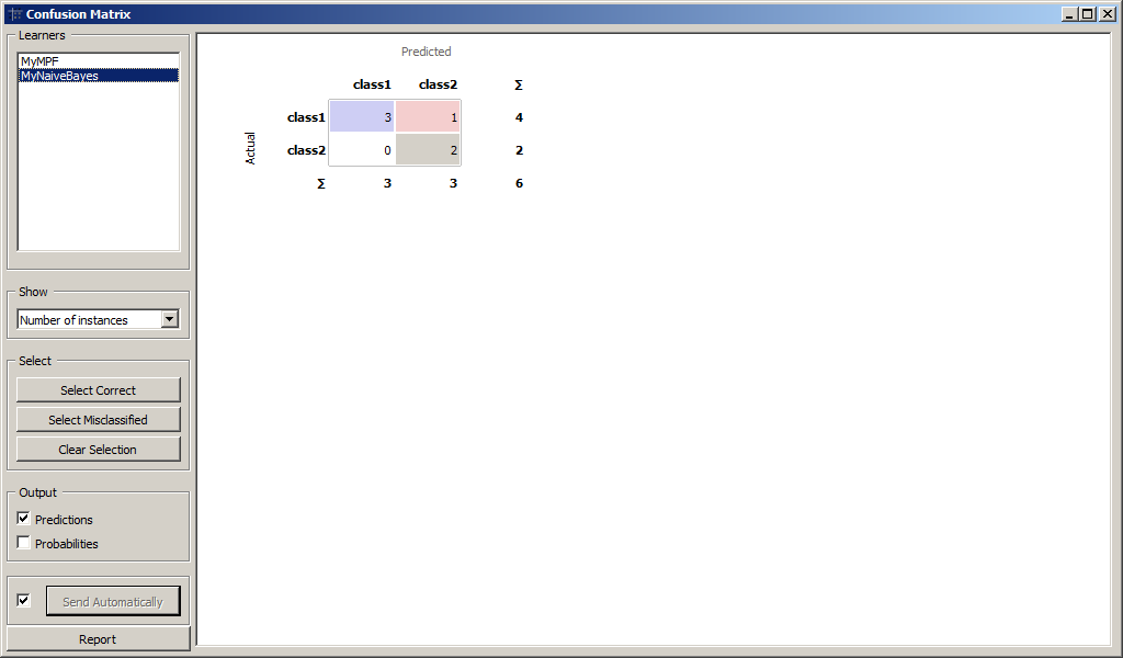
Для более детального анализа воспользуемся виджетом Confusion Matrix для
сравнения количества правильно и неправильно распознанных образов.
Результаты классификации MyMPF и MyNaiveBayes приведены на рисунках.
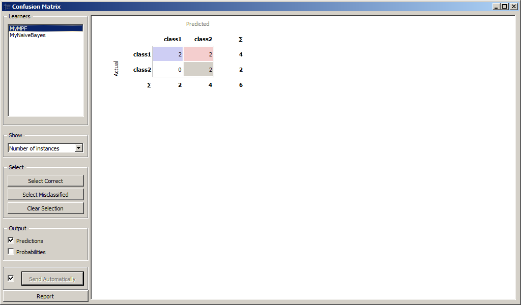
Образы, которые были подвергнуты классификации приведены на рисунках.
Результаты
Файлы orange-проектов можно скачать по ссылкам:
ViewData.ows
Recognition.ows
Программирование
Assembler,
awk,
Bash,
Django,
HTML,
Java,
JavaScript,
Python,
PHP,
regexp,
sed,
south.
Базы данных
SQL,
MySQL,
SQLile,
Серверы
Apache2,
BGBilling,
Debian,
GNU/Linux,
Zabbix.
Сети
Все,
iptables.
Документация
LaTeX.
Образование
Все,
РГАТУ.
Прочее
CrackMe,
CryptoGuard,
DB,
DC,
EPG,
ffmpeg,
HowTo,
IPTV,
MediaWiki,
motion,
Tools,
TV,
Видеонаблюдение,
VLC,
wget,
XML.


Orange Data Mining
Orange is a data mining and visualization toolbox for novice and expert alike. To explore data with Orange, one requires no programming or in-depth mathematical knowledge. We believe that workflow-based data science tools democratize data science by hiding complex underlying mechanics and exposing intuitive concepts. Anyone who owns data, or is motivated to peek into data, should have the means to do so.
Installing
Easy installation
For easy installation, Download the latest released Orange version from our website. To install an add-on, head to Options -> Add-ons... in the menu bar.
Installing with Conda
First, install Miniconda for your OS.
Then, create a new conda environment, and install orange3:
# Add conda-forge to your channels for access to the latest release
conda config --add channels conda-forge

# Perhaps enforce strict conda-forge priority
conda config --set channel_priority strict

# Create and activate an environment for Orange
conda create python=3 --yes --name orange3
conda activate orange3

# Install Orange
conda install orange3
For installation of an add-on, use:
conda install orange3-<addon name>
See specific add-on repositories for details.
Installing with pip
We recommend using our standalone installer or conda, but Orange is also installable with pip. You will need a C/C++ compiler (on Windows we suggest using Microsoft Visual Studio Build Tools).
Orange needs PyQt to run. Install either:
- PyQt5 and PyQtWebEngine:
pip install -r requirements-pyqt.txt - PyQt6 and PyQt6-WebEngine:
pip install PyQt6 PyQt6-WebEngine
Installing with winget (Windows only)
To install Orange with winget, run:
winget install --id UniversityofLjubljana.Orange
Running
Ensure you’ve activated the correct virtual environment. If following the above conda instructions:
Run orange-canvas or python3 -m Orange.canvas. Add --help for a list of program options.
Starting up for the first time may take a while.
Developing
Want to write a widget? Use the Orange3 example add-on template.
Want to get involved? Join us on Discord, introduce yourself in #general!
Take a look at our contributing guide and style guidelines.
Check out our widget development docs for a comprehensive guide on writing Orange widgets.
The Orange ecosystem
The development of core Orange is primarily split into three repositories:
biolab/orange-canvas-core implements the canvas,
biolab/orange-widget-base is a handy widget GUI library,
biolab/orange3 brings it all together and implements the base data mining toolbox.
Additionally, add-ons implement additional widgets for more specific use cases. Anyone can write an add-on. Some of our first-party add-ons:
- biolab/orange3-text
- biolab/orange3-bioinformatics
- biolab/orange3-timeseries
- biolab/orange3-single-cell
- biolab/orange3-imageanalytics
- biolab/orange3-educational
- biolab/orange3-geo
- biolab/orange3-associate
- biolab/orange3-network
- biolab/orange3-explain
Setting up for core Orange development
First, fork the repository by pressing the fork button in the top-right corner of this page.
Set your GitHub username,
export MY_GITHUB_USERNAME=replaceme
create a conda environment, clone your fork, and install it:
conda create python=3 --yes --name orange3
conda activate orange3

git clone ssh://git@github.com/$MY_GITHUB_USERNAME/orange3

# Install PyQT and PyQtWebEngine. You can also use PyQt6
pip install -r requirements-pyqt.txt
pip install -e orange3
Now you’re ready to work with git. See GitHub’s guides on pull requests, forks if you’re unfamiliar. If you’re having trouble, get in touch on Discord.
Running
Run Orange with python -m Orange.canvas (after activating the conda environment).
python -m Orange.canvas -l 2 --no-splash --no-welcome will skip the splash screen and welcome window, and output more debug info. Use -l 4 for more.
Add --clear-widget-settings to clear the widget settings before start.
To explore the dark side of the Orange, try --style=fusion:breeze-dark
Argument --help lists all available options.
To run tests, use unittest Orange.tests Orange.widgets.tests
Setting up for development of all components
Should you wish to contribute Orange’s base components (the widget base and the canvas), you must also clone these two repositories from Github instead of installing them as dependencies of Orange3.
First, fork all the repositories to which you want to contribute.
Set your GitHub username,
export MY_GITHUB_USERNAME=replaceme
create a conda environment, clone your forks, and install them:
conda create python=3 --yes --name orange3
conda activate orange3

# Install PyQT and PyQtWebEngine. You can also use PyQt6
pip install -r requirements-pyqt.txt

git clone ssh://git@github.com/$MY_GITHUB_USERNAME/orange-widget-base
pip install -e orange-widget-base

git clone ssh://git@github.com/$MY_GITHUB_USERNAME/orange-canvas-core
pip install -e orange-canvas-core

git clone ssh://git@github.com/$MY_GITHUB_USERNAME/orange3
pip install -e orange3

# Repeat for any add-on repositories
It’s crucial to install orange-base-widget and orange-canvas-core before orange3 to ensure that orange3 will use your local versions.
This section describes how to load the data in Orange. We also show how to explore the data, perform some basic statistics, and how to sample the data.
Data Input
Orange can read files in proprietary tab-delimited format, or can load data from any of the major standard spreadsheet file types, like CSV and Excel. Native format starts with a header row with feature (column) names. The second header row gives the attribute type, which can be numeric, categorical, time, or string. The third header line contains meta information to identify dependent features (class), irrelevant features (ignore) or meta features (meta).
More detailed specification is available in Loading and saving data (io).
Here are the first few lines from a dataset lenses.tab:
age       prescription  astigmatic    tear_rate     lenses
discrete  discrete      discrete      discrete      discrete
                                                    class
young     myope         no            reduced       none
young     myope         no            normal        soft
young     myope         yes           reduced       none
young     myope         yes           normal        hard
young     hypermetrope  no            reduced       none
Values are tab-limited. This dataset has four attributes (age of the patient, spectacle prescription, notion on astigmatism, and information on tear production rate) and an associated three-valued dependent variable encoding lens prescription for the patient (hard contact lenses, soft contact lenses, no lenses). Feature descriptions could use one letter only, so the header of this dataset could also read:
age       prescription  astigmatic    tear_rate     lenses
d         d             d             d             d
                                                    c
The rest of the table gives the data. Note that there are 5 instances in our table above. For the full dataset, check out or download lenses.tab) to a target directory. You can also skip this step as Orange comes preloaded with several demo datasets, lenses being one of them. Now, open a python shell, import Orange and load the data:
>>> import Orange
>>> data = Orange.data.Table("lenses")
>>>
Note that for the file name no suffix is needed, as Orange checks if any files in the current directory are of a readable type. The call to Orange.data.Table creates an object called data that holds your dataset and information about the lenses domain:
>>> data.domain.attributes
(DiscreteVariable('age', values=('pre-presbyopic', 'presbyopic', 'young')),
 DiscreteVariable('prescription', values=('hypermetrope', 'myope')),
 DiscreteVariable('astigmatic', values=('no', 'yes')),
 DiscreteVariable('tear_rate', values=('normal', 'reduced')))
>>> data.domain.class_var
DiscreteVariable('lenses', values=('hard', 'none', 'soft'))
>>> for d in data[:3]:
   ...:     print(d)
   ...:
[young, myope, no, reduced | none]
[young, myope, no, normal | soft]
[young, myope, yes, reduced | none]
>>>
The following script wraps-up everything we have done so far and lists first 5 data instances with soft prescription:
import Orange

data = Orange.data.Table("lenses")
print("Attributes:", ", ".join(x.name for x in data.domain.attributes))
print("Class:", data.domain.class_var.name)
print("Data instances", len(data))

target = "soft"
print("Data instances with %s prescriptions:" % target)
atts = data.domain.attributes
for d in data:
    if d.get_class() == target:
        print(" ".join(["%14s" % str(d[a]) for a in atts]))
Note that data is an object that holds both the data and information on the domain. We show above how to access attribute and class names, but there is much more information there, including that on feature type, set of values for categorical features, and other.
Creating a Data Table
To create a data table from scratch, one needs two things, a domain and the data. The domain is the description of the variables, i.e. column names, types, roles, etc.
First, we create the said domain. We will create three types of variables, numeric (ContiniousVariable), categorical (DiscreteVariable) and text (StringVariable). Numeric and categorical variables will be used a features (also known as X), while the text variable will be used as a meta variable.
>>> from Orange.data import Domain, ContinuousVariable,
    DiscreteVariable, StringVariable
>>>
>>> domain = Domain([ContinuousVariable("col1"),
                     DiscreteVariable("col2", values=["red", "blue"])],
                     metas=[StringVariable("col3")])
Now, we will build the data with numpy.
>>> import numpy as np
>>>
>>> column1 = np.array([1.2, 1.4, 1.5, 1.1, 1.2])
>>> column2 = np.array([0, 1, 1, 1, 0])
>>> column3 = np.array(["U13", "U14", "U15", "U16", "U17"], dtype=object)
Two things to note here. column2 has values 0 and 1, even though we specified it will be a categorical variable with values «red» and «blue». X (features in the data) can only be numbers, so the numpy matrix will contain numbers, while Orange will handle the categorical representation internally. 0 will be mapped to the value «red» and 1 to «blue» (in the order, specified in the domain).
Text variable requires dtype=object for numpy to handle it correctly.
Next, variables have to be transformed to a matrix.
>>> X = np.column_stack((column1, column2))
>>> M = column3.reshape(-1, 1)
Finally, we create a table. We need a domain and variables, which can be passed as X (features), Y (class variable) or metas.
>>> table = Table.from_numpy(domain, X=X, metas=M)
>>> print(table)
>>> [[1.2, red] {U13},
[1.4, blue] {U14},
[1.5, blue] {U15},
[1.1, blue] {U16},
[1.2, red] {U17}]
To add a class variable to the table, the procedure would be the same, with the class variable passed as Y (e.g. table = Table.from_numpy(domain, X=X, Y=Y, metas=M)).
To add a single column to the table, one can use the Table.add_column() method.
>>> new_var = DiscreteVariable("var4", values=["one", "two"])
>>> var4 = np.array([0, 1, 0, 0, 1]) # no reshaping necessary
>>> table = table.add_column(new_var, var4)
>>> print(table)
>>> [[1.2, red, one] {U13},
[1.4, blue, two] {U14},
[1.5, blue, one] {U15},
[1.1, blue, one] {U16},
[1.2, red, two] {U17}]
Saving the Data
Data objects can be saved to a file:
>>> data.save("new_data.tab")
>>>
This time, we have to provide the file extension to specify the output format. An extension for native Orange’s data format is «.tab». The following code saves only the data items with myope perscription:
import Orange

data = Orange.data.Table("lenses")
myope_subset = [d for d in data if d["prescription"] == "myope"]
new_data = Orange.data.Table(data.domain, myope_subset)
new_data.save("lenses-subset.tab")
We have created a new data table by passing the information on the structure of the data (data.domain) and a subset of data instances.
Exploration of the Data Domain
Data table stores information on data instances as well as on data domain. Domain holds the names of attributes, optional classes, their types and, and if categorical, the value names. The following code:
import Orange

data = Orange.data.Table("imports-85.tab")
n = len(data.domain.attributes)
n_cont = sum(1 for a in data.domain.attributes if a.is_continuous)
n_disc = sum(1 for a in data.domain.attributes if a.is_discrete)
print("%d attributes: %d continuous, %d discrete" % (n, n_cont, n_disc))

print(
    "First three attributes:",
    ", ".join(data.domain.attributes[i].name for i in range(3)),
)

print("Class:", data.domain.class_var.name)
outputs:
25 attributes: 14 continuous, 11 discrete
First three attributes: symboling, normalized-losses, make
Class: price
Orange’s objects often behave like Python lists and dictionaries, and can be indexed or accessed through feature names:
print("First attribute:", data.domain[0].name)
name = "fuel-type"
print("Values of attribute '%s': %s" % (name, ", ".join(data.domain[name].values)))
The output of the above code is:
First attribute: symboling
Values of attribute 'fuel-type': diesel, gas
Data Instances
Data table stores data instances (or examples). These can be indexed or traversed as any Python list. Data instances can be considered as vectors, accessed through element index, or through feature name.
import Orange

data = Orange.data.Table("iris")
print("First three data instances:")
for d in data[:3]:
    print(d)

print("25-th data instance:")
print(data[24])

name = "sepal width"
print("Value of '%s' for the first instance:" % name, data[0][name])
print("The 3rd value of the 25th data instance:", data[24][2])
The script above displays the following output:
First three data instances:
[5.100, 3.500, 1.400, 0.200 | Iris-setosa]
[4.900, 3.000, 1.400, 0.200 | Iris-setosa]
[4.700, 3.200, 1.300, 0.200 | Iris-setosa]
25-th data instance:
[4.800, 3.400, 1.900, 0.200 | Iris-setosa]
Value of 'sepal width' for the first instance: 3.500
The 3rd value of the 25th data instance: 1.900
The Iris dataset we have used above has four continuous attributes. Here’s a script that computes their mean:
average = lambda x: sum(x) / len(x)

data = Orange.data.Table("iris")
print("%-15s %s" % ("Feature", "Mean"))
for x in data.domain.attributes:
    print("%-15s %.2f" % (x.name, average([d[x] for d in data])))
The above script also illustrates indexing of data instances with objects that store features; in d[x] variable x is an Orange object. Here’s the output:
Feature         Mean
sepal length    5.84
sepal width     3.05
petal length    3.76
petal width     1.20
A slightly more complicated, but also more interesting, code that computes per-class averages:
average = lambda xs: sum(xs) / float(len(xs))

data = Orange.data.Table("iris")
targets = data.domain.class_var.values
print("%-15s %s" % ("Feature", " ".join("%15s" % c for c in targets)))
for a in data.domain.attributes:
    dist = [
        "%15.2f" % average([d[a] for d in data if d.get_class() == c]) for c in targets
    ]
    print("%-15s" % a.name, " ".join(dist))
Of the four features, petal width and length look quite discriminative for the type of iris:
Feature             Iris-setosa Iris-versicolor  Iris-virginica
sepal length               5.01            5.94            6.59
sepal width                3.42            2.77            2.97
petal length               1.46            4.26            5.55
petal width                0.24            1.33            2.03
Finally, here is a quick code that computes the class distribution for another dataset:
import Orange
from collections import Counter

data = Orange.data.Table("lenses")
print(Counter(str(d.get_class()) for d in data))
Orange Datasets and NumPy
Orange datasets are actually wrapped NumPy arrays. Wrapping is performed to retain the information about the feature names and values, and NumPy arrays are used for speed and compatibility with different machine learning toolboxes, like scikit-learn, on which Orange relies. Let us display the values of these arrays for the first three data instances of the iris dataset:
>>> data = Orange.data.Table("iris")
>>> data.X[:3]
array([[ 5.1,  3.5,  1.4,  0.2],
       [ 4.9,  3. ,  1.4,  0.2],
       [ 4.7,  3.2,  1.3,  0.2]])
>>> data.Y[:3]
array([ 0.,  0.,  0.])
Notice that we access the arrays for attributes and class separately, using data.X and data.Y. Average values of attributes can then be computed efficiently by:
>>> import np as numpy
>>> np.mean(data.X, axis=0)
array([ 5.84333333,  3.054     ,  3.75866667,  1.19866667])
We can also construct a (classless) dataset from a numpy array:
>>> X = np.array([[1,2], [4,5]])
>>> data = Orange.data.Table(X)
>>> data.domain
[Feature 1, Feature 2]
If we want to provide meaninful names to attributes, we need to construct an appropriate data domain:
>>> domain = Orange.data.Domain([Orange.data.ContinuousVariable("lenght"),
                                 Orange.data.ContinuousVariable("width")])
>>> data = Orange.data.Table(domain, X)
>>> data.domain
[lenght, width]
Here is another example, this time with the construction of a dataset that includes a numerical class and different types of attributes:
size = Orange.data.DiscreteVariable("size", ["small", "big"])
height = Orange.data.ContinuousVariable("height")
shape = Orange.data.DiscreteVariable("shape", ["circle", "square", "oval"])
speed = Orange.data.ContinuousVariable("speed")

domain = Orange.data.Domain([size, height, shape], speed)

X = np.array([[1, 3.4, 0], [0, 2.7, 2], [1, 1.4, 1]])
Y = np.array([42.0, 52.2, 13.4])

data = Orange.data.Table(domain, X, Y)
print(data)
Running of this scripts yields:
[[big, 3.400, circle | 42.000],
 [small, 2.700, oval | 52.200],
 [big, 1.400, square | 13.400]
Missing Values
Consider the following exploration of the dataset on votes of the US senate:
>>> import numpy as np
>>> data = Orange.data.Table("voting.tab")
>>> data[2]
[?, y, y, ?, y, ... | democrat]
>>> np.isnan(data[2][0])
True
>>> np.isnan(data[2][1])
False
The particular data instance included missing data (represented with ‘?’) for the first and the fourth attribute. In the original dataset file, the missing values are, by default, represented with a blank space. We can now examine each attribute and report on proportion of data instances for which this feature was undefined:
data = Orange.data.Table("voting.tab")
for x in data.domain.attributes:
    n_miss = sum(1 for d in data if np.isnan(d[x]))
    print("%4.1f%% %s" % (100.0 * n_miss / len(data), x.name))
First three lines of the output of this script are:
 2.8% handicapped-infants
11.0% water-project-cost-sharing
 2.5% adoption-of-the-budget-resolution
A single-liner that reports on number of data instances with at least one missing value is:
>>> sum(any(np.isnan(d[x]) for x in data.domain.attributes) for d in data)
203
Data Selection and Sampling
Besides the name of the data file, Orange.data.Table can accept the data domain and a list of data items and returns a new dataset. This is useful for any data subsetting:
data = Orange.data.Table("iris.tab")
print("Dataset instances:", len(data))
subset = Orange.data.Table(data.domain, [d for d in data if d["petal length"] > 3.0])
print("Subset size:", len(subset))
The code outputs:
Dataset instances: 150
Subset size: 99
and inherits the data description (domain) from the original dataset. Changing the domain requires setting up a new domain descriptor. This feature is useful for any kind of feature selection:
data = Orange.data.Table("iris.tab")
new_domain = Orange.data.Domain(
    list(data.domain.attributes[:2]),
    data.domain.class_var
)
new_data = Orange.data.Table(new_domain, data)

print(data[0])
print(new_data[0])
We could also construct a random sample of the dataset:
>>> sample = Orange.data.Table(data.domain, random.sample(data, 3))
>>> sample
[[6.000, 2.200, 4.000, 1.000 | Iris-versicolor],
 [4.800, 3.100, 1.600, 0.200 | Iris-setosa],
 [6.300, 3.400, 5.600, 2.400 | Iris-virginica]
]
or randomly sample the attributes:
>>> atts = random.sample(data.domain.attributes, 2)
>>> domain = Orange.data.Domain(atts, data.domain.class_var)
>>> new_data = Orange.data.Table(domain, data)
>>> new_data[0]
[5.100, 1.400 | Iris-setosa]
Building Machine Learning Model Using Orange Is Fun
Introduction:Data has become a powerful source of earning and predict future and people will seek to utilize it even if they don’t know exactly how. Machine learning will become a usual part of programmer’s resume, data scientists will be as common as accountants. Nowadays and for the next approximately two decades, we will continue to see a major need for machine learning and data science specialists to help apply machine learning technologies to application areas where they aren’t applied today.Nowadays people prefer GUI based tools instead of more coding stuff. Orange is one of the popular open source machine learning and data visualization tool for beginners. People who don’t know more about coding and willing to visualize pattern and other stuff can easily work with Orange.Why Orange:Orange is an open-source software package released under GPL that powers Python scripts with its rich compilation of mining and machine learning algorithms for data pre-processing, classification, modeling, regression, clustering and other miscellaneous functions.Orange also comes with a visual programming environment and its workbench consists of tools for importing data, dragging and dropping widgets, and links to connect different widgets for completing the workflow.Orange uses common Python open-source libraries for scientific computing, such as numpy, scipy, and scikit-learn, while its graphical user interface operates within the cross-platform Qt framework.Getting Started:Here is how to get started with data visualization in orange.Download Orange=> Go to https://orange.biolab.si and click on Download.For Linux Users:AnacondaIf you are using python provided by Anaconda distribution, you are almost ready to go. If not, follow these steps to download Orange:conda config —add channels conda-forgeand runconda install orange3 conda install -c defaults pyqt=5 qtPIPOrange can also be installed from the Python Package Index. You may need additional system packages provided by your distribution.pip install orange3Run shortcode to verify your setup Orange successfully. Open your Python Terminal and run the following code :>>> import Orange
>>> Orange.version.version
‘3.2.dev0+8907f35’
>>>Note: If You find result shown above then you successfully setup Orange. In case you get an error like this :from Orange.data import _variable
ImportError: cannot import name ‘_variable’Kindly Follow These Steps: Install Orange From SourceMac and Windows user can easily setup orange in their system step by step just by following the official docs of Orange:Official docs for setup OrangeAfter installation let’s start working with OrangeVisualization of DataSet in Orange:A primary goal of data visualization is to communicate information clearly and efficiently via statistical graphics, plots and information graphics.The Main goal of data visualization is to communicate information clearly and effectively through graphical means. It doesn’t mean that data visualization needs to look boring to be functional or extremely sophisticated to look beautiful. To convey ideas effectively, both aesthetic form and functionality need to go hand in hand, providing insights into a rather sparse and complex data set by communicating its key-aspects in a more intuitive way. Yet designers often fail to achieve a balance between form and function, creating gorgeous data visualizations which fail to serve their main purpose — to communicate information.” -Friedman (2008)Open Orange on your system & create your own new Workflow:After you clicked on “New” in the above step, this is what you should have come up with:In this tutorial, we are going to see the steps for Visualization of DataSet in orange:Step 1: Without data, there is no existence of Machine Learning. So, In our first step we import our dataset and in this tutorial, I use example dataset available in Orange Directory. We import zoo.tab dataset in file widget:Step 2: In next step, we need data tables to view our dataset. For this, we use Data Table widget.When we double-click on the data table widget we can visualize our data in actual format.Step 3: This is the last step where we will understand our data, with the help of visualization. Orange make visualization pretty much easier. We just add one more widget and choose which format we would like to visualize our data like Scatter Plot.This completely works on the concept of neurons, data transfer from one layer to another layer when we connect data table to scatter plot widget then we find an actual representation of our data in the form of scatter plot.Closing Note:Orange is the most powerful tool used for almost any kind of analysis and visualizing dataset is fun using Orange. The default installation includes a number of machine learning, preprocessing and data visualization algorithms in 6 widget sets (data, visualize, classify, regression, evaluate and unsupervised). Additional functionalities are available as add-ons (bioinformatics, data fusion and, text-mining).Hope, this tutorial helps you to understand how to visualize data set using orange. It is very important to understand the flow of data, this helps you to figure out problems easily.Keep Practicing with OrangeHappy Coding

Rated 4.0/5
based on 29 customer reviews
- Home
- Magazine
- Building Machine Learning Model Using Orange Is Fun
Building Machine Learning Model Using Orange Is Fun
By Himanshu Awasthi
19th Apr, 2018
-
Category:
Blog -
71
Introduction:
Data has become a powerful source of earning and predict future and people will seek to utilize it even if they don’t know exactly how. Machine learning will become a usual part of programmer’s resume, data scientists will be as common as accountants. Nowadays and for the next approximately two decades, we will continue to see a major need for machine learning and data science specialists to help apply machine learning technologies to application areas where they aren’t applied today.
Nowadays people prefer GUI based tools instead of more coding stuff. Orange is one of the popular open source machine learning and data visualization tool for beginners. People who don’t know more about coding and willing to visualize pattern and other stuff can easily work with Orange.
Why Orange:
Orange is an open-source software package released under GPL that powers Python scripts with its rich compilation of mining and machine learning algorithms for data pre-processing, classification, modeling, regression, clustering and other miscellaneous functions.
Orange also comes with a visual programming environment and its workbench consists of tools for importing data, dragging and dropping widgets, and links to connect different widgets for completing the workflow.
Orange uses common Python open-source libraries for scientific computing, such as numpy, scipy, and scikit-learn, while its graphical user interface operates within the cross-platform Qt framework.
Getting Started:
Here is how to get started with data visualization in orange.
Download Orange
=> Go to https://orange.biolab.si and click on Download.
For Linux Users:
Anaconda
If you are using python provided by Anaconda distribution, you are almost ready to go. If not, follow these steps to download Orange:
conda config —add channels conda-forge
and run
conda install orange3 conda install -c defaults pyqt=5 qt
PIP
Orange can also be installed from the Python Package Index. You may need additional system packages provided by your distribution.
pip install orange3
Run shortcode to verify your setup Orange successfully. Open your Python Terminal and run the following code :
>>> import Orange
>>> Orange.version.version
'3.2.dev0+8907f35'
>>>
Note: If You find result shown above then you successfully setup Orange. In case you get an error like this :
from Orange.data import _variable
ImportError: cannot import name '_variable'
Visualization of DataSet in Orange:
A primary goal of data visualization is to communicate information clearly and efficiently via statistical graphics, plots and information graphics.
The Main goal of data visualization is to communicate information clearly and effectively through graphical means. It doesn’t mean that data visualization needs to look boring to be functional or extremely sophisticated to look beautiful. To convey ideas effectively, both aesthetic form and functionality need to go hand in hand, providing insights into a rather sparse and complex data set by communicating its key-aspects in a more intuitive way. Yet designers often fail to achieve a balance between form and function, creating gorgeous data visualizations which fail to serve their main purpose — to communicate information.” -Friedman (2008)
Open Orange on your system & create your own new Workflow:
After you clicked on “New” in the above step, this is what you should have come up with:
In this tutorial, we are going to see the steps for Visualization of DataSet in orange:
Step 1: Without data, there is no existence of Machine Learning. So, In our first step we import our dataset and in this tutorial, I use example dataset available in Orange Directory. We import zoo.tab dataset in file widget:
Step 2: In next step, we need data tables to view our dataset. For this, we use Data Table widget.
When we double-click on the data table widget we can visualize our data in actual format.
Step 3: This is the last step where we will understand our data, with the help of visualization. Orange make visualization pretty much easier. We just add one more widget and choose which format we would like to visualize our data like Scatter Plot.
This completely works on the concept of neurons, data transfer from one layer to another layer when we connect data table to scatter plot widget then we find an actual representation of our data in the form of scatter plot.
Closing Note:
Orange is the most powerful tool used for almost any kind of analysis and visualizing dataset is fun using Orange. The default installation includes a number of machine learning, preprocessing and data visualization algorithms in 6 widget sets (data, visualize, classify, regression, evaluate and unsupervised). Additional functionalities are available as add-ons (bioinformatics, data fusion and, text-mining).
Hope, this tutorial helps you to understand how to visualize data set using orange. It is very important to understand the flow of data, this helps you to figure out problems easily.
Keep Practicing with Orange
Happy Coding
- Big Data
- Artificial Intelligence
REQUEST A FREE DEMO CLASS
SUBSCRIBE OUR BLOG
TRENDING BLOG POSTS
Python in a Nutshell: Everything That You Need to Know
By Susan May
Python is one of the best known high-level programming languages in the world, like Java. It’s steadily gaining traction among programmers because it’s easy to integrate with other technologies and offers more stability and higher coding productivity, especially when it comes to mass projects with volatile requirements. If you’re considering learning an object-oriented programming language, consider starting with Python.A Brief Background On Python It was first created in 1991 by Guido Van Rossum, who eventually wants Python to be as understandable and clear as English. It’s open source, so anyone can contribute to, and learn from it. Aside from supporting object-oriented programming and imperative and functional programming, it also made a strong case for readable code. Python is hence, a multi-paradigm high-level programming language that is also structure supportive and offers meta-programming and logic-programming as well as ‘magic methods’.More Features Of PythonReadability is a key factor in Python, limiting code blocks by using white space instead, for a clearer, less crowded appearancePython uses white space to communicate the beginning and end of blocks of code, as well as ‘duck typing’ or strong typingPrograms are small and run quickerPython requires less code to create a program but is slow in executionRelative to Java, it’s easier to read and understand. It’s also more user-friendly and has a more intuitive coding styleIt compiles native bytecodeWhat It’s Used For, And By WhomUnsurprisingly, Python is now one of the top five most popular programming languages in the world. It’s helping professionals solve an array of technical, as well as business problems. For example, every day in the USA, over 36,000 weather forecasts are issued in more than 800 regions and cities. These forecasts are put in a database, compared to actual conditions encountered location-wise, and the results are then tabulated to improve the forecast models, the next time around. The programming language allowing them to collect, analyze, and report this data? Python!40% of data scientists in a survey taken by industry analyst O’Reilly in 2013, reported using Python in their day-to-day workCompanies like Google, NASA, and CERN use Python for a gamut of programming purposes, including data scienceIt’s also used by Wikipedia, Google, and Yahoo!, among many othersYouTube, Instagram, Quora, and Dropbox are among the many apps we use every day, that use PythonPython has been used by digital special effects house ILM, who has worked on the Star Wars and Marvel filmsIt’s often used as a ‘scripting language’ for web apps and can automate a specific progression of tasks, making it more efficient. That’s why it is used in the development of software applications, web pages, operating systems shells, and games. It’s also used in scientific and mathematical computing, as well as AI projects, 3D modelers and animation packages.Is Python For You? Programming students find it relatively easy to pick up Python. It has an ever-expanding list of applications and is one of the hottest languages in the ICT world. Its functions can be executed with simpler commands and much less text than most other programming languages. That could explain its popularity amongst developers and coding students.If you’re a professional or a student who wants to pursue a career in programming, web or app development, then you will definitely benefit from a Python training course. It would help if you have prior knowledge of basic programming concepts and object-oriented concepts. To help you understand how to approach Python better, let’s break up the learning process into three modules:Elementary PythonThis is where you’ll learn syntax, keywords, loops data types, classes, exception handling, and functions.Advanced PythonIn Advanced Python, you’ll learn multi-threading, database programming (MySQL/ MongoDB), synchronization techniques and socket programming.Professional PythonProfessional Python involves knowing concepts like image processing, data analytics and the requisite libraries and packages, all of which are highly sophisticated and valued technologies.With a firm resolve and determination, you can definitely get certified with Python course!Some Tips To Keep In Mind While Learning PythonFocus on grasping the fundamentals, such as object-oriented programming, variables, and control flow structuresLearn to unit test Python applications and try out its strong integration and text processing capabilitiesPractice using Python’s object-oriented design and extensive support libraries and community to deliver projects and packages. Assignments aren’t necessarily restricted to the four-function calendar and check balancing programs. By using the Python library, programming students can work on realistic applications as they learn the fundamentals of coding and code reuse.
Rated 4.5/5
based on 12 customer reviews

Python in a Nutshell: Everything That You Need to Know
Blog
The Ultimate Guide to Node.Js
By Susan May
IT professionals have always been in much demand, but with a Node.js course under your belt, you will be more sought after than the average developer. In fact, recruiters look at Node js as a major recruitment criterion these days. Why are Node.js developers so sought-after, you may ask. It is because Node.js requires much less development time and fewer servers, and provides unparalleled scalability.In fact, LinkedIn uses it as it has substantially decreased the development time. Netflix uses it because Node.js has improved the application’s load time by 70%. Even PayPal, IBM, eBay, Microsoft, and Uber use it. These days, a lot of start-ups, too, have jumped on the bandwagon in including Node.js as part of their technology stack.The Course In BriefWith a Nodejs course, you learn beyond creating a simple HTML page, learn how to create a full-fledged web application, set up a web server, and interact with a database and much more, so much so that you can become a full stack developer in the shortest possible time and draw a handsome salary. The course of Node.js would provide you a much-needed jumpstart for your career.Node js: What is it?Developed by Ryan Dahl in 2009, Node.js is an open source and a cross-platform runtime environment that can be used for developing server-side and networking applications.Built on Chrome’s JavaScript runtime (V8 JavaScript engine) for easy building of fast and scalable network applications, Node.js uses an event-driven, non-blocking I/O model, making it lightweight and efficient, as well as well-suited for data-intensive real-time applications that run across distributed devices.Node.js applications are written in JavaScript and can be run within the Node.js runtime on different platforms – Mac OS X, Microsoft Windows, Unix, and Linux.What Makes Node js so Great?I/O is Asynchronous and Event-Driven: APIs of Node.js library are all asynchronous, i.e., non-blocking. It simply means that unlike PHP or ASP, a Node.js-based server never waits for an API to return data. The server moves on to the next API after calling it. The Node.js has a notification mechanism (Event mechanism) that helps the server get a response from the previous API call.Superfast: Owing to the above reason as well as the fact that it is built on Google Chrome’s V8 JavaScript Engine, Node JavaScript library is very fast in code execution.Single Threaded yet Highly Scalable: Node.js uses a single threaded model with event looping, in which the same program can ensure service to a much larger number of requests than the usual servers like Apache HTTP Server. Its Event mechanism helps the server to respond promptly in a non-blocking way, eliminating the waiting time. This makes the server highly scalable, unlike traditional servers that create limited threads to handle requests.No buffering: Node substantially reduces the total processing time of uploading audio and video files. Its applications never buffer any data; instead, they output the data in chunks.Open source: Node JavaScript has an open source community that has produced many excellent modules to add additional capabilities to Node.js applications.License: It was released under the MIT license.Eligibility to attend Node js CourseThe basic eligibility for pursuing Node training is a Bachelors in Computer Science, Bachelors of Technology in Computer Science and Engineering or an equivalent course.As prerequisites, you would require intermediate JavaScript skills and the basics of server-side development.CertificationThere are quite a few certification courses in Node Js. But first, ask yourself:Do you wish to launch your own Node applications or work as a Node developer?Do you want to learn modern server-side web development and apply it on apps /APIs?Do you want to use Node.js to create robust and scalable back-end applications?Do you aspire to build a career in back-end web application development?If you do, you’ve come to the right place!Course CurriculumA course in Node JavaScript surely includes theoretical lessons; but prominence is given to case studies, practical classes, including projects. A good certification course would ideally train you to work with shrink-wrap to lock the node modules, build a HTTP Server with Node JS using HTTP APIs, as well as about important concepts of Node js like asynchronous programming, file systems, buffers, streams, events, socket.io, chat apps, and also Express.js, which is a flexible, yet powerful web application framework.Have You Decided Yet? Now that you know everything there is to know about why you should pursue a Node js course and a bit about the course itself, it is time for you to decide whether you are ready to embark on a journey full of exciting technological advancements and power to create fast, scalable and lightweight network applications.
Rated 4.5/5
based on 6 customer reviews

The Ultimate Guide to Node.Js
Blog
MIT’s new automated ML runs 100x faster than human Data Scientists
By Ruslan Bragin
According to Michigan State University and MIT, automated machine learning system analyses the data and deliver a solution 100x faster than one human. The automated machine learning platform which is known as ATM (Auto Tune Models) uses cloud-based, on demand computing to accelerate data analysis.
Researchers of MIT tested the system through open-ml.org, a collaborative crowdsourcing platform, on which data scientists collaborate to resolve problems. They found that ATM evaluated 47 datasets from the platform and the system was capable to deliver a solution that is better than humans. It took nearly 100 days for data scientists to deliver a solution, while it took less than a day for ATM to design a better-performing model.
«There are so many options,» said Ross, Franco Modigliani professor of financial economics at MIT, told MIT news. «If a data scientist chose support vector machines as a modeling technique, the question of whether she should have chosen a neural network to get better accuracy instead is always lingering in her mind.»
ATM searches via different techniques and tests thousands of models as well, analyses each, and offers more resources that solves the problem effectively. Then, the system exhibits its results to help researchers compare different methods. So, the system is not automating the human data scientists out of the process, Ross explained.
«We hope that our system will free up experts to spend more time on data understanding, problem formulation and feature engineering,» Kalyan Veeramachaneni, principal research scientist at MIT’s Laboratory for Information and Decision Systems and co-author of the paper, told MIT News.
Auto Tune Model is now made available for companies as an open source platform. It can operate on single machine, on-demand clusters, or local computing clusters in the cloud and can work with multiple users and multiple datasets simultaneously, MIT noted. «A small- to medium-sized data science team can set up and start producing models with just a few steps,» Veeramachaneni told MIT News.
Source: MIT Official Website
Rated 4.0/5
based on 20 customer reviews

MIT’s new automated ML runs 100x faster than human Data Scientists
What’s New
Follow Us On
Share on
Useful Links
Project description
Orange 3
Orange is a component-based data mining software. It includes a range of data
visualization, exploration, preprocessing and modeling techniques. It can be
used through a nice and intuitive user interface or, for more advanced users,
as a module for the Python programming language.
This is the latest version of Orange (for Python 3). The deprecated version of
Orange 2.7 (for Python 2.7) is still available (binaries and sources).
Installing with pip
To install Orange with pip, run the following.
# Install some build requirements via your system's package manager
sudo apt install virtualenv build-essential python3-dev

# Create a separate Python environment for Orange and its dependencies ...
virtualenv --python=python3 --system-site-packages orange3venv
# ... and make it the active one
source orange3venv/bin/activate

# Install Orange
pip install orange3
Starting Orange GUI
To start Orange GUI from the command line, run:
orange-canvas
# or
python3 -m Orange.canvas
Append --help for a list of program options.
Download files
Download the file for your platform. If you’re not sure which to choose, learn more about installing packages.