A frontend Framework for building data-driven applications running in the browser, on top of REST/GraphQL APIs, using React and Material Design. Open sourced and maintained by marmelab.
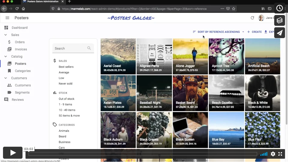
Check out the demos page for real-life examples.
Installation
React-admin is available from npm. You can install it (and its required dependencies)
using:
npm install react-admin
#or
yarn add react-admin
How To Learn React-Admin
- Read the Tutorial for a 30 minutes introduction.
- Read the source code of the demos for real-life examples.
- Read the Documentation for a deep dive into the react-admin components and hooks.
- Read the Architecture decisions to better understand why features are implemented that way.
- Check out the API Reference for a complete list of the public API.
- Get Support for fixing your own problems
Usage
Here is a simple example of how to use React-admin:
// in app.js
import * as React from "react";
import { render } from 'react-dom';
import { Admin, Resource } from 'react-admin';
import simpleRestProvider from 'ra-data-simple-rest';

import { PostList, PostEdit, PostCreate, PostIcon } from './posts';

render(
    <Admin dataProvider={simpleRestProvider('http://localhost:3000')}>
        <Resource name="posts" list={PostList} edit={PostEdit} create={PostCreate} icon={PostIcon}/>
    </Admin>,
    document.getElementById('root')
);
The <Resource> component is a configuration component that allows defining sub components for each of the admin view: list, edit, and create. These components use Material UI and custom components from react-admin:
// in posts.js
import * as React from "react";
import { List, Datagrid, Edit, Create, SimpleForm, DateField, TextField, EditButton, TextInput, DateInput, useRecordContext } from 'react-admin';
import BookIcon from '@mui/icons-material/Book';
export const PostIcon = BookIcon;

export const PostList = () => (
    <List>
        <Datagrid>
            <TextField source="id" />
            <TextField source="title" />
            <DateField source="published_at" />
            <TextField source="average_note" />
            <TextField source="views" />
            <EditButton />
        </Datagrid>
    </List>
);

const PostTitle = () => {
    const record = useRecordContext();
    return <span>Post {record ? `"${record.title}"` : ''}</span>;
};

export const PostEdit = () => (
    <Edit title={<PostTitle />}>
        <SimpleForm>
            <TextInput disabled source="id" />
            <TextInput source="title" />
            <TextInput source="teaser" options={{ multiline: true }} />
            <TextInput multiline source="body" />
            <DateInput label="Publication date" source="published_at" />
            <TextInput source="average_note" />
            <TextInput disabled label="Nb views" source="views" />
        </SimpleForm>
    </Edit>
);

export const PostCreate = () => (
    <Create title="Create a Post">
        <SimpleForm>
            <TextInput source="title" />
            <TextInput source="teaser" options={{ multiline: true }} />
            <TextInput multiline source="body" />
            <TextInput label="Publication date" source="published_at" />
            <TextInput source="average_note" />
        </SimpleForm>
    </Create>
);
Does It Work With My API?
Yes.
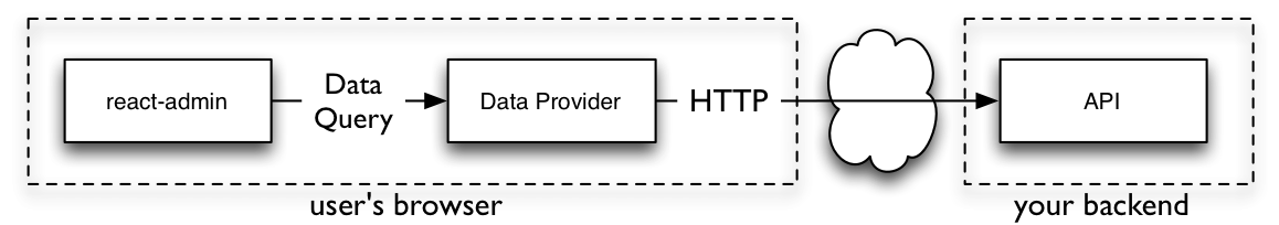
React-admin uses an adapter approach, with a concept called Data Providers. Existing providers can be used as a blueprint to design your API, or you can write your own Data Provider to query an existing API. Writing a custom Data Provider is a matter of hours.
See the Data Providers documentation for details.
Architecture: Batteries Included But Removable
React-admin is designed as a library of loosely coupled React components built on top of Material UI, in addition to React hooks allowing to reuse the logic with a custom UI.
You may replace one part of react-admin with your own, e.g. to use a custom Datagrid, GraphQL instead of REST, or Bootstrap instead of Material Design.
Read more about the Architecture choices.
Support
- Get professional support from Marmelab via React-Admin Enterprise Edition
- Get community support via StackOverflow
Enterprise Edition
The React-Admin Enterprise Edition  offers additional features and services for react-admin:
- Save weeks of development thanks to the Private Modules, valid on an unlimited number of domains and projects.
ra-preferences: Persist user preferences (language, theme, filters, datagrid columns, sidebar position, etc.) in local storage.ra-navigation: Multi-level menu and breadcrumb, with the ability to define a custom path for your resources.ra-realtime: Display live notifications, auto-update content on the screen, lock content when editing, with adapters for real-time backends.ra-editable-datagrid: Edit data directly in the list view, for better productivity. Excel-like editing experience.ra-form-layout: New form layouts for complex data entry tasks (accordion, wizard, etc.)ra-relationships: Visualize and edit complex relationships, including many-to-many relationships.ra-tree: Edit and visualize tree structures. Reorganize by drag and drop. Adapts to any data structure on the backend (parent_id, children, nested sets, etc.).ra-tour: Guided tours for react-admin applications. Step-by-step instructions, Material UI skin.ra-markdown: Read Markdown data, and edit it using a WYSIWYG editor in your admin
- Get Support from experienced react and react-admin developers, who will help you find the right information and troubleshoot your bugs.
- Get a 50% Discount on Professional Services in case you need coaching, audit, or custom development by our experts.
- Get access to exclusive Learning Material, including a Storybook full of examples, and a dedicated demo app.
- Prioritize your needs in the react-admin Development Roadmap thanks to a priority vote.

Working towards digital sustainability is a crucial goal for the react-admin core team (and a formal commitment for our sponsor, Marmelab). We monitor the carbon footprint of example react-admin apps with GreenFrame to avoid adding features with a high ecological footprint. This also leads us to add features that reduce this footprint (like application cache or optimistic rendering). As a consequence, react-admin is not only fast but also respectful of the environment. Apps built with react-admin usually emit less carbon than apps built with other frameworks.
Contributing
If you want to give a hand: Thank you! There are many things you can do to help making react-admin better.
The easiest task is bug triaging. Check that new issues on GitHub follow the issue template and give a way to reproduce the issue. If not, comment on the issue to ask precisions. Then, try and reproduce the issue following the description. If you managed to reproduce the issue, add a comment to say it. Otherwise, add a comment to say that something is missing.
The second way to contribute is to answer support questions on StackOverflow. There are many beginner questions there, so even if you’re not super experienced with react-admin, there is someone you can help there.
Pull requests for bug fixes are welcome on the GitHub repository. There is always a bunch of issues labeled “Good First Issue” in the bug tracker — start with these. Check the contributing guidelines in the repository README.
If you want to add a feature, you can open a Pull request on the next branch. We don’t accept all features — we try to keep the react-admin code small and manageable. Try and see if your feature can be built as an additional npm package. If you’re in doubt, open a “Feature Request” issue to see if the core team would accept your feature before developing it.
License
React-admin is licensed under the MIT Licence, sponsored and supported by marmelab.
Donate
This library is free to use, even for commercial purpose. If you want to give back, please talk about it, help newcomers, or contribute code. But the best way to give back is to donate to a charity. We recommend Doctors Without Borders.
| layout | title |
|---|---|
|
default |
My First Project Tutorial |
React-Admin Tutorial
This 30 minutes tutorial will expose how to create a new admin app based on an existing REST API.
Here is an overview of the result:
Setting Up
React-admin uses React. We’ll use create-react-admin to bootstrap a new admin:
yarn create react-admin test-admin
Choose JSON Server as the data provider, then None as the auth provider. Don’t add any resource for now and just press Enter. Finally, choose either npm or yarn and press Enter. Once everything is installed, enter the following commands:
cd test-admin
npm run dev
# or
yarn dev
You should be up and running with an empty React admin application on port 5173.
Tip: Although this tutorial uses a TypeScript template, you can use react-admin with JavaScript if you prefer. Also, you can use Vite, create-react-app, Next.js, Remix, or any other React framework to create your admin app. React-admin is framework-agnostic.
Using an API As Data Source
React-admin runs in the browser, and fetches data from an API.
We’ll be using JSONPlaceholder, a fake REST API designed for testing and prototyping, as the data source for the application. Here is what it looks like:
curl https://jsonplaceholder.typicode.com/users/2
{
  "id": 2,
  "name": "Ervin Howell",
  "username": "Antonette",
  "email": "Shanna@melissa.tv",
  "address": {
    "street": "Victor Plains",
    "suite": "Suite 879",
    "city": "Wisokyburgh",
    "zipcode": "90566-7771",
    "geo": {
      "lat": "-43.9509",
      "lng": "-34.4618"
    }
  },
  "phone": "010-692-6593 x09125",
  "website": "anastasia.net",
  "company": {
    "name": "Deckow-Crist",
    "catchPhrase": "Proactive didactic contingency",
    "bs": "synergize scalable supply-chains"
  }
}
JSONPlaceholder provides endpoints for users, posts, and comments. The admin we’ll build should allow to Create, Retrieve, Update, and Delete (CRUD) these resources.
Making Contact With The API Using a Data Provider
The application has been initialized with enough code for react-admin to render an empty app and confirm that the setup is done:

The <App> component renders an <Admin> component, which is the root component of a react-admin application. This component expects a dataProvider prop — a function capable of fetching data from an API. Since there is no standard for data exchanges between computers, you will probably have to write a custom provider to connect react-admin to your own APIs — but we’ll dive into Data Providers later. For now, let’s take advantage of the ra-data-json-server data provider, which speaks the same REST dialect as JSONPlaceholder.
Now it’s time to add features!
Mapping API Endpoints With Resources
We’ll start by adding a list of users.
The <Admin> component expects one or more <Resource> child components. Each resource maps a name to an endpoint in the API. Edit the App.tsx file to add a resource named users:
// in src/App.tsx
-import { Admin } from "react-admin";
+import { Admin, Resource, ListGuesser } from "react-admin";
import jsonServerProvider from "ra-data-json-server";

const dataProvider = jsonServerProvider('https://jsonplaceholder.typicode.com');

-const App = () => <Admin dataProvider={dataProvider} />;
+const App = () => (
+ <Admin dataProvider={dataProvider}>
+   <Resource name="users" list={ListGuesser} />
+ </Admin>
+);

export default App;
The line <Resource name="users" /> informs react-admin to fetch the «users» records from the https://jsonplaceholder.typicode.com/users URL. <Resource> also defines the React components to use for each CRUD operation (list, create, edit, and show).
The list={ListGuesser} tells react-admin to use the <ListGuesser> component to display the list of users. This component guesses the configuration to use for the list (column names and types) based on the data fetched from the API.
The app can now display a list of users:

The list is already functional: you can reorder it by clicking on column headers, or change pages by using the bottom pagination controls. If you look at the network tab in the browser developer tools, you’ll notice that each action on the list triggers a new call to https://jsonplaceholder.typicode.com/users with a modified query string. That’s what the data provider does: it translates user actions to HTTP requests that the backend API understands.
Writing A Page Component
The <ListGuesser> component is not meant to be used in production — it’s just a way to quickly bootstrap an admin. That means you’ll have to replace the ListGuesser component in the users resource by a custom React component. Fortunately, ListGuesser dumps the code of the list it has guessed to the console:

Let’s copy this code, and create a new UserList component, in a new file named users.tsx:
// in src/users.tsx
import { List, Datagrid, TextField, EmailField } from "react-admin";

export const UserList = () => (
  <List>
    <Datagrid rowClick="edit">
      <TextField source="id" />
      <TextField source="name" />
      <TextField source="username" />
      <EmailField source="email" />
      <TextField source="address.street" />
      <TextField source="phone" />
      <TextField source="website" />
      <TextField source="company.name" />
    </Datagrid>
  </List>
);
Then, edit the App.tsx file to use this new component instead of ListGuesser:
// in src/App.tsx
-import { Admin, Resource, ListGuesser } from "react-admin";
+import { Admin, Resource } from "react-admin";
import jsonServerProvider from "ra-data-json-server";
+import { UserList } from "./users";

const dataProvider = jsonServerProvider("https://jsonplaceholder.typicode.com");

const App = () => (
  <Admin dataProvider={dataProvider}>
-   <Resource name="users" list={ListGuesser} />
+   <Resource name="users" list={UserList} />
  </Admin>
);
There is no visible change in the browser — except now, the app uses a component that you can customize.
Composing Components
Let’s take a moment to analyze the code of the <UserList> component:
export const UserList = () => (
  <List>
    <Datagrid rowClick="edit">
      <TextField source="id" />
      <TextField source="name" />
      <TextField source="username" />
      <EmailField source="email" />
      <TextField source="address.street" />
      <TextField source="phone" />
      <TextField source="website" />
      <TextField source="company.name" />
    </Datagrid>
  </List>
);
The root component, <List>, reads the query parameters from the URL, crafts an API call based on these parameters, and puts the result in a React context. It also builds a set of callbacks allowing child components to modify the list filters, pagination, and sorting. <List> does a lot of things, yet its syntax couldn’t be simpler:
This is a good illustration of the react-admin target: helping developers build sophisticated apps in a simple way.
But in most frameworks, «simple» means «limited», and it’s hard to go beyond basic features. React-admin solves this by using composition. <List> only does the data fetching part. It delegates the rendering of the actual list to its child — in this case, <Datagrid>. To put it otherwise, the above code composes the <List> and <Datagrid> functionalities.
This means we can compose <List> with another component — for instance <SimpleList>:
// in src/users.tsx
import { List, SimpleList } from "react-admin";

export const UserList = () => (
  <List>
    <SimpleList
      primaryText={(record) => record.name}
      secondaryText={(record) => record.username}
      tertiaryText={(record) => record.email}
    />
  </List>
);
<SimpleList> uses Material UI’s <List> and <ListItem> components, and expects functions as primaryText, secondaryText, and tertiaryText props.
Refresh the page, and now the list displays in a different way:

React-admin offers a large library of components you can pick from to build the UI that you want using composition. And if this is not enough, it lets you build your own components to get exactly the UI you want.
Writing A Custom List Component
The react-admin layout is already responsive. Try to resize your browser to see how the sidebar switches to a drawer on smaller screens. Besides, the <SimpleList> component is a really good fit for mobile devices.
But on desktop, <SimpleList> takes too much space for a low information density. So let’s modify the <UserList> component to use the <Datagrid> component on desktop, and the <SimpleList> component on mobile.
To do so, we’ll use the useMediaQuery hook from Material UI:
// in src/users.tsx
import { useMediaQuery } from "@mui/material";
import { List, SimpleList, Datagrid, TextField, EmailField } from "react-admin";

export const UserList = () => {
  const isSmall = useMediaQuery((theme) => theme.breakpoints.down("sm"));
  return (
    <List>
      {isSmall ? (
        <SimpleList
          primaryText={(record) => record.name}
          secondaryText={(record) => record.username}
          tertiaryText={(record) => record.email}
        />
      ) : (
        <Datagrid rowClick="edit">
          <TextField source="id" />
          <TextField source="name" />
          <TextField source="username" />
          <EmailField source="email" />
          <TextField source="address.street" />
          <TextField source="phone" />
          <TextField source="website" />
          <TextField source="company.name" />
        </Datagrid>
      )}
    </List>
  );
};
This works exactly the way you expect.
This shows that the <List> child can be anything you want — even a custom React component with its own logic. It also shows that react-admin is a good fit for responsive applications — but it’s your job to use useMediaQuery() in pages.
Selecting Columns
Let’s get back to <Datagrid>. It reads the data fetched by <List>, then renders a table with one row for each record. <Datagrid> uses its child components (here, a list of <TextField> and <EmailField>) to determine the columns to render. Each Field component maps a different field in the API response, specified by the source prop.
<ListGuesser> created one column for every field in the response. That’s a bit too much for a usable grid, so let’s remove a couple <TextField> from the Datagrid and see the effect:
// in src/users.tsx
  <Datagrid rowClick="edit">
    <TextField source="id" />
    <TextField source="name" />
-   <TextField source="username" />
    <EmailField source="email" />
-   <TextField source="address.street" />
    <TextField source="phone" />
    <TextField source="website" />
    <TextField source="company.name" />
  </Datagrid>

In react-admin, most configuration is achieved via components. <Datagrid> could have taken a columns prop expecting a configuration object. But by using the children prop instead, it opens the door to a much powerful customization — for instance, changing the column type, or using your own component for a given column.
Using Field Types
You’ve just met the <TextField> and the <EmailField> components. React-admin provides many more Field components, mapping various data types: number, date, image, HTML, array, relationship, etc.
For instance, the website field looks like a URL. Instead of displaying it as text, why not display it using a clickable link? That’s exactly what the <UrlField> does:
// in src/users.tsx
-import { List, SimpleList, Datagrid, TextField, EmailField } from "react-admin";
+import { List, SimpleList, Datagrid, TextField, EmailField, UrlField } from "react-admin";
// ...
  <Datagrid rowClick="edit">
    <TextField source="id" />
    <TextField source="name" />
    <EmailField source="email" />
    <TextField source="phone" />
-   <TextField source="website" />
+   <UrlField source="website" />
    <TextField source="company.name" />
  </Datagrid>

This reflects the early stages of development with react-admin: let the guesser component bootstrap a basic page, then tweak the generated code to better match your business logic.
Writing A Custom Field
In react-admin, fields are just React components. When rendered, they grab the record fetched from the API (e.g. { "id": 2, "name": "Ervin Howell", "website": "anastasia.net", ... }) using a custom hook, and use the source field (e.g. website) to get the value they should display (e.g. «anastasia.net»).
That means that you can do the same to write a custom Field. For instance, here is a simplified version of the <UrlField>:
// in src/MyUrlField.tsx
import { useRecordContext } from "react-admin";

const MyUrlField = ({ source }) => {
  const record = useRecordContext();
  if (!record) return null;
  return <a href={record[source]}>{record[source]}</a>;
};

export default MyUrlField;
For each row, <Datagrid> creates a RecordContext and stores the current record in it. useRecordContext allows to read that record. It’s one of the 50+ headless hooks that react-admin exposes to let you build your own components, without forcing a particular UI.
You can use the <MyUrlField> component in <UserList>, instead of react-admin’s <UrlField> component, and it will work just the same.
// in src/users.tsx
-import { List, SimpleList, Datagrid, TextField, EmailField, UrlField } from "react-admin";
+import { List, SimpleList, Datagrid, TextField, EmailField } from "react-admin";
+import MyUrlField from './MyUrlField';
// ...
  <Datagrid rowClick="edit">
    <TextField source="id" />
    <TextField source="name" />
    <EmailField source="email" />
    <TextField source="phone" />
-   <UrlField source="website" />
+   <MyUrlField source="website" />
    <TextField source="company.name" />
  </Datagrid>
That means react-admin never blocks you: if one react-admin component doesn’t perfectly suit your needs, you can just swap it with your own version.
Customizing Styles
The <MyUrlField> component is a perfect opportunity to illustrate how to customize styles.
React-admin relies on Material UI, a set of React components modeled after Google’s Material Design Guidelines. All Material UI components (and most react-admin components) support a prop called sx, which allows custom inline styles. Let’s take advantage of the sx prop to remove the underline from the link and add an icon:
{% raw %}
// in src/MyUrlField.tsx
import { useRecordContext } from "react-admin";
import { Link } from "@mui/material";
import LaunchIcon from "@mui/icons-material/Launch";

const MyUrlField = ({ source }) => {
  const record = useRecordContext();
  return record ? (
    <Link href={record[source]} sx={{ textDecoration: "none" }}>
      {record[source]}
      <LaunchIcon sx={{ fontSize: 15, ml: 1 }} />
    </Link>
  ) : null;
};

export default MyUrlField;
{% endraw %}

The sx prop is like React’s style prop, except it supports theming, media queries, shorthand properties, and much more. It’s a CSS-in-JS solution, so you’ll have to use the JS variants of the CSS property names (e.g. textDecoration instead of text-decoration).
Tip: There is much more to Material UI styles than what this tutorial covers. Read the Material UI documentation to learn more about theming, vendor prefixes, responsive utilities, etc.
Tip: Material UI supports other CSS-in-JS solutions, including Styled components.
Handling Relationships
In JSONPlaceholder, each post record includes a userId field, which points to a user:
{
    "id": 1,
    "title": "sunt aut facere repellat provident occaecati excepturi optio reprehenderit",
    "body": "quia et suscipitnsuscipit recusandae consequuntur expedita et cumnreprehenderit molestiae ut ut quas totamnnostrum rerum est autem sunt rem eveniet architecto",
    "userId": 1
}
React-admin knows how to take advantage of these foreign keys to fetch references. Let’s see how the ListGuesser manages them by creating a new <Resource> for the /posts API endpoint:
// in src/App.tsx
-import { Admin, Resource } from "react-admin";
+import { Admin, Resource, ListGuesser } from "react-admin";
import jsonServerProvider from "ra-data-json-server";
import { UserList } from "./users";

const App = () => (
  <Admin dataProvider={dataProvider}>
    <Resource name="users" list={UserList} />
+   <Resource name="posts" list={ListGuesser} />
  </Admin>
);

export default App;

The ListGuesser suggests using a <ReferenceField> for the userId field. Let’s play with this new field by creating the PostList component based on the code dumped by the guesser:
// in src/posts.tsx
import { List, Datagrid, TextField, ReferenceField } from "react-admin";

export const PostList = () => (
  <List>
    <Datagrid rowClick="edit">
      <ReferenceField source="userId" reference="users" />
      <TextField source="id" />
      <TextField source="title" />
      <TextField source="body" />
    </Datagrid>
  </List>
);
// in src/App.tsx
-import { Admin, Resource, ListGuesser } from "react-admin";
+import { Admin, Resource } from "react-admin";
+import { PostList } from "./posts";
import { UserList } from "./users";

const App = () => (
    <Admin dataProvider={dataProvider}>
-       <Resource name="posts" list={ListGuesser} />
+       <Resource name="posts" list={PostList} />
        <Resource name="users" list={UserList} />
    </Admin>
);
When displaying the posts list, the app displays the id of the post author. This doesn’t mean much — we should use the user name instead. For that purpose, set the recordRepresentation prop of the «users» Resource:
// in src/App.tsx
const App = () => (
    <Admin dataProvider={dataProvider}>
        <Resource name="posts" list={PostList} />
-       <Resource name="users" list={UserList} />
+       <Resource name="users" list={UserList} recordRepresentation="name" />
    </Admin>
);
The post list now displays the user names on each line.

The <ReferenceField> component fetches the reference data, creates a RecordContext with the result, and renders the record representation (or its children).
Tip: Look at the network tab of your browser again: react-admin deduplicates requests for users, and aggregates them in order to make only one HTTP request to the /users endpoint for the whole Datagrid. That’s one of many optimizations that keep the UI fast and responsive.
To finish the post list, place the post id field as first column, and remove the body field. From a UX point of view, fields containing large chunks of text should not appear in a Datagrid, only in detail views. Also, to make the Edit action stand out, let’s replace the rowClick action by an explicit action button:
// in src/posts.tsx
-import { List, Datagrid, TextField, ReferenceField } from "react-admin";
+import { List, Datagrid, TextField, ReferenceField, EditButton } from "react-admin";

export const PostList = () => (
  <List>
-   <Datagrid rowClick="edit">
+   <Datagrid>
+     <TextField source="id" />
      <ReferenceField source="userId" reference="users" />
-     <TextField source="id" />
      <TextField source="title" />
-     <TextField source="body" />
+     <EditButton />
    </Datagrid>
  </List>
);

Adding Editing Capabilities
An admin interface isn’t just about displaying remote data, it should also allow editing records. React-admin provides an <Edit> component for that purpose ; let’s use the <EditGuesser> to help bootstrap it.
// in src/App.tsx
-import { Admin, Resource } from "react-admin";
+import { Admin, Resource, EditGuesser } from "react-admin";
import { PostList } from "./posts";
import { UserList } from "./users";

const App = () => (
    <Admin dataProvider={dataProvider}>
-       <Resource name="posts" list={PostList} />
+       <Resource name="posts" list={PostList} edit={EditGuesser} />
        <Resource name="users" list={UserList} recordRepresentation="name" />
    </Admin>
);
Users can display the edit page just by clicking on the Edit button. The form is already functional; it issues PUT requests to the REST API upon submission. And thanks to the recordRepresentation of the «users» Resource, the user name is displayed for the post author.
Copy the <PostEdit> code dumped by the guesser in the console to the posts.tsx file so that you can customize the view:
// in src/posts.tsx
import {
  List,
  Datagrid,
  TextField,
  ReferenceField,
  EditButton,
  Edit,
  SimpleForm,
  ReferenceInput,
  TextInput,
} from "react-admin";

export const PostList = () => (
  { /* ... */ }
);

export const PostEdit = () => (
  <Edit>
    <SimpleForm>
      <ReferenceInput source="userId" reference="users" />
      <TextInput source="id" />
      <TextInput source="title" />
      <TextInput source="body" />
    </SimpleForm>
  </Edit>
);
Use that component as the edit prop of the «posts» Resource instead of the guesser:
// in src/App.tsx
-import { Admin, Resource, EditGuesser } from "react-admin";
+import { Admin, Resource } from "react-admin";
import jsonServerProvider from "ra-data-json-server";
-import { PostList } from "./posts";
+import { PostList, PostEdit } from "./posts";
import { UserList } from "./users";

const dataProvider = jsonServerProvider("https://jsonplaceholder.typicode.com");

const App = () => (
  <Admin dataProvider={dataProvider}>
-   <Resource name="posts" list={PostList} edit={EditGuesser} />
+   <Resource name="posts" list={PostList} edit={PostEdit} />
    <Resource name="users" list={UserList} recordRepresentation="name" />
  </Admin>
);
You can now adjust the <PostEdit> component to disable the edition of the primary key (id), place it first, and use a textarea for the body field, as follows:
// in src/posts.tsx
export const PostEdit = () => (
  <Edit>
    <SimpleForm>
+     <TextInput source="id" disabled />
      <ReferenceInput source="userId" reference="users" />
-     <TextInput source="id" />
      <TextInput source="title" />
-     <TextInput source="body" />
+     <TextInput source="body" multiline rows={5} />
    </SimpleForm>
  </Edit>
);
If you’ve understood the <List> component, the <Edit> component will be no surprise. It’s responsible for fetching the record, and displaying the page title. It passes the record down to the <SimpleForm> component, which is responsible for the form layout, default values, and validation. Just like <Datagrid>, <SimpleForm> uses its children to determine the form inputs to display. It expects input components as children. <TextInput> and <ReferenceInput> are such inputs.
The <ReferenceInput> takes the same props as the <ReferenceField> (used earlier in the <PostList> page). <ReferenceInput> uses these props to fetch the API for possible references related to the current record (in this case, possible users for the current post). It then creates a context with the possible choices and renders an <AutocompleteInput>, which is responsible for displaying the choices, and letting the user select one.
Adding Creation Capabilities
Let’s allow users to create posts, too. Copy the <PostEdit> component into a <PostCreate>, and replace <Edit> by <Create>:
// in src/posts.tsx
import {
    List,
    Datagrid,
    TextField,
    ReferenceField,
    EditButton,
    Edit,
+   Create,
    SimpleForm,
    ReferenceInput,
    TextInput,
} from "react-admin";

export const PostList = () => (
  { /* ... */ }
);

export const PostEdit = () => (
  { /* ... */ }
);

+export const PostCreate = () => (
+  <Create>
+    <SimpleForm>
+      <ReferenceInput source="userId" reference="users" />
+      <TextInput source="title" />
+      <TextInput source="body" multiline rows={5} />
+    </SimpleForm>
+  </Create>
+);
Tip: The <PostEdit> and the <PostCreate> components use almost the same child form, except for the additional id input in <PostEdit>. In most cases, the forms for creating and editing a record are a bit different, because most APIs create primary keys server-side. But if the forms are the same, you can share a common form component in <PostEdit> and <PostCreate>.
To use the new <PostCreate> components in the posts resource, just add it as create attribute in the <Resource name="posts"> component:
// in src/App.tsx
import { Admin, Resource } from "react-admin";
-import { PostList, PostEdit } from "./posts";
+import { PostList, PostEdit, PostCreate } from "./posts";
import { UserList } from "./users";

const App = () => (
  <Admin dataProvider={dataProvider}>
-   <Resource name="posts" list={PostList} edit={PostEdit} />
+   <Resource name="posts" list={PostList} edit={PostEdit} create={PostCreate} />
    <Resource name="users" list={UserList} recordRepresentation="name" />
  </Admin>
);
React-admin automatically adds a «create» button on top of the posts list to give access to the create component. And the creation form works ; it issues a POST request to the REST API upon submission.
Optimistic Rendering And Undo
Unfortunately, JSONPlaceholder is a read-only API; although it seems to accept POST and PUT requests, it doesn’t take into account the creations and edits — that’s why, in this particular case, you will see errors after creation, and you won’t see your edits after you save them. It’s just an artifact of JSONPlaceholder.
But then, how come the newly created post appears in the list just after creation in the screencast above?
That’s because react-admin uses optimistic updates. When a user edits a record and hits the «Save» button, the UI shows a confirmation and displays the updated data before sending the update query to server. The main benefit is that UI changes are immediate — no need to wait for the server response. It’s a great comfort for users.
But there is an additional benefit: it also allows the «Undo» feature. Undo is already functional in the admin at that point. Try editing a record, then hit the «Undo» link in the black confirmation box before it slides out. You’ll see that the app does not send the UPDATE query to the API, and displays the non-modified data.
Even though updates appear immediately due to Optimistic Rendering, React-admin only sends them to the server after a short delay (about 5 seconds). During this delay, the user can undo the action, and react-admin will never send the update.
Optimistic updates and undo require no specific code on the API side — react-admin handles them purely on the client-side. That means that you’ll get them for free with your own API!
Note: When you add the ability to edit an item, you also add the ability to delete it. The «Delete» button in the edit view is fully working out of the box — and it is also «Undo»-able .
Customizing The Page Title
The post editing page has a slight problem: it uses the post id as main title (the text displayed in the top bar). We could set a custom recordRepresentation in the <Resource name="posts"> component, but it’s limited to rendering a string.
Let’s customize the view title with a custom title component:
// in src/posts.tsx
+import { useRecordContext} from "react-admin";

// ...

+const PostTitle = () => {
+  const record = useRecordContext();
+  return <span>Post {record ? `"${record.title}"` : ''}</span>;
+};

export const PostEdit = () => (
-   <Edit>
+   <Edit title={<PostTitle />}>
        // ...
    </Edit>
);

This component uses the same useRecordContext hook as the custom <UrlField> component described earlier.
As users can access the post editing page directly by its url, the <PostTitle> component may render without a record while the <Edit> component is fetching it. That’s why you must always check that the record returned by useRecordContext is defined before using it — as in PostTitle above.
Adding Search And Filters To The List
Let’s get back to the post list for a minute. It offers sorting and pagination, but one feature is missing: the ability to search content.
React-admin can use Input components to create a multi-criteria search engine in the list view. Pass an array of such Input components to the List filters prop to enable filtering:
// in src/posts.tsx
const postFilters = [
    <TextInput source="q" label="Search" alwaysOn />,
    <ReferenceInput source="userId" label="User" reference="users" />,
];

export const PostList = () => (
    <List filters={postFilters}>
        // ...
    </List>
);
The first filter, ‘q’, takes advantage of a full-text functionality offered by JSONPlaceholder. It is alwaysOn, so it always appears on the screen. Users can add the second filter, userId, thanks to the «add filter» button, located on the top of the list. As it’s a <ReferenceInput>, it’s already populated with possible users.
Filters are «search-as-you-type», meaning that when the user enters new values in the filter form, the list refreshes (via an API request) immediately.
Tip: Note that the label property can be used on any input to customize its label.
Customizing the Menu Icons
The sidebar menu shows the same icon for both posts and users. Customizing the menu icon is just a matter of passing an icon attribute to each <Resource>:
// in src/App.tsx
import PostIcon from "@mui/icons-material/Book";
import UserIcon from "@mui/icons-material/Group";

const App = () => (
  <Admin dataProvider={dataProvider}>
    <Resource name="posts" list={PostList} edit={PostEdit} create={PostCreate} icon={PostIcon} />
    <Resource name="users" list={UserList} icon={UserIcon} recordRepresentation="name" />
  </Admin>
);
Using a Custom Home Page
By default, react-admin displays the list page of the first Resource element as home page. If you want to display a custom component instead, pass it in the dashboard prop of the <Admin> component.
// in src/Dashboard.tsx
import { Card, CardContent, CardHeader } from "@mui/material";

export const Dashboard = () => (
  <Card>
    <CardHeader title="Welcome to the administration" />
    <CardContent>Lorem ipsum sic dolor amet...</CardContent>
  </Card>
);
// in src/App.tsx
import { Dashboard } from './Dashboard';

const App = () => (
  <Admin dataProvider={dataProvider} dashboard={Dashboard} >
      // ...
  </Admin>
);

Adding a Login Page
Most admin apps require authentication. React-admin can check user credentials before displaying a page, and redirect to a login form when the REST API returns a 403 error code.
What those credentials are, and how to get them, are questions that you, as a developer, must answer. React-admin makes no assumption about your authentication strategy (basic auth, OAuth, custom route, etc.), but gives you the ability to add the auth logic at the right place — using the authProvider object.
For this tutorial, since there is no public authentication API, we can use a fake authentication provider that accepts every login request, and stores the username in localStorage. Each page change will require that localStorage contains a username item.
The authProvider must expose 5 methods, each returning a Promise:
// in src/authProvider.ts

// TypeScript users must reference the type: `AuthProvider`
export const authProvider = {
  // called when the user attempts to log in
  login: ({ username }) => {
    localStorage.setItem("username", username);
    // accept all username/password combinations
    return Promise.resolve();
  },
  // called when the user clicks on the logout button
  logout: () => {
    localStorage.removeItem("username");
    return Promise.resolve();
  },
  // called when the API returns an error
  checkError: ({ status }) => {
    if (status === 401 || status === 403) {
      localStorage.removeItem("username");
      return Promise.reject();
    }
    return Promise.resolve();
  },
  // called when the user navigates to a new location, to check for authentication
  checkAuth: () => {
    return localStorage.getItem("username")
      ? Promise.resolve()
      : Promise.reject();
  },
  // called when the user navigates to a new location, to check for permissions / roles
  getPermissions: () => Promise.resolve(),
};
Tip: As the authProvider calls are asynchronous, you can easily fetch an authentication server in there.
To enable this authentication strategy, pass the authProvider to the <Admin> component:
// in src/App.tsx
import { Dashboard } from './Dashboard';
import { authProvider } from './authProvider';

const App = () => (
    <Admin authProvider={authProvider} dataProvider={dataProvider} dashboard={Dashboard} >
        // ...
    </Admin>
);
Once the app reloads, it’s now behind a login form that accepts everyone:
Connecting To A Real API
Here is the elephant in the room of this tutorial. In real world projects, the dialect of your API (REST? GraphQL? Something else?) won’t match the JSONPlaceholder dialect. Writing a Data Provider is probably the first thing you’ll have to do to make react-admin work. Depending on your API, this can require a few hours of additional work.
React-admin delegates every data query to a Data Provider object, which acts as an adapter to your API. This makes react-admin capable of mapping any API dialect, using endpoints from several domains, etc.
For instance, let’s imagine you have to use the my.api.url REST API, which expects the following parameters:
| Action | Expected API request |
|---|---|
| Get list | GET http://my.api.url/posts?sort=["title","ASC"]&range=[0, 24]&filter={"title":"bar"} |
| Get one record | GET http://my.api.url/posts/123 |
| Get several records | GET http://my.api.url/posts?filter={"id":[123,456,789]} |
| Get related records | GET http://my.api.url/posts?filter={"author_id":345} |
| Create a record | POST http://my.api.url/posts |
| Update a record | PUT http://my.api.url/posts/123 |
| Update records | PUT http://my.api.url/posts?filter={"id":[123,124,125]} |
| Delete a record | DELETE http://my.api.url/posts/123 |
| Delete records | DELETE http://my.api.url/posts?filter={"id":[123,124,125]} |
React-admin calls the Data Provider with one method for each of the actions of this list, and expects a Promise in return. These methods are called getList, getOne, getMany, getManyReference, create, update, updateMany, delete, and deleteMany. It’s the Data Provider’s job to emit HTTP requests and transform the response into the format expected by react-admin.
The code for a Data Provider for the my.api.url API is as follows:
// in src/dataProvider.ts
import { fetchUtils } from "react-admin";
import { stringify } from "query-string";

const apiUrl = 'https://my.api.com/';
const httpClient = fetchUtils.fetchJson;

// TypeScript users must reference the type `DataProvider`
export const dataProvider = {
    getList: (resource, params) => {
        const { page, perPage } = params.pagination;
        const { field, order } = params.sort;
        const query = {
            sort: JSON.stringify([field, order]),
            range: JSON.stringify([(page - 1) * perPage, page * perPage - 1]),
            filter: JSON.stringify(params.filter),
        };
        const url = `${apiUrl}/${resource}?${stringify(query)}`;

        return httpClient(url).then(({ headers, json }) => ({
            data: json,
            total: parseInt((headers.get('content-range') || "0").split('/').pop() || 0, 10),
        }));
    },

    getOne: (resource, params) =>
        httpClient(`${apiUrl}/${resource}/${params.id}`).then(({ json }) => ({
            data: json,
        })),

    getMany: (resource, params) => {
        const query = {
            filter: JSON.stringify({ id: params.ids }),
        };
        const url = `${apiUrl}/${resource}?${stringify(query)}`;
        return httpClient(url).then(({ json }) => ({ data: json }));
    },

    getManyReference: (resource, params) => {
        const { page, perPage } = params.pagination;
        const { field, order } = params.sort;
        const query = {
            sort: JSON.stringify([field, order]),
            range: JSON.stringify([(page - 1) * perPage, page * perPage - 1]),
            filter: JSON.stringify({
                ...params.filter,
                [params.target]: params.id,
            }),
        };
        const url = `${apiUrl}/${resource}?${stringify(query)}`;

        return httpClient(url).then(({ headers, json }) => ({
            data: json,
            total: parseInt((headers.get('content-range') || "0").split('/').pop() || 0, 10),
        }));
    },

    update: (resource, params) =>
        httpClient(`${apiUrl}/${resource}/${params.id}`, {
            method: 'PUT',
            body: JSON.stringify(params.data),
        }).then(({ json }) => ({ data: json })),

    updateMany: (resource, params) => {
        const query = {
            filter: JSON.stringify({ id: params.ids}),
        };
        return httpClient(`${apiUrl}/${resource}?${stringify(query)}`, {
            method: 'PUT',
            body: JSON.stringify(params.data),
        }).then(({ json }) => ({ data: json }));
    },

    create: (resource, params) =>
        httpClient(`${apiUrl}/${resource}`, {
            method: 'POST',
            body: JSON.stringify(params.data),
        }).then(({ json }) => ({
            data: { ...params.data, id: json.id },
        })),

    delete: (resource, params) =>
        httpClient(`${apiUrl}/${resource}/${params.id}`, {
            method: 'DELETE',
        }).then(({ json }) => ({ data: json })),

    deleteMany: (resource, params) => {
        const query = {
            filter: JSON.stringify({ id: params.ids}),
        };
        return httpClient(`${apiUrl}/${resource}?${stringify(query)}`, {
            method: 'DELETE',
        }).then(({ json }) => ({ data: json }));
    }
};
Tip: fetchUtils.fetchJson() is just a shortcut for fetch().then(r => r.json()), plus a control of the HTTP response code to throw an HTTPError in case of 4xx or 5xx response. Feel free to use fetch() directly if it doesn’t suit your needs.
Using this provider instead of the previous jsonServerProvider is just a matter of switching a function:
// in src/app.tsx
import { dataProvider } from './dataProvider';

const App = () => (
  <Admin dataProvider={dataProvider}>
    // ...
  </Admin>
);
Conclusion
React-admin was built with customization in mind. You can replace any react-admin component with a component of your own, for instance to display a custom list layout, or a different edit form for a given resource.
Now that you’ve completed the tutorial, continue your journey with the Features chapter, which lists all the features of react-admin.
Tip: To help you close the gap between theoretical knowledge and practical experience, take advantage of the react-admin Demos. They are great examples of how to use react-admin in a real world application. They also show the best practices for going beyond simple CRUD apps.
React admin has been one of the holy grail frontend frameworks for building responsive admin panels. It offers a lot of really cool features such as data validation, optimistic rendering, accessibility, and action undo. React-admin is also plug-and-play as it supports standard REST APIs and a handful of GraphQL dialects. Being a Reactjs framework, it also gives you access to thousands of plugins and libraries available in Javascript and the React ecosystem.
In this article, I would like to show you how to build an admin panel using React-admin.
We’re going to be building a dashboard to manage DVD movie rentals for a local rental store. The first page would have a table listing all registered members of the store. The second page will have a table that holds all rental records. From here, new rental entries can be created and existing rentals can be updated i.e from borrowed to returned. We would also be able to click on a customer from the first page and then be taken to the rentals page to see his rental history.
Here’s a gif and a link to the completed application

You can view the demo app here
Dashboard link: https://as-react-admin.netlify.app
username: cokoghenun@appsmith.com
password: 123456
Through building this dashboard, we’re going to cover core React-admin concepts such as
- Resources
- List view
- Edit/Create view
- Reference inputs and
- Authentication
Since React-admin requires an API server we would need to build one on top of the database. Speaking of the database, we’ll be making use of MongoDB and the demo dataset is a modified version of the Sakila dataset.
To save time and get to the fun part of building the dashboard with React-admin, we’ll be making use of Loopback to generate a Nodejs API over the database. If you are not familiar with Loopback, it is a highly extensible Node.js and TypeScript framework for building APIs and microservices.
You can skip this if you already have an API to use
We’re almost set. But before we begin, I’d like to give you a mini-map of the entire article. The first part of this article will focus on generating an API server over the database on MongoDB using Loopback. The second part of this article would cover how to use React-admin to build a dashboard from the API generated in the first section.
Alright, everything looks good. Let’s get started!
Generating an API server
There are many ways to build an API server. You can roll up your sleeves and build one yourself(this takes a lot of time) or you can choose to go with a framework. Loopback is the fastest framework I found to build Nodejs APIs over a database. It supports a host of databases ranging from in-memory to document to relational databases.
The API that would be generated using Loopback will have three resources, the first being the customer resource that represents customers who come to rent DVDs from the store. We also have the film resource, representing DVDs that are in stock. Lastly, we have the rentals resource, which records each rental.
Here’s the schema for each resource
// Customer resource
{
  "store_id": String,
  "first_name": String,
  "last_name": String,
  "email": String,
  "address_id": String,
  "activebool": Boolean,
  "create_date": Date,
  "last_update": Date,
  "active": Number
}


// Film resource
{
  "title": String,
  "description": String,
  "release_year": Number,
  "language_id": String,
  "rental_duration": Number,
  "rental_rate": Number,
  "length": Number,
  "replacement_cost": Number,
  "rating": String,
  "last_update": Date,
  "special_features": String,
  "fulltext": String
}

// Rental resource
{
  "status": String,
  "rental_date": Date,
  "film_title": String,
  "customer_email": String,
  "return_date": Date,
  "staff_id": String,
  "last_update": Date
}
Enter fullscreen mode
Exit fullscreen mode
Okay! Now let’s get started by install Loopback CLI with npm
npm i -g @loopback/cli
Enter fullscreen mode
Exit fullscreen mode
We can easily scaffold the Nodejs server using the Loopback CLI. It configures a Typescript compiler and installs all required dependencies. Let’s run the CLI and answer a few prompts to generate a new app
lb4 app
Enter fullscreen mode
Exit fullscreen mode
You should have your app configured as shown below

Hit enter and give the CLI some time to set up the app.
Creating a model
Now that the loopback app has been scaffolded, cd (change directory) into the app folder, and let’s start by creating a model for each resource. A model communicates the shape of each document for a particular resource, much like the schema shown earlier.
Let’s create a model for the customer resource using the Loopback CLI
lb4 model
Enter fullscreen mode
Exit fullscreen mode
As we did when generating the app, answer the CLI prompts. Yours should look like this

Great Job! Now, go ahead and do the same for the film and rental resources. Don’t forget that to create a new model, you’ll need to run the lb4 model command.
Connecting to the database
Next, we’ll need to link the Loopback app to the Mongo database. Loopback provides two entities to help us accomplish this, and they are the datasource and repository mechanisms.
A datasource represents a database connection that would be used to store and retrieve documents from the database i.e MongoDB or PostgreSQL. On the other hand, a repository links a resource on the Loopback app to a particular table or collection in the database. For example, the customer resource is linked to the Customer collection in the database using a repository.
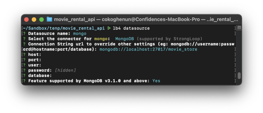
Now, let’s add a datasource to the app, and link it to our MongoDB database. We can easily do this using the CLI command below
lb4 datasource
Enter fullscreen mode
Exit fullscreen mode
As usual, go ahead and answer the CLI prompts, supplying the database credentials to the CLI
Awesome! Now we can add a repository for each resource.
Run the command below and let’s set up a repository for the customer resource. Notice that we have to link the created resource to the target resource, and in this case, it is the customer resource
lb4 repository
Enter fullscreen mode
Exit fullscreen mode

Cool! Go ahead and do the same for the film and rental repositories. I’m confident you can finish up on your own 😜
Adding CRUD functionality
Great Job! That was a lot we just covered. Right now, we have models for each resource, a datasource, and repositories linking each model to its respective collection in the database.
The last piece of the puzzle is to add CRUD functionality for each resource.
We can do this by creating controllers. Controllers do the grunt work of creating, reading, updating, and deleting documents for each resource.
As you may have already guessed, we can create a controller using the controller command. Now, let’s create a REST controller for the customer resource. Notice we’ll need to use the model and repository created earlier for the customer resource.
lb4 controller
Enter fullscreen mode
Exit fullscreen mode
Note that the Id is a string and is not required when creating a new instance

As usual, go ahead and do the same for the film and rental resources.
Awesome! We now have a full-blown REST API that was generated in a few minutes. Open up the project folder in your favorite code editor and you’ll see all the code(and folders) generated by Loopback.
I recommend you change the default port in the
index.tsfile to something else i.e 4000 because Create React App (used by React-admin) runs by default on port 3000
You can start the server using the start script
npm start
Enter fullscreen mode
Exit fullscreen mode
You can find a playground and the auto-generated API documentation for your server by visiting the server address on your browser i.e http://localhost:4000/

Alright! Now we have a REST API server with CRUD functionality, we can move on with creating the admin dashboard for using React-admin.
Enter React-admin
We’ve finally gotten to the fun part, yay!
As a quick recap, we have a Loopback API generated in the last section that serves the customer, film, and rental resource with the following endpoints and data schema
// /customers endpoint
{
  "store_id": String,
  "first_name": String,
  "last_name": String,
  "email": String,
  "address_id": String,
  "activebool": Boolean,
  "create_date": Date,
  "last_update": Date,
  "active": Number
}


// /films endpoint
{
  "title": String,
  "description": String,
  "release_year": Number,
  "language_id": String,
  "rental_duration": Number,
  "rental_rate": Number,
  "length": Number,
  "replacement_cost": Number,
  "rating": String,
  "last_update": Date,
  "special_features": String,
  "fulltext": String
}

// /rentals endpoint
{
  "status": String,
  "rental_date": Date,
  "film_title": String,
  "customer_email": String,
  "return_date": Date,
  "staff_id": String,
  "last_update": Date
}
Enter fullscreen mode
Exit fullscreen mode
So here’s the game plan. We’re going to use this API to build a dashboard to manage DVD movie rentals. The first page would be a table showing all customers. Then we can click on a customer and view all his rentals on a new page. We can update the return date and status of each rental i.e from borrowed to returned. Lastly, we can view all rentals on the rentals page and create a new entry or edit an existing one.
Phew! Now we can finally begin with React-admin 😅
React-admin is a powerful front-end framework for building admin panels and dashboards. It is highly customizable and has a host of other great features. Since it is based on Reactjs, it can be used with thousands of other Reactjs and Javascript libraries.
React admin requires a base Reactjs project. We are going to be going with Create-React-App (CRA) in this article. So let’s set up the project with CRA
npx create-react-app rental-admin-panel
Enter fullscreen mode
Exit fullscreen mode
Give the CLI some time to install all dependencies and finish setting up the project. Then, cd into the project directory and go-ahead to install React-admin and the Loopback dataprovider.
npm install react-admin react-admin-lb4
Enter fullscreen mode
Exit fullscreen mode
A dataProvider is the mechanism with which React-admin communicates with a REST/GraphQL API. The Loopback provider for React-admin enables it to understand and use Loopback APIs i.e how to paginate or filter requests. If you aren’t using a Loopback generated API, you should look into using one of these dataProviders for React-admin.
Open up the project in your favourite code editor and replace everything in the App.js file with the below starter code
//src/App.js

import React from 'react';
import lb4Provider from 'react-admin-lb4';
import { Admin, Resource } from 'react-admin';

function App() {
  return (
    // ------------- Replace the below endpoint with your API endpoint -------------
    <Admin dataProvider={lb4Provider(“http://localhost:4000”)} >
      <Resource name='customers' />
    </Admin>
  );
}

export default App;
Enter fullscreen mode
Exit fullscreen mode
So far so good. But we have some new concepts to clear up. In the starter code above, we supply a dataProvider to React-admin which enables it to query the API. The next thing we did up there is to register a resource from the API that we would like to use in React-admin. This is done simply by supplying the endpoint as a name prop to the <Resource> component.
You don’t need to add the forward-slash “/” to the resource name
Going by this rule, we must register it as a resource whenever we need to query a new API endpoint. In this way, React-admin becomes aware of it. Moving on…
Creating the Customers’ table
The easiest way to view all customers’ info is to have a paginated table displaying all customers’ info. React-admin makes it easy to do this by providing us with a <List> component.
The <List> component generates a paginated table that lists out all documents in a particular resource. We can choose which fields we want to show up on the table by wrapping them in the appropriate <Field> component i.e a date property on a document would be wrapped in a <DateField> component.
The data property on the document is linked to the <Field> component using the source prop. This prop must contain the exact property name. And the field name showing up on the table can be customized using the label prop.
We can also create a filter for the table using the <Filter> component and specify an action to be triggered whenever an item is clicked on the table using the rowClick props on the <Datagrid> component. You can learn more about filtering here and row actions here
Alright! So we want a customer table to show all the customers. We also want this table to be filterable by customer email. Lastly, we want to be able to click on a customer and see all his rentals (we haven’t created the rentals page yet, but we will shortly).
Let’s see all of this in action. Go ahead to create a customer list component with the following content
//src/components/CustomerList.js

import React from 'react';
import { List, Filter, Datagrid, TextField, SearchInput, } from 'react-admin';

// ------------- filter component which filters by customer email -------------
const CustomerFilter = (props) => (
  <Filter {...props}>
    <SearchInput placeholder='Customer Email' source='email' resettable alwaysOn />
  </Filter>
);

const CustomerList = (props) => (
  <List {...props} filters={<CustomerFilter />} title='List of Customers'>
// ------------- rowclick action that redirects to the rentals of the selected customer using the customer id -------------
    <Datagrid
      rowClick={(id, basePath, record) => {
        return `/rentals?filter=%7B%22customer_email%22%3A%22${record.email}%22%7D&order=ASC&page=1&perPage=10&sort=film_title`;
      }}
    >
      <TextField disabled source='id' />
      <TextField source='first_name' />
      <TextField source='last_name' />
      <TextField source='email' />
      <TextField source='activebool' label='Active' />
    </Datagrid>
  </List>
);

export default CustomerList;
Enter fullscreen mode
Exit fullscreen mode
Next, we need to link the <CustomerList> component with the customer resource component.
//src/App.js

// ------------- import CustomerList -------------
import CustomerList from './components/CustomerList';

//…

// ------------- use CustomerList as the list view on the customer resource -------------
<Resource name='customers' list={CustomerList} />
Enter fullscreen mode
Exit fullscreen mode
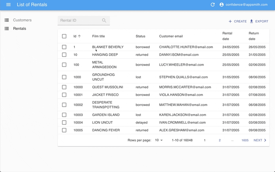
Save your code and let’s head over to the browser. You can see we have a nice paginated, and filterable customer table that has been automatically generated and is rendering customer information from the API. Cool right? 😎

Not so fast! Go ahead and create a similar list table for the rental resource. You can name this component RentalList. If you are curious or get stock, feel free to fall back on the code here.
Creating and Editing a Rental
We have two more views to create and they are the edit and create view for the rental resource. They are quite similar to each other and are both similar to the list view but with a few differences.
The edit view would be used to edit an item clicked on the rental table.
To wire up this behaviour ensure that you have
rowClick='edit'on the<Datagrid>component in<RentalList>
An edit view uses a <SimpleForm> component, which in reality is a simple form with nested <Input> components. Like with the <Field> components, each <Input> component used is based on the data type of the property to be edited i.e a <TextInput> component is used on a text property. Inputs also require the source props and optional label props as we’ve already seen with the <Field> component.
Bringing it all together, the edit view for the rental resource would look like this:
Notice that some inputs have been disabled using the
disabledprops
// src/components/RentalEdit.sj
import React from 'react';
import {
  Edit,
  SimpleForm,
  TextInput,
  DateTimeInput,
  SelectInput,
} from 'react-admin';

const RentalEdit = (props) => (
  <Edit {...props} title='Edit of Rentals'>
    <SimpleForm>
      <TextInput disabled source='id' />
      <TextInput disabled source='film_title' />
      <TextInput disabled source='customer_email' />
      <DateTimeInput disabled source='rental_date' />

      <SelectInput
        source='status'
        choices={[
          { id: 'borrowed', name: 'borrowed' },
          { id: 'delayed', name: 'delayed' },
          { id: 'lost', name: 'lost' },
          { id: 'returned', name: 'returned' },
        ]}
      />
      <DateTimeInput source='return_date' />
    </SimpleForm>
  </Edit>
);

export default RentalEdit;
Enter fullscreen mode
Exit fullscreen mode
Don’t forget to import and use the edit view in the rental resource component in your App.js file.
//src/App.js

// ------------- import RentalEdit' -------------
import RentalEdit from './components/RentalEdit';

//…

// ------------- use RentalEdit as the edit view on the rental resource -------------
 <Resource name='rentals' list={RentalList} edit={RentalEdit}/>
Enter fullscreen mode
Exit fullscreen mode
Save your files and let’s head to the browser. Click on an order to see the magic!
Okay, so we’ve completed the edit view. Now moving on to make the create view.
The create view is quite similar to the edit view. It’s so similar that I’m just going to paste the code right here and you wouldn’t be able to tell the difference. Just kidding 😜. Anyway, here’s the code for the create view
// src/components/RentalCreate.js
import React, { useState, useEffect } from 'react';
import {
  Create,
  SimpleForm,
  DateTimeInput,
  SelectInput,
  useNotify,
  useRefresh,
  useRedirect,
  useQuery,
  TextInput,
} from 'react-admin';

const RentalCreate = (props) => {
  const notify = useNotify();
  const refresh = useRefresh();
  const redirect = useRedirect();

  const onSuccess = ({ data }) => {
    notify(`New Rental created `);
    redirect(`/rentals?filter=%7B"id"%3A"${data.id}"%7D`);
    refresh();
  };

  const [customers, setCustomers] = useState([]);
  const { data: customer } = useQuery({
    type: 'getList',
    resource: 'customers',
    payload: {
      pagination: { page: 1, perPage: 600 },
      sort: { field: 'email', order: 'ASC' },
      filter: {},
    },
  });

  const [films, setFilms] = useState([]);
  const { data: film } = useQuery({
    type: 'getList',
    resource: 'films',
    payload: {
      pagination: { page: 1, perPage: 1000 },
      sort: { field: 'title', order: 'ASC' },
      filter: {},
    },
  });


  useEffect(() => {
    if (film) setFilms(film.map((d) => ({ id: d.title, name: d.title })));
    if (customer)
      setCustomers(customer.map((d) => ({ id: d.email, name: d.email })));
  }, [film, customer]);

  return (
    <Create {...props} title='Create new Rental' onSuccess={onSuccess}>
      <SimpleForm>
        <TextInput disabled source='staff_id' defaultValue='1' />
        <SelectInput source='customer_email' choices={customers} />
        <SelectInput source='film_title' choices={films} />
        <SelectInput
          source='status'
          defaultValue='borrowed'
          disabled
          choices={[
            { id: 'borrowed', name: 'borrowed' },
            { id: 'delayed', name: 'delayed' },
            { id: 'lost', name: 'lost' },
            { id: 'returned', name: 'returned' },
          ]}
        />

        <DateTimeInput source='rental_date' />

        <DateTimeInput source='return_date' />
      </SimpleForm>
    </Create>
  );
};

export default RentalCreate;
Enter fullscreen mode
Exit fullscreen mode
The only difference here is that we have two select inputs that display a list of all customers and films by manually querying those resources.
Instead of writing custom logic to query the customer and film resources, we could have easily use the built-in <ReferenceInput> component. But currently, there’s no way to set the selected value from the <SelectInput> component to something other than the document id. In the create form, we require the email field from the customer resource and the title field from the film resource. That is why we are manually querying, else the <ReferenceInput> component would have been awesome.
Do not forget to import and use the create view we just made. Also, register the film resource in App.js
//src/App.js

// ------------- import RentalCreate -------------
import RentalCreate from './components/RentalCreate';


//…

// ------------- use RentalCreate as the create view on the rental resource -------------
 <Resource name='rentals' create={RentalCreate} list={RentalList} edit={RentalEdit}/>
// ------------- register the film resource -------------
 <Resource name='films'/>
Enter fullscreen mode
Exit fullscreen mode
If a resource is registered and no list view is passed to it, React-admin hides it from the navbar. But the resource is still useful for querying as we did for the
filmselect input in the<RentalCreate>component.
This is the moment you’ve been waiting for! Save your files and head over to the browser. You’ll notice that we now have a create button on the rentals table, and clicking on a rental takes you to edit that rental. Sweet!

We’ve finally completed the dashboard! 🥳 🎉 🎊
We have a complete admin panel to manage rentals. We can see a list of customers, select a customer and view all his orders and lastly, we can create new rental entries or edit existing ones. Awesome!
For some extra credit, let’s add some authentication.
Extra credit: Authentication
You must add some authentication to your apps, else anyone would be able to use it, even malicious individuals! Thankfully, adding authentication to our API and admin dashboard is not too difficult.
The first part of this section will focus on adding authentication to the Loopback API. You can skip this if you’ve been following along with your API. Next, we’ll look at implementing auth on the React-admin panel.
Securing the API
Loopback has various authentication strategies that we can implore to secure the API. We are going to be going with the JWT authentication strategy, mostly because it’s super easy to set up and is fully supported by React-admin.
Enough talk, let’s get started by installing the JWT auth extension library and Validatorjs on the Loopback API server.
npm i --save @loopback/authentication @loopback/authentication-jwt @types/validator
Enter fullscreen mode
Exit fullscreen mode
Next, bind the authentication components to the application class in src/application.ts
// src/appliation.ts

// ----------- Add imports -------------
import {AuthenticationComponent} from '@loopback/authentication';
import {
  JWTAuthenticationComponent,
  SECURITY_SCHEME_SPEC,
  UserServiceBindings,
} from '@loopback/authentication-jwt';
import {MongoDataSource} from './datasources';
// ------------------------------------

export class TodoListApplication extends BootMixin(
  ServiceMixin(RepositoryMixin(RestApplication)),
) {
  constructor(options: ApplicationConfig = {}) {

    //…

    // ------ Add snippet at the bottom ---------

    // Mount authentication system
    this.component(AuthenticationComponent);
    // Mount jwt component
    this.component(JWTAuthenticationComponent);
    // Bind datasource
    this.dataSource(MongoDataSource, UserServiceBindings.DATASOURCE_NAME);
    // ------------- End of snippet -------------
  }
}
Enter fullscreen mode
Exit fullscreen mode
Great job! We now have a foundation for auth.
Authentication usually works by validating the credentials of the user attempting to sign in and allowing him to go through if valid credentials are supplied. Thus, we’ll then need to create a user resource to represent a user. For our purposes, a user only has an id and an email field.
Alright, let’s create the user model using the Loopback CLI. Answer the CLI prompts as usual
lb4 model
Enter fullscreen mode
Exit fullscreen mode

We’ll also need to create a controller for the user resource that handles all authentication logic. You can use the CLI to generate an empty controller.
Note that this controller would need to be an empty controller and not a REST controller
lb4 controller
Enter fullscreen mode
Exit fullscreen mode

The generated empty controller file can be found in src/controllers/user.controller.ts. Copy the contents of the file linked here into your controller file. It contains all the authentication logic. You can find the file here
Visit the link above and copy its contents into the
user.controller.tsfile
Finally, we can secure the customer resource by adding the authentication strategy we just implemented to its controller. Here’s how to do it:
// src/controllers/order.controller.ts

// ---------- Add imports -------------
import {authenticate} from '@loopback/authentication';

// ------------------ Add auth decorator -----------
@authenticate('jwt') // <---- Apply the @authenticate decorator at the class level
export class CustomerController {
  //...
}
Enter fullscreen mode
Exit fullscreen mode
Do the same for the film and rental resources by adding the authentication strategy to their respective controller files.
And that’s it! Visiting the API playground on the browser http://localhost:4000/explorer/ you’ll notice we have a nice green Authorize button at the top of the page. We also now have signup and login routes to create user accounts and log in.
You’ll need to use this playground/explorer to create a new user
Now, let’s use this authentication on the React-admin dashboard.
Adding authentication to React-admin
Implementing authentication on the React-admin dashboard is fairly straightforward. We need an authProvider which is an object that contains methods for the authentication logic, and also a httpClient that adds the authorization header to every request made by the dashboard.
Create an Auth.js file in src/Auth.js that contains the authProvider method, and the httpClient function. Here’s what the content of the file should be
// src/Auth.js

export const httpClient = () => {
  const { token } = JSON.parse(localStorage.getItem('auth')) || {};
  return { Authorization: `Bearer ${token}` };
};

export const authProvider = {
  // authentication
  login: ({ username, password }) => {
    const request = new Request(
      process.env.REACT_APP_API_URL + '/users/login',
      {
        method: 'POST',
        body: JSON.stringify({ email: username, password }),
        headers: new Headers({ 'Content-Type': 'application/json' }),
      }
    );
    return fetch(request)
      .then((response) => {
        if (response.status < 200 || response.status >= 300) {
          throw new Error(response.statusText);
        }
        return response.json();
      })
      .then((auth) => {
        localStorage.setItem(
          'auth',
          JSON.stringify({ ...auth, fullName: username })
        );
      })
      .catch(() => {
        throw new Error('Network error');
      });
  },
  checkError: (error) => {
    const status = error.status;
    if (status === 401 || status === 403) {
      localStorage.removeItem('auth');
      return Promise.reject();
    }
    // other error code (404, 500, etc): no need to log out
    return Promise.resolve();
  },
  checkAuth: () =>
    localStorage.getItem('auth')
      ? Promise.resolve()
      : Promise.reject({ message: 'login required' }),
  logout: () => {
    localStorage.removeItem('auth');
    return Promise.resolve();
  },
  getIdentity: () => {
    try {
      const { id, fullName, avatar } = JSON.parse(localStorage.getItem('auth'));
      return Promise.resolve({ id, fullName, avatar });
    } catch (error) {
      return Promise.reject(error);
    }
  },
  getPermissions: (params) => Promise.resolve(),
};
Enter fullscreen mode
Exit fullscreen mode
Alright! Now let’s make use of the authProvider and httpClient in our app. Import authProvider and httpClient from ‘Auth.jsintoApp.jsand passhttpClientas a second parameter tolb4Provider. Then add an authProvider prop to theAdmincomponent and pass inauthProvider` as its value.
Simple and easy!
`js
// ———— Import Auth ————-
import { authProvider, httpClient } from ‘./Auth’;
//…
// ———— Use httpClient and authProvider in the Admin component ———
dataProvider={lb4Provider(‘http://localhost:4000’, httpClient)}
authProvider={authProvider}
>
//…
`
Save the files and head back to the browser and you’ll be greeted with a login screen. Fill in the email and password of your registered user and you’ll be taken to the customers’ table like before.

And that’s it! We now have a super-secured app! 💪
Deploy 🚀
We now have a fully functional admin dashboard with authentication. Lastly, I’ll like to walk you through deployment to your favourite cloud provider.
Since the API generated using Loopback is a standard Nodejs server, you can deploy your app to any Nodejs hosting provider i.e Heroku or Glitch. But note that you will need to move all packages under devDependencies to the dependencies section in your package.json file.
And for the React-admin dashboard, you can deploy it on any static hosting service i.e Netlify or Vercel. Don’t forget to replace the lb4Provider URL with that of your hosted backend.
Большое количество веб-приложений сегодня требует наличия динамических веб-страниц, где пользователи получают доступ к контенту и взаимодействуют с ним. Взаимодействие с контентом часто происходит по API, т.е. операции выполняются путем отправки специальных запросов на бэкэнд-сервер. В таких ситуациях часто возникает необходимость в наличии личного кабинета где пользователь сможет выполнять какие-то действия, а администратор и модераторы отслеживать изменения и при необходимости вносить правки.
Обычной практикой при создании интерфейса является подключение каждого endpoint к конкретному API-запросу. С использованием фреймворка react-admin этот процесс стал намного проще и быстрее. React-admin – это фреймворк, который был создан специально для разработки интерфейсов администратора путем взаимодействия с API – через Rest, GraphQL или кастомные схемы. Вам не придется беспокоиться о форматировании стилей, так как фреймворк основан на с Material UI – библиотеке React, используемой при разработке интерфейсов приложений.
Вероятно, в разработке мособлеирц личный кабинет клиента применяли различные технологии, которые делают его удобным для пользователей.
Установка React и React-Admin
Для начала создадим новый проект на React и установим react-admin. Для это выполняем следующие команды:
npx create-react-app react-admin-demo-app
cd react-admin-demo-app/
npm i react-admin ra-data-json-server prop-types
npm start
Теперь ваше пустое приложение на React должно запуститься и работать на порту 3000.
API как источник данных
Для работы нашей панели администратора важно иметь функции CRUD. Для этого будем использовать API, чтобы показать, как реагирует приложение на наши действия. Воспользуемся JSONPlaceholder – фиктивным REST API, который существует для демонстрационных целей.
Пример вывода при обращении к данному API:
curl https://jsonplaceholder.typicode.com/users/4
{
  "id": 4,
  "name": "Patricia Lebsack",
  "username": "Karianne",
  "email": "[email protected]",
  "address": {
    "street": "Hoeger Mall",
    "suite": "Apt. 692",
    "city": "South Elvis",
    "zipcode": "53919-4257",
    "geo": {
      "lat": "29.4572",
      "lng": "-164.2990"
    }
  },
  "phone": "493-170-9623 x156",
  "website": "kale.biz",
  "company": {
    "name": "Robel-Corkery",
    "catchPhrase": "Multi-tiered zero tolerance productivity",
    "bs": "transition cutting-edge web services"
  }
}
Давайте попробуем извлечь данные из API. Для этой цели react-admin использует <Admin> – корневой компонент, чтобы обеспечить обмен данными между API и приложениями. Изменим код по умолчанию в src/App.js следующим образом:
//src/App.js
import React from 'react';
import { Admin } from 'react-admin';
import jsonServerProvider from 'ra-data-json-server';

const dataProvider = jsonServerProvider('https://jsonplaceholder.typicode.com');
const App = () => <Admin dataProvider={dataProvider} />;

export default App;
После такого изменения в окне браузера мы должны увидеть следующий экран:

В процессе разработки, react-admin создает интерфейсы используя компонент “guessers” (“провидцы”). При получении данных ListGuesser анализирует лучший способ отображения данных. Добавим в код <ListGuesser> и посмотрим на полученный результат:
//src/App.js показаны только измененные сроки
import { Admin, Resource, ListGuesser } from 'react-admin';
...
const App = () => (
  <Admin dataProvider={dataProvider}>
    <Resource name='users' list={ListGuesser} />
  </Admin>
);
...
Параметр list = {ListGuesser} означает, что react admin должен использовать компонент <ListGuesser> для отображения списка сообщений.

Строка <Resource name="users" /> сообщает react-admin получить “users” из API URL. <Resource> также определяет компоненты React, которые будут использоваться для каждой операции CRUD. Если сейчас открыть Web Developer Tools в браузере, то можно увидеть, что /users был автоматически добавлен к dataProvider URL, после чего был получен результат.
Стоит помнить, что компонент <ListGuesser> не предназначен для использования в production, поэтому его необходимо заменить пользовательским компонентом. Удивительной особенностью гессеров является отображение исходного кода данных, полученных из API, в консоли браузера.

Это позволяет нам понять, какой вид должен иметь наш список пользователей. Давайте реализуем пользовательский компонент в нашем приложении, используя за основу предложенный гессером код. В папке src проекта создаём файл users.js:
import React from 'react';
import { List, Datagrid, TextField, EmailField, UrlField } from 'react-admin';
export const UserList = props => (
  <List {...props}>
    <Datagrid rowClick='edit'>
      <TextField source='id' />
      <TextField source='name' />
      <TextField source='username' />
      <EmailField source='email' />
      <TextField source='address.street' label='Address' />
      <TextField source='phone' />
      <UrlField source='website' />
      <TextField source='company.name' label='Company' />
    </Datagrid>
  </List>
);
В приведенном выше блоке кода произведено несколько изменений. <UrlField> используем для того, чтобы сделать ссылки в столбце нашего сайта кликабельными. Затем мы добавляем свойство label в столбцы адреса и компании, чтобы сделать их заголовки более презентабельными. Давайте перейдем к App.js и заменим ListGuesser на UserList.
//src/App.js показаны только измененные сроки
...
import { Admin, Resource } from 'react-admin';
import { UserList } from './users';
...
const App = () => (
  <Admin dataProvider={dataProvider}>
    <Resource name='users' list={UserList} />
  </Admin>
);
...
В браузере будет минимум изменений, за исключение поля с адресом сайта, которое стало кликабельным благодаря UrlField. Теперь мы создали свой компонент, который можем настроить с учетом потребностей приложения.
Как это все работает?
Основным компонентом списка пользователей является компонент, отвечающий за получение информации из API, отображение заголовка страницы и обработку нумерации страниц. Этот список затем делегирует отображение фактического списка пользователей его дочернему элементу. В данном случае это компонент, который отображает таблицу с одной строкой для каждой записи. <Datagrid> использует свои дочерние компоненты (<TextField>, <EmailField> и прочие), чтобы определить столбцы для визуализации. Каждый компонент <Field> отображает отдельное поле в ответе API, заданное атрибутом source.
ListGuesser создал один столбец для каждого поля в ответе. Часто это слишком много для наглядного представления, поэтому можно удалить менее важные поля или те, которые вовсе не нужны. Реализованный только что процесс, отражает начальный этап разработки с использованием react-admin. Первым делом “гадатель” выполнит работу и выдаст список, далее мы выберем необходимые для отображения поля и представим их в пользовательском компоненте для дальнейшей настройки.
Создание и редактирование данных
Любая административная панель должна давать возможность пользователю создавать и редактировать данные. React Admin также легко позволяет организовать данный процесс при помощи компонента EditGuesser. Для этого импортируем его в нашем файле App.js и добавим в компонент <Resourse>.
//src/App.js показаны только измененные строки
import { Admin, Resource, EditGuesser } from "react-admin";
...
<Resource name='users' list={UserList} edit={EditGuesser} />
...
Теперь мы можем редактировать данные пользователя в нашем интерфейсе администратора.
Важно отметить, что JSONPlaceholder, используемый нами API, не имеет функций редактирования и создания. Здесь срабатывает концепция, называемая оптимистическим рендерингом – которую react admin использует для отображения изменений, внесенных при одновременной отправке запроса на обновление в фоновом режиме. В случае сбоя запроса данные возвращаются к первоначальному виду.
Аналогично гессеру со списком пользователей, в консоли браузера можно найти код для рендеринга отображаемой в редакторе информации.

Перенесем предложенную структуру в наш users.js внеся несколько корректировок по полям.
export const UserEdit = props => (
  <Edit {...props}>
    <SimpleForm>
      <TextInput disabled source='id' />
      <TextInput source='name' />
      <TextInput source='username' />
      <TextInput source='email' />
      <TextInput source='address.street' label='Address' />
      <TextInput source='phone' />
      <UrlField source='website' />
      <TextInput source='company.name' label='Company' />
    </SimpleForm>
  </Edit>
);
Добавление disabled к полю с id предотвратит возможность его редктирования, т.к. это поле чувствительных данных и по нему может идти привязка к пользователю. Во избежание нарушения структуры БД такие поля необходимо отключить для редактирования.
В App.js заменяем EditGuesser на только что созданный компонент UserEdit:
...
import  { UserList, UserEdit }  from './users';
...
<Resource name='users' list={UserList} edit={UserEdit} />
...
Процесс создания нового пользователя похож на редактирование единичой записи. Для реализации создания пользователя добавим в users.js следующий кода:
...
import { Create, List, Datagrid, TextField, EmailField, Edit, UrlField, SimpleForm, TextInput } from 'react-admin';
...
export const UserCreate = props => (
  <Create {...props}>
    <SimpleForm>
      <TextInput source='name' />
      <TextInput source='username' />
      <TextInput source='email' />
      <TextInput source='address.street' label='Address' />
      <TextInput source='phone' />
      <UrlField source='website' />
      <TextInput source='company.name' label='Company' />
    </SimpleForm>
  </Create>
);
B App.js добавляем компонент UserCreate:
...
<Resource name='users' list={UserList} edit={UserEdit} create={UserCreate} />
...
Теперь мы можем создать нового пользователя.
Аналогично процессу редактирования, создание пользователя происходит с применением оптимистичного рендеринга. Запрос к серверу выполняется после отображения в браузере, после чего мы получим ошибку о том, что запись не найдена, т.к. наше демонстрационное API не поддерживает POST / PUT операции.
Примечание. Когда вы добавляете возможность редактировать элемент, вы также добавляете возможность его удаления. Кнопка «Удалить» в представлении редактирования полностью работает «из коробки», и она поддерживает отмену операции (UNDO).
На этом этапе предлагаю сделать паузу, а в следующем посте продолжим знакомство с фреймворком react admin.
Editor’s note: This guide to creating a React admin panel was last updated on 1 May 2023 to reflect changes to React and to include sections defining React admin panels, its benefits, and how to customize your React admin page. To learn more about existing React admin panels, check out this article.
A good number of web applications have evolved from static websites that just display content to dynamic webpages where users access and interact with content. This content is often powered by APIs that send and receive data. Often, an admin page sorts and handles this data, usually by building an interface and connecting every endpoint by sending requests to the API.
This was previously a tedious process until react-admin was introduced. In this article, we will learn how to create a React admin panel and how react-admin scaffolds admin interfaces for React applications. Let’s get started, shall we?
Jump ahead:
- What is a React admin panel?
- What is react-admin?
- Benefits of using react-admin
- Exploring react-admin UI elements
- Getting started with react-admin
- Modifying and filtering data with guessers
- How to use guessers in React
- Using the
<ListGuesser>component - Working with the
EditGuessercomponent - Adding new users
- React-admin authentication
- How to customize your react-admin page
- Referencing multiple records
- Theming
What is a React admin panel?
An admin panel is a web-based interface that allows admins to manage and control a web application. With web applications always scaling, administratively managing and controlling the data is essential. Using an admin panel can simplify the process of controlling and managing a web app, ultimately saving time and increasing productivity while providing security, collaboration, flexibility, and real-time insights.
What is react-admin?
React-admin is an open source framework that builds admin interfaces by consuming APIs, including REST, GraphQL, or custom ones using React. We also don’t need to worry about style formatting because react-admin provides a set of pre-built UI components based on Material-UI.
Benefits of using react-admin
React-admin can be designed to fit the web application’s specific needs, providing flexibility and control while delivering a high-quality UX. React-admin comes with common features of admin panels, including the following:
- Data management: React-admin provides a simple way to handle data management. With it, you can perform CRUD operations, filtering, sorting, and pagination with less code
- Customizable UI: React-admin comes pre-built with UI components that can be customized to fit your needs using Material-UI or CSS
- Streamlined development: React-admin provides guessers that generate a reusable component with the properties and values from your API
- Authentication and authorization: React-admin allows developers to easily manage user access to the admin panel out-of-the-box
- Internationalization (i18n): React-admin has inbuilt support for internationalization, which makes it easy to create an admin panel with support for multiple languages
Exploring react-admin UI elements
Before we jump in, let’s take a look at some of the common UI elements of react-admin and what they are used for. These elements are pre-built and come as React components. The list elements are used to fetch and display a list of records (data). These elements also come with UI controls for filtering, sorting, and pagination. They include <ListGuesser>, <List>, <DataGrid> <FilterList>, <Pagination>, and more.
React-admin also comes with show elements. These elements are used to fetch and display the detail of a single record. The <Show> element, for example, is responsible for fetching the record from the dataProvider (we will see this in play later in this article), renders the page layout with a default page title or a custom title, etc.
Some other elements used in displaying a record along with <Show> include <SimpleShowLayout>, <TabbedShowLayout>, field elements (<TextField>, <DateField>), etc. Lastly, we have the creation and edition elements. These elements are used for creating and editing records. They include <Create>, <Edit>, <SimpleForm>, <Form >, <EditGuesser>.
These elements are used with input elements like <TextInput>, <NumberInput>, and more. The <Create> and <Edit> elements create pages for creating and editing a record, respectively, while the <SimpleForm> element creates the form to create or edit a record.
Getting started with react-admin
Let’s begin by creating a new-react-admin folder and installing package.json, concurrently, and json-server in a new server folder, as shown below:
# install package.json, concurrently & json-server

npm init -y
npm install json-server
npm install concurrently
Instead of installing json-server globally, we’ll create an npm script for it. Open up the package.json file and replace the default value of the scripts object with the following:
// /new-react-admin/server/package.json
# - "test": "echo "Error: no test specified " && exit 1"

+ "server": "json-server --watch db.json --port 5000",
+ "client": "npm start --prefix ../admin-demo",
+ "dev": "concurrently "npm run server" "npm run client""

# "admin-demo" will be the name of our react app
In the code block above, we want to run json-server and watch a file called db.json. The db.json file holds the data generated by the fake REST API we’ll be using. By default, this runs on port 3000, which prevents our React app from running. Instead, we’ll set it to port 5000.
The Concurrently framework enables the API and React app to run simultaneously instead of running in separate terminals. As shown above, the client script is assigned to start the React app and the dev script runs both the server and client scripts simultaneously. Now, we can create a React project in a new folder called admin-demo and install react-admin in its directory:
npx create-react-app admin-demo
Then, add a proxy to the package.json file of the React app. The proxy is set to the server script URL as shown below:
// /new-react-admin/admin-demo/package.json
"proxy": "http://localhost:5000"
Next, we’ll need to fill the db.json file with some data. Here’s a sample of the data we’ll use:
// /new-react-admin/server/db.json

{
  "users": [
    {
      "id": "1",
      "name": "Klaus Huntelaar",
      "username": "Kanaar",
      "email": "[email protected]",
      "phone": 37802223,
      "company": "Hunters Mobile Co."
    },
    {
      "id": "2",
      "name": "Peggy Sonaya",
      "username": "Peggaya",
      "email": "[email protected]",
      "phone": 4402673,
      "company": "Peggy's Drycleaning"
    },
    {
      "id": "3",
      "name": "Joseph Maguire",
      "username": "Joemag",
      "email": "[email protected]",
      "phone": 224423045,
      "company": "Jojo's Pot"
    },
    {
      "id": "4",
      "name": "Jon Hanus",
      "username": "Hanuson",
      "email": "[email protected]",
      "phone": 89354033,
      "company": "Joe's Funeral Home"
    },
    {
      "id": "5",
      "name": "Ron Burgundy",
      "username": "Colorburgundy",
      "email": "[email protected]",
      "phone": 23455,
      "company": "Color Burgundy"
    }
  ],
  "posts": [
    {
      "id": "1",
      "title": "Post One",
      "body": "This is post one",
      "publishedAt": "2019-08-01",
      "userId": "2"
    },
    {
      "id": "2",
      "title": "Post Two",
      "body": "This is post two",
      "publishedAt": "2011-06-27",
      "userId": "1"
    },
    {
      "id": "3",
      "title": "Post Three",
      "body": "This is post three",
      "publishedAt": "2021-12-14",
      "userId": "4"
    }
  ]
}
Modifying and filtering data with guessers
An admin page needs to have CRUD functionalities. We’ll use a data provider to show how react-admin does this. Simple REST is a data provider that fits REST APIs using simple GET parameters that exist for filters and sorting. First, we need to install Simple REST into our react-admin app with the following code:
// /new-react-admin/admin-demo
npm install ra-data-simple-rest
Let’s try fetching data with db.json. For this purpose, react-admin uses <Admin>, its root component, to provide the data exchange between APIs and applications. Replace the default syntax in src/App.js with the following:
import React from 'react'
import { Admin} from 'react-admin'
import restProvider from 'ra-data-simple-rest'

const dataProvider = restProvider('http://localhost:3000');

function App() {
  return (
      <Admin dataProvider={dataProvider} />
    );
  }
export default App;
Now, changing directories from the React app to the main folder, cd .., and running npm run dev at this point should render an app with a confirmatory message in a browser:
To display the data from the db.json file, the API server needs to have a content range value to prevent it from throwing an error. With the help of middleware, we’ll create a file called range.js that has a function to set the amount of content to display:
// /new-react-admin/server/range.js
module.exports = (req, res, next) => {
    res.header('Content-Range', 'posts 0-20/20');
    next();
}
For the middleware function to run, we must add --middlewares ./range.js to the server script in the package.json file.
How to use guessers in React
While still in development, react-admin creates admin interfaces through guessers. Guessers receive data from the API, determine what sort of data it is, and decide what kind of format the data should display. Let’s try to display a list of users by applying guessers:
import { Admin, Resource,ListGuesser } from 'react-admin'
import restProvider from 'ra-data-simple-rest'

const dataProvider = restProvider('http://localhost:3000');

function App() {
    return (
      <Admin dataProvider={dataProvider}>
        <Resource name="users" list={ListGuesser} />
      </Admin>
    );
  }
export default App;
In the code block above, the <resource> element is responsible for mapping the name property to an endpoint in the API. Here, <resource> appends the users value to our API and fetches the data of users from the API.
Using the <ListGuesser> component
The list property uses the <ListGuesser> component to display this data as a list of users. Here’s what that looks like:
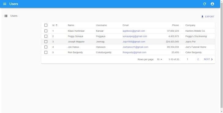
<ListGuesser> is not meant to be used in production. Therefore, it must be replaced by a custom component. An awesome feature of guessers is the display of source code data retrieved from the API in the browser’s console. Let’s take a look at what <ListGuesser> displays:
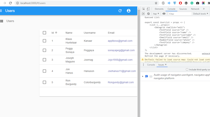
So, this shows us how our user list should be created. Let’s replicate this data in our application. In the src folder of the project, create a components folder, and in it, create a file and name it User.js:
/src/components/User.js
import { List, Datagrid, TextField, EmailField, DeleteButton } from 'react-admin';

export const UserList = () => {
    return (
        <List>
            <Datagrid rowClick="edit">
              <TextField source="id" />
              <TextField source="name" />
              <TextField source="username" />
              <EmailField source="email" />
              <TextField source="phone" />
              <TextField source="company" />
              <DeleteButton />
            </Datagrid>
        </List>
    )
}
In the code block above, a couple of changes were made. First, we used the <EmailField> element to make the links on our email column clickable. Then, we added a DeleteButton component to easily delete any of the records (data).
Let’s navigate to App.js and replace ListGuesser with UserList:
/src/App.js
import { Admin, Resource } from "react-admin";
import { UserList } from './components/User';
import restProvider from 'ra-data-simple-rest';

const dataProvider = restProvider('http://localhost:3000');
function App() {
  return (
      <Admin dataProvider={dataProvider}>
        <Resource name="users" list={UserList} />
      </Admin>
    );
  }
export default App;
Working with the EditGuesser component
Admin pages should also be able to edit, delete, and create data. React-admin does this by using guessers. If you recall, we added the rowClick prop to the DataGrid component in UserList. This means when a row is clicked, it will navigate you to an edit page where you can make updates to that record. EditGuesser edits data of admin pages. In App.js, import EditGuesser from react-admin with the following code:
src/App.js
import { Admin, Resource, EditGuesser } from "react-admin";
import { UserList } from './components/User';
import restProvider from 'ra-data-simple-rest';

const dataProvider = restProvider('http://localhost:3000');
function App() {
  return (
      <Admin dataProvider={dataProvider}>
        <Resource
          name="users"
          list={UserList}
          edit={EditGuesser}
        />
      </Admin>
    );
  }
}
Now, we can edit user details on our admin interface:
One important thing to note is that Simple REST, the data provider we’re using for the fake API, has editing and creating functionalities. Here, react-admin displays changes made while simultaneously sending an update query to the data in the db.json file. Similar to listing users, a look at our console gives us an idea of what to input as markup. Here’s what we have after using EditGuesser:
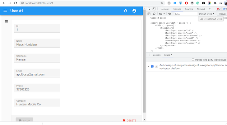
Now, let’s replicate our console’s markup in our application. Append the code sample below in Users.js:
//src/components/User.js
import { Edit, SimpleForm, TextInput } from 'react-admin';

export const UserEdit = () => {
    return (
        <Edit>
            <SimpleForm>
                <TextInput disabled source="id" />
                <TextInput source="name" />
                <TextInput source="username" />
                <TextInput source="email" />
                <TextInput source="phone" />
                <TextInput source="company"/>
            </SimpleForm>
        </Edit>
    )
}
The disabled attribute in the TextInput element prevents sensitive properties from being edited. In App.js, replace EditGuesser with UserEdit:
//src/App.js
import { Admin, Resource } from "react-admin";
import  { UserList, UserEdit }  "./components/User";
import jsonServerProvider from "ra-data-json-server";

const dataProvider = restProvider('http://localhost:3000')
function App() {
  return (
      <Admin dataProvider={dataProvider}>
        <Resource name="users" list={UserList} edit={UserEdit} />
      </Admin>
    );
  }
}
export default App;
Adding new users
The process of creating a new user is almost the same as editing. However, we must create a new set in the db.json file. In User.js, replicate the code sample below:
//src/components/User.js
import { Create, SimpleForm, TextInput, NumberInput } from 'react-admin';

export const UserCreate = () => {
    return (
        <Create title='Create User'>
            <SimpleForm>
                <NumberInput source="id" />
                <TextInput source="name" />
                <TextInput source="username" />
                <TextInput source="email" />
                <TextInput source="phone" />
                <TextInput source="company"/>
            </SimpleForm>
        </Create>
    )
}
Now, in App.js, add the UserCreate component:
//src/App.js
import { Admin, Resource } from "react-admin";
import  { UserList, UserEdit, UserCreate }  from './components/User';
const dataProvider = restProvider('http://localhost:3000')
function App() {
  return (
    <Admin dataProvider={dataProvider}>
      <Resource name="users" list={UserList} create={UserCreate} edit={UserEdit} />
    </Admin>
  );
}
export default App;
On our interface, let’s try to create a new user:
Similar to what happens when we try to edit the details of a user, when we try to create new users, optimistic rendering occurs. This explains why, in the last seconds of the snippet above, our newly created user displays for a while before the message NOT FOUND can be seen.
React-admin authentication
Every admin page needs an authentication process. It can be basic or a bit more complex, such as JSON Web Tokens (JWT) or OAuth. Although, by default, react-admin apps do not need authentication to function, it’s still best practice to integrate authentication into admin pages.
React-admin lets us be flexible with how we implement authentication. Simple REST has no authentication model, so we will create a dummy authentication process that accepts any values as username and password, and store these values in localStorage. In our src folder, create a file called authProvider:
// src/authProvider.js
import { AUTH_LOGIN, AUTH_LOGOUT, AUTH_ERROR, AUTH_CHECK } from 'react-admin';

   export const authProvider = (type, params) => {
    // when a user tries to log in
    if (type === AUTH_LOGIN) {
     const { username } = params;
     localStorage.setItem('username', username)
     return Promise.resolve();
    }
    // when a user tries to logout
    if (type === AUTH_LOGOUT) {
        localStorage.removeItem('username');
     return Promise.resolve();
    }
    // when the API throws an error
    if (type === AUTH_ERROR) {
     const { status } = params;
     if (status === 401 || status === 403) {
      localStorage.removeItem('username');
      return Promise.reject()
     }
     return Promise.resolve()
    }
    // when a user navigates to a new location
    if (type === AUTH_CHECK) {
     return localStorage.getItem('username') ?
      Promise.resolve() :
      Promise.reject();
    }
    return Promise.reject('Unknown Method');
   };
Then, head to App.js and pass the authProvider property in the <Admin> component:
//src/App.js
import { Admin, Resource } from 'react-admin'
import restProvider from 'ra-data-simple-rest'
import { authProvider } from "./authProvider";
import { UserList, UserEdit, UserCreate} from './components/User';

const dataProvider = restProvider('http://localhost:3000')
function App() {
  return (
    <Admin dataProvider={dataProvider} authProvider={authProvider}>
      <Resource name="users" list={UserList} create={UserCreate} edit={UserEdit} />
    </Admin>
  );
}
export default App;
Now, when we restart our application, we see a login page:
How to customize your react-admin page
In this section, we’re going to look at another set of records other than just the users we’ve seen from the examples above. We’ll look at how we can style our admin page and how to manage multiple records with reference to each other. So, let’s start off by enlisting posts as one of the resources to the Admin component, so head up to App.js and paste this in:
// src/App.js
import {Admin, Resource} from 'react-admin'
import restProvider from 'ra-data-simple-rest'
import { authProvider } from "./authProvider";
import { PostList, PostEdit, PostCreate} from './components/Post';
import { UserList, UserEdit, UserCreate} from './components/User';

const dataProvider = restProvider('http://localhost:3000')
function App() {
  return (
    <Admin dataProvider={dataProvider} authProvider={authProvider}>
      <Resource name="users" list={UserList} create={UserCreate} edit={UserEdit} />
      <Resource name="posts" list={PostList} create={PostCreate} edit={PostEdit} />
    </Admin>
  );
}

export default App;
Just like we’ve created UserList, UserEdit, and UserCreate with the help of guessers, we’ll do the same thing to create PostList, PostEdit, and PostCreate. But, we won’t go through every detail like we did for users. So, in components, simply create a Post.js file and paste the following code:
// src/components/Post.js
import { List, Create, Edit, SimpleForm, TextInput, DateInput, Datagrid, TextField, DateField, NumberInput } from 'react-admin'

export const PostList = () => {
    return (
        <List>
            <Datagrid rowClick='edit'>
                <TextField source="id" />
                <TextField source="title" />
                <DateField source="publishedAt" />
                <TextField source='userId' label='Author' />
            </Datagrid>
        </List>
    )
}

export const PostCreate = () => {
    return (
        <Create title='Create a Post' >
            <SimpleForm>
                <NumberInput source='id' />
                <TextInput source='title' />
                <TextInput multiline source='body' />
                <DateInput label='Published' source='publishedAt' />
            </SimpleForm>
        </Create>
    )
}

export const PostEdit = () => {
    return (
        <Edit>
            <SimpleForm>
                <NumberInput disabled source='id' />
                <TextInput source='title'/>
                <TextInput multiline source='body' />
                <DateInput label='Published' source='publishedAt' />
            </SimpleForm>
        </Edit>
    )
}
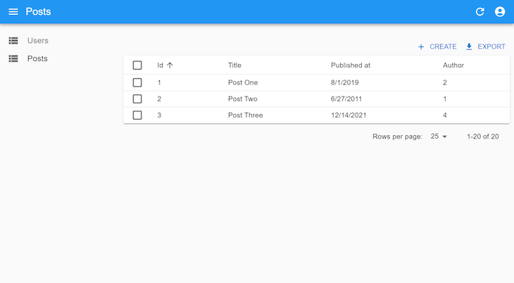
Notice that the author columns are not as effective as they should be. Here, we expect the username of the authors to display rather than the userId passed from the db.json. We can do so with the reference prop.
Referencing multiple records
Head up to Post.js and update your PostList component as follows:
// src/components/Post.js
export const PostList = () => {
    return (
        <List>
            <Datagrid rowClick='show'>
                <TextField source="id" />
                <TextField source="title" />
                <DateField source="publishedAt" />
                <ReferenceField source="userId" label="Author" reference="users" />
            </Datagrid>
        </List>
    )
}
Here, we introduce a ReferenceField component and set the reference prop on the users. The value of the reference should tally with the name we provided for the users’ Resource in the Admin component. So far, what we’ve done will only make each list of the Author column clickable, and when clicked, it will navigate you to that user.
But, it will still show the authors’ IDs rather than their usernames. To change that, head up to App.js and update the Resource of users to this:
// src/App.js
<Resource
  name="users"
  list={UserList}
  create={UserCreate}
  edit={UserEdit}
  recordRepresentation={(user) => user.username}
/>
By default, react-admin represents each record by its ID, but now we’ve changed this representation to the username. Here’s what that looks like:
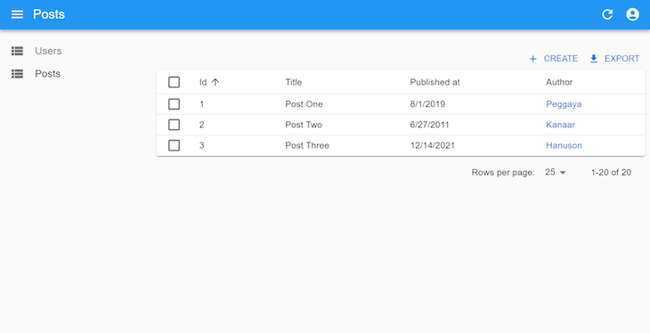
When updating or creating a new post, we can use the ReferenceInput to help admins specify the authors. Update your PostCreate and PostEdit to this:
// src/components/App.js
export const PostCreate = () => {
  return (
    <Create title="Create a Post">
      <SimpleForm>
        <NumberInput source="id" />
        <ReferenceInput source="userId" reference="users">
          <AutocompleteInput label="Author" />
        </ReferenceInput>
        <TextInput source="title" />
        <TextInput multiline source="body" />
        <DateInput label="Published" source="publishedAt" />
      </SimpleForm>
    </Create>
  );
};

export const PostEdit = () => {
  return (
    <Edit>
      <SimpleForm>
        <NumberInput disabled source="id" />
        <ReferenceInput source="userId" reference="users">
          <AutocompleteInput label="Author" />
        </ReferenceInput>
        <TextInput source="title" />
        <TextInput multiline source="body" />
        <DateInput label="Published" source="publishedAt" />
      </SimpleForm>
    </Edit>
  );
};
Theming
Each component of react-admin can be styled with the sx prop from MUI System. It uses CSS-in-JS, just like React’s style prop. We will be using it to style the DataGrid component in UserList, as shown below:
export const UserList = () => {
  return (
    <List>
      <Datagrid
        rowClick="edit"
        sx={{
          ".RaDatagrid-rowEven": {
            backgroundColor: "lavender",
          },
          ".RaDatagrid-headerCell": {
            backgroundColor: "MistyRose",
          },
        }}
      >
        <TextField source="id" />
        <TextField source="name" />
        <TextField source="username" />
        <EmailField source="email" />
        <TextField source="phone" />
        <TextField source="company" />
        <DeleteButton />
      </Datagrid>
    </List>
  );
};
The .RaDatagrid-rowEven is a class selector that selects all even rows of the table, meanwhile, .RaDatagrid-headerCell selects the header of the table. You can get the class names when you inspect the element like so:
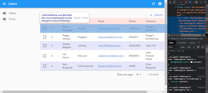
If we want to apply the same style to multiple DataGrid components in our app, we use the styled function from the MUI System to create a reusable styled DataGrid component:
import { styled } from '@mui/system';
import { Datagrid } from 'react-admin';
export const CustomDataGrid = styled(Datagrid)({
  '.RaDatagrid-rowEven': {
    backgroundColor: 'lavender',
  },
  '.RaDatagrid-headerCell': {
    backgroundColor: 'MistyRose',
  },
});
Now, let’s see how we can give unique icons to both the users and posts menu on the left sidebar. The Resource component has an icon prop that you can pass an icon component like this:
import { Admin, Resource } from "react-admin";
import restProvider from "ra-data-simple-rest";
import { authProvider } from "./authProvider";
import { PostList, PostEdit, PostCreate } from "./components/Post";
import { UserList, UserEdit, UserCreate } from "./components/User";
import PeopleIcon from "@mui/icons-material/People";
import ArticleIcon from "@mui/icons-material/Article";

const dataProvider = restProvider("http://localhost:3000");

function App() {
  return (
    <Admin dataProvider={dataProvider} authProvider={authProvider}>
      <Resource
        name="users"
        list={UserList}
        create={UserCreate}
        edit={UserEdit}
        recordRepresentation={(user) => user.username}
        icon={PeopleIcon}
      />
      <Resource
        name="posts"
        list={PostList}
        create={PostCreate}
        edit={PostEdit}
        icon={ArticleIcon}
      />
    </Admin>
  );
}

export default App;
Finally, let’s create an option to switch from a dark to a light theme and vice versa. To do this, we will have to create a new layout that will contain a toggle button on the header of all pages. So, create a layouts folder in the src folder. In that folder, create an AppLayout.js file, and paste the following into it:
// src/layouts/AppLayout.js
import {
  defaultTheme,
  Layout,
  AppBar,
  ToggleThemeButton,
  TitlePortal,
} from 'react-admin';
import { createTheme } from '@mui/material';

const darkTheme = createTheme({
  palette: { mode: 'dark' },
});

const CustomAppBar = () => (
  <AppBar>
    <TitlePortal />
    <ToggleThemeButton lightTheme={defaultTheme} darkTheme={darkTheme} />
  </AppBar>
);
export const AppLayout = (props) => <Layout {...props} appBar={CustomAppBar} />;
Now, head up to App.js and pass the new AppLayout to the layout prop of Admin like so:
<Admin
  dataProvider={dataProvider}
  authProvider={authProvider}
  layout={AppLayout}
>
{/**/}
</Admin>
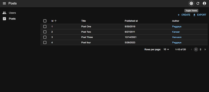
Conclusion
Creating React admin panels does not have to be as complex as it once was. With React’s react-admin, we can scaffold admin interfaces quite readily. Authentication processes are equally important, and they are not excluded here. You can find the source code for this project here on GitHub.
Cut through the noise of traditional React error reporting with LogRocket
LogRocket
is a React analytics solution that shields you from the hundreds of false-positive errors alerts to just a few truly important items. LogRocket tells you the most impactful bugs and UX issues actually impacting users in your React applications.
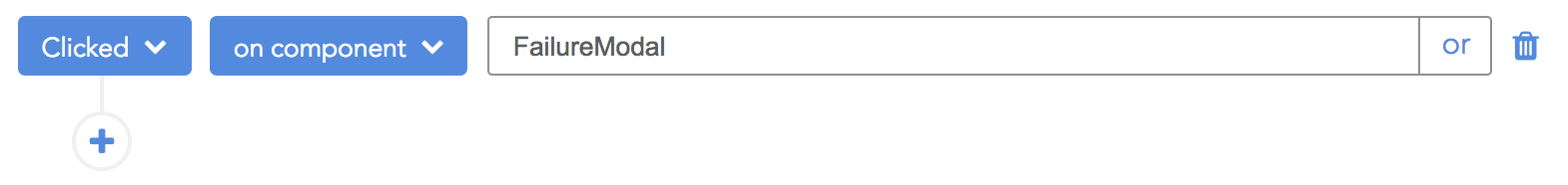
LogRocket
automatically aggregates client side errors, React error boundaries, Redux state, slow component load times, JS exceptions, frontend performance metrics, and user interactions. Then LogRocket uses machine learning to notify you of the most impactful problems affecting the most users and provides the context you need to fix it.
Focus on the React bugs that matter —
try LogRocket today.
Building an admin dashboard in react-admin

6 April 2020
•
18 min read
I’m going to make a wild guess here – if you’ve ever had to build an admin panel at work, you probably weren’t incredibly excited about it. Every business needs an admin UI to manage the day to day – looking up a user’s address, marking an order as refunded, resetting a password – but they can be a bit of a pain to build and maintain. If you’re using React though, react-admin might just make things a bit easier.
This tutorial is going to walk through how to build a fully functional admin panel in react-admin with auth. To get the most out of this tutorial, you’ll want to be comfortable with React and basic frontend/backend interaction.
Sidebar: With Retool, you can build admin panels and internal tools remarkably fast. Get started for free 👉
What’s react-admin?
React-admin is a framework that uses React, Material UI, React Router, Redux, and React-final-form to give you a unified admin framework that you can customize to fit your dashboard building needs. It’s developed and maintained by a dev shop called Marme Lab (I’m guessing they got tired of building the same admin UIs for their clients over and over again).
React-admin is a frontend framework, so it’s built to use your ** existing ** REST / GraphQL APIs. It allows you to easily create frontend admin applications that interact with your backend in a standardized way through data providers.
What are data providers, you say?
React-admin is unique in the way that it processes the interactions between your frontend and backend:

It uses something called an adapter approach (data providers): the data provider acts as the interface between the framework and your backend → it takes care of the querying and response handling between the frontend & your respective backend API(s) to allow you to focus on your dashboard building in modular steps.
To start, react-admin gives us data providers that can be used to backwards engineer our API’s if they haven’t already been built, or in the more likely scenario that they already exist, you can write your own data providers to interface with your existing APIs**.**
At a high level, react-admin offers some pretty interesting features (we’ll dive into one of them later):
- Relationship support
- Conditional formatting
- Full-featured datagrids
- Optimistic rendering
Long story short: it’s a powerful framework.
How to build your own admin app
Prerequisites:
- Install
npx(nodeversion should be >
- Install
create-react-app

Let’s start out by creating a new folder to store our codebase for our new admin app. I’m going to call mine react-admin-tutorial (very creative, I know). After dropping into your new directory, let’s create a new react application with create-react-app:
npx create-react-app awesome-admin
This will create a new empty React app that we can use to jumpstart our development through Facebook’s create-react-app tool. Now we can move into the directory holding our new app:
cd awesome-admin
npm install react-admin ra-data-json-server
// ra-data-json is the package containing the data provider we’ll use
npm start
That will install the react-admin package and the data provider we need to connect to our fake API. Our app will be running at localhost:3000. Now it’s time to work on building out the app.
Subscribe to the Retool monthly newsletter
Once a month, we send out top stories (like this one) along with Retool tutorials, templates, and product releases.
Building the admin app
For this tutorial, we are going to use JSONPlaceholder — this is a fake REST API that we can use to develop our frontend with fake data. This way, we’ll be able to focus on the core of react-admin without worrying too much about writing custom data providers yet.
First off, replace src/app.js with the following to get us off the ground:
import React from 'react';
import { Admin } from 'react-admin';
import jsonServerProvider from 'ra-data-json-server';

//connect the data provider to the REST endpoint
const dataProvider = jsonServerProvider('https://jsonplaceholder.typicode.com');

function App() {
 return (
     <Admin dataProvider={dataProvider} />
 );
}

export default App;
Now you should see something like the screenshot below; this is the default page you get when you supply react-admin with the data provider it expects.

Now we’ll bring in our first resource:
import React from 'react';
import { Admin, Resource,ListGuesser } from 'react-admin';
import jsonServerProvider from 'ra-data-json-server';

//connect the data provider to the REST endpoint
const dataProvider = jsonServerProvider('https://jsonplaceholder.typicode.com');

function App() {
   return (
       <Admin dataProvider={dataProvider}>
           <Resource name="users" list={ListGuesser}/>

       </Admin>
   );
}

export default App;
The Resource component allows us to tell react-admin that we’d like to fetch and display a resource with the name “users.” The dataprovider processes this and makes a request according to its interface – in this case to https://jsonplaceholder.typicode.com/users – and then displays that to the user using the ListGuesser component. This “list” prop tells react-admin to use ListGuesser to take whatever data the resource receives and make it’s best guest to format the initial data grid.
We’ll use this initial with all of our resources to generate some initial list code — it spits out its best guess to the console for us to use. Here’s what things should look like:

The guesser gets us 90% of the way there, but we want to customize the columns to have slightly more human-readable labels. Inspect the table element in your browser, and copy the Guessed List that you see in your console (inspect element → console). It should look something like this:
export const UserList = props => (
    <List {...props}>
        <Datagrid rowClick="edit">
            <TextField source="id" />
            <TextField source="name" />
            <TextField source="username" />
            <EmailField source="email" />
            <TextField source="address.street" />
            <TextField source="phone" />
            <TextField source="website" />
            <TextField source="company.name" />
        </Datagrid>
    </List>
);
We’ll create a new component that overrides these suggestions. Create a folder called components in src and paste the copied code in a new file called users.js (src/components/users.js). It should look like this :
import React from 'react';
import { List, Datagrid, TextField, EmailField } from 'react-admin';

export const UserList = props => (
   <List {...props}>
       <Datagrid rowClick="edit">
           <TextField source="id" />
           <TextField source="name" />
           <TextField source="username" />
           <EmailField source="email" />
           <TextField source="address.street" />
           <TextField source="phone" />
           <TextField source="website" />
           <TextField source="company.name" />
       </Datagrid>
   </List>
);
The list is the main component here, handling the majority of the work (pagination, etc.) but the actual rendering of the data is left to the DataGrid, which renders a table where each record has one of the child components / fields. These fields’ data is sourced based on the source name that you provide, which matches up with what is received by the dataprovider from the API.
While we’re here, let’s refine this list a bit to show how you can customize it. Here’s what I am going to do:
- Get rid of the id and username field to save screen space
- Disable sorting in the phone field, as all fields default to being sortable
- Change the street address & company name field label with the label prop
The changed fields should look like this :
<TextField source="address.street" label="Street Address"/>
<TextField source="phone" sortable={false}/>
<TextField source="company.name" label="Company Name"/>
Now we’ll need to replace the ListGuesser with our new list in the Resource component. Head back to App.js, and add in a line up top to import our new UserList component:
import {UserList} from "./components/users";
Now replace ListGuesser in the List prop of our Resource with the UserList:
<Resource name="users" list={UserList} />
With those changes, we should have a more concise and usable view of the users resource:

It’s worth mentioning that you can replace any of the components inside the datagrid with your own, so if you want to create your own fields to suit your needs, just drop them in and make sure to include the source prop.
To show you what this would look like:
import React from 'react';
import { makeStyles } from '@material-ui/core/styles';
import MailOutlineIcon from '@material-ui/icons/MailOutline';

const useStyles = makeStyles({
   link: {
       textDecoration: 'underline',
   },
   icon: {
       width: '0.5em',
       paddingLeft: 2,
   },
});

const CustomEmailField = ({ record = {}, source }) => {
   const classes = useStyles();
   return (
       <a href={"mailto:" + record[source]} className={classes.link}>
           {record[source]}
           <MailOutlineIcon className={classes.icon} />
       </a>
   );
}

export default CustomEmailField;
Paste this in src/components/CustomEmailField.js and modify the email field in src/Users.js to reflect our new custom field.
By swapping out the email fields, we customize the component that’ll render the email data record. As you can see above, we modified the original functionality to have the link be a mailto so you can click on it and open an email to the person. We also added an email icon with custom styles using useStyles.
Note: You can do plenty more in customizing the fields to your heart’s desire that won’t be covered here, but this gives you a solid template to build off and create your own custom fields.
Let’s repeat this process with posts. There’s something else we need to tackle here: relationship handling. In our sample API, querying the posts resource gives us this JSON:

Notice how in each document there’s a userId attached. This userId allows us to create a reference between the user and the post within the admin panel, and thankfully react-admin automatically detects this for us.
To show the posts resource in our panel, let’s add another resource component:
import React from 'react';
import { Admin, Resource,ListGuesser } from 'react-admin';
import jsonServerProvider from 'ra-data-json-server';
import {UserList} from "./components/users";

//connect the data provider to the REST endpoint
const dataProvider = jsonServerProvider('https://jsonplaceholder.typicode.com');
D
function App() {
   return (
       <Admin dataProvider={dataProvider}>
           <Resource name="users" list={UserList}/>
           <Resource name="posts" list={ListsGuesser}/>

       </Admin>
   );
}

export default App;
Again, we’ll use the ListGuesser to generate the guessed fields. If you can see something like this (click on the “posts” tab), you should be in good shape.

We’re going to want to update these column names, so we’ll go through the same workflow as above. Go ahead and copy the code from the guessed list in the console and paste into a new file: src/components/posts.js.
It should look like this:
import React from 'react';
import { List, Datagrid,ReferenceField, TextField, EmailField } from 'react-admin';

export const PostList = props => (
   <List {...props}>
       <Datagrid rowClick="edit">
           <ReferenceField source="userId" reference="users"><TextField source="name" /></ReferenceField>
           <TextField source="id" />
           <TextField source="title" />
           <TextField source="body" />
       </Datagrid>
   </List>
);
The ReferenceField component above allows us to create a relationship with the user resource. We identify the foreign key with the prop source=”userId” and create the relationship with the reference prop.
Also, make sure to change the list prop for the new posts resource to reference our custom PostList in App.js – import the PostList and then replace ListGuesser in the post resource’s list prop.
Note: I went ahead and changed the TextField, what is actually displayed for the reference inside the table, to display the name. You can display anything contained within a user object by passing the source name for the user resource. Logically speaking, any child of a reference field will be working with the record of the referenced resource. In this case, the user resource is referenced so the child textfield’s source will be derived from the user resource.
Next, we’re going to add an edit button to set us up to be able to modify content. We’ll start by adding a new component into our Datagrid: an EditButton at the bottom (and adding it into the import from react-admin up top).
import React from 'react';
import { List, Datagrid,ReferenceField, TextField, EmailField,EditButton } from 'react-admin';

export const PostList = props => (
   <List {...props}>
       <Datagrid rowClick="edit">
           <ReferenceField source="userId" reference="users"><TextField source="name" /></ReferenceField>
           <TextField source="id" />
           <TextField source="title" />
           <TextField source="body" />
           <EditButton/>
       </Datagrid>
   </List>
);
Much like the list prop, we need to pass an edit prop to our resource in order to be able to have react-admin generate edit capabilities. We’ll use a component called EditGuesser and pass that to the posts resource in src/App.js (make sure to add it into the import up top):
import React from 'react';
import { Admin, Resource,ListGuesser,EditGuesser } from 'react-admin';
import jsonServerProvider from 'ra-data-json-server';
import {UserList} from "./components/users";
import {PostList} from "./components/posts";

//connect the data provider to the REST endpoint
const dataProvider = jsonServerProvider('https://jsonplaceholder.typicode.com');

function App() {
   return (
       <Admin dataProvider={dataProvider}>
           <Resource name="users" list={UserList}/>
           <Resource name="posts" list={PostList} edit={EditGuesser}/>

       </Admin>
   );
}

export default App;
This guesser will generate the initial edit code for the posts that we can then customize.
Once you have the edit guesser wired in, check that the edit functionality works by clicking edit on one of the post records. It should bring you to a screen where you can make edits to the fields of the object being modified – since we’re using a test api, changes made will not persist beyond the local frontend state. In a real application though, the edit functionality would interface with the backend to make the necessary changes as you make them to the objects on the frontend.
Once you verify this is working, take the guessed code from the console, and put it in src/components/posts.js. It should look something like this:
   <export const
   PostEdit = props => (
       <Edit {...props}>
           <SimpleForm>
               <ReferenceInput source="userId" reference="users">
               <SelectInput optionText="id"/>
               </ReferenceInput>
               <TextInput source="id"/>
               <TextInput source="title"/>
               <TextInput source="body"/>
           </SimpleForm>
       </Edit>
Note: you’ll have to import previously unused components – SimpleForm, TextInput, ReferenceInput, SelectInput, and Edit.
Let’s copy and paste the edit code now and create a CreatePost component. It takes almost the same structure of the edit component. Your posts.js file should like this:
import React from 'react';
import {
   List,
   TextInput,
   SimpleForm,
   Edit,
   Create,
   ReferenceInput,
   SelectInput,
   Datagrid,
   ReferenceField,
   TextField,
   EmailField,
   EditButton,
   EditGuesser
} from 'react-admin';

export const PostList = props => (
   <List {...props}>
       <Datagrid rowClick="edit">
           <ReferenceField source="userId" reference="users"><TextField source="name"/></ReferenceField>
           <TextField source="id"/>
           <TextField source="title"/>
           <TextField source="body"/>
           <EditButton/>
       </Datagrid>
   </List>
);

export const PostEdit = props => (
   <Edit {...props}>
       <SimpleForm>
           <ReferenceInput source="userId" reference="users"><SelectInput optionText="id"/></ReferenceInput>
           <TextInput source="id"/>
           <TextInput source="title"/>
           <TextInput source="body"/>
       </SimpleForm>
   </Edit>
);

export const PostCreate = props => (
   <Create {...props}>
       <SimpleForm>
           <ReferenceInput source="userId" reference="users"><SelectInput optionText="id"/></ReferenceInput>
           <TextInput source="id"/>
           <TextInput source="title"/>
           <TextInput source="body"/>
       </SimpleForm>
   </Create>
);
The only difference between the edit and create components is that we’re using two different wrapper components – <Edit> and <Create> – which each handle the data processing & interfacing with the backend uniquely. Make sure to add the Create component into your import statement up top.
As you might expect, we need to supply the create prop in our resource too. Start by adding our two new components from posts.js into the import on top of App.js (PostEdit and PostCreate), and then add them into the posts resource:
<Resource name="posts" list={PostList} edit={PostEdit} create={PostCreate}/>
While it’s not apparent in our code, react-admin bakes in a feature into our admin dashboard that enables deletion for every resource that has an edit component. If you check your edit screen on the Posts resource, you’ll see the delete button in the bottom right.
(Note that after clicking delete, the frontend will show that it was deleted due to optimistic rendering, but since our fake api disallows PUT/DELETE requests, this should error out after a few seconds. Not to worry though, once you’re hooked up to your live API, you’ll be fine.)
Although we only covered the basics with edit/create components, you can customize them even further with these props:
- title
- actions
- aside
- successMessage
- component
- undoable (
<Edit>only)
Also, if we want to create a rich input experience, we can customize the input fields with props like:
- source
- label
- validate
- helperText
- className: A class name (usually generated by JSS) to customize the look and feel of the input element itself
- formClassName: Class name to be applied to the container of the input (e.g. the <div> forming each row in <SimpleForm>)
- fullWidth: If true, the input will expand to fill the form width. Defaults to false.
Optimistic Rendering
Let’s talk a bit about why react-admin is so fast. Optimistic rendering means that react-admin renders changes to the client side state before the server has returned with a response for a particular action. For example, if you deleted a user, react-admin will render the user as deleted before the request actually goes through and responds. In reality, react-admin puts an approximately 5 second delay on requests to resources initiated by the user. This allows for this kind of fast rendering and also the ability to undo actions.
Say you accidentally hit delete: you can undo your actions quickly with an undo button and react-admin will cancel the request to delete the user before even sending it to the server. Overall, optimistic rendering let’s the user experience a more seamless UX when compared to a more traditional model that waits for the server to return in order to render. That being said, there are obviously tradeoffs inherent in each model.
Some notes about <List>
If you’ve been following along, you’ve seen that the List component is integral to building out an admin app with react-admin, so it’s worth understanding what’s going on behind the scenes. The lists acts as the data facilitator / processor / interface for the application’s data List components – i.e. the components that render resource data for, say, users in a list. All the children of that list can be thought of as dumb, as they are mainly presentational in nature, whereas the List itself handles the connection to the data and all the associated processes. For example, if you want to control a filter, pagination, or sorting, you need to deal with the <List> components of a parent component.
As your application grows (and maybe scope creep starts happening), being able to leverage these customizable capabilities becomes important to fit your needs.
Adding Authentication
Nobody wants their internal APIs to be publicly accessible, so let’s quickly run through how we’d add some authentication into our admin console. By default, react-admin has a login page ready and setup, but it’s authentication provider agnostic, meaning you can use whatever identity service you want with react-admin, assuming you write an authentication provider.
React-admin expects five methods from our authentication provider: login, logout, checkError, checkAuth, and getPermissions . We’ll add our own basic ones in. Let’s put them in a new directory and file, src/providers/authProvider.js:
export default {
   login: ({ username }) => {
       localStorage.setItem('username', username);
       return Promise.resolve();
   },
  logout: () => {
       localStorage.removeItem('username');
       return Promise.resolve();
   },
   checkError: ({ status }) => {
       if (status === 401 || status === 403) {
           localStorage.removeItem('username');
           return Promise.reject();
       }
       return Promise.resolve();
   },
   checkAuth: () => {
       return localStorage.getItem('username')
           ? Promise.resolve()
           : Promise.reject();
   },
   getPermissions: () => Promise.resolve(),
};
Then go to your admin component in src/app.js and add the prop authProvider={authProvider}. Make sure to remember to add a new import statement for the authProvider component as well:
import authProvider from "./providers/authProvider";
After that, you’ll have a functioning admin app with a login page. Granted, some of the services and backend still need to be wired up in a production app, but you’ve still accomplished a lot! The big thing to take away from this is that react-admin makes it insanely easy to interact with your existing data that sit behind existing APIs, as long as you can fulfill the data contracts between the data providers and the API services.
For now, let’s implement a real authentication service, firebase auth. First you’re going to need to install react-admin-firebase: this package is an authProvider built specifically for use with react-admin and firebase.
npm i react-admin-firebase
Next, you’ll need to go to firebase and create a new project, and then go to settings to retrieve your auth config. Once you have it, create an auth object in src/app.js like below below:
import React from 'react';
import {Admin, Resource, ListGuesser, EditGuesser} from 'react-admin';
import jsonServerProvider from 'ra-data-json-server';
import {UserList} from "./components/users";
import {PostCreate, PostEdit, PostList} from "./components/posts";
import authProvider from "./providers/authProvider";
import {
   FirebaseAuthProvider,
} from 'react-admin-firebase';

//connect the data provider to the REST endpoint

const config = {
   apiKey: "xxxxxxxxxxxxxxxxxxxxxxx",
   authDomain: "xxxxxxxxxxxxxxxxxxxxxxx",
   databaseURL: "xxxxxxxxxxxxxxxxxxxxxxx",
   projectId: "xxxxxxxxxxxxxxxxxxxxxxx",
   storageBucket: "xxxxxxxxxxxxxxxxxxxxxxx",
   messagingSenderId: "xxxxxxxxxxxxxxxxxxxxxxx",
};

// const options = {
//     // Use a different root document to set your resource collections, by default it uses the root collections of firestore
//     rootRef: 'root-collection/some-doc',
// // Your own, previously initialized firebase app instance
//     app: firebaseAppInstance,
// // Enable logging of react-admin-firebase
//     logging: true,
// // Resources to watch for realtime updates, will implicitly watch all resources by default, if not set.
//     watch: ['posts'],
// // Resources you explicitly dont want realtime updates for
//     dontwatch: ['comments'],
// }

const dataProvider = jsonServerProvider('https://jsonplaceholder.typicode.com');
const firebaseAuthProvider = FirebaseAuthProvider(config)

function App() {
   return (
       <Admin dataProvider={dataProvider} authProvider={firebaseAuthProvider}>
           <Resource name="users" list={UserList}/>
           <Resource name="posts" list={PostList} edit={PostEdit} create={PostCreate}/>

       </Admin>
   );
}

export default App;
You’ll notice that the main piece is the firebase config, and beyond that you can set options and pass them as an optional argument to FireBaseAuthProvider. These options would allow you to customize the authentication handling, but we’ll leave it to the defaults for now.
This should set us up with a fully functioning login page. If we create a user in the firebase console with a username(email) and password then try to login to our admin app, we should be able to successfully get through.

The Final Code
You see the code for the final functioning app on GitHub.
Retool gives you a complete set powerful building blocks for building internal tools: Assemble your app in 30 seconds by dragging and dropping from 50+ pre-built components. Connect to dozens of data integrations and anything with a REST or GraphQL API. Get started for free 👉
Where to go from here
React-admin lets us get off the ground and build a super functional admin app in minutes, not months. It abstracts the nasty building and maintaining that us developers are usually tasked with. But where do you go from here if you want keep building?
If you want to use your own API, react-admin’s tutorial is a must read. At a high level, this is what the dataProvider interface needs to look like:
const dataProvider = {
    getList:    (resource, params) => Promise,
    getOne:     (resource, params) => Promise,
    getMany:    (resource, params) => Promise,
    getManyReference: (resource, params) => Promise,
    create:     (resource, params) => Promise,
    update:     (resource, params) => Promise,
    updateMany: (resource, params) => Promise,
    delete:     (resource, params) => Promise,
    deleteMany: (resource, params) => Promise,
}
The following is a list of existing data providers I got from marmelab.com (the developers and maintainers of react-admin):
- Django Rest Framework: synaptic-cl/ra-data-drf
- Express & Sequelize: express-sequelize-crud
- Feathersjs: josx/ra-data-feathers
- Firebase: aymendhaya/ra-data-firebase-client.
- Firestore: rafalzawadzki/ra-data-firestore-client.
- GraphCool: marmelab/ra-data-graphcool (uses Apollo)
- GraphQL: marmelab/ra-data-graphql (uses Apollo)
- HAL: b-social/ra-data-hal
- Hasura: hasura/ra-data-hasura
- Hydra / JSON-LD: api-platform/admin/hydra
- IndexedDB: tykoth/ra-data-dexie
- JSON API: henvo/ra-jsonapi-client
- JSON HAL: ra-data-json-hal
- JSON server: marmelab/ra-data-json-server.
- Loopback: darthwesker/react-admin-loopback
- Moleculer Microservices: RancaguaInnova/moleculer-data-provider
- NestJS CRUD: FusionWorks/react-admin-nestjsx-crud-dataprovider
- Parse: almahdi/ra-data-parse
- PostgREST: raphiniert-com/ra-data-postgrest
- Prisma: weakky/ra-data-prisma
- OpenCRUD: weakky/ra-data-opencrud
- REST-HAPI: ra-data-rest-hapi
- Sails.js: mpampin/ra-data-json-sails
- Spring Boot: vishpat/ra-data-springboot-rest
- Strapi: nazirov91/ra-strapi-rest
Check these out to see if any fit your stack before you try and write your own. Many of these will allow you to jumpstart your dataprovider development, if not eliminate you having to write one.
I will say that what you need to do to write your dataprovider is highly dependent on your api schema. If it’s standard, it will probably either fall under one of the prebuilt data providers listed above, or be fairly easy to implement. But if your api isn’t as standard, it might take more than a few minutes to get the data provider working.
If you’re building an admin app or custom dashboard or for your organization, check out Retool! Retool saves you a bunch of time and hassle by letting you drag and drop components like tables, search boxes, and buttons, and connecting them to SQL or Javascript on the backend. You can also build off of templates to customize your dashboard with custom components that interface with your backend.
Introduction
Every web project has two sides: the one seen by users and the admin page that its manager uses to control each aspect of each page of said project. To draw a parallel, the user side of the site is our usual beautiful world, and an Admin Page or Admin Console is like the Upside Down from “Stranger Things”, where it is dark and scary, but all the important stuff happens. Or, to draw another analogy, a React-based Admin Page is like the Enterprise spacecraft engine rooms: all the main characters like Captain Kirk and Spock are on the beautiful and well-lit main deck, which would be rendered useless if all the ship’s engineers left the above-mentioned engine rooms. So, the importance of a well-made Admin Page cannot be underestimated if you need your whole project to run smoothly and correctly. But first off, let’s fully understand what a React Admin Page is and how it operates.
What is React Admin
React Admin Page or React Admin Console is, to put it simply, a framework that contains all the information about the site and its content, including information about your products, users, etc. React Admin page also gives you the ability to control everything about the content on your website or app.
In other words, it is the control tool that you use to manage and improve your web project. Thus, it is a tool of great importance able to make or break your business, especially if your specialty is of an e-commerce nature. Don’t get us wrong, we are not telling you this to scare you, but to merely emphasize the significance of creating a React Admin Page worthy of your business.
Before we give you a quick rundown on how to create your own basic React Admin Page, there is only one little question left standing: why use React as a basis for your Admin Page in the first place? React is, no doubt, one of the best bases for an Admin Page. It is easy to create, improve, use, and, most importantly, easy to maintain. This fact renders the decision on what to use as a basis for not only your Admin Page or Admin Console, but pretty much your whole web project preemptively made for you.
That being said, let’s have a look at how to create your own crud React Admin Page in two ways:
1. By actually sitting down and writing a code, spending so much precious time and effort;
2. Or by seamlessly and effortlessly creating it with the help of Flatlogic’s Full Stack Web App Generator.
More on seamlessness and effortlessness of option number two later, as now we take a look at path number one.
How to Build React Admin
In order to create your own React Admin Page you will require some preliminary preparations that mainly consist of installing npx, which version would be newer than its eighth iteration, and create-react-app.
With the preliminaries out of the way, your next step is to create a new folder that will contain and store your React Admin Page’s codebase. When that is done, you need to use your preinstalled create-react-app with the following line of coding:
npx create-react-app my-react-admin-pageThis line will create a blank React application that will serve as your React Admin Page after we fill it with all the needed innards. Now it is time to install the react-admin package, as well as the data provider that will help us connect to a fake API:
cd my-react-admin-pagenpm install react-admin ra-data-json-servernpm startNow it is time to start working on the above-mentioned React Admin Page innards. Bear in mind that we don’t pay much attention to filling up our frontend with any real data and instead we are going to use an API for testing and prototyping. This will help us by letting us forget about creating custom data providers for now. The first step we are to partake in is replacing the src/app.js element with the next lines of code to set up your React Admin’s default page:
import { Admin } from 'react-admin';
import jsonServerProvider from 'ra-data-json-server';

const dataProvider = jsonServerProvider('https://jsonplaceholder.typicode.com');

function App() {
return (
<Admin dataProvider={dataProvider} />
);
}

export default App;
The next step is setting up the Resource component, which allows you to command react-admin to fetch and subsequently display a user resource. The process is quite simple: your data provider will process the fetch command and display the requested user with the help of the ListGuesser, which takes the data the resource was provided with and tries its best to guess upon the format of the initial data grid. This, subsequently, allows us to use the above-mentioned initial data grid in order to generate our initial list code. And to set the Resource component you will need the following lines of coding:
import { Admin, Resource,ListGuesser } from 'react-admin';
import jsonServerProvider from 'ra-data-json-server';

const dataProvider = jsonServerProvider('https://jsonplaceholder.typicode.com');

function App() {
   return (
   	<Admin dataProvider={dataProvider}>
       	<Resource name="users" list={ListGuesser}/>

   	</Admin>
   );
}
export default App;
Now, in order to customize the mishmash of columns, you will have to look through the table element in your browser and copy the parts you would like to systemize and customize. After that, copy the selected parts into your console by using the inspect element → console chain of commands. The result will look something like this:
export const UserList = props => (
	<List {...props}>
    	<Datagrid rowClick="edit">
        	<TextField source="id" />
        	<TextField source="name" />
        	<TextField source="username" />
        	<EmailField source="email" />
        	<TextField source="address.street" />
        	<TextField source="phone" />
        	<TextField source="website" />
        	<TextField source="company.name" />
    	</Datagrid>
	</List>
);
To sort everything nice and tidy you will need to create a components folder in your src and paste the data in need of sorting into the user.js file. What you get as a result should look as follows:
import { List, Datagrid, TextField, EmailField } from 'react-admin';

export const UserList = props => (
<List {...props}>
<Datagrid rowClick="edit">
<TextField source="id" />
<TextField source="name" />
<TextField source="username" />
<EmailField source="email" />
<TextField source="address.street" />
<TextField source="phone" />
<TextField source="website" />
<TextField source="company.name" />
</Datagrid>
</List>
);
Now you can get rid of the unnecessary information. For this example, let’s get rid of the Ids and usernames, as well as disable the phone sorting and change the street address and company name field label with the label prop. Now, this part should look like this:
import { List, Datagrid, TextField, EmailField } from 'react-admin';

export const UserList = props => (
<List {...props}>
<Datagrid rowClick="edit">
<TextField source="address.street" label="Street Address"/>
<TextField source="phone" sortable={false}/>
<TextField source="company.name" label="Company Name"/></Datagrid>
</List>
);
At this point, it is time to replace the ListGuesser with the list above in the Resource component. To do that, get back to the App.js and add the following lines:
- import {UserList} from “./components/users”;
- <Resource name=”users” list={UserList} />
And this part of the process is finished. Now you will need to repeat the process to set up your posts. But keep in mind that each post should be connected to its userId to create a reference between a post and the user that created it.
So, let’s get a closer look at this aspect, as the steps of the post set up previous to it are similar to user set up. In order to ensure the correlation between a post and its user-creator, add the following lines:
<p><em>import { Admin, Resource,ListGuesser } from 'react-admin';</em></p>
<p><em>import jsonServerProvider from 'ra-data-json-server';</em></p>
<p><em>import {UserList} from "./components/users";</em></p>
<p><em>const dataProvider = jsonServerProvider('https://jsonplaceholder.typicode.com');</em></p>
<p><em>D</em></p>
<p><em>function App() {</em></p>
<p><em>return (</em></p>
<p><em><Admin dataProvider={dataProvider}></em></p>
<p><em><Resource name="users" list={UserList}/></em></p>
<p><em><Resource name="posts" list={ListsGuesser}/></em></p>
<p><em></Admin></em></p>
<p><em>);</em></p>
<p><em>}</em></p>
<p><em>export default App;</em></p>To create relationships between the post and the user, you will need to use the ReferenceField component, setting up the foreign key with the source=”userId” prop. After that, you will need to change the list prop for the new posts resource to reference PostList in App.js. To do that, replace the ListGuesser in the post’s resources list prop with the PostList.
The next step in creating your React Admin is to create an edit button to allow content modifications. And the first thing you will need to do here is to add the EditButton component to your Datagrid. The coding for this operation will look like this:
import { List, Datagrid,ReferenceField, TextField, EmailField,EditButton } from 'react-admin';

export const PostList = props => (
<List {...props}>
<Datagrid rowClick="edit">
<ReferenceField source="userId" reference="users"><TextField source="name" /></ReferenceField>
<TextField source="id" />
<TextField source="title" />
<TextField source="body" />
<EditButton/>
</Datagrid>
</List>
);
The second thing you will need to do here is to pass an edit prop to your resource. To do that, use the EditGuesser component and pass it to the posts resource in src/App.js. What you need to get is as follows:
import { Admin, Resource,ListGuesser,EditGuesser } from 'react-admin';
import jsonServerProvider from 'ra-data-json-server';
import {UserList} from "./components/users";
import {PostList} from "./components/posts";

const dataProvider = jsonServerProvider('https://jsonplaceholder.typicode.com');

function App() {
return (
<Admin dataProvider={dataProvider}>
<Resource name="users" list={UserList}/>
<Resource name="posts" list={PostList} edit={EditGuesser}/>

</Admin>
);
}

export default App;
At this point, the EditGuesser component will generate edits. You will need to take those edits in order and copy them into src/components/posts.js. The whole thing will look like this:
<export const
PostEdit = props => (
<Edit {...props}>
<SimpleForm>
<ReferenceInput source="userId" reference="users">
<SelectInput optionText="id"/>
</ReferenceInput>
<TextInput source="id"/>
<TextInput source="title"/>
<TextInput source="body"/>
</SimpleForm>
</Edit>
If everything is fine and dandy with this, you will copy and paste the edit code, after which it is time to create the CreatePost component. This component is quite similar to the previous ones with the exception of using two different wrapper components. Here, you will need the Create component.
But that’s not the end of this whole ordeal, as you will need to supply the create prop in the React Admin’s resource as well. In order to do that, you will need to add the PostEdit and PostCreate components into the import. After that, you will need to add them into the posts resource:
<Resource name="posts" list={PostList} edit={PostEdit} create={PostCreate}/>“That surely must be it. My React Admin is ready!” – you might think. But unfortunately, as we told you at the beginning of this article, writing your React Admin from scratch is an extremely long and winding road. After all, it surely needs authentication, so your API will not be accessible to the general public. What you will need to do in order to add it is to create a new directory and a new file, which will be src/providers/authProvider.js. Your coding for this part should look somewhat like this:
export default {
login: ({ username }) => {
localStorage.setItem('username', username);
return Promise.resolve();
},
logout: () => {
localStorage.removeItem('username');
return Promise.resolve();
},
checkError: ({ status }) => {
if (status === 401 || status === 403) {
localStorage.removeItem('username');
return Promise.reject();
}
return Promise.resolve();
},
checkAuth: () => {
return localStorage.getItem('username')
? Promise.resolve()
: Promise.reject();
},
getPermissions: () => Promise.resolve(),
};
After that the addition of the authProvider={authProvider} prop and the authProvider component in the src/app.js’s admin component would be required:
import authProvider from "./providers/authProvider";And only now you will have a very crude and extremely basic React Admin that will still require services and backend tinkering and wiring up, but we digress. The main take out of this part of the article should be that this process, also not particularly difficult and somewhat simplified, could be best described as time-consuming.
But what if we told you that you can create a fully functional and stunningly beautiful React Admin Page in under five minutes? Let us introduce you to your new best friend, as we get to the next part of the article!
How to build React Admin easier with Flatlogic’s Full Stack Web App Generator
When we said that creating a React Admin in under five minutes is possible, we weren’t joking around. It is more than possible with the help of Flatlogic’s Full Stack Web App Generator, which allows you to create ready-made React Admin Pages in just five easy steps. So, take out your stopwatch, and let’s undertake this pleasant little journey together!
Step №1. Choose a name for your React Admin Page
The process of creating a React Admin Page with the help of Flatlogic’s Full Stack Web App Generator is already a thousand times easier than doing it by hand, as one of the steps is not writing or pre-installing anything, but a simple task of choosing a name for you API. After you do it, it’s already time for the second step.
Step №2. Choose your React Admin Page’s Stack
This step is important, but also easy. Just pick the basis for your backend, frontend, and database. For the purposes of this article, we will, of course, choose the React as a frontend option. The rest is all up to you.
Step №3. Choose design for your React Admin Page
This step is visually pleasing, as you get to choose from a number of stunningly beautiful ready-for-usage designs. For our example, we’ve decided to pick the marvelous “Flatlogic” design.
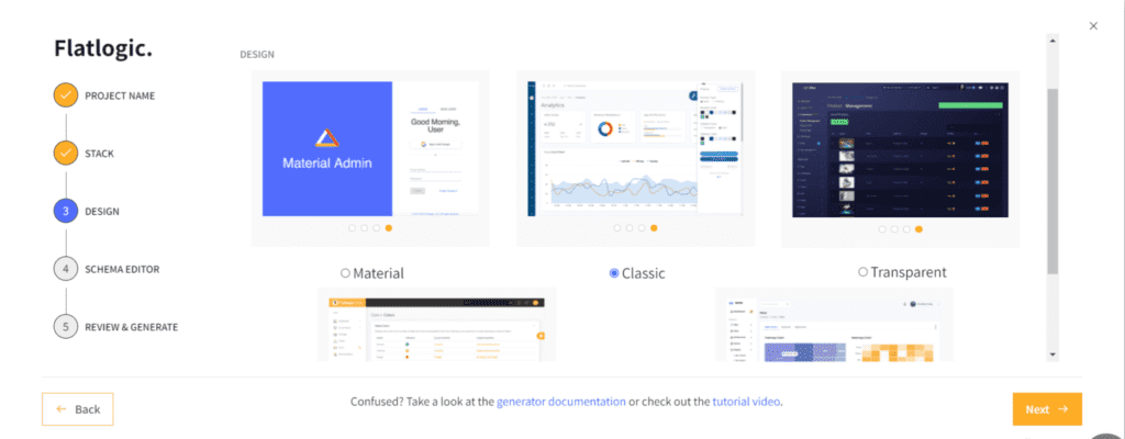
Step №4. Create your React Admin Page’s Database Schema
This step is quite important, as it is the basis for your React Admin Page. But fear not, as it is highly editable and customizable to your project’s needs. For the purpose of this example, we decided that our imaginary project is an E-commerce one and, quite luckily, Flatlogic’s Full Stack Web App Generator has a ready-made database schema just for this purpose. Bear in mind that even though it is ready-made it is still customizable and ready to be tailored to your project’s specialties.
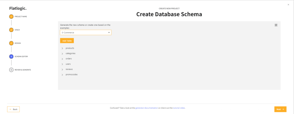
Step №5. Review and generate your React Admin Page
Now we are already at the finish line. All we have to do is just ensure that we’ve chosen everything we wanted and press the majestic “Create Project” button.
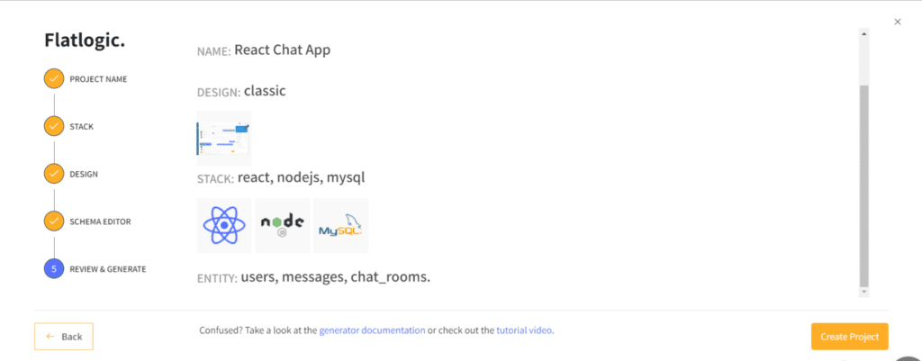
After that, just sit back and let Flatlogic’s Full Stack Web App Generator do what it does best. And after a laughably short time, you have on your hands the done and dusted React Admin Page.
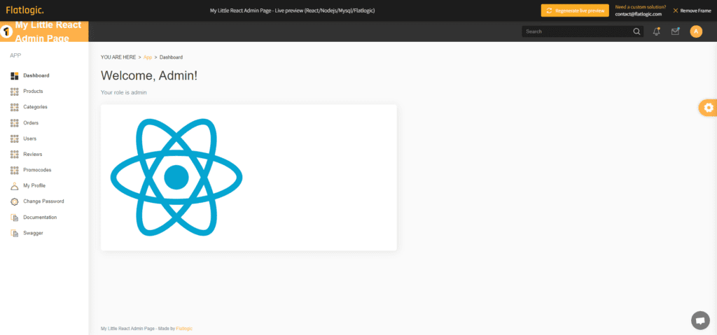
Conclusion
Summarizing, it ought to be said that the main goal of this article was simple: to show you how easy and effortless the process of creating such a pivotal part of a web project is, as an Admin Page/App/Console, can be with the help of Flatlogic’s Full Stack Web App Generator. And we are absolutely sure that this goal can be achieved without any hitches. Now you don’t have to spend the valuable and precious time of you and your colleagues on this important task, but instead, you can do it in a jiffy. Finally, thank you for spending your time on this article that we hope you have found really helpful. Have a nice day and, as always, feel free to read up on more of the articles in our blog!