Последнее обновление: 28.01.2023
-
Глава 1. Введение в Windows Forms
-
Первое приложение с .NET CLI
-
Первое приложение в Visual Studio
-
Создание графического приложения
-
-
Глава 2. Работа с формами
-
Основы форм
-
Основные свойства форм
-
Добавление форм. Взаимодействие между формами
-
События в Windows Forms. События формы
-
Создание непрямоугольных форм. Закрытие формы
-
-
Глава 3. Контейнеры в Windows Forms
-
Динамическое добавление элементов
-
Элементы GroupBox, Panel и FlowLayoutPanel
-
TableLayoutPanel
-
Размеры элементов и их позиционирование в контейнере
-
Панель вкладок TabControl и SplitContainer
-
-
Глава 4. Элементы управления
-
Кнопка
-
Метки и ссылки
-
Текстовое поле TextBox
-
Элемент MaskedTextBox
-
Элементы Radiobutton и CheckBox
-
ListBox
-
Элемент ComboBox
-
Привязка данных в ListBox и ComboBox
-
Элемент CheckedListBox
-
Элементы NumericUpDown и DomainUpDown
-
ImageList
-
ListView
-
TreeView
-
TrackBar, Timer и ProgressBar
-
DateTimePicker и MonthCalendar
-
PictureBox
-
WebBrowser
-
Элемент NotifyIcon
-
Окно сообщения MessageBox
-
OpenFileDialog и SaveFileDialog
-
FontDialog и ColorDialog
-
ErrorProvider
-
-
Глава 5. Меню и панели инструментов
-
Панель инструментов ToolStrip
-
Создание меню MenuStrip
-
Строка состояния StatusStrip
-
Контекстное меню ContextMenuStrip
-
-
Глава 6. Привязка и паттерн Model-View-ViewModel
-
Введение в привязку. Форматирование значения привязки
-
Привязка объектов. Интерфейс INotifyPropertyChanged
-
DataContext
-
Паттерн Model-View-ViewModel
-
Команды и взаимодействие с пользователем в MVVM
-
Параметры команды
-
- Глава 1. Введение в Windows Forms
- Первое приложение с .NET CLI
- Первое приложение в Visual Studio
- Создание графического приложения
- Глава 2. Работа с формами
- Основы форм
- Основные свойства форм
- Добавление форм. Взаимодействие между формами
- События в Windows Forms. События формы
- Создание непрямоугольных форм. Закрытие формы
- Глава 3. Контейнеры в Windows Forms
- Динамическое добавление элементов
- Элементы GroupBox, Panel и FlowLayoutPanel
- TableLayoutPanel
- Размеры элементов и их позиционирование в контейнере
- Панель вкладок TabControl и SplitContainer
- Глава 4. Элементы управления
- Кнопка
- Метки и ссылки
- Текстовое поле TextBox
- Элемент MaskedTextBox
- Элементы Radiobutton и CheckBox
- ListBox
- Элемент ComboBox
- Привязка данных в ListBox и ComboBox
- Элемент CheckedListBox
- Элементы NumericUpDown и DomainUpDown
- ImageList
- ListView
- TreeView
- TrackBar, Timer и ProgressBar
- DateTimePicker и MonthCalendar
- PictureBox
- WebBrowser
- Элемент NotifyIcon
- Окно сообщения MessageBox
- OpenFileDialog и SaveFileDialog
- FontDialog и ColorDialog
- ErrorProvider
- Глава 5. Меню и панели инструментов
- Панель инструментов ToolStrip
- Создание меню MenuStrip
- Строка состояния StatusStrip
- Контекстное меню ContextMenuStrip
- Глава 6. Привязка и паттерн Model-View-ViewModel
- Введение в привязку. Форматирование значения привязки
- Привязка объектов. Интерфейс INotifyPropertyChanged
- DataContext
- Паттерн Model-View-ViewModel
- Команды и взаимодействие с пользователем в MVVM
- Параметры команды
Помощь сайту
YooMoney:
410011174743222
Перевод на карту
Номер карты:
4048415020898850
|
Содержание |
|
Windows Forms — фреймворк для работы с формами.
Общая структура программы[править]
Любая программа, использующая Wondows Forms может иметь следующий вид:
{$apptype windows}
{$reference 'System.Windows.Forms.dll'}
{$reference 'System.Drawing.dll'}

uses
  System.Windows.Forms,
  System.Drawing;

var
  MainForm: System.Windows.Forms.Form;

begin
  MainForm := new Form;
  Application.Run(MainForm);
end.
MainForm — главная форма.
Основные классы[править]
Windows Forms содержит следующие классы:
- System.Windows.Forms.Button или Button (кнопка)
- System.Windows.Forms.Label или Label (метка)
- System.Windows.Forms.CheckBox или CheckBox (флажок)
- System.Windows.Forms.RadioButton или RadioButton (радио-кнопка)
- System.Windows.Forms.TrackBar или TrackBar (ползунок)
- System.Windows.Forms.ListBox или ListBox (список)
- System.Windows.Forms.ComboBox или ComboBox (выпадающий список)
- System.Windows.Forms.Form или Form (форма)
- System.Windows.Forms.GroupBox или GroupBox (фрейм)
- System.Windows.Forms.SplitContainer или SplitContainer (элемент разделения окна)
- System.Windows.Forms.MenuStrip или MenuStrip (главное меню)
- System.Windows.Forms.ToolStripMenuItem или ToolStripMenuItem (подменю)
Button[править]
System.Windows.Forms.Button — класс кнопки. Синтаксис ее создания:
name — имя кнопки.
| Свойство | Значение |
|---|---|
| Width | Ширина кнопки. |
| Height | Высота кнопки. |
| Text | Текст на кнопке. |
| BackColor | Цвет фона кнопки. |
| ForeColor | Цвет текста кнопки. |
| Location | Позиция кнопки на форме.
В качестве значения должна быть точка System.Drawing.Point. |
| AutoSize | Будет ли меняться размер кнопки, подгоняясь под размер содержимого, или будет отображаться лишь та часть содержимого, умещающаяся на кнопке. |
| Parent | Родительский виджет. |
| Visible | Видна ли кнопка. |
| Событие | Значение |
|---|---|
| Click | Хранит ссылку на процедуру, которая выполниться при нажатии на кнопку.
Для установки его значения используйте вместо := +=. |
Label[править]
System.Windows.Forms.Label — класс метки. Синтаксис ее создания:
name — имя метки.
| Свойство | Значение |
|---|---|
| Width | Ширина метки. |
| Height | Высота метки. |
| Text | Текст на метки. |
| BackColor | Цвет фона метки. |
| ForeColor | Цвет текста метки. |
| Location | Позиция метки на форме. |
| AutoSize | Будет ли меняться размер метки, подгоняясь под размер содержимого, или будет отображаться лишь та часть содержимого, умещающаяся на метке. |
| Parent | Родительский виджет. |
| Visible | Видна ли метка. |
CheckBox[править]
System.Windows.Forms.CheckBox — класс флажка. Синтаксис его создания:
name — имя флажка.
| Свойство | Значение |
|---|---|
| Width | Ширина флажка. |
| Height | Высота флажка. |
| Text | Текст на флажка. |
| BackColor | Цвет фона флажка. |
| ForeColor | Цвет текста флажка. |
| Location | Позиция флажка форме. |
| AutoSize | Будет ли меняться размер флажка, подгоняясь под размер содержимого, или будет отображаться лишь та часть содержимого, умещающаяся на флажка. |
| Parent | Родительский виджет. |
| Visible | Виден ли флажок. |
| Checked | Определяет установлен ли флажок или нет. |
RadioBox[править]
System.Windows.Forms.RadioBox- класс радио-кнопки. Синтаксис ее создания:
name — имя радио-кнопки.
| Свойство | Значение |
|---|---|
| Width | Ширина радио-кнопки. |
| Height | Высота радио-кнопки. |
| Text | Текст на радио-кнопки. |
| BackColor | Цвет фона радио-кнопки. |
| ForeColor | Цвет текста радио-кнопки. |
| Location | Позиция радио-кнопки форме. |
| AutoSize | Будет ли меняться размер радио-кнопки, подгоняясь под размер содержимого, или будет отображаться лишь та часть содержимого, умещающаяся на радио-кнопке. |
| Parent | Родительский виджет. |
| Visible | Видна ли радио-кнопка. |
| Checked | Определяет установлена ли радио-кнопка или нет. |
TrackBar[править]
System.Windows.Forms.TrackBar — класс ползунка. Синтаксис его создания:
name — имя ползунка.
| Свойство | Значение |
|---|---|
| Width | Ширина ползунка. |
| Height | Ширина ползунка. |
| Location | Позиция ползунка на форме. |
| Parent | Родительский виджет. |
| Visible | Виден ли ползунок. |
| Minimum | Минимальное значение ползунка. |
| Maximum | Максимальное значение ползунка. |
| Value | Текущее значение ползунка. |
| Orientation | Ориентация ползунка.
|
| TickStyle | Контролирует как отображаются деления.
|
| TickFrequency | Расстояние между делениями. |
ListBox[править]
System.Windows.Forms.ListBox- класс списка. Синтаксис его создания:
name — имя списка.
| Свойство | Значение |
|---|---|
| Width | Ширина списка. |
| Height | Высота списка. |
| Location | Позиция списка на форме. |
| Parent | Родительский виджет. |
| Visible | Виден ли список. |
| ItemHeight | Высота элемента списка. |
| Items.Count | Количество элементов списка. |
| Items.Item[k] | K-ый элемент списка. |
| IntegralHeight | Указывает будет ли подгоняться размер списка под размер элементов, чтобы был видны названия всех элементов полностью. |
| Событие | Описание |
|---|---|
| Click | Хранит ссылку на процедуру, которая выполнится при щелчке по списку. |
| SelectedIndexChanged | Хранит ссылку на процедуру, которая выполнится при смене выбранного элемента списка. |
Ниже a — список.
| Процедура | Значение |
|---|---|
| a.Items.Add(t) | Добавляет в список элемент с текстом t. |
| a.Items.Clear | Очищает список. |
ComboBox[править]
System.Windows.Forms.ComboBox — класс выпадающего списка. Для его создания пишите:
name — имя выпадающего списка.
| Свойство | Значение |
|---|---|
| Width | Ширина выпадающего списка. |
| Height | Высота выпадающего списка. |
| Parent | Родительский виджет. |
| Visible | Виден ли выпадающий список. |
| Count | Количество элементов в выпадающем списке. |
| SelectedIndex | Индекс выбранного элемента выпадающего списка. |
| SelectedItem | Выбранный элемент выпадающего списка. |
| Items.Item[k] | K-ый элемент выпадающего списка. |
| IntegralHeight | Указывает будет ли подгоняться размер выпадающего списка под размер элементов, чтобы был видны названия всех элементов полностью. |
| Событие | Описание |
|---|---|
| Click | Хранит ссылку на процедуру, которая выполнится при щелчке по выпадающему списку. |
| SelectedIndexChanged | Хранит ссылку на процедуру, которая выполнится при смене выбранного элемента выпадающего списка. |
Ниже a — выпадающий список.
| Функция | Описание |
|---|---|
| a.Items.Add | Добавляет в выпадающий список элемент. |
| a.Items.Clear | Удаляет все элементы выпадающего списка. |
GroupBox[править]
System.Windows.Forms.GroupBox- класс фрейма. Синтаксис его создания:
name — имя кнопки.
| Свойство | Значение |
|---|---|
| Width | Ширина фрейма. |
| Height | Высота фрейма. |
| Text | Текст на в заголовке фрейма. |
| Location | Позиция фрейма на форме.
В качестве значения должна быть точка System.Drawing.Point. |
| AutoSize | Будет ли меняться размер фрейма, подгоняясь под размер содержимого, или будет отображаться лишь та часть содержимого, умещающаяся на кнопке. |
| Parent | Родительский виджет. |
| Visible | Виден ли фрейм. |
SplitContainer[править]
System.Windows.Forms.SplitContainer — класс элемента разделения окна. Синтаксис его создания:
name := new SplitContainer();
name — имя элемента разделения окна.
| Свойство | Значение |
|---|---|
| Width | Ширина элемента разделения окна. |
| Height | Высота элемента разделения окна. |
| Location | Позиция элемента разделения окна на форме.
В качестве значения должна быть точка System.Drawing.Point. |
| AutoSize | Будет ли меняться размер элемента разделения окна, подгоняясь под размер содержимого, или будет отображаться лишь та часть содержимого, умещающаяся на элементе разделения окна. |
| Visible | Виден ли элемент разделения окна. |
| Orientation | Ориентация элемента разделения окна.
|
| Parent | Родительский виджет. |
| Panel1 | Имя виджета, входящего в левую или верхнюю часть элемента разделения окна. |
| Panel2 | Имя виджета, входящего в правую или нижнюю часть элемента разделения окна. |
[править]
System.Windows.Forms.MenuStrip — класс главного меню. Синтаксис его создания:
name := new MenuStrip ();
name — имя главного меню.
| Свойство | Значение |
|---|---|
| BackColor | Цвет фона главного меню. |
| ForeColor | Цвет текста меню. |
| GripStyle | Видим ли объект для перемещения меню, находящийся слева.
|
Ниже a — главное меню.
| Процедура | Значение |
|---|---|
| a.Items.Add(k) | Добавляет подменю k в главное меню. |
[править]
System.Windows.Forms.ToolStripMenuItem — класс подменю. Синтаксис его создания:
name := new ToolStripMenuItem ();
name — имя подменю.
| Свойство | Значение |
|---|---|
| BackColor | Цвет фона заголовка подменю. |
| ForeColor | Цвет текста заголовка подменю. |
Ниже b — подменю.
| Процедура | Значение |
|---|---|
| b.DropDownItems.Add(t,i,act) | Добавляет пункт в подменю b.
|
Форма[править]
System.Windows.Forms.Form — класс формы. Общий синтаксис ее создания:
| Свойство | Описане |
|---|---|
| Text | Заголовок формы. |
Ниже a — форма.
| Свойство | Описане |
|---|---|
| a.Controls.Add(виджет) | Добавляет виджет на форму. |
Курсор[править]
Cursor — объект курсора в Windows Forms.
| Свойство | Значение |
|---|---|
| System.Windows.Forms.Cursor.Position.X | Позиция курсора по X. |
| System.Windows.Forms.Cursor.Position.Y | Позиция курсора по Y. |
Обработка событий[править]
Любая процедура, являющаяся обработчиком события должна иметь вид:
procedure p(sender:object; args:System.EventArgs);
begin
   //тело процедуры
end;
p — имя процедуры.
Стили[править]
Подключить визуальные стили для более красивого отображения виджетов можно так:
Application.EnableVisualStyles;
Примеры программ[править]
- Вывод сообщения по нажатию кнопки:
{$reference 'System.Windows.Forms.dll'}
{$reference 'System.Drawing.dll'}

uses System, System.Windows.Forms;

var
  f : Form;
  btn : Button;

procedure ButtonClick(sender: object; e: EventArgs);
begin
  MessageBox.Show('Hello world!');
end;

begin
  f := new Form;
  btn := new Button;
  btn.Text := 'Click me';
  btn.Click += ButtonClick;
  f.Controls.Add(btn);
  Application.Run(f);
end.
| title | description | ms.date | ms.topic | helpviewer_keywords | author | ms.author | manager | ms.technology |
|---|---|---|---|---|---|---|---|---|
|
Windows Forms Designer tutorial |
Learn how to build an app using the various tools provided by Windows Forms Designer. The app is a custom control that uses many available layout features. |
07/06/2022 |
tutorial |
Windows Forms Designer, get started |
TerryGLee |
tglee |
jmartens |
vs-ide-designers |
Tutorial: Get started with Windows Forms Designer
[!INCLUDE Visual Studio]
The Windows Forms Designer provides many tools for building Windows Forms applications. This article illustrates how to build an app using the various tools provided by the designer, including the following tasks:
- Arrange controls using snaplines.
- Accomplish designer tasks using smart tags.
- Set margins and padding for controls.
- Arrange controls using a xref:System.Windows.Forms.TableLayoutPanel control.
- Partition your control’s layout by using a xref:System.Windows.Forms.SplitContainer control.
- Navigate your layout with the Document Outline window.
- Position controls with the size and location information display.
- Set property values using the Properties window.
When you’re finished, you’ll have a custom control that’s been assembled using many of the layout features available in the Windows Forms Designer. This control implements the user interface (UI) for a simple calculator. The following image shows the general layout of the calculator control:

[!TIP]
If you’re a C++ developer and are looking for a tutorial to help you create a Windows app that includes forms and controls, see Creating a forms-based MFC application. For more generalized info, see Overview of Windows programming in C++.
Create the custom control project
The first step is to create the DemoCalculator control project.
-
Open Visual Studio and create a new Windows Forms Control Library project. Name the project DemoCalculatorLib.

-
To rename the file, in Solution Explorer, right-click UserControl1.vb or UserControl1.cs, select Rename, and change the file name to DemoCalculator.vb or DemoCalculator.cs. Select Yes when you are asked if you want to rename all references to the code element «UserControl1».

The Windows Forms Designer shows the designer surface for the DemoCalculator control. In this view, you can graphically design the appearance of the control by selecting controls and components from Toolbox and placing them on the designer surface. For more information about custom controls, see Varieties of custom controls.
Design the control layout
The DemoCalculator control contains several Windows Forms controls. In this procedure, you’ll arrange the controls using the Windows Forms Designer.
-
In the Windows Forms Designer, change the DemoCalculator control to a larger size by selecting the sizing handle in the lower-right corner and dragging it down and to the right. In the lower-right corner of Visual Studio, find the size and location information for controls. Set the size of the control to width 500 and height 400 by watching the size information as you resize the control.
-
In Toolbox, select the Containers node to open it. Select the SplitContainer control and drag it onto the designer surface.
The
SplitContaineris placed on the DemoCalculator control’s designer surface.[!TIP]
TheSplitContainercontrol sizes itself to the fit the size of the DemoCalculator control. Look at the Properties window to see the property settings for theSplitContainercontrol. Find the xref:System.Windows.Forms.SplitContainer.Dock%2A property. Its value is DockStyle.Fill, which means theSplitContainercontrol will always size itself to the boundaries of the DemoCalculator control. Resize the DemoCalculator control to verify this behavior. -
In the Properties window, change the value of the xref:System.Windows.Forms.SplitContainer.Dock%2A property to
None.The
SplitContainercontrol shrinks to its default size and no longer follows the size of the DemoCalculator control. -
Select the smart tag glyph (
) on the upper-right corner of the SplitContainercontrol. Select Dock in Parent Container to set theDockproperty toFill.The
SplitContainercontrol docks to the DemoCalculator control’s boundaries.[!NOTE]
Several controls offer smart tags to facilitate design. For more information, see Walkthrough: Perform common tasks using Smart Tags on Windows Forms controls. -
Select the vertical border between the panels and drag it to the right, so that most of the space is taken by the left panel.
The
SplitContainerdivides the DemoCalculator control into two panels with a movable border separating them. The panel on the left will hold the calculator buttons and display, and the panel on the right will show a record of the arithmetic operations performed by the user. -
In the Properties window, change the value of the
BorderStyleproperty toFixed3D. -
In Toolbox, select the Common Controls node to open it. Select the
ListViewcontrol and drag it into the right panel of theSplitContainercontrol. -
Select the
ListViewcontrol’s smart tag glyph. In the smart tag panel, change theViewsetting toDetails. -
In the smart tag panel, select Edit Columns.
The ColumnHeader Collection Editor dialog box opens.
-
In the ColumnHeader Collection Editor dialog box, select Add to add a column to the
ListViewcontrol. Change the value of the column’sTextproperty to History. Select OK to create the column. -
In the smart tag panel, select Dock in Parent Container, and then select the smart tag glyph to close the smart tag panel.
-
From the Containers node Toolbox, drag a
TableLayoutPanelcontrol into the left panel of theSplitContainercontrol.The
TableLayoutPanelcontrol appears on the designer surface with its smart tag panel open. TheTableLayoutPanelcontrol arranges its child controls in a grid. TheTableLayoutPanelcontrol will hold the DemoCalculator control’s display and buttons. For more information, see Walkthrough: Arrange controls using a TableLayoutPanel. -
Select Edit Rows and Columns on the smart tag panel.
The Column and Row Styles dialog box opens.
-
Select the Add button until five columns are displayed. Select all five columns, and then select Percent in the Size Type box. Set the Percent value to 20. This sets each column to the same width.
-
Under Show, select Rows.
-
Select Add until five rows are displayed. Select all five rows, and the select Percent in the Size Type box. Set the Percent value to 20. This sets each row to the same height.
-
Select OK to accept your changes, and then select the smart tag glyph to close the smart tag panel.
-
In the Properties window, change the value of the
Dockproperty toFill.
 ) on the upper-right corner of the
 Populate the control
Now that the layout of the control is set up, you can populate the DemoCalculator control with buttons and a display.
-
In Toolbox, select the
TextBoxcontrol icon.A
TextBoxcontrol is placed in the first cell of theTableLayoutPanelcontrol. -
In the Properties window, change the value of the
TextBoxcontrol’s ColumnSpan property to 5.The
TextBoxcontrol moves to a position that is centered in its row. -
Change the value of the
TextBoxcontrol’sAnchorproperty toLeft,Right.The
TextBoxcontrol expands horizontally to span all five columns. -
Change the value of the
TextBoxcontrol’sTextAlignproperty toRight. -
In the Properties window, expand the
Fontproperty node. SetSizeto 14, and setBoldto true for theTextBoxcontrol. -
Select the
TableLayoutPanelcontrol. -
In Toolbox, select the
Buttonicon.A
Buttoncontrol is placed in the next open cell of theTableLayoutPanelcontrol. -
In Toolbox, select the
Buttonicon four more times to populate the second row of theTableLayoutPanelcontrol. -
Select all five
Buttoncontrols by selecting them while holding down the Shift key. Press Ctrl+C to copy theButtoncontrols to the clipboard. -
Press Ctrl+V three times to paste copies of the
Buttoncontrols into the remaining rows of theTableLayoutPanelcontrol. -
Select all 20
Buttoncontrols by selecting them while holding down the Shift key. -
In the Properties window, change the value of the
Dockproperty toFill.All the
Buttoncontrols dock to fill their containing cells. -
In the Properties window, expand the
Marginproperty node. Set the value ofAllto 5.All the
Buttoncontrols are sized smaller to create a larger margin between them. -
Select button10 and button20, and then press Delete to remove them from the layout.
-
Select button5 and button15, and then change the value of their
RowSpanproperty to 2. These will be the Clear and = buttons for the DemoCalculator control.
Use the Document Outline window
When your control or form is populated with several controls, you may find it easier to navigate your layout with the Document Outline window.
-
On the menu bar, choose View > Other Windows > Document Outline.
The Document Outline window shows a tree view of the DemoCalculator control and its constituent controls. Container controls like the
SplitContainershow their child controls as subnodes in the tree. You can also rename controls in place using the Document Outline window. -
In the Document Outline window, right-click button1, and then select Rename. Change its name to sevenButton.
-
Using the Document Outline window, rename the
Buttoncontrols from the designer-generated name to the production name according to the following list:-
button1 to sevenButton
-
button2 to eightButton
-
button3 to nineButton
-
button4 to divisionButton
-
button5 to clearButton
-
button6 to fourButton
-
button7 to fiveButton
-
button8 to sixButton
-
button9 to multiplicationButton
-
button11 to oneButton
-
button12 to twoButton
-
button13 to threeButton
-
button14 to subtractionButton
-
button15 to equalsButton
-
button16 to zeroButton
-
button17 to changeSignButton
-
button18 to decimalButton
-
button19 to additionButton
-
-
Using the Document Outline and Properties windows, change the
Textproperty value for eachButtoncontrol name according to the following list:-
Change the sevenButton control text property to 7
-
Change the eightButton control text property to 8
-
Change the nineButton control text property to 9
-
Change the divisionButton control text property to / (forward slash)
-
Change the clearButton control text property to Clear
-
Change the fourButton control text property to 4
-
Change the fiveButton control text property to 5
-
Change the sixButton control text property to 6
-
Change the multiplicationButton control text property to * (asterisk)
-
Change the oneButton control text property to 1
-
Change the twoButton control text property to 2
-
Change the threeButton control text property to 3
-
Change the subtractionButton control text property to — (hyphen)
-
Change the equalsButton control text property to = (equals sign)
-
Change the zeroButton control text property to 0
-
Change the changeSignButton control text property to +/-
-
Change the decimalButton control text property to . (period)
-
Change the additionButton control text property to + (plus sign)
-
-
On the designer surface, select all the
Buttoncontrols by selecting them while holding down the Shift key. -
In the Properties window, expand the
Fontproperty node. SetSizeto 14, and setBoldto true for all theButtoncontrols.
This completes the design of the DemoCalculator control. All that remains is to provide the calculator logic.
Implement event handlers
The buttons on the DemoCalculator control have event handlers that can be used to implement much of the calculator logic. The Windows Forms Designer enables you to implement the stubs of all the event handlers for all the buttons with one selection.
-
On the designer surface, select all the
Buttoncontrols by selecting them while holding down the Shift key. -
Select one of the
Buttoncontrols.The Code Editor opens to the event handlers generated by the designer.
Test the control
Because the DemoCalculator control inherits from the xref:System.Windows.Forms.UserControl class, you can test its behavior with the UserControl Test Container. For more information, see How to: Test the run-time behavior of a UserControl.
-
Press F5 to build and run the DemoCalculator control in the UserControl Test Container.
-
Select the border between the
SplitContainerpanels and drag it left and right. TheTableLayoutPaneland all its child controls resize themselves to fit in the available space. -
When you are finished testing the control, select Close.
Use the control on a form
The DemoCalculator control can be used in other composite controls or on a form. The following procedure describes how to use it.
Create the project
The first step is to create the application project. You’ll use this project to build the application that shows your custom control.
-
Create a new Windows Forms Application project and name it DemoCalculatorTest.
-
In Solution Explorer, right-click the DemoCalculatorTest project, and then select Add > Project Reference to open the Reference Manager dialog box.
(If you’re using Visual Studio 2017, select Add > Reference to open the Reference Manager dialog box.)
-
Go to the Projects tab, and then select the DemoCalculatorLib project to add the reference to the test project.
-
In Solution Explorer, right-click DemoCalculatorTest, and then select Set as StartUp Project.
-
In the Windows Forms Designer, increase the size of the form to about 700 x 500.
Use the control in the form’s layout
To use the DemoCalculator control in an application, you need to place it on a form.
-
In Toolbox, expand the DemoCalculatorLib Components node.
-
Drag the DemoCalculator control from Toolbox onto your form. Move the control to the upper-left corner of the form. When the control is close to the form’s borders, snaplines will appear. Snaplines indicate the distance of the form’s
Paddingproperty and the control’sMarginproperty. Position the control at the location indicated by the snaplines.For more information, see Walkthrough: Arrange controls using snaplines.
-
Drag a
Buttoncontrol from Toolbox and drop it onto the form. -
Move the
Buttoncontrol around the DemoCalculator control and observe where the snaplines appear. You can align your controls precisely and easily using this feature. Delete theButtoncontrol when you’re finished. -
Right-click the DemoCalculator control, and then select Properties.
-
Change the value of the
Dockproperty toFill. -
Select the form, and then expand the
Paddingproperty node. Change the value of All to 20.The size of the DemoCalculator control is reduced to accommodate the new
Paddingvalue of the form. -
Resize the form by dragging the various sizing handles to different positions. Observe how the DemoCalculator control is resized to fit.
Next steps
This article has demonstrated how to construct the user interface for a simple calculator. To continue, you can extend its functionality by implementing the calculator logic, then publish the app using ClickOnce. Or, continue on to a different tutorial where you create a picture viewer using Windows Forms.
See also
- Windows Forms controls
- Accessibility for Windows Forms controls
- Publish using ClickOnce
Improve Article
Save Article
Like Article
Improve Article
Save Article
Like Article
Windows Forms is a Graphical User Interface(GUI) class library which is bundled in .Net Framework. Its main purpose is to provide an easier interface to develop the applications for desktop, tablet, PCs. It is also termed as the WinForms. The applications which are developed by using Windows Forms or WinForms are known as the Windows Forms Applications that runs on the desktop computer. WinForms can be used only to develop the Windows Forms Applications not web applications. WinForms applications can contain the different type of controls like labels, list boxes, tooltip etc.
Creating a Windows Forms Application Using Visual Studio 2017
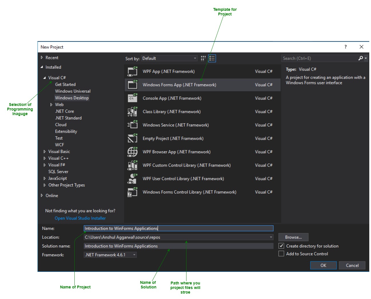
- First, open the Visual Studio then Go to File -> New -> Project to create a new project and then select the language as Visual C# from the left menu. Click on Windows Forms App(.NET Framework) in the middle of current window. After that give the project name and Click OK. Here the solution is like a container which contains the projects and files that may be required by the program.
- After that following window will display which will be divided into three parts as follows:
- Editor Window or Main Window: Here, you will work with forms and code editing. You can notice the layout of form which is now blank. You will double click the form then it will open the code for that.
- Solution Explorer Window: It is used to navigate between all items in solution. For example, if you will select a file form this window then particular information will be display in the property window.
- Properties Window: This window is used to change the different properties of the selected item in the Solution Explorer. Also, you can change the properties of components or controls that you will add to the forms.
- Now to add the controls to your WinForms application go to Toolbox tab present in the extreme left side of Visual Studio. Here, you can see a list of controls. To access the most commonly used controls go to Common Controls present in Toolbox tab.
- Now drag and drop the controls that you needed on created Form. For example, if you can add TextBox, ListBox, Button etc. as shown below. By clicking on the particular dropped control you can see and change its properties present in the right most corner of Visual Studio. In the above image, you can see the TextBox is selected and its properties like TextAlign, MaxLength etc. are opened in right most corner. You can change its properties’ values as per the application need. The code of controls will be automatically added in the background. You can check the Form1.Designer.cs file present in the Solution Explorer Window.
- To run the program you can use an F5 key or Play button present in the toolbar of Visual Studio. To stop the program you can use pause button present in the ToolBar. You can also run the program by going to Debug->Start Debugging menu in the menubar.
 Here the solution is like a container which contains the projects and files that may be required by the program.
 In the above image, you can see the TextBox is selected and its properties like TextAlign, MaxLength etc. are opened in right most corner. You can change its properties’ values as per the application need. The code of controls will be automatically added in the background. You can check the Form1.Designer.cs file present in the Solution Explorer Window.
C# Windows Forms is a graphical user interface (GUI) framework that enables developers to create desktop applications for the Windows operating system. Windows Forms applications are created using the C# programming language and the .NET framework. They are built by dragging and dropping controls such as buttons, text boxes, labels, and other user interface elements onto a form.
- The Windows Forms framework provides a rich set of controls that developers can use to build applications with. These controls are designed to provide a consistent and familiar user interface for Windows users. Developers can customize the appearance and behavior of these controls by setting various properties and handling events.
- To create a Windows Forms application in C#, you can use Microsoft Visual Studio, which is an integrated development environment (IDE) that provides a visual designer to create and layout the user interface elements. The visual designer is a drag-and-drop interface for building your UI, and you can easily configure each control’s properties through a user-friendly interface.
- In addition to the visual designer, Visual Studio also provides a code editor that enables developers to write the C# code for the application’s logic. Developers can handle events and perform tasks such as data validation, data manipulation, and business logic implementation.
- Windows Forms applications are versatile and can be used to create various types of applications such as data entry, management, and reporting applications, as well as games and multimedia applications.
Overall, Windows Forms applications provide an easy-to-use and familiar graphical user interface for Windows users, making it an ideal choice for building desktop applications that require a high degree of interactivity and user engagement.
Last Updated :
04 May, 2023
Like Article
Save Article
So far we have seen how to work with C# to create console based applications. But in a real-life scenario team normally use Visual Studio and C# to create either Windows Forms or Web-based applications.
A windows form application is an application, which is designed to run on a computer. It will not run on web browser because then it becomes a web application.
This Tutorial will focus on how we can create Windows-based applications. We will also learn some basics on how to work with the various elements of C# Windows application.
In this Windows tutorial, you will learn-
- Windows Forms Basics
- Hello World in Windows Forms
- Adding Controls to a form
- Event Handling for Controls
- Tree and PictureBox Control
Windows Forms Basics
A Windows forms application is one that runs on the desktop computer. A Windows forms application will normally have a collection of controls such as labels, textboxes, list boxes, etc.
Below is an example of a simple Windows form application C#. It shows a simple Login screen, which is accessible by the user. The user will enter the required credentials and then will click the Login button to proceed.

So an example of the controls available in the above application
- This is a collection of label controls which are normally used to describe adjacent controls. So in our case, we have 2 textboxes, and the labels are used to tell the user that one textbox is for entering the user name and the other for the password.
- The 2 textboxes are used to hold the username and password which will be entered by the user.
- Finally, we have the button control. The button control will normally have some code attached to perform a certain set of actions. So for example in the above case, we could have the button perform an action of validating the user name and password which is entered by the user.
C# Hello World
Now let’s look at an example of how we can implement a simple ‘hello world’ application in Visual Studio. For this, we would need to implement the below-mentioned steps
Step 1) The first step involves the creation of a new project in Visual Studio. After launching Visual Studio, you need to choose the menu option New->Project.

Step 2) The next step is to choose the project type as a Windows Forms application. Here we also need to mention the name and location of our project.

- In the project dialog box, we can see various options for creating different types of projects in Visual Studio. Click the Windows option on the left-hand side.
- When we click the Windows options in the previous step, we will be able to see an option for Windows Forms Application. Click this option.
- We will give a name for the application. In our case, it is DemoApplication. We will also provide a location to store our application.
- Finally, we click the ‘OK’ button to let Visual Studio create our project.
If the above steps are followed, you will get the below output in Visual Studio.
Output:-

You will see a Form Designer displayed in Visual Studio. It’s in this Form Designer that you will start building your Windows Forms application.

In the Solution Explorer, you will also be able to see the DemoApplication Solution. This solution will contain the below 2 project files
- A Form application called Forms1.cs. This file will contain all of the code for the Windows Form application.
- The Main program called Program.cs is default code file which is created when a new application is created in Visual Studio. This code will contain the startup code for the application as a whole.
On the left-hand side of Visual Studio, you will also see a ToolBox. The toolbox contains all the controls which can be added to a Windows Forms. Controls like a text box or a label are just some of the controls which can be added to a Windows Forms.
Below is a screenshot of how the Toolbox looks like.

Step 3) In this step, we will now add a label to the Form which will display “Hello World.” From the toolbox, you will need to choose the Label control and simply drag it onto the Form.

Once you drag the label to the form, you can see the label embedded on the form as shown below.

Step 4) The next step is to go to the properties of the control and Change the text to ‘Hello World’.
To go to the properties of a control, you need to right-click the control and choose the Properties menu option

- The properties panel also shows up in Visual Studio. So for the label control, in the properties control, go to the Text section and enter “Hello World”.
- Each Control has a set of properties which describe the control.

If you follow all of the above steps and run your program in Visual Studio, you will get the following output
Output:-

In the output, you can see that the Windows Form is displayed. You can also see ‘Hello World’ is displayed on the form.
Adding Controls to a form
We had already seen how to add a control to a form when we added the label control in the earlier section to display “Hello World.”
Let’s look at the other controls available for Windows forms and see some of their common properties.
In our Windows form application in C# examples, we will create one form which will have the following functionality.
- The ability for the user to enter name and address.
- An option to choose the city in which the user resides in
- The ability for the user to enter an option for the gender.
- An option to choose a course which the user wants to learn. There will make choices for both C# and ASP.Net
So let’s look at each control in detail and add them to build the form with the above-mentioned functionality.
Group Box
A group box is used for logical grouping controls into a section. Let’s take an example if you had a collection of controls for entering details such as name and address of a person. Ideally, these are details of a person, so you would want to have these details in a separate section on the Form. For this purpose, you can have a group box. Let’s see how we can implement this with an example shown below
Step 1) The first step is to drag the Groupbox control onto the Windows Form from the toolbox as shown below

Step 2) Once the groupbox has been added, go to the properties window by clicking on the groupbox control. In the properties window, go to the Text property and change it to “User Details”.

Once you make the above changes, you will see the following output
Output:-

In the output, you can clearly see that the Groupbox was added to the form. You can also see that the text of the groupbox was changed to “User Details.”
Label Control
Next comes the Label Control. The label control is used to display a text or a message to the user on the form. The label control is normally used along with other controls. Common examples are wherein a label is added along with the textbox control.
The label indicates to the user on what is expected to fill up in the textbox. Let’s see how we can implement this with an example shown below. We will add 2 labels, one which will be called ‘name’ and the other called ‘address.’ They will be used in conjunction with the textbox controls which will be added in the later section.
Step 1) The first step is to drag the label control on to the Windows Form from the toolbox as shown below. Make sure you drag the label control 2 times so that you can have one for the ‘name’ and the other for the ‘address’.

Step 2) Once the label has been added, go to the properties window by clicking on the label control. In the properties window, go to the Text property of each label control.

Once you make the above changes, you will see the following output
Output:-

You can see the label controls added to the form.
Textbox
A textbox is used for allowing a user to enter some text on the Windows application in C#. Let’s see how we can implement this with an example shown below. We will add 2 textboxes to the form, one for the Name and the other for the address to be entered for the user
Step 1) The first step is to drag the textbox control onto the Windows Form from the toolbox as shown below

Step 2) Once the text boxes have been added, go to the properties window by clicking on the textbox control. In the properties window, go to the Name property and add a meaningful name to each textbox. For example, name the textbox for the user as txtName and that for the address as txtAddress. A naming convention and standard should be made for controls because it becomes easier to add extra functionality to these controls, which we will see later on.

Once you make the above changes, you will see the following output
Output:-

In the output, you can clearly see that the Textboxes was added to the form.
List box
A Listbox is used to showcase a list of items on the Windows form. Let’s see how we can implement this with an example shown below. We will add a list box to the form to store some city locations.
Step 1) The first step is to drag the list box control onto the Windows Form from the toolbox as shown below

Step 2) Once the list box has been added, go to the properties window by clicking on the list box control.

- First, change the property of the Listbox box control, in our case, we have changed this to lstCity
- Click on the Items property. This will allow you to add different items which can show up in the list box. In our case, we have selected items “collection”.
- In the String Collection Editor, which pops up, enter the city names. In our case, we have entered “Mumbai”, “Bangalore” and “Hyderabad”.
- Finally, click on the ‘OK’ button.
Once you make the above changes, you will see the following output
Output:-

In the output, you can see that the Listbox was added to the form. You can also see that the list box has been populated with the city values.
RadioButton
A Radiobutton is used to showcase a list of items out of which the user can choose one. Let’s see how we can implement this with an example shown below. We will add a radio button for a male/female option.
Step 1) The first step is to drag the ‘radiobutton’ control onto the Windows Form from the toolbox as shown below.

Step 2) Once the Radiobutton has been added, go to the properties window by clicking on the Radiobutton control.

- First, you need to change the text property of both Radio controls. Go the properties windows and change the text to a male of one radiobutton and the text of the other to female.
- Similarly, change the name property of both Radio controls. Go the properties windows and change the name to ‘rdMale’ of one radiobutton and to ‘rdfemale’ for the other one.
One you make the above changes, you will see the following output
Output:-

You will see the Radio buttons added to the Windows form.
Checkbox
A checkbox is used to provide a list of options in which the user can choose multiple choices. Let’s see how we can implement this with an example shown below. We will add 2 checkboxes to our Windows forms. These checkboxes will provide an option to the user on whether they want to learn C# or ASP.Net.
Step 1) The first step is to drag the checkbox control onto the Windows Form from the toolbox as shown below

Step 2) Once the checkbox has been added, go to the properties window by clicking on the Checkbox control.

In the properties window,
- First, you need to change the text property of both checkbox controls. Go the properties windows and change the text to C# and ASP.Net.
- Similarly, change the name property of both Radio controls. Go the properties windows and change the name to chkC of one checkbox and to chkASP for the other one.
Once you make the above changes, you will see the following output
Output:-

Button
A button is used to allow the user to click on a button which would then start the processing of the form. Let’s see how we can implement this with an example shown below. We will add a simple button called ‘Submit’ which will be used to submit all the information on the form.
Step 1) The first step is to drag the button control onto the Windows Form from the toolbox as shown below

Step 2) Once the Button has been added, go to the properties window by clicking on the Button control.

- First, you need to change the text property of the button control. Go the properties windows and change the text to ‘submit’.
- Similarly, change the name property of the control. Go the properties windows and change the name to ‘btnSubmit’.
Once you make the above changes, you will see the following output
Output:-

Congrats, you now have your first basic Windows Form in place. Let’s now go to the next topic to see how we can do Event handling for Controls.
C# Event Handling for Controls
When working with windows form, you can add events to controls. An event is something that happens when an action is performed. Probably the most common action is the clicking of a button on a form. In C# Windows Forms, you can add code which can be used to perform certain actions when a button is pressed on the form.
Normally when a button is pressed on a form, it means that some processing should take place.
Let’s take a look at one of the event and how it can be handled before we go to the button event scenario.
The below example will showcase an event for the Listbox control. So whenever an item is selected in the listbox control, a message box should pop up which shows the item selected. Let’s perform the following steps to achieve this.
Step 1) Double click on the Listbox in the form designer. By doing this, Visual Studio will automatically open up the code file for the form. And it will automatically add an event method to the code. This event method will be triggered, whenever any item in the listbox is selected.

Above is the snippet of code which is automatically added by Visual Studio, when you double-click the List box control on the form. Now let’s add the below section of code to this snippet of code, to add the required functionality to the listbox event.

- This is the event handler method which is automatically created by Visual Studio when you double-click the List box control. You don’t need to worry about the complexity of the method name or the parameters passed to the method.
- Here we are getting the SelectedItem through the lstCity.SelectedItem property. Remember that lstCity is the name of our Listbox control. We then use the GetItemText method to get the actual value of the selected item. We then assign this value to the text variable.
- Finally, we use the MessageBox method to display the text variable value to the user.
One you make the above changes, and run the program in Visual Studio you will see the following output
Output:-

From the output, you can see that when any item from the list box is selected, a message box will pops up. This will show the selected item from the listbox.
Now let’s look at the final control which is the button click Method. Again this follows the same philosophy. Just double click the button in the Forms Designer and it will automatically add the method for the button event handler. Then you just need to add the below code.

- This is the event handler method which is automatically created by Visual Studio when you double click the button control. You don’t need to worry on the complexity of the method name or the parameters passed to the method.
- Here we are getting values entered in the name and address textbox. The values can be taken from the text property of the textbox. We then assign the values to 2 variables, name, and address accordingly.
- Finally, we use the MessageBox method to display the name and address values to the user.
One you make the above changes, and run the program in Visual Studio you will see the following output
Output:-

- First, enter a value in the name and address field.
- Then click on the Submit button
Once you click the Submit button, a message box will pop, and it will correctly show you what you entered in the user details section.
Tree and PictureBox Control
There are 2 further controls we can look at, one is the ‘Tree Control’ and the other is the ‘Image control’. Let’s look at examples of how we can implement these controls
Tree Control
– The tree control is used to list down items in a tree like fashion. Probably the best example is when we see the Windows Explorer itself. The folder structure in Windows Explorer is like a tree-like structure.
Let’s see how we can implement this with an example shown below.
Step 1) The first step is to drag the Tree control onto the Windows Form from the toolbox as shown below

Step 2) The next step is to start adding nodes to the tree collection so that it can come up in the tree accordingly. First, let’s follow the below sub-steps to add a root node to the tree collection.

- Go to the properties toolbox for the tree view control. Click on the Node’s property. This will bring up the TreeNode Editor
- In the TreeNode Editor click on the Add Root button to add a root node to the tree collection.
- Next, change the text of the Root node and provide the text as Root and click ‘OK’ button. This will add Root node.
Step 3) The next step is to start adding the child nodes to the tree collection. Let’s follow the below sub-steps to add child root node to the tree collection.

- First, click on the Add child button. This will allow you to add child nodes to the Tree collection.
- For each child node, change the text property. Keep on repeating the previous step and this step and add 2 additional nodes. In the end, you will have 3 nodes as shown above, with the text as Label, Button, and Checkbox respectively.
- Click on the OK button
Once you have made the above changes, you will see the following output.
Output:-

You will be able to see the Tree view added to the form. When you run the Windows form application, you can expand the root node and see the child nodes in the list.
PictureBox Control
This control is used to add images to the Winforms C#. Let’s see how we can implement this with an example shown below.
Step 1) The first step is to drag the PictureBox control onto the C# Windows Form from the toolbox as shown below

Step 2) The next step is to actually attach an image to the picture box control. This can be done by following the below steps.

- First, click on the Image property for the PictureBox control. A new window will pops out.
- In this window, click on the Import button. This will be used to attach an image to the picturebox control.
- A dialog box will pop up in which you will be able to choose the image to attach the picturebox
- Click on the OK button
One you make the above changes, you will see the following output
Output:-

From the output, you can see that an image is displayed on the form.
Summary
- A Windows form in C# application is one that runs on the desktop of a computer. Visual Studio Form along with C# can be used to create a Windows Forms application.
- Controls can be added to the Windows forms C# via the Toolbox in Visual Studio. Controls such as labels, checkboxes, radio buttons, etc. can be added to the form via the toolbox.
- One can also use advanced controls like the tree view control and the PictureBox control.
- Event handlers are used to respond to events generated from controls. The most common one is the one added for the button clicked event.