| title | description | ms.custom | ms.date | ms.prod | ms.technology | ms.topic | dev_langs | ms.assetid | author | ms.author | manager | ms.workload |
|---|---|---|---|---|---|---|---|---|---|---|---|---|
|
Hello World app with WPF in C# |
Create a simple Windows Desktop .NET app in C# with Visual Studio using the Windows Presentation Foundation (WPF) UI framework. |
vs-acquisition, get-started |
10/31/2022 |
visual-studio-windows |
vs-ide-general |
tutorial |
CSharp |
f84339c7-d617-4f56-bfcd-af2215c347ba |
anandmeg |
meghaanand |
jmartens |
dotnet |
Tutorial: Create a simple WPF application with C#
[!INCLUDE Visual Studio]
By completing this tutorial, you’ll become familiar with many of the tools, dialog boxes, and designers that you can use when you develop applications with Visual Studio. You’ll create a «Hello, World» application, design the UI, add code, and debug errors, while you learn about working in the integrated development environment (IDE).
Prerequisites
- If you haven’t already installed Visual Studio, go to the Visual Studio downloads page to install it for free.
- Make sure the .NET desktop development workload is installed. You can verify this in the Visual Studio Installer.
- You can use either .NET Framework or .NET Core for this tutorial. .NET Core is the newer, more modern framework. .NET Core requires Visual Studio 2019 version 16.3 or later.
What is WPF?
WPF, or Windows Presentation Foundation, is a UI (user interface) framework that creates desktop client applications. The WPF development platform supports a broad set of application development features, including an application model, resources, controls, graphics, layout, data binding, documents, and security.
WPF is part of .NET, so if you have previously built applications with .NET using ASP.NET or Windows Forms, the programming experience should be familiar. WPF uses the Extensible Application Markup Language XAML to provide a declarative model for application programming. For more information, see WPF .NET overview.
Configure the IDE
When you launch Visual Studio, the start window opens first. Select Continue without code to open the development environment. You’ll see tool windows, the menus and toolbars, and the main window space. Tool windows are docked on the left and right sides of the application window. The search box, menu bar, and the standard toolbar are located at the top. When you load a solution or project, editors and designers appear in the central space of the application window. When you develop an application, you’ll spend most of your time in this central area.
Create the project
When you create an application in Visual Studio, you first create a project and a solution. For this example, you’ll create a Windows Presentation Foundation (WPF) project.
::: moniker range=»vs-2019″
-
Open Visual Studio.
-
On the start window, choose Create new project.

-
On the Create a new project screen, search for «WPF,» choose WPF Application, and then choose Next.
:::image type=»content» source=»media/vs-2019/explore-ide-new-project-csharp-vs-2019.png» alt-text=»Screenshot of the ‘Create a new project’ dialog with ‘WPF’ entered in the search box, and the ‘WPF Application’ project template highlighted.»:::
-
At the next screen, give the project a name, HelloWPFApp, and choose Next.
:::image type=»content» source=»./media/vs-2019/explore-ide-name-project.png» alt-text=»Screenshot of the ‘Configure your new project’ dialog with ‘HelloWPFApp’ entered in the Project name field.»:::
-
In the Additional information window, .NET Core 3.1 should already be selected for your target framework. If not, select .NET Core 3.1. Then, choose Create.
:::image type=»content» source=»./media/vs-2019/wpf-target-framework.png» alt-text=»In the ‘Additional information’ window, make sure .NET Core 3.1 is selected»:::

Visual Studio creates the HelloWPFApp project and solution, and Solution Explorer shows the various files. The WPF Designer shows a design view and a XAML view of MainWindow.xaml in a split view. You can slide the splitter to show more or less of either view. You can choose to see only the visual view or only the XAML view.

[!NOTE]
For more information about XAML (eXtensible Application Markup Language), see the XAML overview for WPF page.
After you create the project, you can customize it. To do so, choose Properties Window from the View menu, or press F4. Then, you can display and change options for project items, controls, and other items in an application.

::: moniker-end
::: moniker range=»>=vs-2022″
-
Open Visual Studio.
-
On the start window, choose Create a new project.
:::image type=»content» source=»media/vs-2022/start-window-create-new-project.png» alt-text=»Screenshot of the start window in Visual Studio 2022 with the ‘Create a new project’ option highlighted.»:::
-
On the Create a new project screen, search for «WPF,» choose WPF Application, and then choose Next.
:::image type=»content» source=»media/vs-2022/explore-ide-new-project-csharp-wpf-vs-2022.png» alt-text=»Screenshot of the ‘Create a new project’ dialog with ‘WPF’ entered in the search box, and the ‘WPF Application’ project template highlighted.»:::
-
At the next screen, give the project a name, HelloWPFApp, and choose Next.
:::image type=»content» source=»media/vs-2022/explore-ide-name-project.png» alt-text=»Screenshot of the ‘Configure your new project’ dialog with ‘HelloWPFApp’ entered in the Project name field.»:::
-
In the Additional information window, .NET 6.0 (Long-term support) should already be selected for your target framework. If not, select .NET 6.0 (Long-term support). Then, choose Create.
:::image type=»content» source=»media/vs-2022/wpf-target-framework.png» alt-text=»In the ‘Screenshot of the Additional information window with ‘.NET 6.0 (Long-term support)’ selected in the Framework field.»:::
Visual Studio creates the HelloWPFApp project and solution, and Solution Explorer shows the various files. The WPF Designer shows a design view and a XAML view of MainWindow.xaml in a split view. You can slide the splitter to show more or less of either view. You can choose to see only the visual view or only the XAML view.
:::image type=»content» source=»media/vs-2022/explore-ide-wpf-project-cs.png» alt-text=»Screenshot of the HelloWPFApp project and solution in the Visual Studio IDE with the Solution Explorer open, and the XAML and designer views of ‘MainWindow.xaml’ open in the WPF Designer.»:::
[!NOTE]
For more information about XAML (eXtensible Application Markup Language), see the XAML overview for WPF page.
After you create the project, you can customize it. To do so, choose Properties Window from the View menu, or press F4. Then, you can display and change options for project items, controls, and other items in an application.
:::image type=»content» source=»media/vs-2022/explore-ide-hello-wpf-properties.png» alt-text=»Screenshot of the Properties window showing the Misc section of the Solution Properties for the HelloWPFApp project.»:::
::: moniker-end
Design the user interface (UI)
If the designer isn’t open, select MainWindow.xaml and press Shift+F7 to open the designer.
We’ll add three types of controls to this application: a xref:System.Windows.Controls.TextBlock control, two xref:System.Windows.Controls.RadioButton controls, and a xref:System.Windows.Controls.Button control.
Add a TextBlock control
::: moniker range=»<=vs-2019″
-
Press Ctrl+Q to activate the search box and type Toolbox. Choose View > Toolbox from the results list.
-
In the Toolbox, expand the Common WPF Controls node to see the TextBlock control.
-
Add a TextBlock control to the design surface by choosing the TextBlock item and dragging it to the window on the design surface. Center the control near the top of the window. In Visual Studio 2019 and later, you can use the red guidelines to center the control.
Your window should resemble the following illustration:
The XAML markup should look something like the following example:
<Grid>
    <TextBlock HorizontalAlignment="Left" Margin="387,60,0,0" TextWrapping="Wrap" Text="TextBlock" VerticalAlignment="Top"/>
</Grid>


::: moniker-end
::: moniker range=»>=vs-2022″
-
Press Ctrl+Q to activate the search box and type Toolbox. Choose View > Toolbox from the results list.
-
In the Toolbox, expand the Common WPF Controls node to see the TextBlock control.
:::image type=»content» source=»media/vs-2022/explore-ide-textblock-toolbox.png» alt-text=»Screenshot of the Toolbox window with the TextBlock control selected in the list of Common WPF Controls.»:::
-
Add a TextBlock control to the design surface by choosing the TextBlock item and dragging it to the window on the design surface. Center the control near the top of the window. You can use the guidelines to center the control.
Your window should resemble the following image:
:::image type=»content» source=»media/vs-2022/explore-ide-greetings-with-textblock-only.png» alt-text=»Screenshot of the TextBlock control on the design surface. Guidelines are shown for positioning and resizing the control.»:::
The XAML markup should look something like the following example:
<Grid>
    <TextBlock HorizontalAlignment="Left" Margin="387,60,0,0" TextWrapping="Wrap" Text="TextBlock" VerticalAlignment="Top"/>
</Grid>
::: moniker-end
Customize the text in the text block
-
In the XAML view, locate the markup for TextBlock and change the Text attribute from
TextBoxtoSelect a message option and then choose the Display button.The XAML markup should look something like the following example:
<Grid>
    <TextBlock HorizontalAlignment="Left" Margin="387,60,0,0" TextWrapping="Wrap" Text="Select a message option and then choose the Display button." VerticalAlignment="Top"/>
</Grid>
-
Center the TextBlock again if you like, and then save your changes by pressing Ctrl+S or using the File menu item.
Next, you’ll add two RadioButton controls to the form.
Add radio buttons
::: moniker range=»<=vs-2019″
-
In the Toolbox, find the RadioButton control.
-
Add two RadioButton controls to the design surface by choosing the RadioButton item and dragging it to the window on the design surface. Move the buttons (by selecting them and using the arrow keys) so that the buttons appear side by side under the TextBlock control. Use the red guidelines to align the controls.
Your window should look like this:
-
In the Properties window for the left RadioButton control, change the Name property (the property at the top of the Properties window) to
HelloButton. -
In the Properties window for the right RadioButton control, change the Name property to
GoodbyeButton, and then save your changes.


Next, you’ll add display text for each RadioButton control. The following procedure updates the Content property for a RadioButton control.
::: moniker-end
::: moniker range=»>=vs-2022″
-
In the Toolbox, find the RadioButton control.
:::image type=»content» source=»media/vs-2022/explore-ide-radiobutton-toolbox.png» alt-text=»Screenshot of the Toolbox window with the RadioButton control selected in the list of Common WPF Controls.»:::
-
Add two RadioButton controls to the design surface by choosing the RadioButton item and dragging it to the window on the design surface. Move the buttons (by selecting them and using the arrow keys) so that the buttons appear side by side under the TextBlock control. You can use the guidelines to align the controls.
Your window should look like this:
:::image type=»content» source=»media/vs-2022/explore-ide-greetings-with-radiobuttons.png» alt-text=»Screenshot of the Design window for Greetings.xaml, showing a TextBlock control and two RadioButton controls positioned on the design surface.»:::
-
In the Properties window for the left RadioButton control, change the Name property (the property at the top of the Properties window) to
HelloButton.:::image type=»content» source=»media/vs-2022/explore-ide-button-properties.png» alt-text=»Screenshot of the Properties window for a RadioButton control. The value of the Name property has been changed to ‘HelloButton’.»:::
-
In the Properties window for the right RadioButton control, change the Name property to
GoodbyeButton, and then save your changes.
Next, you’ll add display text for each RadioButton control. The following procedure updates the Content property for a RadioButton control.
::: moniker-end
Add display text for each radio button
-
Update the Content attribute for the
HelloButtonandGoodbyeButtonto"Hello"and"Goodbye"in the XAML. The XAML markup should now look similar to the following example:<Grid> <TextBlock HorizontalAlignment="Left" Margin="252,47,0,0" TextWrapping="Wrap" Text="Select a message option and then choose the Display button." VerticalAlignment="Top"/> <RadioButton x:Name="HelloButton" Content="Hello" HorizontalAlignment="Left" Margin="297,161,0,0" VerticalAlignment="Top"/> <RadioButton x:Name="GoodbyeButton" Content="Goodbye" HorizontalAlignment="Left" Margin="488,161,0,0" VerticalAlignment="Top"/> </Grid>
Set a radio button to be checked by default
In this step, we’ll set HelloButton to be checked by default so that one of the two radio buttons is always selected.
-
In the XAML view, locate the markup for HelloButton.
-
Add an IsChecked attribute and set it to True. Specifically, add
IsChecked="True".The XAML markup should now look similar to the following example:
<Grid>
     <TextBlock HorizontalAlignment="Left" Margin="252,47,0,0" TextWrapping="Wrap" Text="Select a message option and then choose the Display button." VerticalAlignment="Top"/>
     <RadioButton x:Name="HelloButton" Content="Hello" IsChecked="True" HorizontalAlignment="Left" Margin="297,161,0,0" VerticalAlignment="Top"/>
     <RadioButton x:Name="GoodbyeButton" Content="Goodbye" HorizontalAlignment="Left" Margin="488,161,0,0" VerticalAlignment="Top"/>
</Grid>
The final UI element that you’ll add is a Button control.
Add the button control
::: moniker range=»<=vs-2019″
-
In the Toolbox, find the Button control, and then add it to the design surface under the RadioButton controls by dragging it to the form in the design view. If you’re using Visual Studio 2019 or later, a red line helps you center the control.
-
In the XAML view, change the value of Content for the Button control from
Content="Button"toContent="Display", and then save the changes.Your window should resemble the following illustration.
The XAML markup should now look similar to the following example:
<Grid>
     <TextBlock HorizontalAlignment="Left" Margin="252,47,0,0" TextWrapping="Wrap" Text="Select a message option and then choose the Display button." VerticalAlignment="Top"/>
     <RadioButton x:Name="HelloButton" Content="Hello" IsChecked="True" HorizontalAlignment="Left" Margin="297,161,0,0" VerticalAlignment="Top"/>
     <RadioButton x:Name="GoodbyeButton" Content="Goodbye" HorizontalAlignment="Left" Margin="488,161,0,0" VerticalAlignment="Top"/>
     <Button Content="Display" HorizontalAlignment="Left" Margin="377,270,0,0" VerticalAlignment="Top" Width="75"/>
</Grid>

::: moniker-end
::: moniker range=»>=vs-2022″
-
In the Toolbox, find the Button control, and then add it to the design surface under the RadioButton controls by dragging it to the form in the design view. The guidelines can help you center the control.
-
In the XAML view, change the value of Content for the Button control from
Content="Button"toContent="Display", and then save the changes.Your window should resemble the following screenshot.
:::image type=»content» source=»media/vs-2022/explore-ide-greetings-with-control-labels-cs.png» alt-text=»Screenshot of the Design window for Greetings.xaml showing a TextBlock control, two RadioButton controls labeled ‘Hello’ and ‘Goodbye’, and a button labeled ‘Display’.»:::
The XAML markup should now look similar to the following example:
<Grid>
     <TextBlock HorizontalAlignment="Left" Margin="252,47,0,0" TextWrapping="Wrap" Text="Select a message option and then choose the Display button." VerticalAlignment="Top"/>
     <RadioButton x:Name="HelloButton" Content="Hello" IsChecked="True" HorizontalAlignment="Left" Margin="297,161,0,0" VerticalAlignment="Top"/>
     <RadioButton x:Name="GoodbyeButton" Content="Goodbye" HorizontalAlignment="Left" Margin="488,161,0,0" VerticalAlignment="Top"/>
     <Button Content="Display" HorizontalAlignment="Left" Margin="377,270,0,0" VerticalAlignment="Top" Width="75"/>
</Grid>
::: moniker-end
Add code to the display button
::: moniker range=»<=vs-2019″
When this application runs, a message box appears after a user chooses a radio button and then chooses the Display button. One message box will appear for Hello, and another will appear for Goodbye. To create this behavior, you’ll add code to the Button_Click event in MainWindow.xaml.cs.
-
On the design surface, double-click the Display button.
MainWindow.xaml.cs opens, with the cursor in the
Button_Clickevent.private void Button_Click(object sender, RoutedEventArgs e) { }
-
Enter the following code:
if (HelloButton.IsChecked == true)
{
     MessageBox.Show("Hello.");
}
else if (GoodbyeButton.IsChecked == true)
{
    MessageBox.Show("Goodbye.");
}
-
Save the application.
::: moniker-end
::: moniker range=»>=vs-2022″
When this application runs, a message box appears after a user chooses a radio button and then chooses the Display button. One message box will appear for Hello, and another will appear for Goodbye. To create this behavior, you’ll add code to the Button_Click event in MainWindow.xaml.cs.
-
On the design surface, double-click the Display button.
MainWindow.xaml.cs opens, with the cursor in the
Button_Clickevent.private void Button_Click(object sender, RoutedEventArgs e) { }
-
Enter the following code:
if (HelloButton.IsChecked == true)
{
     MessageBox.Show("Hello.");
}
else if (GoodbyeButton.IsChecked == true)
{
    MessageBox.Show("Goodbye.");
}
-
Save the application.
::: moniker-end
Debug and test the application
Next, you’ll debug the application to look for errors and test that both message boxes appear correctly. The following instructions tell you how to build and launch the debugger, but later you might read Build a WPF application (WPF) and Debug WPF for more information.
Change the name of MainWindow.xaml
Let’s give MainWindow a more specific name. In Solution Explorer, right-click on MainWindow.xaml and choose Rename. Rename the file to Greetings.xaml.
Find and fix errors
In this step, you’ll find the error that we caused earlier by changing the name of the MainWindow.xaml file.
Start debugging and find the error
::: moniker range=»<=vs-2019″
-
Start the debugger by pressing F5 or selecting Debug, then Start Debugging.
A Break Mode window appears, and the Output window indicates that an IOException has occurred: Cannot locate resource ‘mainwindow.xaml’.
-
Stop the debugger by choosing Debug > Stop Debugging.

We renamed MainWindow.xaml to Greetings.xaml, but the code still refers to MainWindow.xaml as the startup URI for the application, so the project can’t start.
::: moniker-end
::: moniker range=»>=vs-2022″
-
Start the debugger by pressing F5 or selecting Debug, then Start Debugging.
A Break Mode window appears, and the Output window indicates that an IOException has occurred: Cannot locate resource ‘mainwindow.xaml’.
:::image type=»content» source=»media/vs-2022/explore-ide-ioexception.png» alt-text=»Screenshot of the Output window showing a System.IO.IOException with the message ‘Cannot locate resource mainwindow.xaml’.»:::
-
Stop the debugger by choosing Debug > Stop Debugging.
We renamed MainWindow.xaml to Greetings.xaml at the start of this tutorial, but the code still refers to MainWindow.xaml as the startup URI for the application, so the project can’t start.
::: moniker-end
Specify Greetings.xaml as the startup URI
-
In Solution Explorer, open the App.xaml file.
-
Change
StartupUri="MainWindow.xaml"toStartupUri="Greetings.xaml", and save the changes.
As an optional step, it will avoid confusion to change the title of your application window to match this new name.
-
In Solution Explorer, open the Greetings.xaml file that you just renamed.
-
Change the value of the Window.Title property from
Title="MainWindow"toTitle="Greetings", and save the changes.
Start the debugger again (press F5). You should now see the Greetings window of your application.
::: moniker range=»vs-2019″

::: moniker-end
::: moniker range=»>=vs-2022″
:::image type=»content» source=»media/vs-2022/explore-ide-wpf-running-app.png» alt-text=»Screenshot of the Greetings window with the TextBlock, RadioButtons, and Button controls visible. The ‘Hello’ radio button is selected.»:::
::: moniker-end
Now close the application window to stop debugging.
Debug with breakpoints
You can test the code during debugging by adding some breakpoints. You can add breakpoints by choosing Debug > Toggle Breakpoint, by clicking in the left margin of the editor next to the line of code where you want the break to occur, or by pressing F9.
Add breakpoints
::: moniker range=»vs-2019″
-
Open Greetings.xaml.cs, and select the following line:
MessageBox.Show("Hello.") -
Add a breakpoint from the menu by selecting Debug, then Toggle Breakpoint.
A red circle appears next to the line of code in the far left margin of the editor window.
-
Select the following line:
MessageBox.Show("Goodbye."). -
Press the F9 key to add a breakpoint, and then press F5 to start debugging.
-
In the Greetings window, choose the Hello radio button, and then choose the Display button.
The line
MessageBox.Show("Hello.")is highlighted in yellow. At the bottom of the IDE, the Autos, Locals, and Watch windows are docked together on the left side, and the Call Stack, Breakpoints, Exception Settings, Command, Immediate, and Output windows are docked together on the right side. -
On the menu bar, choose Debug > Step Out.
The application resumes execution, and a message box with the word «Hello» appears.
-
Choose the OK button on the message box to close it.
-
In the Greetings window, choose the Goodbye radio button, and then choose the Display button.
The line
MessageBox.Show("Goodbye.")is highlighted in yellow. -
Choose the F5 key to continue debugging. When the message box appears, choose the OK button on the message box to close it.
-
Close the application window to stop debugging.
-
On the menu bar, choose Debug > Disable All Breakpoints.

::: moniker-end
::: moniker range=»>=vs-2022″
-
Open Greetings.xaml.cs, and select the following line:
MessageBox.Show("Hello.") -
Add a breakpoint from the menu by selecting Debug, then Toggle Breakpoint.
A red circle appears next to the line of code in the far left margin of the editor window.
-
Select the following line:
MessageBox.Show("Goodbye."). -
Press the F9 key to add a breakpoint, and then press F5 to start debugging.
-
In the Greetings window, choose the Hello radio button, and then choose the Display button.
The line
MessageBox.Show("Hello.")is highlighted in yellow. At the bottom of the IDE, the Autos, Locals, and Watch windows are docked together on the left side, and the Call Stack, Breakpoints, Exception Settings, Command, Immediate, and Output windows are docked together on the right side.:::image type=»content» source=»media/vs-2022/explore-ide-debug-breakpoint.png» alt-text=»Screenshot of a debug session in Visual Studio. The code window for Greetings.xaml.cs shows execution stopped at a breakpoint with a line highlighted in yellow.»:::
-
On the menu bar, choose Debug > Step Out.
The application resumes execution, and a message box with the word «Hello» appears.
-
Choose the OK button on the message box to close it.
-
In the Greetings window, choose the Goodbye radio button, and then choose the Display button.
The line
MessageBox.Show("Goodbye.")is highlighted in yellow. -
Choose the F5 key to continue debugging. When the message box appears, choose the OK button on the message box to close it.
-
Close the application window to stop debugging.
-
On the menu bar, choose Debug > Disable All Breakpoints.
::: moniker-end
View a representation of the UI elements
In the running app, you should see a widget that appears at the top of your window. The widget is a runtime helper that provides quick access to some helpful debugging features. Select the first button, Go to Live Visual Tree. You should see a window with a tree that contains all the visual elements of your page. Expand the nodes to find the buttons you added.
::: moniker range=»vs-2019″

::: moniker-end
::: moniker range=»>=vs-2022″
:::image type=»content» source=»media/vs-2022/explore-ide-live-visual-tree.png» alt-text=»Screenshot of the Live Visual Tree window, showing the tree of visual elements in HelloWPFApp.exe while it’s running.»:::
::: moniker-end
Build a release version of the application
Now that you’ve verified that everything works, you can prepare a release build of the application.
-
On the main menu, select Build > Clean solution to delete intermediate files and output files that were created during previous builds. This step isn’t required, but it cleans up the debug build outputs.
-
Change the build configuration for HelloWPFApp from Debug to Release by using the dropdown control on the toolbar (it says «Debug» currently).
-
Build the solution by choosing Build > Build Solution.
Congratulations on completing this tutorial! You can find the .exe you built under your solution and project directory (…HelloWPFAppHelloWPFAppbinRelease).
Next steps
Congratulations on completing this tutorial! To learn even more, continue with the following tutorials.
[!div class=»nextstepaction»]
Continue with more WPF tutorials
See also
- Productivity tips
Последнее обновление: 04.03.2023
-
Глава 1. Введение в WPF
-
Особенности платформы WPF
-
Первое приложение с .NET CLI
-
Первое приложение в Visual Studio
-
-
Глава 2. XAML
-
Введение в язык XAML
-
Файлы отделенного кода
-
Сложные свойства и конвертеры типов
-
Пространства имен из C# в XAML
-
-
Глава 3. Компоновка
-
Введение в компоновку
-
Grid
-
GridSplitter
-
StackPanel
-
DockPanel
-
WrapPanel
-
Canvas
-
Свойства компоновки элементов
-
-
Глава 4. Элементы управления
-
Обзор элементов управления и их свойств
-
Элементы управления содержимым
-
Кнопки
-
CheckBox и RadioButton
-
Всплывающие подсказки ToolTip и Popup
-
Контейнеры GroupBox и Expander
-
ScrollViewer. Создание прокрутки
-
Текстовые элементы управления
-
Элементы управления списками
-
ListBox
-
ComboBox
-
ListView
-
Создание вкладок и TabControl
-
Меню
-
ToolBar
-
TreeView
-
DataGrid
-
ProgressBar и Slider
-
Работа с датами. Calendar и DatePicker
-
Работа с изображениями. Image и InkCanvas
-
-
Глава 5. DependencyObject и свойства зависимостей
-
Введение в Dependency Property
-
Прикрепляемые свойства / attached property
-
Создание свойств зависимостей
-
-
Глава 6. Модель событий в WPF
-
Маршрутизация событий
-
События клавиатуры
-
События мыши и фокуса
-
-
Глава 7. Команды
-
Основы команд
-
Создание новых команд
-
-
Глава 8. Кисти
-
Обзор кистей
-
-
Глава 9. Ресурсы
-
Концепция ресурсов в WPF
-
Статические и динамические ресурсы
-
Словари ресурсов
-
-
Глава 10. Привязка
-
Введение в привязку данных
-
Интерфейс INotifyPropertyChanged
-
Форматирование привязки и конвертеры значений
-
-
Глава 11. Стили, триггеры и темы
-
Стили
-
Триггеры
-
Темы
-
-
Глава 12. Приложение и класс Application
-
Класс Application
-
Работа с классом Application
-
Ресурсы приложения
-
-
Глава 13. Шаблоны элементов управления
-
Логическое и визуальное дерево
-
Создание и использование шаблонов
-
Визуальные состояния
-
Круглое окно
-
-
Глава 14. Работа с данными
-
Привязка данных и контекст данных
-
Работа с коллекциями данных. ObservableCollection
-
ItemTemplate и DataTemplate
-
ItemsPanel. Установка панели элементов
-
Виртуализация
-
Провайдеры данных. ObjectDataProvider
-
XmlDataProvider
-
Иерархические данные и HierarchicalDataTemplate
-
Валидация данных
-
-
Глава 15. Документы
-
Потоковые документы
-
Контейнеры потоковых документов
-
RichTextBox и редактирование документов
-
Фиксированные документы
-
Аннотации
-
-
Глава 16. Работа с графикой
-
Фигуры
-
Пути и геометрии
-
PathGeometry
-
Трансформации
-
-
Глава 17. Трехмерная графика
-
Основы работы с трехмерной графикой
-
Определение трехмерного объекта
-
Освещение
-
Камера
-
Создание куба. Текстурирование
-
Трехмерные трансформации и анимации
-
Взаимодействие с трехмерными объектами
-
-
Глава 18. Анимация
-
Основы анимаций
-
Анимация в XAML
-
Анимации по ключевым кадрам
-
Анимация пути
-
Плавность анимации
-
-
Глава 19. Окна
-
Класс Window
-
Взаимодействие между окнами
-
Диалоговые окна
-
-
Глава 20. Паттерн MVVM
-
Определение паттерна MVVM
-
Реализация MVVM. ViewModel
-
Команды в MVVM
-
Передача параметров команде
-
Взаимодействие команд и событий
-
Работа с диалоговыми окнами
-
-
Глава 21. Взаимодействие с базой данных
-
Работа с SQLite через Entity Framework
-
MVVM и SQLite
-
-
Глава 22. Хостирование приложения и внедрение зависимостей
-
Внедрение зависимостей в приложении WPF
-
- Глава 1. Введение в WPF
- Особенности платформы WPF
- Первое приложение с .NET CLI
- Первое приложение в Visual Studio
- Глава 2. XAML
- Введение в язык XAML
- Файлы отделенного кода
- Сложные свойства и конвертеры типов
- Пространства имен из C# в XAML
- Глава 3. Компоновка
- Введение в компоновку
- Grid
- GridSplitter
- StackPanel
- DockPanel
- WrapPanel
- Canvas
- Свойства компоновки элементов
- Глава 4. Элементы управления
- Обзор элементов управления и их свойств
- Элементы управления содержимым
- Кнопки
- CheckBox и RadioButton
- Всплывающие подсказки ToolTip и Popup
- Контейнеры GroupBox и Expander
- ScrollViewer. Создание прокрутки
- Текстовые элементы управления
- Элементы управления списками
- ListBox
- ComboBox
- ListView
- Создание вкладок и TabControl
- Меню
- ToolBar
- TreeView
- DataGrid
- ProgressBar и Slider
- Работа с датами. Calendar и DatePicker
- Работа с изображениями. Image и InkCanvas
- Глава 5. DependencyObject и свойства зависимостей
- Введение в Dependency Property
- Прикрепляемые свойства / attached property
- Создание свойств зависимостей
- Глава 6. Модель событий в WPF
- Маршрутизация событий
- События клавиатуры
- События мыши и фокуса
- Глава 7. Команды
- Основы команд
- Создание новых команд
- Глава 8. Кисти
- Обзор кистей
- Глава 9. Ресурсы
- Концепция ресурсов в WPF
- Статические и динамические ресурсы
- Словари ресурсов
- Глава 10. Привязка
- Введение в привязку данных
- Интерфейс INotifyPropertyChanged
- Форматирование привязки и конвертеры значений
- Глава 11. Стили, триггеры и темы
- Стили
- Триггеры
- Темы
- Глава 12. Приложение и класс Application
- Класс Application
- Работа с классом Application
- Ресурсы приложения
- Глава 13. Шаблоны элементов управления
- Логическое и визуальное дерево
- Создание и использование шаблонов
- Визуальные состояния
- Круглое окно
- Глава 14. Работа с данными
- Привязка данных и контекст данных
- Работа с коллекциями данных. ObservableCollection
- ItemTemplate и DataTemplate
- ItemsPanel. Установка панели элементов
- Виртуализация
- Провайдеры данных. ObjectDataProvider
- XmlDataProvider
- Иерархические данные и HierarchicalDataTemplate
- Валидация данных
- Глава 15. Документы
- Потоковые документы
- Контейнеры потоковых документов
- RichTextBox и редактирование документов
- Фиксированные документы
- Аннотации
- Глава 16. Работа с графикой
- Фигуры
- Пути и геометрии
- PathGeometry
- Трансформации
- Глава 17. Трехмерная графика
- Основы работы с трехмерной графикой
- Определение трехмерного объекта
- Освещение
- Камера
- Создание куба. Текстурирование
- Трехмерные трансформации и анимации
- Взаимодействие с трехмерными объектами
- Глава 18. Анимация
- Основы анимаций
- Анимация в XAML
- Анимации по ключевым кадрам
- Анимация пути
- Плавность анимации
- Глава 19. Окна
- Класс Window
- Взаимодействие между окнами
- Диалоговые окна
- Глава 20. Паттерн MVVM
- Определение паттерна MVVM
- Реализация MVVM. ViewModel
- Команды в MVVM
- Передача параметров команде
- Взаимодействие команд и событий
- Работа с диалоговыми окнами
- Глава 21. Взаимодействие с базой данных
- Работа с SQLite через Entity Framework
- MVVM и SQLite
- Глава 22. Хостирование приложения и внедрение зависимостей
- Внедрение зависимостей в приложении WPF
| title | titleSuffix | description | ms.date | ms.topic | dev_langs | helpviewer_keywords | ms.assetid | ms.custom | ||||
|---|---|---|---|---|---|---|---|---|---|---|---|---|
|
Create your first WPF app in Visual Studio 2019 — .NET Framework |
Develop a Windows Presentation Foundation (WPF) desktop application that includes elements common to most WPF applications. |
09/06/2019 |
tutorial |
|
|
b96bed40-8946-4285-8fe4-88045ab854ed |
mvc,vs-dotnet |
Tutorial: Create your first WPF application in Visual Studio 2019
This article shows you how to develop a Windows Presentation Foundation (WPF) desktop application that includes the elements that are common to most WPF applications: Extensible Application Markup Language (XAML) markup, code-behind, application definitions, controls, layout, data binding, and styles. To develop the application, you’ll use Visual Studio.
[!IMPORTANT]
This article was written for .NET Framework. To get started with .NET 7, see Tutorial: Create a new WPF app (WPF .NET).
In this tutorial, you learn how to:
[!div class=»checklist»]
- Create a WPF project.
- Use XAML to design the appearance of the application’s user interface (UI).
- Write code to build the application’s behavior.
- Create an application definition to manage the application.
- Add controls and create the layout to compose the application UI.
- Create styles for a consistent appearance throughout the application’s UI.
- Bind the UI to data, both to populate the UI from data and to keep the data and UI synchronized.
By the end of the tutorial, you’ll have built a standalone Windows application that allows users to view expense reports for selected people. The application is composed of several WPF pages that are hosted in a browser-style window.
[!TIP]
The sample code that is used in this tutorial is available for both Visual Basic and C# at Tutorial WPF App Sample Code.You can toggle the code language of the sample code between C# and Visual Basic by using the language selector on top of this page.
Prerequisites
-
Visual Studio 2019 with the .NET desktop development workload installed.
For more information about installing the latest version of Visual Studio, see Install Visual Studio.
Create the application project
The first step is to create the application infrastructure, which includes an application definition, two pages, and an image.
-
Create a new WPF Application project in Visual Basic or Visual C# named
ExpenseIt:-
Open Visual Studio and select Create a new project under the Get started menu.
The Create a new project dialog opens.
-
In the Language dropdown, select either C# or Visual Basic.
-
Select the WPF App (.NET Framework) template and then select Next.
The Configure your new project dialog opens.
-
Enter the project name
ExpenseItand then select Create.Visual Studio creates the project and opens the designer for the default application window named MainWindow.xaml.
-
-
Open Application.xaml (Visual Basic) or App.xaml (C#).
This XAML file defines a WPF application and any application resources. You also use this file to specify the UI, in this case MainWindow.xaml, that automatically shows when the application starts.
Your XAML should look like the following in Visual Basic:
[!code-xamlExpenseIt#1_A]
And like the following in C#:
[!code-xamlExpenseIt#1]
-
Open MainWindow.xaml.
This XAML file is the main window of your application and displays content created in pages. The xref:System.Windows.Window class defines the properties of a window, such as its title, size, or icon, and handles events, such as closing or hiding.
-
Change the xref:System.Windows.Window element to a xref:System.Windows.Navigation.NavigationWindow, as shown in the following XAML:
<NavigationWindow x:Class="ExpenseIt.MainWindow"
     xmlns="http://schemas.microsoft.com/winfx/2006/xaml/presentation"
     xmlns:x="http://schemas.microsoft.com/winfx/2006/xaml"
     ...
</NavigationWindow>
This app navigates to different content depending on the user input. This is why the main xref:System.Windows.Window needs to be changed to a xref:System.Windows.Navigation.NavigationWindow. xref:System.Windows.Navigation.NavigationWindow inherits all the properties of xref:System.Windows.Window. The xref:System.Windows.Navigation.NavigationWindow element in the XAML file creates an instance of the xref:System.Windows.Navigation.NavigationWindow class. For more information, see Navigation overview.
-
Remove the xref:System.Windows.Controls.Grid elements from between the xref:System.Windows.Navigation.NavigationWindow tags.
-
Change the following properties in the XAML code for the xref:System.Windows.Navigation.NavigationWindow element:
-
Set the xref:System.Windows.Window.Title%2A property to «
ExpenseIt«. -
Set the xref:System.Windows.FrameworkElement.Height%2A property to 350 pixels.
-
Set the xref:System.Windows.FrameworkElement.Width%2A property to 500 pixels.
Your XAML should look like the following for Visual Basic:
[!code-xamlExpenseIt#2_A]
And like the following for C#:
[!code-xamlExpenseIt#2]
-
-
Open MainWindow.xaml.vb or MainWindow.xaml.cs.
This file is a code-behind file that contains code to handle the events declared in MainWindow.xaml. This file contains a partial class for the window defined in XAML.
-
If you’re using C#, change the
MainWindowclass to derive from xref:System.Windows.Navigation.NavigationWindow. (In Visual Basic, this happens automatically when you change the window in XAML.) Your C# code should now look like this:[!code-csharpExpenseIt#3]


Add files to the application
In this section, you’ll add two pages and an image to the application.
-
Add a new page to the project, and name it
ExpenseItHome.xaml:-
In Solution Explorer, right-click on the
ExpenseItproject node and choose Add > Page. -
In the Add New Item dialog, the Page (WPF) template is already selected. Enter the name
ExpenseItHome, and then select Add.
This page is the first page that’s displayed when the application is launched. It will show a list of people to select from, to show an expense report for.
-
-
Open
ExpenseItHome.xaml. -
Set the xref:System.Windows.Controls.Page.Title%2A to «
ExpenseIt - Home«. -
Set the
DesignHeightto 350 pixels and theDesignWidthto 500 pixels.The XAML now appears as follows for Visual Basic:
[!code-xamlExpenseIt#6_A]
And like the following for C#:
[!code-xamlExpenseIt#6]
-
Open MainWindow.xaml.
-
Add a xref:System.Windows.Navigation.NavigationWindow.Source%2A property to the xref:System.Windows.Navigation.NavigationWindow element and set it to «
ExpenseItHome.xaml«.This sets
ExpenseItHome.xamlto be the first page opened when the application starts.Example XAML in Visual Basic:
[!code-xamlExpenseIt#7_A]
And in C#:
[!code-xamlExpenseIt#7]
[!TIP]
You can also set the Source property in the Miscellaneous category of the Properties window. -
Add another new WPF page to the project, and name it ExpenseReportPage.xaml::
-
In Solution Explorer, right-click on the
ExpenseItproject node and choose Add > Page. -
In the Add New Item dialog, select the Page (WPF) template. Enter the name ExpenseReportPage, and then select Add.
This page will show the expense report for the person that is selected on the
ExpenseItHomepage. -
-
Open ExpenseReportPage.xaml.
-
Set the xref:System.Windows.Controls.Page.Title%2A to «
ExpenseIt - View Expense«. -
Set the
DesignHeightto 350 pixels and theDesignWidthto 500 pixels.ExpenseReportPage.xaml now looks like the following in Visual Basic:
[!code-xamlExpenseIt#4_A]
And like the following in C#:
[!code-xamlExpenseIt#4]
-
Open ExpenseItHome.xaml.vb and ExpenseReportPage.xaml.vb, or ExpenseItHome.xaml.cs and ExpenseReportPage.xaml.cs.
When you create a new Page file, Visual Studio automatically creates its code-behind file. These code-behind files handle the logic for responding to user input.
Your code should look like the following for
ExpenseItHome:[!code-csharpExpenseIt#2_5]
[!code-vbExpenseIt#2_5]
And like the following for ExpenseReportPage:
[!code-csharpExpenseIt#5]
[!code-vbExpenseIt#5]
-
Add an image named watermark.png to the project. You can create your own image, copy the file from the sample code, or get it from the microsoft/WPF-Samples GitHub repository.
-
Right-click on the project node and select Add > Existing Item, or press Shift+Alt+A.
-
In the Add Existing Item dialog, set the file filter to either All Files or Image Files, browse to the image file you want to use, and then select Add.
-
Select the image file in Solution Explorer, then in the Properties window, set Build Action to Resource.
-

Build and run the application
-
To build and run the application, press F5 or select Start Debugging from the Debug menu.
The following illustration shows the application with the xref:System.Windows.Navigation.NavigationWindow buttons:
-
Close the application to return to Visual Studio.

Create the layout
Layout provides an ordered way to place UI elements, and also manages the size and position of those elements when a UI is resized. You typically create a layout with one of the following layout controls:
- xref:System.Windows.Controls.Canvas — Defines an area within which you can explicitly position child elements by using coordinates that are relative to the Canvas area.
- xref:System.Windows.Controls.DockPanel — Defines an area where you can arrange child elements either horizontally or vertically, relative to each other.
- xref:System.Windows.Controls.Grid — Defines a flexible grid area that consists of columns and rows.
- xref:System.Windows.Controls.StackPanel — Arranges child elements into a single line that can be oriented horizontally or vertically.
- xref:System.Windows.Controls.VirtualizingStackPanel — Arranges and virtualizes content on a single line that is oriented either horizontally or vertically.
- xref:System.Windows.Controls.WrapPanel — Positions child elements in sequential position from left to right, breaking content to the next line at the edge of the containing box. Subsequent ordering happens sequentially from top to bottom or from right to left, depending on the value of the Orientation property.
Each of these layout controls supports a particular type of layout for its child elements. ExpenseIt pages can be resized, and each page has elements that are arranged horizontally and vertically alongside other elements. In this example, the xref:System.Windows.Controls.Grid is used as layout element for the application.
[!TIP]
For more information about xref:System.Windows.Controls.Panel elements, see Panels overview. For more information about layout, see Layout.
In this section, you create a single-column table with three rows and a 10-pixel margin by adding column and row definitions to the xref:System.Windows.Controls.Grid in ExpenseItHome.xaml.
-
In
ExpenseItHome.xaml, set the xref:System.Windows.FrameworkElement.Margin%2A property on the xref:System.Windows.Controls.Grid element to «10,0,10,10», which corresponds to left, top, right and bottom margins:<Grid Margin="10,0,10,10">
[!TIP]
You can also set the Margin values in the Properties window, under the Layout category: -
Add the following XAML between the xref:System.Windows.Controls.Grid tags to create the row and column definitions:
[!code-xamlExpenseIt#8]
The xref:System.Windows.Controls.RowDefinition.Height%2A of two rows is set to xref:System.Windows.GridLength.Auto%2A, which means that the rows are sized based on the content in the rows. The default xref:System.Windows.Controls.RowDefinition.Height%2A is xref:System.Windows.GridUnitType.Star sizing, which means that the row height is a weighted proportion of the available space. For example if two rows each have a xref:System.Windows.Controls.RowDefinition.Height%2A of «*», they each have a height that is half of the available space.
Your xref:System.Windows.Controls.Grid should now contain the following XAML:
[!code-xamlExpenseIt#9]

Add controls
In this section, you’ll update the home page UI to show a list of people, where you select one person to display their expense report. Controls are UI objects that allow users to interact with your application. For more information, see Controls.
To create this UI, you’ll add the following elements to ExpenseItHome.xaml:
- A xref:System.Windows.Controls.ListBox (for the list of people).
- A xref:System.Windows.Controls.Label (for the list header).
- A xref:System.Windows.Controls.Button (to click to view the expense report for the person that is selected in the list).
Each control is placed in a row of the xref:System.Windows.Controls.Grid by setting the xref:System.Windows.Controls.Grid.Row%2A?displayProperty=nameWithType attached property. For more information about attached properties, see Attached Properties Overview.
-
In
ExpenseItHome.xaml, add the following XAML somewhere between the xref:System.Windows.Controls.Grid tags:[!code-xamlExpenseIt#10]
[!TIP]
You can also create the controls by dragging them from the Toolbox window onto the design window, and then setting their properties in the Properties window. -
Build and run the application.
The following illustration shows the controls you created:

Add an image and a title
In this section, you’ll update the home page UI with an image and a page title.
-
In
ExpenseItHome.xaml, add another column to the xref:System.Windows.Controls.Grid.ColumnDefinitions%2A with a fixed xref:System.Windows.Controls.ColumnDefinition.Width%2A of 230 pixels:[!code-xamlExpenseIt#11]
-
Add another row to the xref:System.Windows.Controls.Grid.RowDefinitions%2A, for a total of four rows:
[!code-xamlExpenseIt#11b]
-
Move the controls to the second column by setting the xref:System.Windows.Controls.Grid.Column%2A?displayProperty=nameWithType property to 1 in each of the three controls (Border, ListBox, and Button).
-
Move each control down a row by incrementing its xref:System.Windows.Controls.Grid.Row%2A?displayProperty=nameWithType value by 1 for each of the three controls (Border, ListBox, and Button) and for the Border element.
The XAML for the three controls now looks like the following:
[!code-xamlExpenseIt#12]
-
Set the Background property to the watermark.png image file, by adding the following XAML anywhere between the
<Grid>and</Grid>tags:[!code-xamlExpenseIt#14]
-
Before the xref:System.Windows.Controls.Border element, add a xref:System.Windows.Controls.Label with the content «View Expense Report». This label is the title of the page.
[!code-xamlExpenseIt#13]
-
Build and run the application.
The following illustration shows the results of what you just added:

Add code to handle events
-
In
ExpenseItHome.xaml, add a xref:System.Windows.Controls.Primitives.ButtonBase.Click event handler to the xref:System.Windows.Controls.Button element. For more information, see How to: Create a simple event handler.[!code-xamlExpenseIt#15]
-
Open
ExpenseItHome.xaml.vborExpenseItHome.xaml.cs. -
Add the following code to the
ExpenseItHomeclass to add a button click event handler. The event handler opens the ExpenseReportPage page.[!code-csharpExpenseIt#16]
[!code-vbExpenseIt#16]
Create the UI for ExpenseReportPage
ExpenseReportPage.xaml displays the expense report for the person that’s selected on the ExpenseItHome page. In this section, you’ll create the UI for ExpenseReportPage. You’ll also add background and fill colors to the various UI elements.
-
Open ExpenseReportPage.xaml.
-
Add the following XAML between the xref:System.Windows.Controls.Grid tags:
[!code-xamlExpenseIt#17]
This UI is similar to
ExpenseItHome.xaml, except the report data is displayed in a xref:System.Windows.Controls.DataGrid. -
Build and run the application.
-
Select the View button.
The expense report page appears. Also notice that the back navigation button is enabled.
The following illustration shows the UI elements added to ExpenseReportPage.xaml.

Style controls
The appearance of various elements is often the same for all elements of the same type in a UI. UI uses styles to make appearances reusable across multiple elements. The reusability of styles helps to simplify XAML creation and management. This section replaces the per-element attributes that were defined in previous steps with styles.
-
Open Application.xaml or App.xaml.
-
Add the following XAML between the xref:System.Windows.Application.Resources%2A?displayProperty=nameWithType tags:
[!code-xamlExpenseIt#18]
This XAML adds the following styles:
-
headerTextStyle: To format the page title xref:System.Windows.Controls.Label. -
labelStyle: To format the xref:System.Windows.Controls.Label controls. -
columnHeaderStyle: To format the xref:System.Windows.Controls.Primitives.DataGridColumnHeader. -
listHeaderStyle: To format the list header xref:System.Windows.Controls.Border controls. -
listHeaderTextStyle: To format the list header xref:System.Windows.Controls.Label. -
buttonStyle: To format the xref:System.Windows.Controls.Button onExpenseItHome.xaml.
Notice that the styles are resources and children of the xref:System.Windows.Application.Resources%2A?displayProperty=nameWithType property element. In this location, the styles are applied to all the elements in an application. For an example of using resources in a .NET app, see Use Application Resources.
-
-
In
ExpenseItHome.xaml, replace everything between the xref:System.Windows.Controls.Grid elements with the following XAML:[!code-xamlExpenseIt#19]
The properties such as xref:System.Windows.VerticalAlignment and xref:System.Windows.Media.FontFamily that define the look of each control are removed and replaced by applying the styles. For example, the
headerTextStyleis applied to the «View Expense Report» xref:System.Windows.Controls.Label. -
Open ExpenseReportPage.xaml.
-
Replace everything between the xref:System.Windows.Controls.Grid elements with the following XAML:
[!code-xamlExpenseIt#20]
This XAML adds styles to the xref:System.Windows.Controls.Label and xref:System.Windows.Controls.Border elements.
-
Build and run the application. The window appearance is the same as previously.
-
Close the application to return to Visual Studio.
Bind data to a control
In this section, you’ll create the XML data that is bound to various controls.
-
In
ExpenseItHome.xaml, after the opening xref:System.Windows.Controls.Grid element, add the following XAML to create an xref:System.Windows.Data.XmlDataProvider that contains the data for each person:[!code-xamlExpenseIt#23]
The data is created as a xref:System.Windows.Controls.Grid resource. Normally this data would be loaded as a file, but for simplicity the data is added inline.
-
Within the
<Grid.Resources>element, add the following<xref:System.Windows.DataTemplate>element, which defines how to display the data in the xref:System.Windows.Controls.ListBox, after the<XmlDataProvider>element:[!code-xamlExpenseIt#24]
For more information about data templates, see Data templating overview.
-
Replace the existing xref:System.Windows.Controls.ListBox with the following XAML:
[!code-xamlExpenseIt#25]
This XAML binds the xref:System.Windows.Controls.ItemsControl.ItemsSource%2A property of the xref:System.Windows.Controls.ListBox to the data source and applies the data template as the xref:System.Windows.Controls.ItemsControl.ItemTemplate%2A.
Connect data to controls
Next, you’ll add code to retrieve the name that’s selected on the ExpenseItHome page and pass it to the constructor of ExpenseReportPage. ExpenseReportPage sets its data context with the passed item, which is what the controls defined in ExpenseReportPage.xaml bind to.
-
Open ExpenseReportPage.xaml.vb or ExpenseReportPage.xaml.cs.
-
Add a constructor that takes an object so you can pass the expense report data of the selected person.
[!code-csharpExpenseIt#26]
[!code-vbExpenseIt#26] -
Open
ExpenseItHome.xaml.vborExpenseItHome.xaml.cs. -
Change the xref:System.Windows.Controls.Primitives.ButtonBase.Click event handler to call the new constructor passing the expense report data of the selected person.
[!code-csharpExpenseIt#27]
[!code-vbExpenseIt#27]
Style data with data templates
In this section, you’ll update the UI for each item in the data-bound lists by using data templates.
-
Open ExpenseReportPage.xaml.
-
Bind the content of the «Name» and «Department» xref:System.Windows.Controls.Label elements to the appropriate data source property. For more information about data binding, see Data binding overview.
[!code-xamlExpenseIt#31]
-
After the opening xref:System.Windows.Controls.Grid element, add the following data templates, which define how to display the expense report data:
[!code-xamlExpenseIt#30]
-
Replace the xref:System.Windows.Controls.DataGridTextColumn elements with xref:System.Windows.Controls.DataGridTemplateColumn under the xref:System.Windows.Controls.DataGrid element and apply the templates to them. Also, specify the
ItemsSourceattribute with its value in theDataGridElement.[!code-xamlExpenseIt#32]
-
Build and run the application.
-
Select a person and then select the View button.
The following illustration shows both pages of the ExpenseIt application with controls, layout, styles, data binding, and data templates applied:

[!NOTE]
This sample demonstrates a specific feature of WPF and doesn’t follow all best practices for things like security, localization, and accessibility. For comprehensive coverage of WPF and the .NET app development best practices, see the following topics:
- Accessibility
- Security
- WPF globalization and localization
- WPF performance
Next steps
In this walkthrough you learned a number of techniques for creating a UI using Windows Presentation Foundation (WPF). You should now have a basic understanding of the building blocks of a data-bound .NET app. For more information about the WPF architecture and programming models, see the following topics:
- WPF architecture
- XAML in WPF
- Dependency properties overview
- Layout
For more information about creating applications, see the following topics:
- Application development
- Controls
- Data binding overview
- Graphics and multimedia
- Documents in WPF
See also
- Panels overview
- Data templating overview
- Build a WPF application
- Styles and templates
Время на прочтение
7 мин
Количество просмотров 62K
Всем привет!
По разным причинам большинство из нас использует десктопные приложения, как минимум, браузер  А у некоторых из нас возникает необходимость в написании своих. В этой статье я хочу пробежаться по процессу разработки несложного десктопного приложения с использованием технологии Windows Presentation Foundation (WPF) и применением паттерна MVVM. Желающих продолжить чтение прошу под кат.
Думаю, необязательно говорить, что WPF — это разработка Microsoft Технология эта предназначена для разработки десктопных приложений под Windows, начиная с Windows XP. Почему именно так? Это связано с тем, что WPF работает поверх платформы .NET, минимальные требования которой — Windows XP и новее. К сожалению, WPF не работает на других платформах, хотя есть шансы, что в ближайшее время это изменится: в стадии разработки находится WPF-based фреймворк Avalonia.
В чём особенность WPF?
Два основных отличия WPF от других средств построения десктопных приложений:
- Язык разметки XAML, предназначенный для разметки самого интерфейса окна.
- Рендеринг посредством DirectX, аппаратное ускорение графики.
Я не буду углубляться в подробности, т.к. это не совсем тема статьи. Если интересно, то гуглить XAML, WPF rendering, milcore.dll и DirectX
О чём эта статья?
Эта статья содержит пример приложения, построенного на технологии WPF:
- MVVM и интерфейс INotifyPropertyChanged. Копия текста.
Я постараюсь ориентировать материал статьи в практическую сторону в стиле «повторяй за мной» с пояснениями.
Что нам понадобится для повторения статьи?
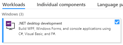
Небольшой опыт разработки на C# Как минимум, нужно хорошо понимать синтаксис языка. Также понадобится Windows-машина (в примерах будет Win 10) с установленной на ней Visual Studio (в примерах будет 2017, есть бесплатная Community версия). При установке VS необходимо будет включить поддержку десктопной разработки под платформу .NET
Так же в этом разделе я опишу создание проекта.
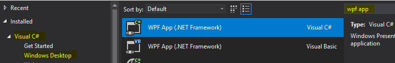
Запускаем VS, создаём новый проект, тип приложения выбираем WPF App (.NET Framework) (можно ввести в строке поиска справа вверху), называем как угодно.
После создания нового проекта откроется окно редактора интерфейса, у меня оно выглядит так
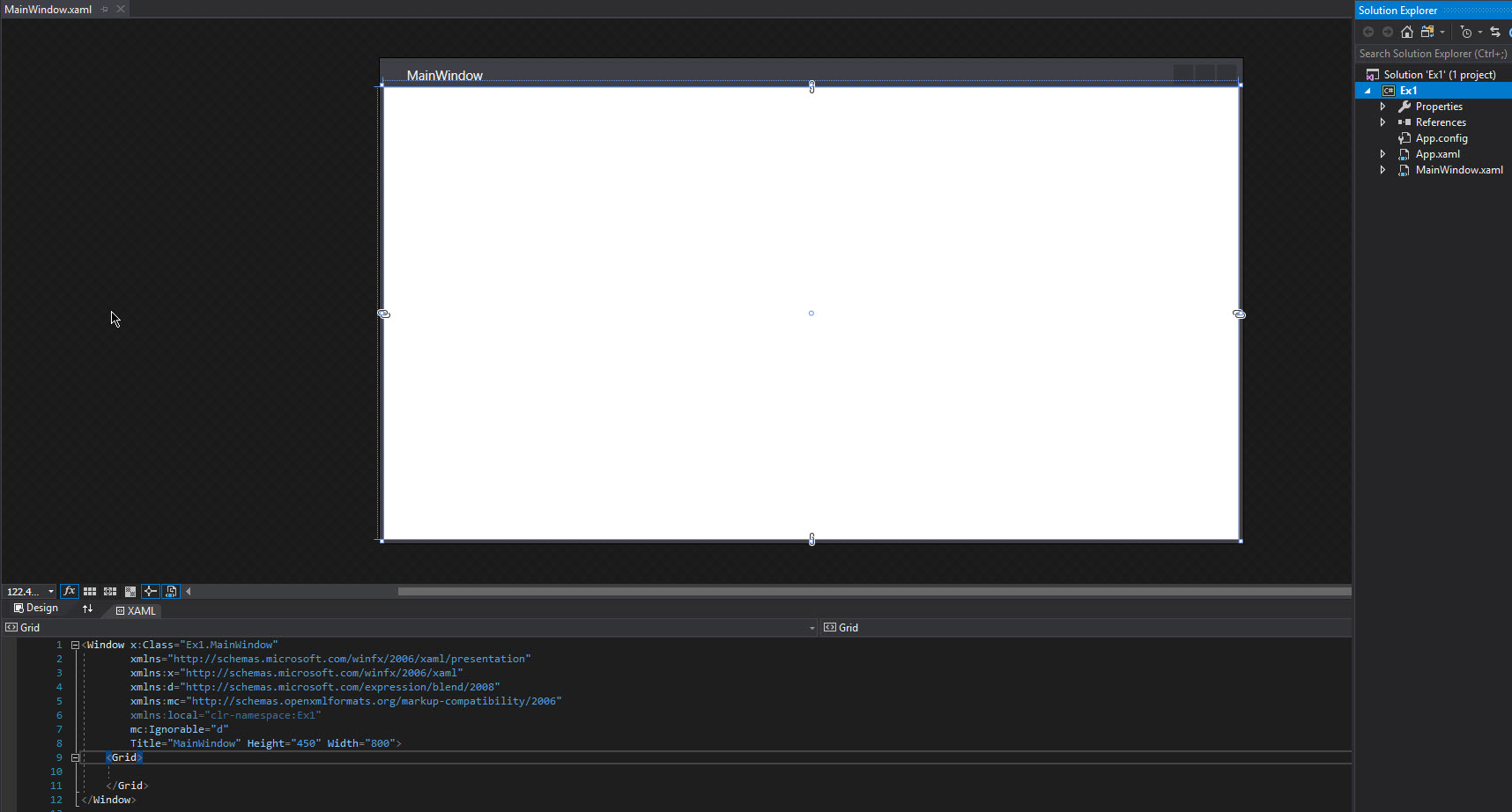
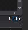
Внизу находится редактор разметки, вверху — предпросмотр интерфейса окна, но можно поменять относительное расположение редактора кода и предпросмотра интерфейса так, что они будут располагаться в горизонтальном порядке, с помощью вот этих кнопок (справа на границе двух областей):
Перед тем, как начать
Элементы окна (их ещё называют контрОлами от слова Control) должны размещаться внутри контейнера или внутри другого элемента типа ContentControl. Контейнер — это специальный контрол, позволяющий разместить внутри себя несколько дочерних контролов и организовать их взаимное расположение. Примеры контейнеров:
- Grid — позволяет организовать элементы по столбцам и строкам, ширина каждого столбца или строки настраивается индивидуально.
- StackPanel — позволяет расположить дочерние элементы в одну строку или столбец.
Есть и другие контейнеры. Поскольку контейнер тоже является контролом, то внутри контейнера могут быть вложенные контейнеры, содержащие вложенные контейнеры и так далее. Это позволяет гибко располагать контролы относительно друг друга. Так же с помощью контейнеров мы можем не менее гибко управлять поведением вложенных контролов при изменении размеров окна.
MVVM и интерфейс INotifyPropertyChanged. Копия текста.
Итогом этого примера станет приложение с двумя контролами, в одном из которых можно редактировать текст, а в другом только просматривать. Изменения из одного в другой будут переходить синхронно без явного копирования текста с помощью привязки (binding).
Итак, у нас есть свежесозданный проект (я назвал его Ex1), перейдём в редактор разметки и первым делом заменим контейнер, указанный по умолчанию (<Grid></Grid>) на <StackPanel></StackPanel>. Этого контейнера будет достаточно, т.к. нам понадобится расположить всего лишь два контрола один над другим. Укажем явно, каким образом будут располагаться компоненты, добавив свойство Orientation=»Vertical». Добавим внутрь стек панели парочку элементов: поле для ввода текста и поле для отображения текста. Поскольку эти контролы не будут содержать вложенного кода, можно описать их самозакрывающимся тегом (см. код ниже). После всех вышеописанных процедур код описания контейнера и вложенных контролов должен принять такой вид:
<StackPanel Orientation="Vertical">
    <TextBox />
    <TextBlock />
</StackPanel>
Теперь сосредоточимся на цели этого примера. Мы хотим, чтобы при наборе текста в текстбоксе этот же текст синхронно отображался в текстблоке, избежав при этом явной операции копирования текста. Нам понадобится некая связующая сущность, и вот тут-то мы и подошли к такой штуке, как привязка (binding), о которой было сказано выше. Привязка в терминологии WPF — это механизм, позволяющий связывать некоторые свойства контролов с некоторыми свойствами объекта C#-класса и выполнять взаимное обновление этих свойств при изменении одной из частей связки (это может работать в одну, в другую или в обе стороны сразу). Для тех, кто знаком с Qt, можно провести аналогию слотов и сигналов. Чтобы не растягивать время, перейдём к коду.
Итак, для организации привязки нужны свойства контролов и некое свойство некоего C#-класса. Для начала разберёмся с XAML-кодом. Текст обоих контролов хранится в свойстве Text, поэтому добавим привязку для этих свойств. Делается это так:
<TextBox Text="{Binding}"/>
<TextBlock Text="{Binding}"/>
Мы сделали привязку, но пока непонятно к чему Нам нужен объект какого-то класса и какое-то свойство в этом объекте, к которому будет выполнена привязка (как ещё говорят, на которое нужно забиндиться).
Так что это за класс? Этот класс называется вьюмоделью (view model) и служит как раз связующим звеном между view (интерфейсом или его частями) и model (моделью, т.е. теми частями кода, которые отвечают за логику приложения. Это позволяет отделить (в какой-то степени) логику приложения от интерфейса (представления, view) и называется паттерном Model-View-ViewModel (MVVM). В рамках WPF этот класс также называется DataContext.
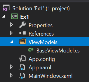
Однако, просто написать класс вьюмодели недостаточно. Нужно ещё как-то оповещать механизм привязки о том, что свойство вьюмодели или свойство вью изменилось. Для этого существует специальный интерфейс INotifyPropertyChanged, который содержит событие PropertyChanged. Реализуем этот интерфейс в рамках базового класса BaseViewModel. В дальнейшем все наши вьюмодели мы будем наследовать от этого базового класса, чтобы не дублировать реализацию интерфейса. Итак, добавим в проект каталог ViewModels, а в этот каталог добавим файл BaseViewModel.cs. Получим такую структуру проекта:
Код реализации базовой вьюмодели:
using System.ComponentModel;

namespace Ex1.ViewModels
{
    public class BaseViewModel : INotifyPropertyChanged
    {
        public event PropertyChangedEventHandler PropertyChanged;

        protected virtual void OnPropertyChanged(string propertyName = "")
        {
            PropertyChanged?.Invoke(this, new PropertyChangedEventArgs(propertyName));
        }
    }
}
Создадим для нашего класса MainWindow свою вьюмодель, унаследовавшись от базовой. Для этого в том же каталоге ViewModels создадим файл MainWindowViewModel.cs, внутри которого будет такой код:
namespace Ex1.ViewModels
{
    public class MainWindowViewModel : BaseViewModel
    {

    }
}
Шикарно! Теперь нужно добавить в эту вьюмодель свойство, на которое будем биндить текст наших контролов. Поскольку это текст, тип этого свойства должен быть string:
public string SynchronizedText { get; set; }В итоге получим такой код
namespace Ex1.ViewModels
{
    public class MainWindowViewModel : BaseViewModel
    {
        public string SynchronizedText { get; set; }
    }
}
Так, кажется, справились. Осталось забиндиться на это свойство из вьюхи и готово. Давайте сделаем это прямо сейчас:
<TextBox Text="{Binding Path=SynchronizedText}"/>
<TextBlock Text="{Binding Path=SynchronizedText}"/>
Ништяк, запускаем проект, набираем текст в текстбокс иииии… ничего не происходит))) Ну, ничего страшного, на самом деле мы идём правильной дорогой, просто пока ещё не дошли до нужной точки.
Предлагаю на минутку остановиться и подумать, чего же нам не хватает. Вьюха у нас есть. Вьюмодель тоже. Свойства вроде забиндили. Нужный интерфейс реализовали. Проделали кучу работы ради копирования жалкой строчки текста, за что нам это???!?!111
Ладно, шутки в сторону. Мы забыли создать объект вьюмодели и кое-что ещё (об этом позже). Сам класс мы описали, но это ничего не значит, ведь у нас нет объектов этого класса. Ок, где нужно хранить ссылку на этот объект? Ближе к началу примера я упомянул некий DataContext, используемый в WPF. Так вот, у любой вью есть свойство DataContext, которому мы можем присвоить ссылку на нашу вьюмодель. Сделаем это. Для этого откроем файл MainWindow.xaml и нажмём F7, чтобы открыть код этой вьюхи. Он практически пустой, в нём есть только конструктор класса окна. Добавим в него создание нашей вьюмодели и поместим её в DataContext окна (не забываем добавить using с нужным неймспейсом):
public MainWindow()
{
    InitializeComponent();
    this.DataContext = new MainWindowViewModel();
}
Это было просто, но этого всё равно не хватает. По-прежнему при запуске приложения никакой синхронизации текста не происходит. Что ещё нужно сделать?
Нужно вызвать событие PropertyChanged при изменении свойства SynchronizedText и сообщить вьюхе о том, что она должна следить за этим событием. Итак, чтобы вызвать событие, модифицируем код вьюмодели:
public class MainWindowViewModel : BaseViewModel
{
    private string _synchronizedText;
    public string SynchronizedText
    {
        get => _synchronizedText;
        set
        {
            _synchronizedText = value;
            OnPropertyChanged(nameof(SynchronizedText));
        }
    }
}
Что мы тут сделали? Добавили скрытое поле для хранения текста, обернули его в уже существующее свойство, а при изменении этого свойства не только меняем скрытое поле, но и вызываем метод OnPropertyChanged, определённый в базовой вьюмодели и вызывающий событие PropertyChanged, объявленное в интерфейсе INotifyPropertyChanged, так же реализованное в базовой вьюмодели. Получается, что при каждом изменении текста возникает событие PropertyChanged, которому передаётся имя свойства вьюмодели, которое было изменено.
Ну, почти всё, финишная прямая! Осталось указать вьюхе, что оно должно слушать событие PropertyChanged:
<TextBox Text="{Binding Path=SynchronizedText, UpdateSourceTrigger=PropertyChanged, Mode=OneWayToSource}"/>
<TextBlock Text="{Binding Path=SynchronizedText, UpdateSourceTrigger=PropertyChanged, Mode=OneWay}"/>
Помимо того, что мы указали, по какому триггеру должно происходить обновление, мы так же указали, в какую сторону это обновление отслеживается: от вью к вьюмодели или наоборот. Поскольку в текстбоксе мы вводим текст, то нам интересны изменения только во вью, поэтому выбираем режим OneWayToSource. В случае с текстблоком всё ровно наоборот: нам интересны изменения во вьюмодели, чтобы отобразить их во вью, поэтому выбираем режим OneWay. Если бы нам нужно было, чтобы изменения отслеживались в обе стороны, можно было не указывать Mode вообще, либо указать TwoWay явно.
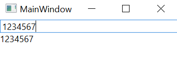
Итак, запускаем программу, набираем текст и voi-la! Текст синхронно меняется, и мы нигде ничего не копировали!
Спасибо за внимание, продолжение следует. Будем разбираться с DataTemplate и паттерном Command.